In the Details
Hello Design Crush readers!! Cassandra here from coco+kelley and I’m so happy to be hoppin’ over here today with a guest post based on one of my favorite series on my blog called In the Details. I usually like to focus on a theme, so today we’re looking at how to get creative with wallpaper…
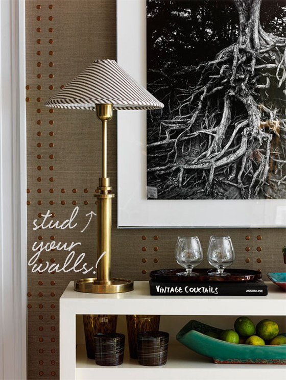
One of my favorite wallpapers, grasscloths provide such gorgeous texture, but can be fairly plain. To punch things up, add some badass studs in a large checkered pattern, and you’ve created a masculine-inspired detail not to be messed with.
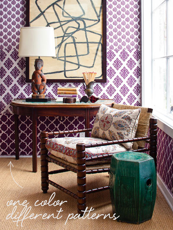
Layering different patterns within the same colourway is such a cool idea – and definitely no for the faint of heart. I’d suggest sticking to different styles within one line to make sure the hues are really spot on – this example is from John Robshaw’s wallpaper collection, and I love the mix of scale and style!
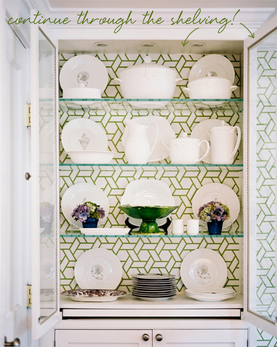
While it’s sometimes nice to have large case pieces to break up bold wallpaper patterns, I love this idea more. Line the back of the cabinet with the same wallpaper pattern and the eye will continuously move throughout the space instead! It won’t work in every case (remember if you line a cabinet with pattern, the items in the cabinet will need to stay fairly simple!)
What do you think? Would you experiment with any of these ideas in your own home??
*image sources: 1. Traditional Home 2. John Robshaw 3. Lonny Mag
Posted In guest post, house and home


designer
October 30, 2012 at 10:06 amThe first wallcovering already comes like that. You can order it from http://www.phillipjeffries.com
Susie
October 31, 2012 at 8:25 amI love the idea of studded wallpaper – great post!
Sea and Swank