Adobe MAX 2013: An Insider’s View
If you follow Design Crush on Twitter or Instagram you probably noticed that I was posting a lot from the hashtag #AdobeMAX last week. A few months ago I was invited to be an Adobe Insider for the Adobe MAX creativity conference that took place in Los Angeles, and I jumped on it. As a graphic designer Adobe is my livelihood, and I couldn’t wait to see the big new reveals that were in store as well as learn from the best of the best in the 300+ sessions offered. (Psst… you can watch a ton of the conference right here!)
Adobe MAX was by far the largest conference I’ve gone to with over 5,000 creative industry leaders, designers, video professionals and photographers from around the world in attendance. Everyone I crossed paths with was so excited to be there and openly exchanging ideas, innovations, and inspiration. It was incredibly refreshing because sometimes the design industry can feel very hush hush.
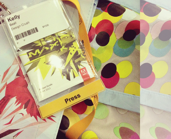
I felt extra special with my Press badge, which gave me access to any session I wished to attend as well as the Press Room. With so many people milling about it was nice to have a place to stop in between sessions to decompress, regroup, and grab a snack.
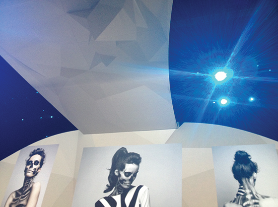
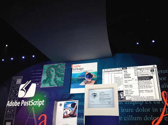
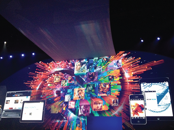
The first full day kicked off with the A Creative Evolution keynote. Everyone was welcomed into the Nokia Theater to the sounds of high-energy pop music to set the mood for what was to come as Adobe got ready to unveil brand new creative workflows and capabilities that focused on productivity, responsive design, and just a little bit of Adobe magic.
CEO Shatanu Narayen, SVP and GM of Digital Media David Wadhwani, and a collection of Adobe visionaries led the audience through the past, present, and endless possibilities of our creative future over the next two hours. Some of my favorite new features follow.
Photoshop CC
• use the Camera Raw filter to reposition camera angle
• radial blur can now be used several times in the same image
• spot healing can now be used as a non-circular area
• photos can be deblurred with the Shake Reduction filter
• can now generate web assets
Illustrator CC
• vector images can now be turned into brushes
• the Touch Type took can now manipular individual character without converting to outlines
After Effects CC
• 3D modeling app – Maxon Cinema 4D
• 3D camera tracker
• can now adjust without rendering
• refined edge is now a tool similar to in Photoshop that tracks frame to frame
Edge Reflow CC
• places web assets back in place automatically
• sizes for different devices
Edge Inspect CC
• Chrome extension
• connects to all devices wirelessly to preview
Edge Animate CC
• timeline-based for working on any device
Edge Code CC
• simply mouse over color and image code to get a thumbnail view
• after that use the quick edit pickers to make fast changes
• live Chrome preview
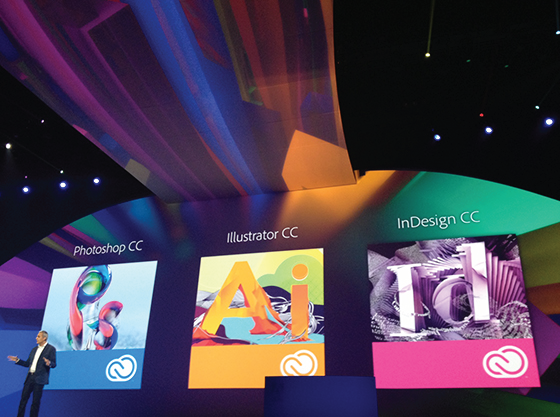
The biggest deal both at the conference and in online coverage was news that the Creative Suite (Photoshop, Illustrator, InDesign, Dreamweaver) will be replaced with the Creative Cloud as of June 17, 2013. CS6 will be available in perpetuity, but there will be no further developments or updates. CC will allow Adobe to get both to us faster and offer a broader canvas for innovation.
Once you download the Creative Cloud – and it does live on your computer, you’re not renting! – a Creative Cloud desktop app will show up on your computer that makes keeping everything in sync a breeze. Mentioning breezy things, all of your settings are saved to CC. Meaning they’ll follow you wherever you go. And all of the files you save to your 20GB of Cloud space carry their layers, type, etc with them, so when you share a preview or project with someone they’re not left guessing and recreating. There’s also a CC Touch App in the works for sharing, viewing, etc.
You Creative Cloud membership also includes Typekit! That’s $25,000 worth of professional fonts at your fingertips that you can download to your desktop for web and print projects. Mind = Blown.
It’s a lot to educate yourself on and transition to (and I’ve only covered the basics), but you can read more about the new technology and have FAQs answered right here. For what it’s worth, I’ve been using the current iteration of the Creative Cloud for about a month now and couldn’t love it more. To quote, “It’s like an app store where you own all of the apps.”
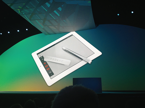
Adobe is also making its first venture into hardware! Check out Project Mighty – a pressure sensitive pen – and Project Napoleon, a short ruler (heh) that also allows use of basic shapes. The tools and settings for both devices are saved on the Creative Cloud, which means it’s not tethered to the device you’re using them on. Like I said, magic.
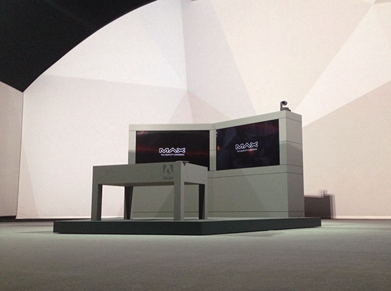
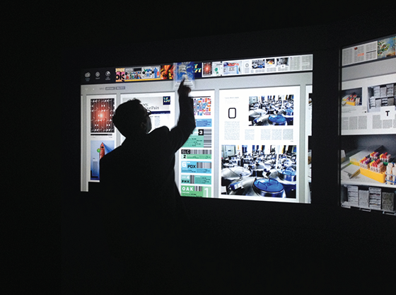
Project Context is a collaboration between Adobe and Wired magazine that’s planning on changing the face of digital publishing as we know it. See those two screens? Basically a touch wall. That table? A touch desk. Soon digital publishers will be able to use both to share folders, touch and drag items into containers for review, mark up files, type notes – and so much more. Today’s pin boards that are present in every magazine office will be a thing of the past and now editors will always up to date with the most recent files. The Adobe Insiders got an up close and personal sneak peek of Projects Mighty, Napoleon, and Context backstage after the keynote and I basically felt like I was starring in the Jetsons. This is good stuff, people!
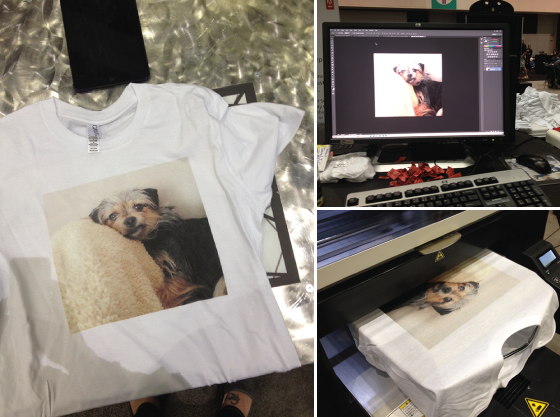
And then this happened. Yup, I had Bebe printed on a shirt. And the guys in charge of the booth said it was the best shirt they’d seen yet, and then they took my picture holding it up. I’ll be honest, it took awhile to come down from that high.
In the same space were the Red Bull Collective Art Project, Kiel Johnson’s Crowd Sourced Sentence, and the MAX Store full of souvenirs. Creativity explosion!
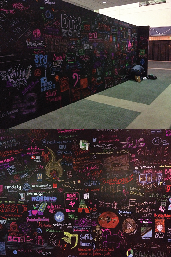
All of the sessions took place in the Los Angeles Convention Center, and I can’t say enough nice things about their staff. Each person was genuinely helpful and so nice, and the facility was top notch. In the middle of the main floor was this gigantic chalkboard wall that was doodled on and erased several times throughout the course of the conference. People got super into it sketching out their logos, Twitter handles, and so much more!
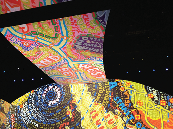
Day 2 brought with it a general session in the Nokia Theater. There we listened to four creative minds – iconic graphic designer and illustrator Paula Scher (that’s her work above), constraint-based artist Phil Hansen, photographer and retouch artist Erik Johansson, and Oscar winning visual effects supervisor Rob Legato – about how they foster creativity and approach their work. It was humbling to say the least, and each creator was supportive of the fact that we could each be doing exactly what they are. Incredible.
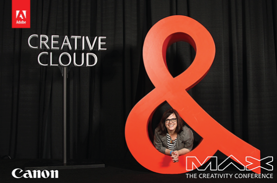
Then this might have happened at the MAX & You Photo Experience, you know how I love a photobooth! And I have to say, best and most flattering lighting setup ever.
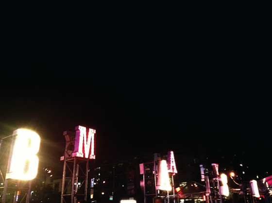
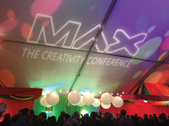
That evening was the much anticipated MAX Bash! It’s the official close of the conference, though there’s almost a full day of sessions left. I wasn’t sure just what to expect and was completely blown away by the planning and coordination put into everything, conference-wide really. These giant marquee-style lights greeted everyone as we filed in.
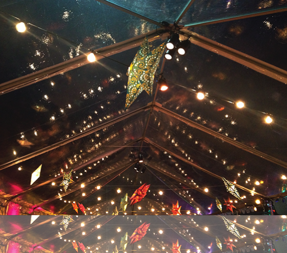
There were several tents filled with street food faire, I opted for Indian because it was closest to the entrance and I was super hungry! But I also spied Asian and Korean-themed tents. I especially loved the decorations that adorned the ceilings.
There was even a tent dedicated solely to desserts. I was too full to enjoy any, but definitely had my eye on the astronaut ice cream and soda bar.
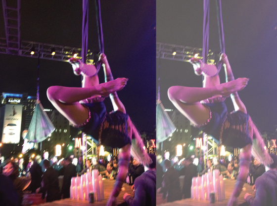
The outdoor space was filled with performers who were handpicked for their unique and creative approach to their craft. I think my favorites were these ladies dangling above one of the bars (yes, there were several), I kept wondering how they weren’t exhausted and falling off! This gal would occasionally reach down and ruffle the hair of people in line for drinks.
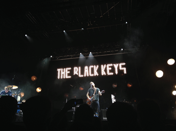
The finale was an hour and a half performance by The Black Keys! I had met up with a longtime internet friend (for the first time!) just before the show started, and we managed to hold our ground about 25 feet from the stage for the duration. They were really fantastic live and put on a great show, the perfect ending to an incredible conference and opportunity from Adobe.
Disclaimer: Registration, travel, and accommodations provided by Adobe. All words are my own.
Posted In sponsored post, technology

Tim
July 20, 2014 at 11:50 pmLooks like a blast. I’m going to Max 2014 this year (for the first time) and am scrounging the net looking for this years performer at the Max Bash. If it’s anyone of Black Keys caliber I’ll be pretty jazzed.
Kelly
July 21, 2014 at 9:46 am2012 was Weezer, so I’m betting this year will be pretty epic!