The Kitchen
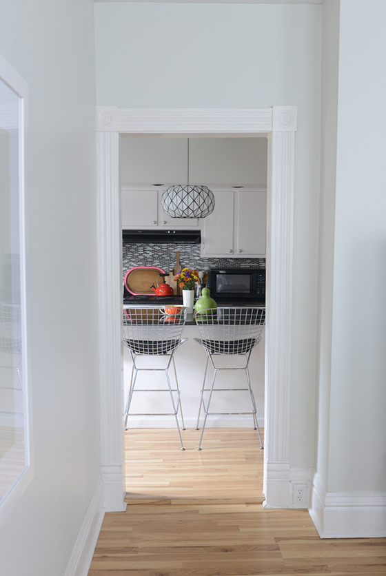
Today I’m sharing the last room on the first floor, the kitchen. (The second floor bedrooms and office will be along come spring when I can get around to doing some more decorating.) We’re also going from my favorite room to the one I fight with most often. The kitchen has more “fast fixes” in it than any other part of the house, at least that I’ve found so far. If you look at the doorway floor above you’ll see that the floor of the entire room has been built up about an inch, and both doors into it require you to physically step up. It’s been missed by many a person, many a time.
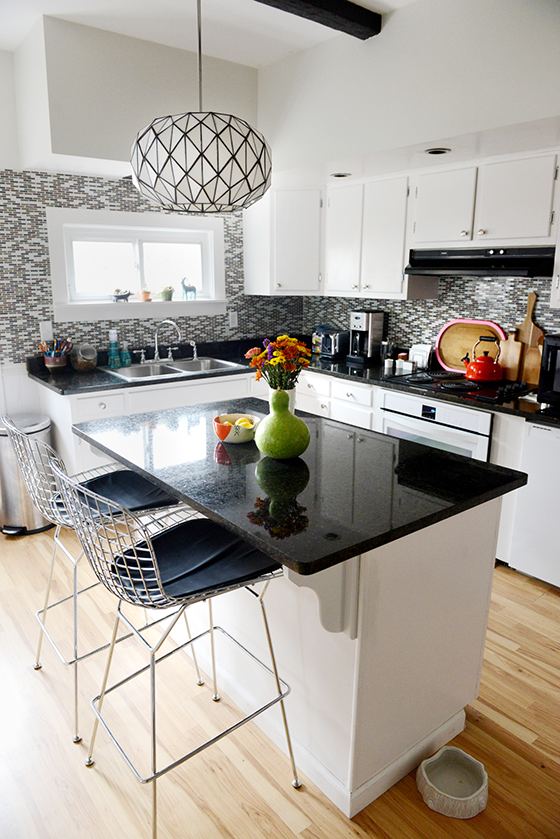
So here we are, and that’s alotta tile. Someone must’ve scored a serious deal because half of the kitchen is covered in the stuff. The plan is to tear it down in a year or so – when those painted 1950s cabinets gets replaced – and instead do a half wall of white subway tile.
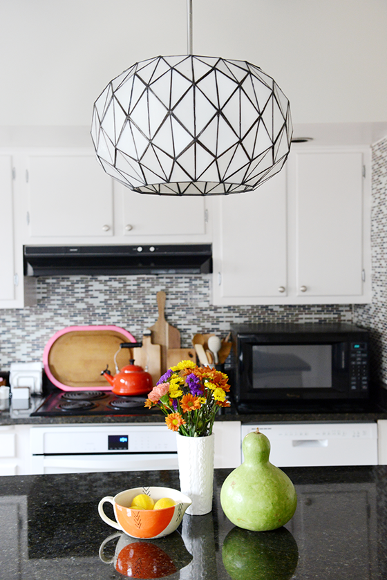
One of my favorite parts of the room is the Tetra Pendant from Lamps.com that I put in about a month after moving it. With all of the spaces quirks and problems I feel like this pulled a lot of things together and gave it at least a touch of my sensibilities. It’s the first thing that everyone sees when they walk (or trip) into a room that really needed a focal point.
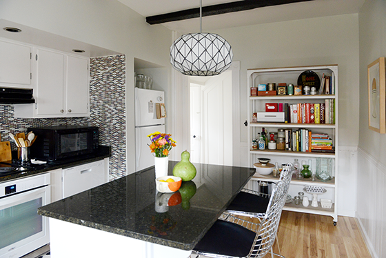
The kitchen in my last house had about twice as much cabinet space, it was the room that sold me the house when it came down to it. Here I had to downgrade to a standard fridge from a double-door as well as bring in some additional open shelving. There’s also a small closet/pantry next to the back door that I plan on adding shelves to after the new year.
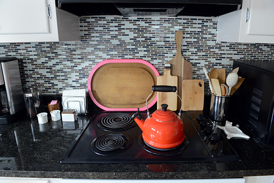
My biggest pet peeve might be that there’s no stove, only a separate oven and cooktop. An old cooktop. That someone spray painted black. There actually wasn’t even an oven when the place went on the market, it was a contingency I added during negotiations. The exhaust hood is equally ancient and I can’t stand that the microwave has to be where it is. But at least the oven is brand new and white.
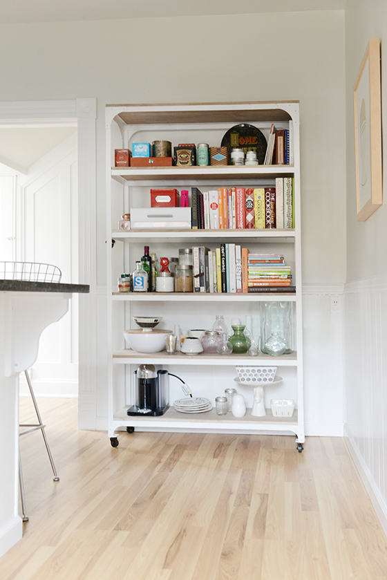
I really like being able to have my cookbooks at arm’s reach, and because there’s not much wall space for art the covers act as just that. I’m also able to display my little vase collection and the ridiculous amount of tea that I rotate through.
There’s definitely a ways to go with this room before I’m satisfied, but I’m also happy with what I’ve been able to do with it on the budget I’ve allowed myself while saving up for bigger renovations.
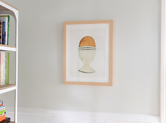
Tetra Pendant c/o Lamps.com // Whitewashed Wood + Metal Shelves c/o West Elm // Edith Bar Chairs – Lulu & Georgia // Le Creuset Red Tea Kettle // The Humble Egg c/o Minted // white sweater knit vase – Target, no longer available
Photos: Quelcy Kogel
Posted In my house

Paula
December 6, 2014 at 10:35 amThe room looks pretty nice as is, but only you know how serviceable it is. That open shelving is a great piece. Do you always keep it so tidy? My shelves start nice, then get jumbled before I know it.
Kelly
December 6, 2014 at 10:48 amThey stay neat for the most part because the things on them are only used occasionally, not every day. And I definitely make a conscious effort at keeping them tidy because they’re so visible.
Urska
December 8, 2014 at 12:32 pmHave you thought about painting the little step which would break the floor and provide clue to people to step up? I thought neon pink would be fun. It is just an idea from the tray you have in the kitchen. For a temporary solution you could buy a fun washi tape to see how it works.
Lexy | The Proper Pinwheel
December 9, 2014 at 11:47 pmOh my gosh, kel! The house looks so good. I feel like you’re so on top of everything after only being there a little while! Everything would STILL be a mess if it were me!
So pretty!