4 Ways to Give a Traditional Space a Modern Touch
The biggest issue I faced when picking up and moving halfway across the country into my new home was that it was 114 years old. It doesn’t get much more traditional than this colonial beast, but when you fall in love with a space that’s the opposite of your aesthetic what’s there to do? I’m partnering with HP x360 #BendTheRules + Meghan Trainor’s That Bass Tour to talk it out and share four ways I’ve modernized my home.
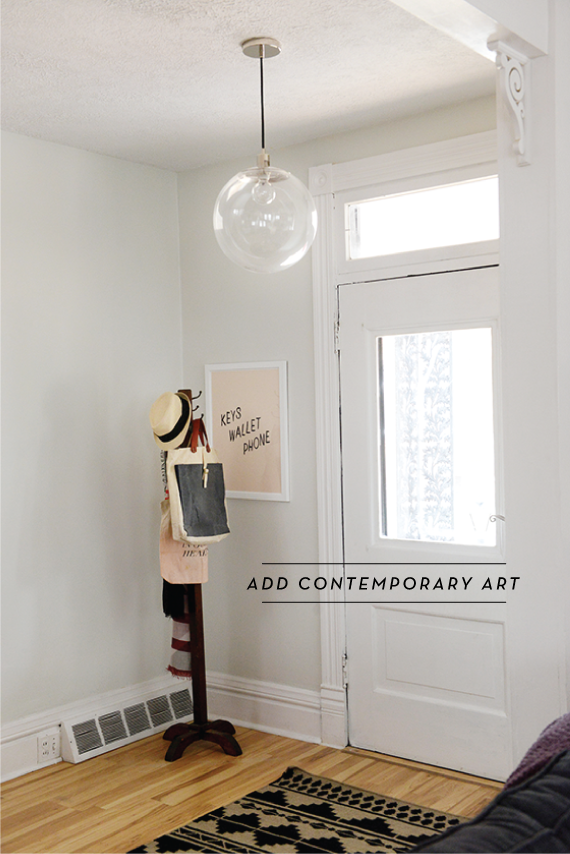
Add Contemporary Art. This tip is first for a reason, and that’s because it adds the biggest dose of personality right off the bat. I’ve added pieces and prints of all shapes and sizes through my home, grouping the smaller together and leaving the oversized to stand on their own. One thing I abided by was sticking to the same frame style and color – simple and white. It helps to pull everything together and achieve the sleekness I was after.
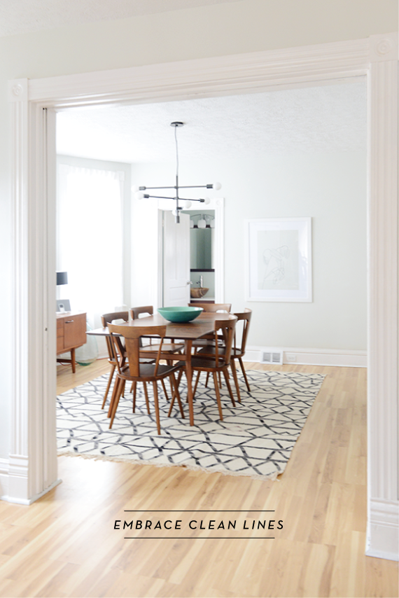
Embrace Clean Lines. Furniture, light fixtures, all of it. I love how the simplicity of almost all of my dining room in particular is the polar opposite of the ornate banister on the stairway and the 10-inch moldings throughout the house. It allows you to appreciate what the space does best without competing with it, which should really be the end goal of every design decision you make.
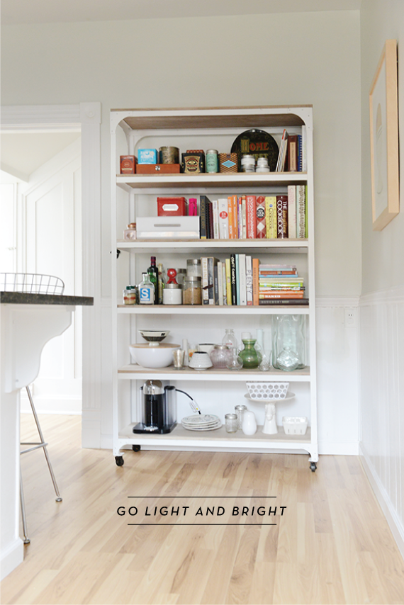
Go Light and Bright. Before I moved in the moldings and framework were thankfully already painted white, but the walls were a buttercream yellow. Safe for staging, but not even a little bit my taste. So within two months I had painted the entire interior (you read that right, all of it) a lovely white-grey/grey-white. The natural light bounces throughout now, creating an almost gallery-like feel that makes every room feel bigger.
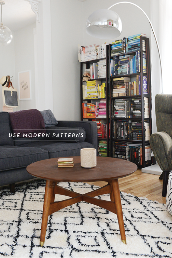
Use Modern Patterns. I like to keep my patterns in check by using them sparingly and choosing modern global repeats. It keeps things feeling fresh and contemporary while breaking up the monotony of large fields of color for your eye. I prefer to neutral tones, but that doesn’t mean you should shy away from color if that’s your aesthetic.
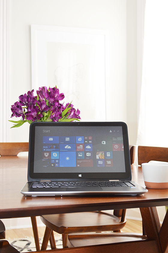
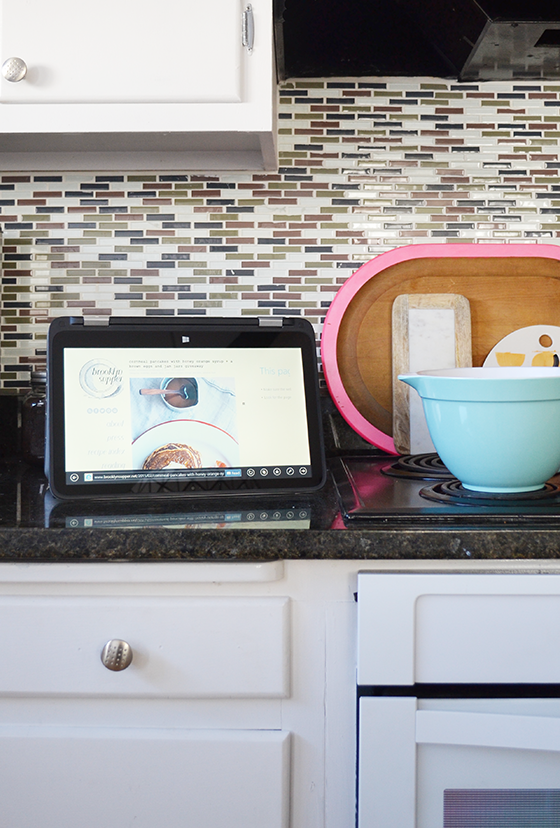
The HP x360 has four great things going on for it, too. Actually four modes – notebook/laptop, tablet, stand, and tent – in one device. I’ve especially loved using tent mode in the kitchen, it’s so convenient to have my favorite recipes at arm’s length while I make dinner. Its touchscreen properties also make the tablet mode perfect for flipping through my emails in bed first thing in the morning (bad habit, I know). The compact size and weight are perfect for carrying the x360 around the house from one room to another like I tend to do through the day. See all four modes here, along with more info on HP + Meghan Trainor’s That Bass Tour and episodes from the fan-generated documentary being created using the HP x360 Convertible PC.
This post sponsored by HP. Be sure to follow along with the Meghan Trainor tour by watching Behind The Scenes episodes or following @HP for updates. Thank you for supporting the brands that support Design Crush!
Posted In house and home, sponsored post, technology, tips + tricks

aubrey
February 26, 2015 at 12:30 pmwas just wondering where that keys wallet phone print came from. i like it a lot. nice home!
Kelly
February 26, 2015 at 2:27 pmIt’s by Annie Clark and available on Minted – http://www.minted.com/product/wall-art-prints/MIN-01J-MGA/a-helpful-reminder
Katie
February 26, 2015 at 11:16 pmWhat’s the wall color?
Kelly
February 27, 2015 at 7:26 pma custom color match from Sherwin-Williams. you can read about it here: http://www.designcrushblog.com/2015/01/20/custom-color-matching-sherwin-williams/
Katie
March 25, 2015 at 12:10 amDo you mind if I ask which color you based it off of or if you know the custom formula? I’d love to see if i can have my local one match it. Does it go blue or Beige at all?