May 3, 2011
Fruita Blanch
Design and images: ATIPUS
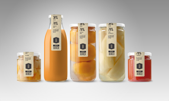
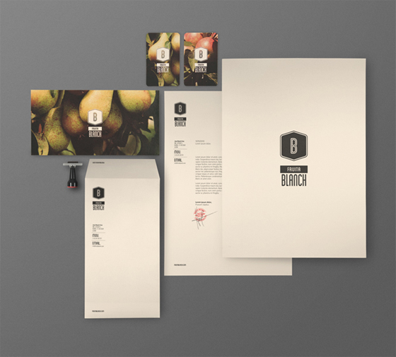
I’m wild about the design and packaging of Fruita Blanch. The muted palette, the simplicity, the what-you-see-is-what-you-get approach. All of it. Well done, ATIPUS.
Posted In create, package


Lulù
May 3, 2011 at 1:48 pmI agree: it’s great. Thanks for sharing!
niki fulton
May 3, 2011 at 4:38 pmaah, wonderful packaging I agree.
julie | julie digs design
May 3, 2011 at 8:25 pmBeautiful identity design!