Welcome Part 4: the Dining Area.
 My dining area is tiny. There’s only room for a four seat table and my bar cabinet. But it’s the perfect size for me right now.
The first thing I did, before I even had any furniture for the space, was replace the existing light fixture with this structural one that a lot of you will recognize from IKEA. It doesn’t emit a lot of light, but with the patio doors being right there I don’t really depend on it for that purpose anyway. It’s definitely something that has better looks than function, but it remains of my favorite things in the house.
 Because of the limited space I really wanted two things out of a table. I wanted it to have nice lines and I wanted it to not stand out against it’s surroundings too terribly much. Luckily I was able to find a set that met both of those requirements and not break the bank. Once again, thank you IKEA!
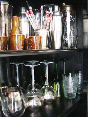
 Somehow over the years I’ve acquired quite a collection of barware. I love chrome and glass and wanted to be able to showcase it instead of hiding everything behind cabinet doors. Thankfully, this china cabinet that I restored has a glass door, allowing me to do just that.


wide open spaces
June 29, 2009 at 5:36 pmthis is a really lovely, cool space. I particularly love the bar area.
caroline duke
June 29, 2009 at 7:18 pmno surprise here: love love love.
oneshotbeyond
June 29, 2009 at 7:30 pmthe cabinet and white curtains are highlights I am drawn to in this space! Great work decorating your dining area.
Tom
June 29, 2009 at 8:28 pmI'm loving your place! Talk about a Room Swoon!
FROM THE RIGHT BANK
June 30, 2009 at 2:38 amHow cute! I love the black cabinet with all the white. Can't wait for to see the bath! 🙂
zebrainfusion
June 30, 2009 at 2:11 pmI absolutely love your blog. 🙂 Thank you for sharing photos of your home. Did you get your light fixture from Ikea?
Kelly
June 30, 2009 at 2:12 pmyup, straight from the big blue and yellow store itself!
xo
Kelly