Electrolux Design Lab Winner


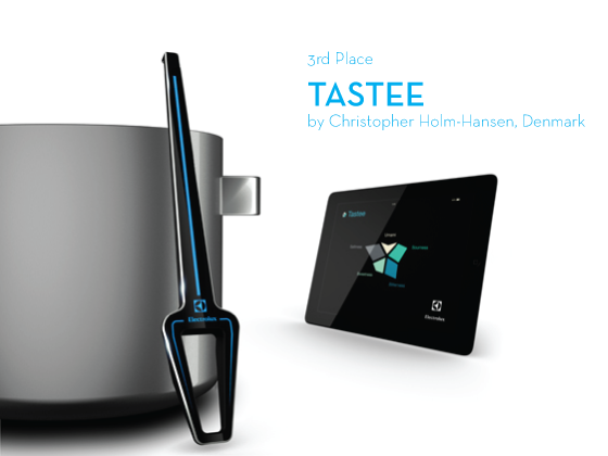
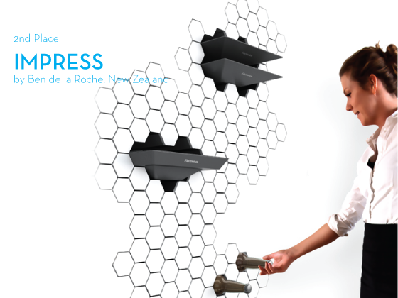
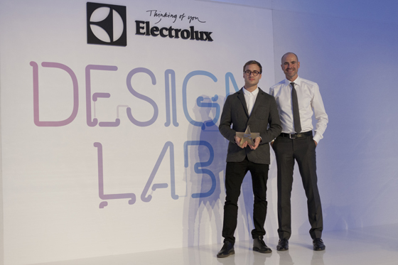
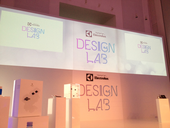
A few weeks ago I traveled to Milan, Italy to sit on the jury of Electrolux’s Design Lab (I shared about the lead up here and here) where along with three other esteemed individuals I helped choose the winner of the 2012 competition! The entrant’s concepts were nothing short of inspiring, and we had our jobs cut out choosing just one winner. But, well, it had to be done!


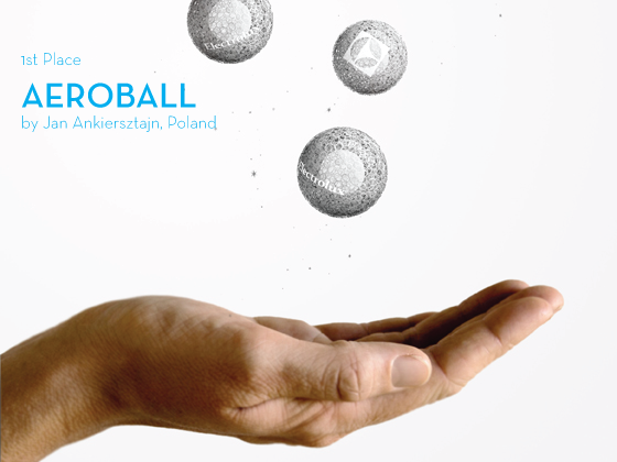
Congratulations to Jan Ankiersztajn and Aeroball!


Which was secretly my favorite design from the very beginning, I can just picture these little air filters that emit light floating around my living room. Jan was so surprised when we announced him as the winner that I got goosebumps watching his reaction – pure joy. His parents, sisters, and girlfriend accompanied him to Milan and were in the audience which I’m sure made it all the more special. Jan’s mother was all tears and everyone was just beaming! I can’t wait to see where this young designer’s career takes him, I know we can only expect great things. Check out Jan’s post-win interview right here!


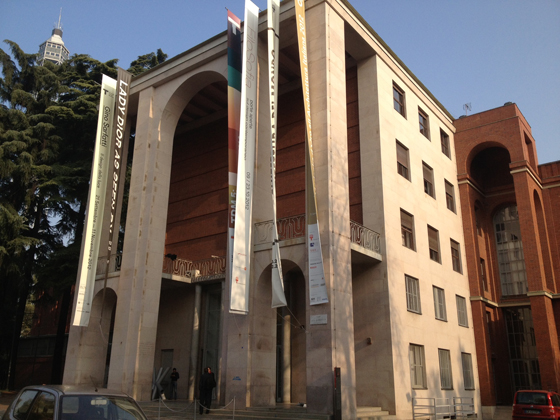
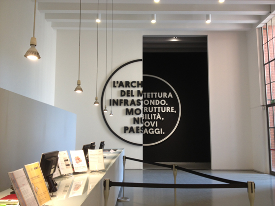
The event was held at la Triennale design museum, which I didn’t have nearly enough time to explore! The Electrolux team transformed one of the large halls into a glossy white modern miracle, complete with social media center and catering that played off of the five taste elements of our palettes. Brilliant.


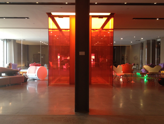
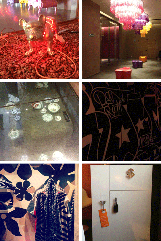
Everyone involved with Design Lab stayed at nHow Milan, a work of art in its own right. Color, art, and design in every nook and cranny – the revolving art exhibits were especially fantastic. The closet in my room even made my clothes look like a perfectly curated display!


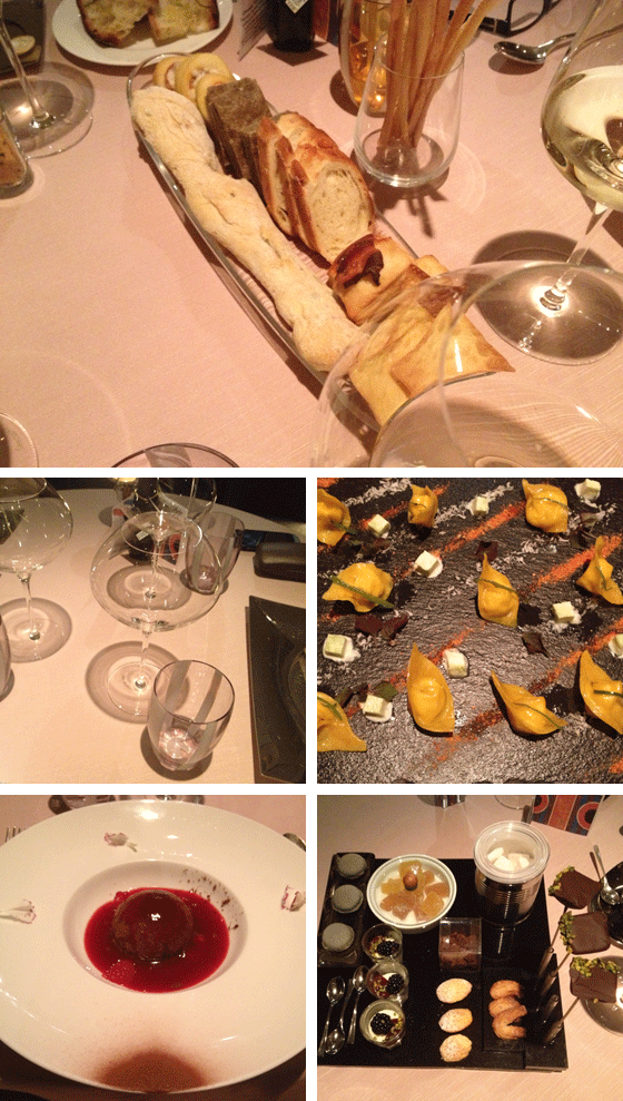
The night I arrived in Milan, I was treated to one of the top three meals of my life at two Michelin star restaurant Sadler. Let’s put it this way – there was a doorbell to even get in the door. And what followed could only be described as a three hour culinary experience of perfect portions, exquisite plate design, and a wine list that surpassed 100 pages. If you’re ever in town I couldn’t recommend it more.


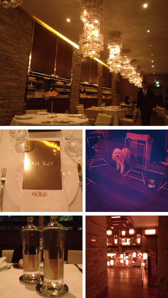
The night of the event the jury and some of the organizers dined at Dolce & Gabanna’s restaurant, Gold. Everything was delicious, from the food to the waiters who could’ve passed as models in their D&G suits and ties. Gold is also the definition of well-branded, from the use of the color to the name. I snapped up the two water bottles above and brought them back as a souvenir.

One last thank you to Electrolux for including me in such an inspiring event. Of course Milan was phenomenal, but what I’m really taking away is a renewed sense of excitement about design and its future.

2

Happy Weekend

01/ Knit ABCs.
02/ Make your own sparkling cider.
03/ Reinvented cereal characters.
04/ An amazing one person seesaw chair.
05/ A DIY mattress!
06/ Pretty sugar placebo pills.
07/ When toilet paper isn’t used in the toilet amazing things happen.
08/ Super smart spool with built-in needle holder.
09/ Beautiful tulle portraits.
10/ An inflatable trampoline bridge in Paris!

0

2013 Calendars – Part 2

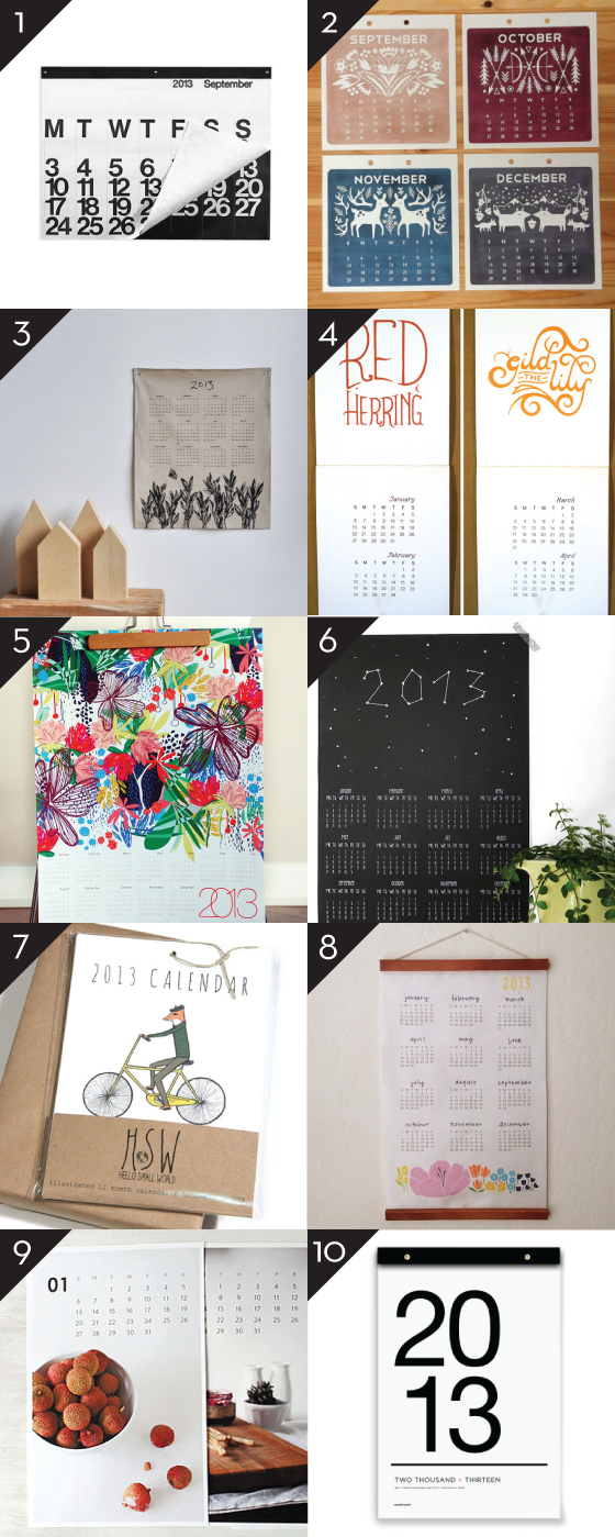
1. 2013 Stendig Calendar from Vetted  2. 2013 Wall Calendar by Hillary Bird from Little Paper Planes  3. Calendar Wall Art 2013 by bookhou  4. Idiom 2013 Calendar by Serious Whims  5. Limited Edition Honduras 2013 Canvas Wall Calendar by Khristiana Howell  6. Kalender Sterne 2013 by Minu Design  7. 2013 Jaunty Animals Calendar by Hello Small World  8. 2013 Floral Calendar by Lisa Rupp Design  9. 2013 Food Photography Calendar by Sweet Fine Day  10. 2013 Tissue Calendar by russell+hazel

Have you signed up for the 2013 Calendar Swap yet? You know you wanna.

4

October

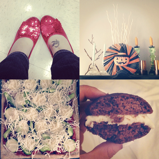
Started the month off right, with the most comfortable costume shoes ever!
Did a little decoratin’.
Made yummy pumpkin whoopie pies with cream cheese filling.
Instated Wednesday Night Pizza.


Spent lots of time with these goobers.
Got to visit my Grandma and my favorite bathroom face, thanks to Sandy.
Did some cat loungin’.
So proud of my web developers, way to go Cooper House!


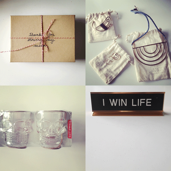
Received the best gifts! A thank you from Cursive Design.
New pieces from Stone & Honey’s Arcos collection.
The best name plate EVER from Capree.
And skull shot glasses from Style & Pepper!


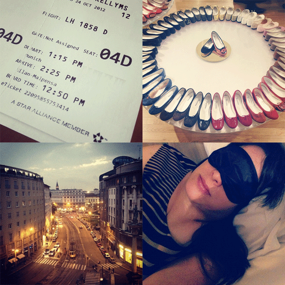
Flew business class for the first time, don’t want to go back to economy!
A rainbow of Repettos.
A long day of business in Milan.
Gorgeous balcony room near the Duomo.

1

Happy Halloween

PHOTO: [Jillian] has heart

Halloween has always been my favorite holiday. I have such great memories of deciding what to dress up as each year  – a ghost, a hobo, a witch – I always seemed to be really traditional things. And then getting so bummed out when it would snow and I’d have to wear a jacket! The nerve. I think I’ve mentioned before that I grew up in a small townhouse, and because of the close proximity of houses it was always a prime trick or treating spot. My mom would easily go through 300 pieces of candy each year. My uncle would bring my two cousins over, along with even more candy to hand out, and we would set off to visit as many houses as humanly possible in a three hour time frame (I remember one of them dressing up as a Teenage Mutant Ninja Turtle for at least three consecutive years!). Our weapons of choice were old pillowcases, and when we were through we’d dump our piles of sweets out onto the living room carpet , organize everything, and make trades. We moved out of that house when I was 18, but Halloween evenings will always be some of my best memories.

0

Hot Commodities

Hi folks!!! Kirsten from Simply Grove here! I am so thrilled to be guest posting for Kelly as she travels the wonderful wide world. Kelly has created such an amazing movement over here on Design Crush. Only amazing things are coming her way!

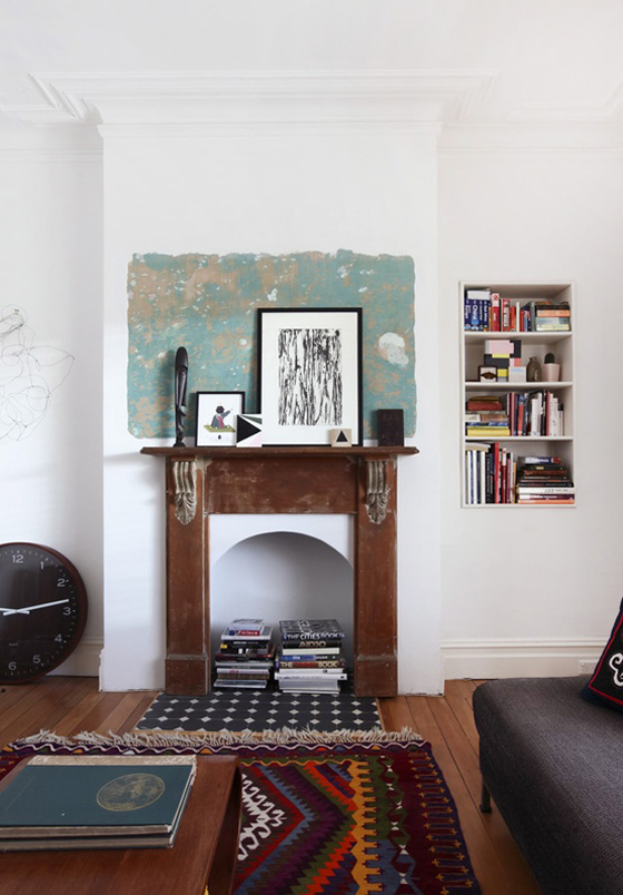
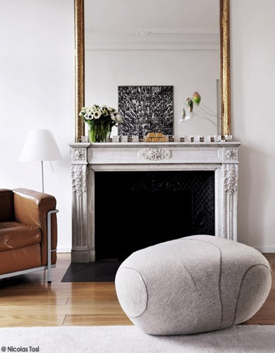
I am an interior stylist so naturally I wanted to share interior design with you today. With the air getting colder for most of us, the home should be getting warmer inside. This is the time of year that the fireplace becomes a hot commodity. Mostly because of the warmth it gives but also for the mad design detail that it gives out. I’ve been seeing quite a few pretty fireplaces surfacing on the web. Here are a few of my favorites. 1, 2, 3


0

Apple Upside-Down Cornmeal Cakes

Hello Design Crush readers, I’m Elizabeth – so pleased to meet you. Along with my husband Brian, I write Brooklyn Supper, a food blog dedicated to seasonal eating and living the good life. It is downright thrilling to be a guest here on Design Crush, and I really want to win you over. Experience has taught me the best way to do that is with cake.

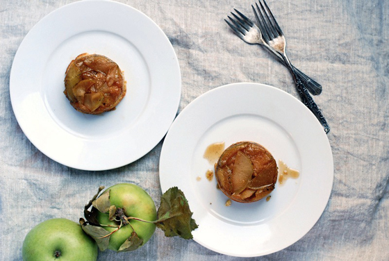
These little apple upside-down cakes were inspired by a recent trip to the apple orchard. Like always, we made it late in the season and all of the red apples were mostly gone. But happily, there was row after row of big, crisp Mutsu apples (also called Crispins). These pale green apples have crisp flesh, and a bright, mildly grassy flavor. I love baking with them because they don’t lose their texture after a stint in the oven, and their mild flavor accommodates notes of vanilla and orange beautifully.


Which brings me to the cakes. Tiny, moist, and dotted with flecks of cornmeal, these little beauties are infused with real vanilla bean and specks of orange zest. The apples have just a bit of bite, and since they’re lightly sweetened, the essence of the fresh fall apples comes through wonderfully. If you don’t have access to Mutsus, try another sweet, crisp, mild variety like Fuji, Macintosh, or Gala.


Apple Upside-Down Cornmeal Cakes
makes 5 eight-ounce cakes


for the fruit

2 tablespoons unsalted butter
3″ section of vanilla bean, split
2 large apples (1 1/2 cups sliced)
1/3 cup packed light brown sugar
1 tablespoon orange zest
1 tablespoon fresh orange juice
pinch sea salt

Preheat the oven to 350 degrees. Set out your butter, eggs, and milk to come to room temperature. Liberally grease five eight-ounce oven-proof ramekins.

In a medium-sized skillet, heat the butter over medium heat. Scrape the vanilla seeds into the bubbling butter, toss in the pods, and turn to heat to the very lowest setting. Allow vanilla and butter to steep over low heat for 10 minutes. If butter starts to brown at all, remove the pan from heat.

Meanwhile, core and slice the apples to 1/4″ thick. Using a diagonal cut, halve the slices.

Next, bring the heat back up to medium, and add the apples, sugar, orange zest and juice, and salt. Sauté for 5 minutes. Set aside while you prepare the batter.


for the cake

3/4 cup unbleached all-purpose flour
2 tablespoons cornmeal
1 teaspoon baking powder
1/4 teaspoon sea salt
6 tablespoons butter, room temperature
1/3 cup sugar
1 egg, room temperature
1/4 cup whole milk, room temperature
1/2 teaspoon vanilla extract

In a small bowl, combine the flour, cornmeal, baking powder, and sea salt. Set aside.

In a large bowl, or using a paddle attachment and a stand mixture, beat the butter on low speed until light and fluffy, about 4 minutes. Add the sugar, and beat for 3 minutes more. Add the egg and beat for 1 minute more, scraping down the sides as needed. Add the milk and vanilla extract. Finally, fold in the dry ingredients, mixing just until combined.

Discard the vanilla pod. Divide the apples and their cooking liquid evenly between the ramekins. Next, spoon the batter over the apples, dividing evenly. Set ramekins on a baking sheet, and place in the oven. Bake for 25 – 30 minutes, or until a toothpick inserted in the center comes out with just a few crumbs attached.

1

In the Details

Hello Design Crush readers!! Cassandra here from coco+kelley and I’m so happy to be hoppin’ over here today with a guest post based on one of my favorite series on my blog called In the Details. I usually like to focus on a theme, so today we’re looking at how to get creative with wallpaper…


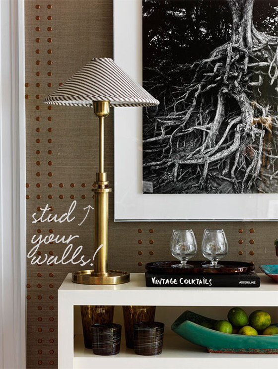
One of my favorite wallpapers, grasscloths provide such gorgeous texture, but can be fairly plain. To punch things up, add some badass studs in a large checkered pattern, and you’ve created a masculine-inspired detail not to be messed with.


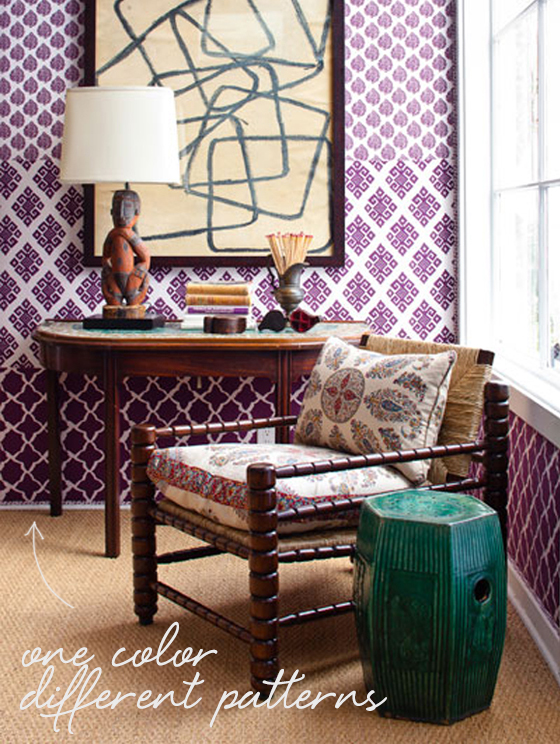
Layering different patterns within the same colourway is such a cool idea – and definitely no for the faint of heart. I’d suggest sticking to different styles within one line to make sure the hues are really spot on – this example is from John Robshaw’s wallpaper collection, and I love the mix of scale and style!


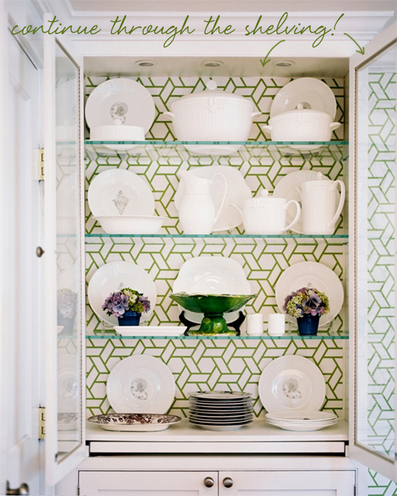
While it’s sometimes nice to have large case pieces to break up bold wallpaper patterns, I love this idea more. Line the back of the cabinet with the same wallpaper pattern and the eye will continuously move throughout the space instead! It won’t work in every case (remember if you line a cabinet with pattern, the items in the cabinet will need to stay fairly simple!)


What do you think? Would you experiment with any of these ideas in your own home??


*image sources: 1. Traditional Home 2. John Robshaw 3. Lonny Mag

2