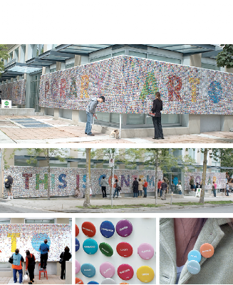
Rethink: Contemporary Art.
Rethink of Vancouver, British Columbia is a cutting edge agency.
The agency’s philosophy – creative and otherwise – is pared down to the essentials. Pencil rough storyboard presentations (no PowerPoint). Notes in client meetings are taken on walls covered in chalkboard paint. Any leave-behinds are tucked into blank white folders, DVD covers, or booklets stamped with a small backwards circle R – the Rethink logo. Even business cards are generic – they’re plain white with blank spaces for the handwritten name of the staffer and a phone number or email address. The web site itself is a blank white screen with a small glyph saying “web site.” Pretty Cool.
This is my favorite project of theirs. Fifty-thousand buttons were displayed, each printed with a single word representing one of a hundred possible responses to contemporary art. The public was free to walk away with as many as they wanted in this installation for the Contemporary Art Gallery in Vancouver.
Posted In ads, graphic design


No Comments