March 7, 2013
Old English Company
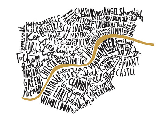
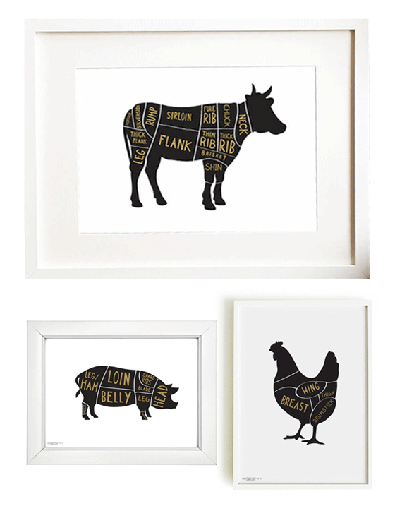
There’s something equally fresh and classic about a black, white, and gold color palette. Old English Company‘s modern illustrations are simple, bold, and an easy fit for many styles of decor thanks to designer Ben Treanor’s discerning eye. So tough to choose a favorite!
Posted In create, illustration, paper goods, prints


Brittni
March 7, 2013 at 1:28 pmLove the way black, white, and gold look together. These prints are awesome.
rooth
March 7, 2013 at 2:04 pmOoh yeah – that map is definitely my favourite
Jesse
March 7, 2013 at 2:10 pmlove the kitchen cooking poster! oh and marilyn monroe quote of course:)