Color With Confidence: Pantone + Valspar + Lowe’s
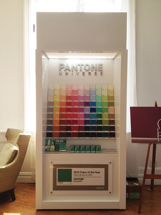
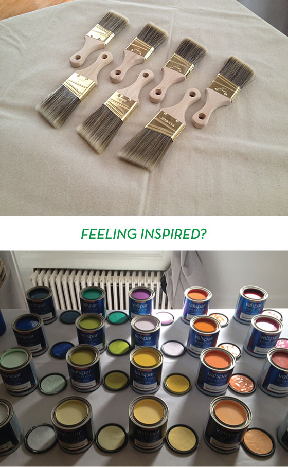
PHOTO: Kelly Beall
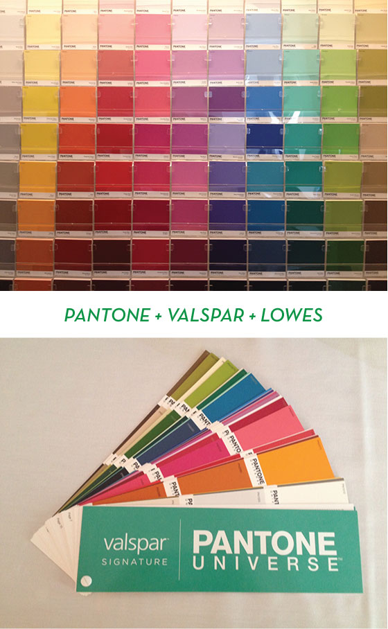
You just did a double-take, amiright? Well, I promise that this isn’t a 30-day late April Fool’s joke. Pantone, the global authority on and standard of color, has teamed up with Valspar to launch a new line of paint! The Pantone Universe Paint Collection will be available exclusively at Lowe’s beginning this month.
PHOTOS: Kelly Beall
The collection features 100 on-trend hues ranging from classic neutrals to eye-popping brights. It also includes the 2013 Pantone Color of the Year, Emerald, as well as the 2012 selection, Tangerine Tango!
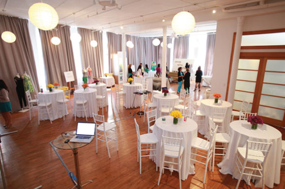
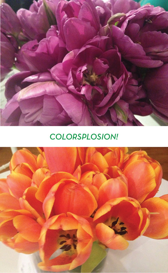
PHOTO: Edelman
This past weekend I visited NYC to participate in the 2-day Color with Confidence event along with several other bloggers and editors. Our first day was filled with inspirational talks from Executive Director of the Pantone Color Institute Leatrice Eiseman, interior designer Elaine Griffin, and fashion designer Nanette Lepore. These ladies were nothing short of lovely and brilliant.
TOP PHOTO: Edelman BOTTOM PHOTO: Kelly Beall
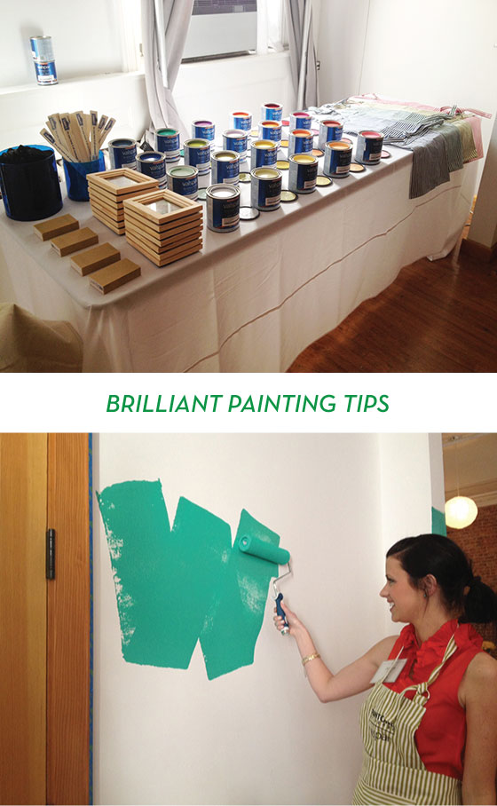
After listening to Leatrice, Elaine, and Nanette (and noshing on some tasty treats and colorful cocktails) we were taught the proper way to paint from Valspar’s Jill. I consider myself a fairly knowledgeable painter and was clueless on half of the tips she spilled!
• Use a wooden brush, it catches drips better.
• Use the handle of said brush to seal the edges of your painter’s tape.
• Remove your tape before the paint is actually dry to avoid peeling.
• Use high-quality brushes and roller to avoid shedding.
• A good paint roller is both washable and reusable.
• Load your roller with way more paint than you think necessary, four bathe + rolls in the tray is optimal.
• Paint in 4 x 4′ sections.
• Use a W technique (seen above). Make the letter W, then fill it in. Reload roller each time.
• Once the wall is filled go over it with vertical stripes of paint to even things out.
• Use a church key not a screwdriver to open paint cans.
• Put cellophane over the can opening before putting the lid back on to keep paint fresh for a year.
• Keep the paintbrush’s original packaging to retain shape.
• Always use a canvas drop cloth, it’s less slippery than plastic and absorbs drips immediately.
• Use a roller scraper to avoid wasting paint left in roller.
• Store paint in a cool place (i.e. not your garage – whoops!)
PHOTOS: Kelly Beall
We played around a bit choosing a color palette and talked to Nanette Lepore about how color inspires fashion. Then we mingled and headed home to rest up for the next day, when we’d finally get to dig in and get some paint on our hands!
PHOTOS: Kelly Beall
PHOTOS: Kelly Beall
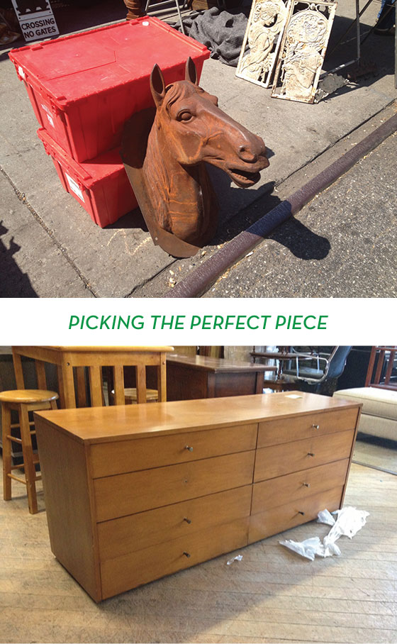
After grabbing breakfast,we all loaded into a black bus with tinted windows (so VIP) with a moving truck tailing us, and headed to Hell’s Kitchen flea market. It was a beautiful sunshiney day and we were chomping at the bit to find the perfect pieces to upcycle. The first thing that caught my eye was a beautiful metal horse bust. I was in love. But the vendor wanted $500 for it and would only negotiate down to $275. Waaay out of my budget. Later we stopped in at the Salvation Army and I found this dresser that would have been perfect in my bedroom, but it was unfortunately already sold.
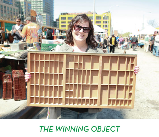
PHOTO: Edelman
Luckily I’d picked up a just-in-case piece, this gorgeous typesetter’s drawer. I’ve been wanting one since high school and had never seen a specimen in such perfect condition, and with unfinished wood. Success!
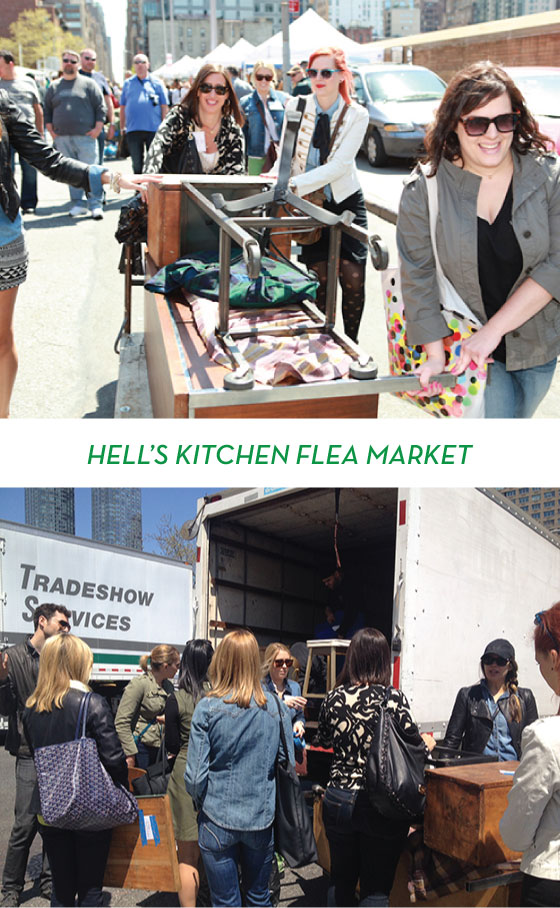
TOP PHOTO: Edelman BOTTOM PHOTO: Kelly Beall
I suspect we all looked like a sideshow hauling pieces to the end of flea and loading them into our truck, but oh well. We had everything from a TV console to mirrors to end tables by the end of our excursion.
PHOTOS: Kelly Beall
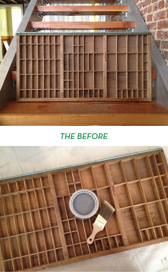
I didn’t realize just how dirty my piece was until I started wiping it down. So gross. (You can see the color difference between this photo pre-wash and the post-wash below.)
PHOTOS: Kelly Beall
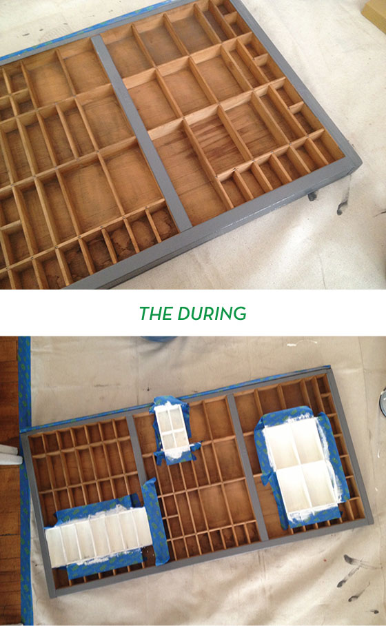
It took me awhile to figure out just how I wanted to transform my newly acquired type drawer, but after some thought I decided to start by painting the borders a nice charcoal grey. When that didn’t seem enough I debated painting the entire interior, but it would have required smaller brushes and more time than I had. I settled on taping off a few “gallery sections” and painting them white, I’ll be able to use these areas to highlight special tchotchkes once I get it home and hang it on my office wall.
TOP PHOTO: Kelly Beall BOTTOM PHOTO: Edelman
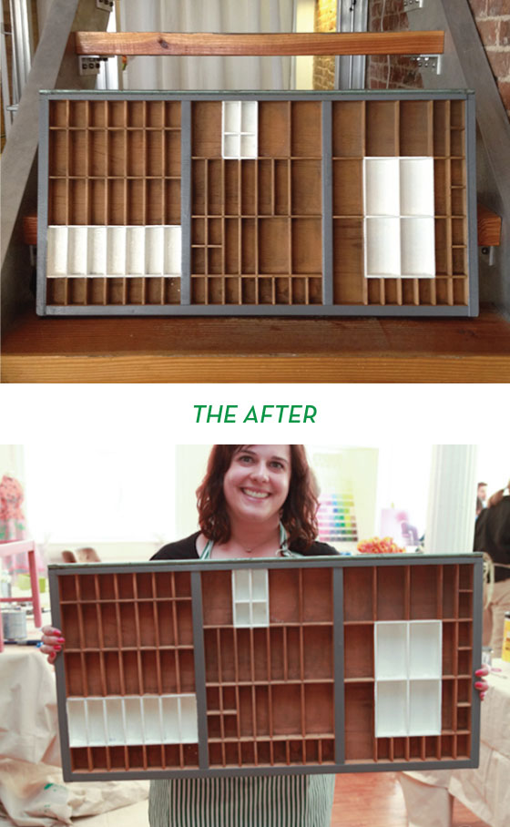
I’m really happy with how it turned out! I plan on going over the white areas with a smaller brush and one more coat before calling it complete, but I’m counting this guy as a success. The Pantone Universe paint in Valspar’s Signature covered like a dream and was so incredibly saturated with color. I only did one layer of the grey if that tells you anything. Oh, and it dries to the touch in 20 minutes! I know you’re going to love it as much as I do.
Disclaimer: Travel and hotel in NYC provided by Pantone and Valspar. All words and opinions are my own. Thank you for supporting the brands that keep Design Crush going!
Posted In house and home, sponsored post, walls
erin
May 1, 2013 at 9:17 amSo jealous of your amazing trip AND that type drawer looks amazing! I never would have thought to highlight the little areas. So cool!
Amy Powell
May 1, 2013 at 9:48 amoh I love that! super cute how it turned out.
Sarah
May 1, 2013 at 9:49 amI’m swooning over this! I now have a sudden desire to repaint our entire home!
Bridget
May 1, 2013 at 11:05 amSo fab! Pantone does SUCH awesome things. And I just cannot resist linking here to the ones I personally am lucky enough to get to work on: http://www.chroniclebooks.com/pantone. Also here are a few other fabulous things that others have made with Pantone: http://bit.ly/uYEsI1
nora
May 1, 2013 at 11:19 amAh, Pantone, I love you! This is so great. Is the color being painted on the wall Emerald?
Kelly
May 1, 2013 at 11:20 amit is! i loved it on the wall, and i didn’t think i would.
Natalie | A Dose of the Delightful
May 1, 2013 at 4:30 pmYay! Great recap and the typesetters drawer looks SO GOOD!
Lana
May 2, 2013 at 8:33 amIt turned out great! I love it! 🙂
April
May 2, 2013 at 9:03 amLove the selective painting to highlight some shelves! Great project!
Jill Davis
May 8, 2013 at 12:47 pmAmazing coverage of the event…Had a blast!
~Jill
A
May 12, 2013 at 6:21 amI am so going to copy this exactly. [runs off to eBay]