A Little Less Blue, A Little More Light
After our teaser last week, I’m back today with my bathroom reveal for National Painting Week! That’s right, I went with a subdued version of the color that was already in play. There’s just something about a blue of any hue that feels refreshing. And because this is also the bath directly across from the guest room I wanted to keep things in the same color family to feel slightly related.
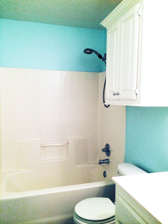
In case you need a reminder (it is Monday after all), here’s the bare bones empty before shot. My goal was to make this windowless hall bath as appealing as possible to buyers since I’m gearing up for a move and will soon be putting my home on the market.
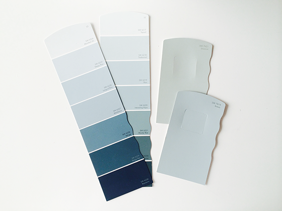
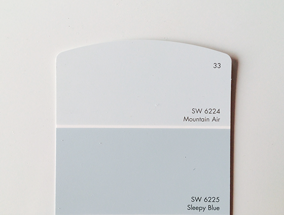
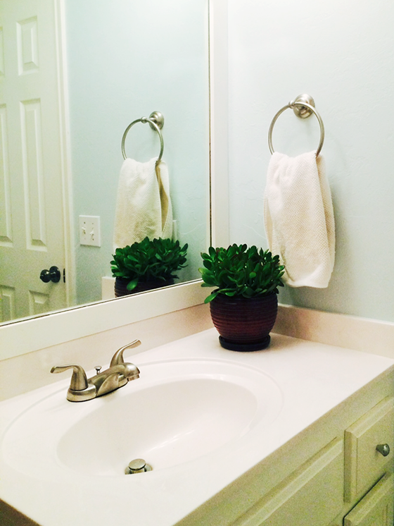
I visited my local Sherwin-Williams store and picked up some paint chips to test against the light about a week before painting. This is definitely an important step, colors that differ only slightly can look hugely different depending on what light they’re in. The winner was Mountain Air, a super light blue-grey that feels unbelievably fresh and welcoming.
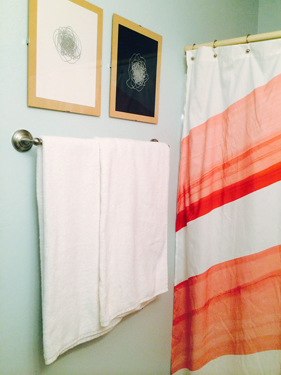
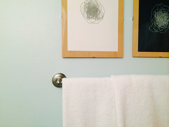
I really love how Mountain Air looks with the other elements I’ve added to the room – a new jade plant (that will hopefully survive!), a shower curtain with a splash of coral, and a few abstract drawings are all helping me achieve a relaxed feel. I also bought some new white towels and hardware to add to the equation for an overall refresh.
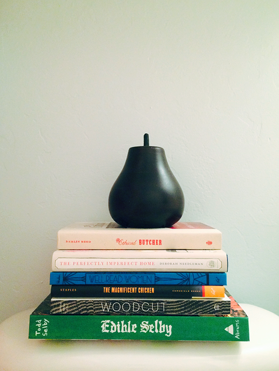
And then I went a little overboard and added a stack of favorite books because, well, it is a bathroom. I also like the pops of color and type they bring to the room. All in all I’d call this project a huge success! I think when I remove the pieces of my personal style any potential buyer should be able to picture themselves putting their own spin on this room.
Check out my fellow bloggers sharing their blue projects today for SWPaintingWeek.com – Remodelaholic gave her daughter’s room a refresh and The City Sage gave a side table new life. Tomorrow tune in to Vintage Revivals, Four Generations One Roof, and Simply Grove to see how they worked their magic with green!
Disclaimer: This is a sponsored post for which I received compensation. All words and opinions are my own. Thank you for supporting the brands that help keep Design Crush going!
Posted In house and home, sponsored post, walls

Artist in LA LA Land
April 7, 2014 at 5:52 pmThis looks so much better. I love the subdued grayish blue you picked. It feels sophisticated. Great job. I love the personal touches you added too, even if they’ll be gone soon with your move.
Kim
June 9, 2014 at 8:32 amPlease tell me where you found that beautiful white and coral shower curtain!
Cathy Bhatt
March 9, 2017 at 2:14 pmDoes the Mountain air color give off any green or turquoise vibes? Or is it more just blue / gray?
Kelly
March 9, 2017 at 5:40 pmI would say more blue/gray than anything. Hope that helps!
Teresa
October 30, 2017 at 9:49 pmHi, the pic here looks greenish, Im wondering if it’s just my phone? I’ve been searching for a lighter version of sleepy blue (which I like) but when I tested it on the wall it looked too dark. I didn’t realize this would be hard to find a blue gray color. Thanks for your input.
Kelly
October 30, 2017 at 9:54 pmYes, with virtually no natural light the room was difficult to photograph. The best depiction is the paint chip which was shot in a better area and is true to color.