Marquee Alphabet Lights.
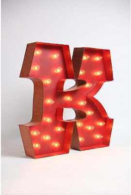
Marquee Alphabet Lights have been making their way around the blogs for the past few weeks, but with my own K collection I had to post about them, too. These letters are freakin’ amazing and would be a great addition to my Ks. Were I to buy one it would find its home on the wall in my entry way!

2

Cubby Display Bathroom.

What I wouldn’t give to have this sort of organization at my soapy fingertips! Not to even speak of the humongous amount of storage it creates. And it looks like such an element of surprise. You walk into what you’re assuming is a pretty, clean white bathroom and then you turn around and BAM! your eyes are full of this amazing display of bags, purses and shoes. Give me any excuse to have a wooden ladder as both decorative and functional in an indoor space and I’m totally on board.

3

Sparkling Double Entryway.

{via ffffound}

When I first saw this photo I thought wow, they really crammed a lot of sparkly into a small space. But then when I really looked at it I realized how well it all worked together. The dazzling stained glass framing both entryways, the two-toned wallpaper, even the chandelier. And I think it all works because of the rest of the elements – the white doorway and parts of the walls, the accessories – they’re all deceptively clean and simple. Whatever the reason, it’s beautiful.

4

LoucheLab.

I was hard-pressed to choose only a few pieces from LoucheLab to share in this post. When you check out their etsy shop you’ll realize the ones I ended up with are all from the first page. Of six. Everything is just that good. Can I just settle this by saying I’ll take one of everything?


:: via The Bedlam of Beefy

1

Light Living.

The show-stopper in this light-filled living room is that rose hued sofa. That’s right sofa, not couch. The tapered legs and architectural design automatically put it into the former category. I love that it’s the only bit of color in the room, while all the white draws your attention directly into its grasp. I’ve only recently been turned on to curtains being hung at ceiling level as opposed to the top of the window casing. And this is the perfect example of how that sort of treatment can make a room feel that much bigger. What else can I say? The poof-like stools that are all similar but with different designs, the structurally simple coffee table… when can I move in?

:: photo via ffffound

4

Beautiful Bunks.

This is the picture of grown-up sleepaway camp. Comfy-cozy looking beds, each tucked away in their own little nook with pretty teal curtains for privacy. Patio doors leading out into what I can only imagine is a deck overlooking a sparkling lake or dewy forest. Yes, I think I’ll be quite comfortable here during Rest Hour.

3