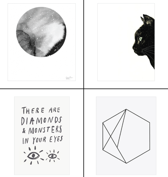
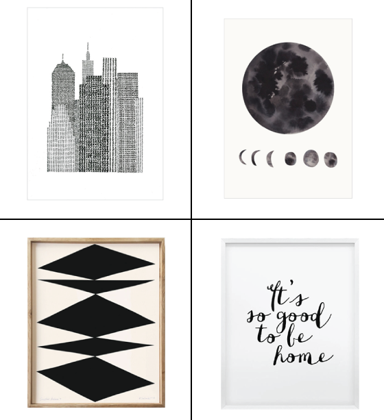
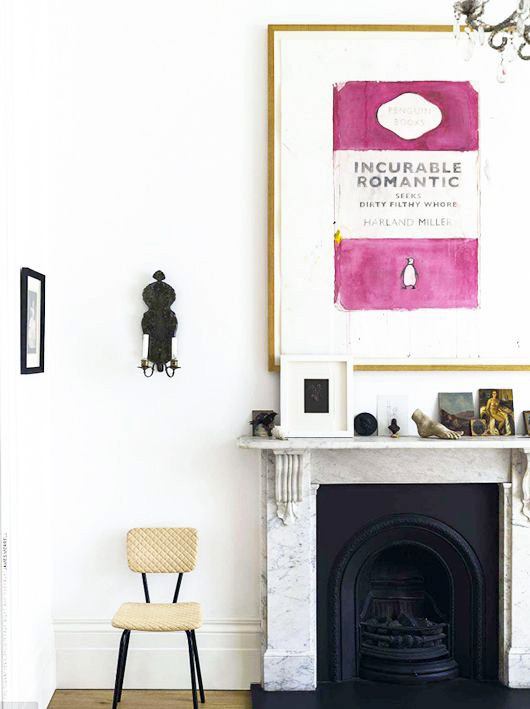
There’s something simple yet striking about black and white art. Whatever form the subject matter takes – illustration, photograph, sculpture – the end result tends to be graphic and attention grabbing. Now that’s a theme I can back 100%.
It’s a trend that’s been slowly building momentum over the past year – big + bold statement art. While the gallery wall doesn’t seem to be going anywhere anytime soon, it’s being given a run for its money by the impactful look of one large piece. So clean and simple, such a focal point. All of these things resonate with my heart and the clean aesthetic I gravitate towards. Feel free to go as big or as bold as you dare, an wall-sized mural is as much fair game as a massive canvas. The beauty of it all is that this treatment works in nearly every room, from dining room to bedroom and everywhere in between.
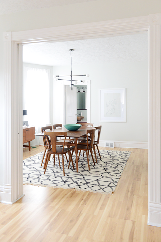
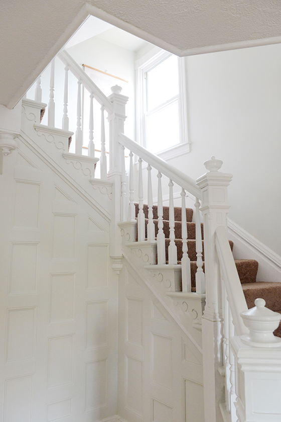
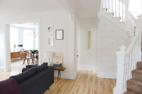
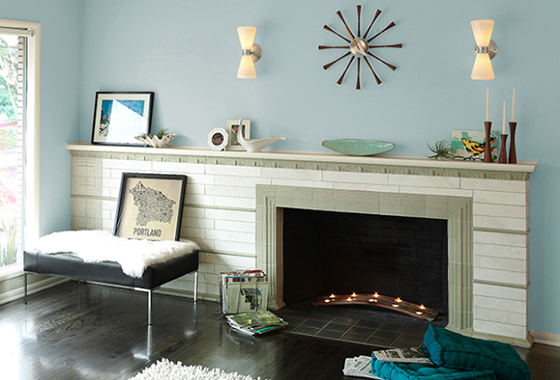
When I moved into my new space this past September it was painted the universal house staging color of buttercream. While a lot of people might be okay with that – it’s a neutral, isn’t offensive, etc – it may as well have been neon green to me. It was the very first thing I knew I had to tackle to make this place feel like home.
I’ve always had dreams of an entirely white and bright home. One that radiates light and would be the perfect gallery-like backdrop for the myriad of art I possess and love. After obsessing over paint chips I came to the conclusion that a ready-made color wasn’t going to be the answer, so I teamed up with Sherwin-Williams to do a custom color match.
I pried a piece of shoe board off in a doorway and headed over to my localSherwin-Williams to get their expert opinion and advice. The assistant manager, Jared, gave me a few different color match options after scanning the piece of already painted wood. The two of us spent about fifteen minutes tweaking things until I was 100% happy with the shade. I opted for the darkest to create a small contrast between the walls and 10-inch molding that’s present in the whole house.
I went with Sherwin-Williams‘ Emerald line because I’ve used it several times in the past and love the coverage and low odor. Jared also made sure I knew exactly which brushes would be best for the different areas of detail, as well as extension rollers that would help 5-foot-two-inch me reach the top of the 10-foot ceilings. After about thirty minutes I left with the confidence and know-how to tackle this project – did I mention that I’m painting the entire house this shade? Because yeah. The whole enchilada. The end result was a shade of not-white-grey/not-grey-white.
One long weekend and four helping hands later the first floor, staircase, and half of the second floor was done! I’ll be knocking the other two bedrooms and finished attic off the list as soon as it warms up a bit this spring. I’m thrilled with the result so far and guests who have seen the before and after love the look, too.
Product and consultation provided by Sherwin-Williams. All words and opinions are my own. Thank you for supporting the brands that help keep Design Crush going!
I have a confession to make. I’m a legitimate print hoarder.
I’d guess I own around forty pieces of varying shapes and sizes, but only about half are actually framed. As someone who likes to change up the art in her home frequently this presents a little bit of a problem, and if you visit you’ll often find pieces hung by metal clips/pants hanger/washi tape.
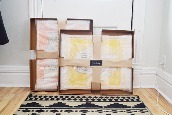
Because I’m such a portrasti-framer (Can that please be a thing?) I’ve become very excited about affordable online framing. And one in particular, Framebridge. Basically you visit their site, then input the size of your piece and choose a frame style and a mat if you’d like one. Framebridge calculates the cost and then gives you the option of receiving a tube or flat mailing supplies or using your own. They email you the free shipping label to print and affix and you’re set. You can also send them a file you wish to have printed and framed.
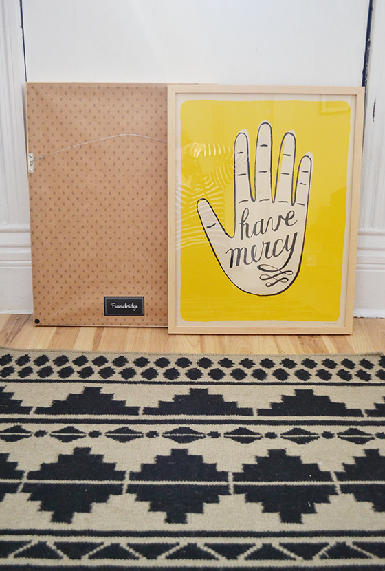
A few weeks later your art shows up back at your house and ready to hang! I’ve used a similar service in the past that I was not nearly as impressed with. Framebridge‘s attention to detail and protective packaging had me smiling from ear to ear. Each frame comes with a bracket and nail to assure an all-around quality experience (and eliminates the need to dig through your own things to track one down).
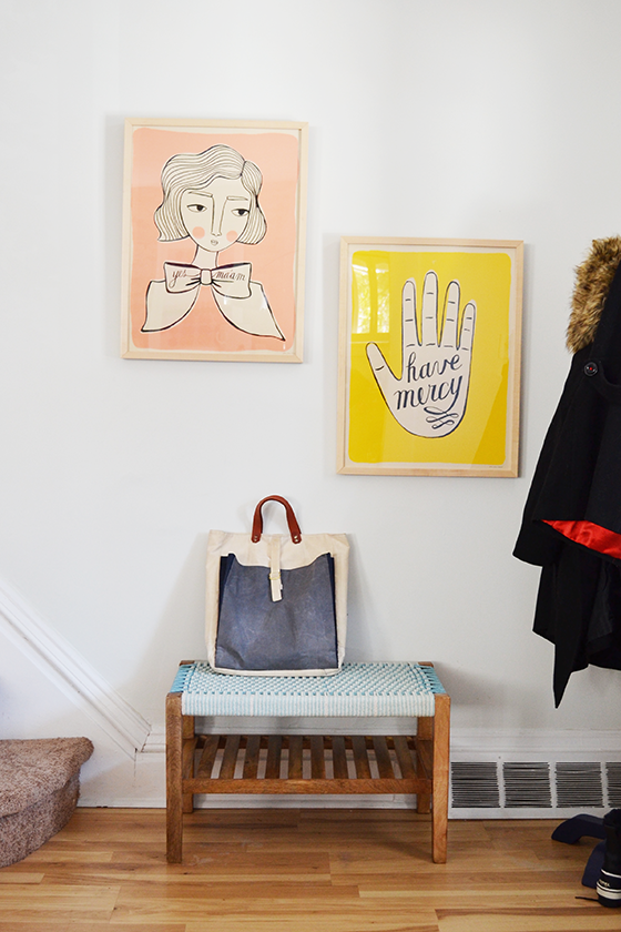
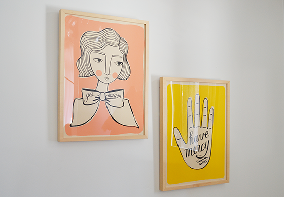
These are two screen printed posters by Jordan Grace Owens that I’ve owned for just over a year, previously victims of the aforementioned pant hanger treatment. I chose a simple thin natural wood frame – the Marin – for both pieces so as not to detract from the art, and I also opted for no mat. The end result is just what I envisioned, two pops of color to welcome guests into my home in the entryway.
Try Framebridge for yourself before January 29th and receive 15% off any order with the code DESIGNCRUSH!
This post is sponsored by Framebridge. I received product and compensation in exchange for my thoughts of the experience. All words and opinions are my own. Thank you for supporting the brands that help keep Design Crush going!
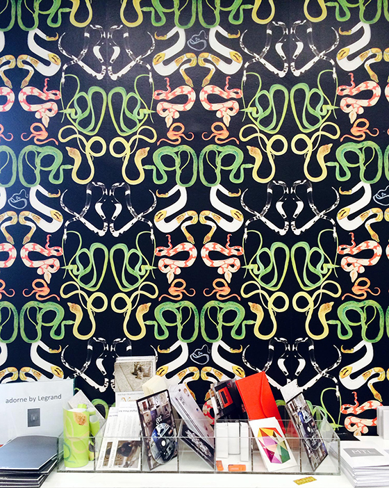
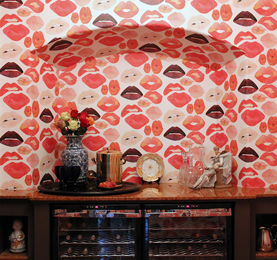
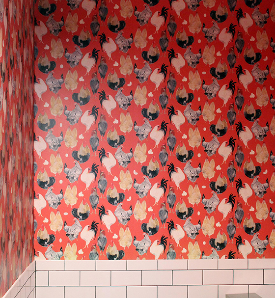
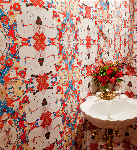
I used to abhor wallpaper – could it have something to do with the pastel Native American-inspired pattern that lined my walls through puberty? Maybe/probably/definitely. These days I find myself looking at wallpaper as floor to ceiling art more than anything else. These handprinted patterns from Voutsa can’t be seen as anything but.
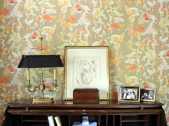
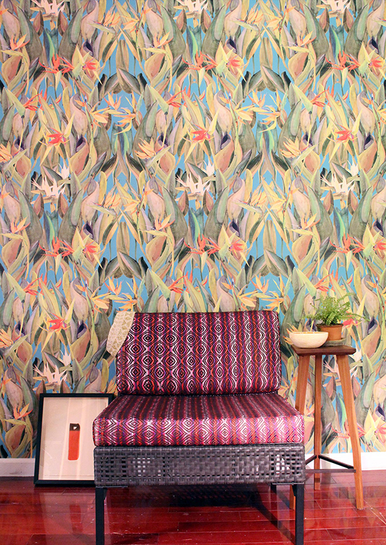
A few months ago I discovered Quercus & Co and immediately shared them with you. Since then I’ve happily added one of their incredible pieces to my home – the eat-in area of the kitchen to be exact, right next to my depression era kitchen cabinet. I chose this space to hang my Scarf in Freya No. 1 because I love the way the greys in the print play off of the wall behind it and the slightly darker shade on the wall adjacent to it. The artwork is actually printed on canvas which gives a great physical weight and texture to the entire piece. I’m hoping to use one of Quercus & Co’s more graphic wallpapers in a small area of my new house, too!
Disclaimer: I received product for this post. However, all words and opinions are my own as usual. Thank you for supporting the brands that help to keep Design Crush going!
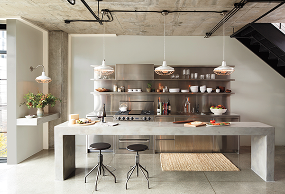
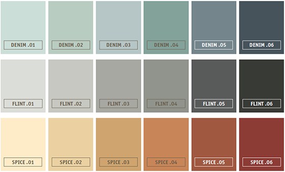
Colorhouse paint and Rejuvenation have teamed up to bring us the Mercantile Color Collection, a palette of 36 interior hues designed with the modern pioneer in mind. The line’s main inspiration is rooted in history, when quality home items used to be purchased in one general store and were made to last. Both Colorhouse and Rejuvenation create products whose quality, authenticity, and sustainability reflect the spirit of their shared birthplace – Portland, Oregon – and all of those characteristics are clearly present in the Mercantile Color Collection.
I’m in love with the classic palette, and definitely daydreaming of using this collection in my next home. (I’m also daydreaming about this kitchen!) The 36 exclusive colors in Mercantile Color Collection are organized into six families named after traditional general store bulk items – CHALK (whites), TEA (warm neutrals), SEED (greens), DENIM (blues), FLINT (cool neutrals), and SPICE (yellows, reds, oranges).
What’s not in the paint is just as important as what is. The Mercantile Collection is tinted in Colorhouse paint, which has no VOCs, no toxic fumes (HAPs-free), no reproductive toxins, no mutagens, no hazardous air pollutants, no ozone depleting compounds, no formaldehyde, no phthalates, and no chemical solvents. Colorhouse paints are low odor and boast superior coverage, durable finish, and easy cleanup in flat, eggshell, and semi-gloss sheens. All huge deals when it comes to what you’re putting on your walls. I’m looking forward to trying this line out for myself. And I have a feeling CHALK .01, FLINT .01, and FLINT .02 will be prevalent to my walls in a few months!
This post sponsored by Colorhouse. All words and opinions are my own. Thank you for supporting the brands I love that help keep Design Crush going!