Increase Curb Appeal with James Hardie

 

As you may have noticed, there’s been a lot of emphasis on the exterior of my house lately. While I’m forever futzing around with things inside, the outside deserves a little more love because it doesn’t quite match my more modern and minimal aesthetic. I’d love to make it magazine ready by updating the facade and I’m hoping James Hardie siding is the golden ticket!



My place was built back in 1900, and underneath the mishmash of siding and cedar shingles lies the original yellow brick. My hope is to one day pare all of this down to one material, in one color, going in the same direction – dreams! – so I checked out James Hardie’s line of plank siding.

The James Hardie product line offers a great collection of profiles, textures, widths, and colors with character in the tradition of American home design, while their commitment to artistry and innovation allows for timeless designs and performance. My home deserves to stand out on the block and yours does, too.
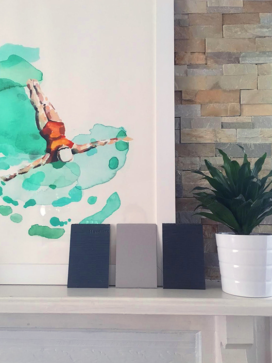


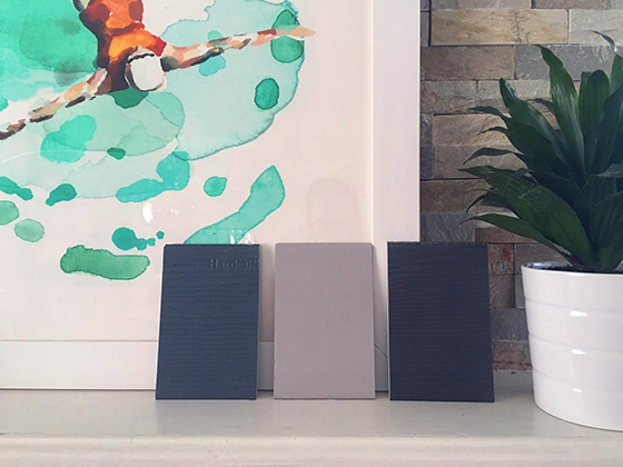
I ordered a selection of their HardiePlank siding samples – North America’s #1 brand – to check out in (left to right) Evening Blue, Pearl Gray, and Iron Gray. I desperately want to do a super dark gray monochromatic facade, but the idea of how much summer heat it will trap makes me nervous, so I also grabbed a light gray similar to what’s currently on most of my home. The blue is my wildcard (SO CRAZY). While the Iron Gray and Evening Blue have a wood-like texture, the Pearl Gray is smooth.

James Hardie lets you express your personality through hundreds of inspiring color combinations with a color collection featuring both national colors and regional specialty colors. Advanced technology coats surfaces, edges, and features of each siding plank uniformly while multiple layers of color are baked onto each board for a great finish and a strong bond that resists chipping, peeling, cracking, and fading for years to come. James Hardie allows you to enjoy the peace of mind that comes from a single manufacturer covering your home’s finish with a 15-year limited warranty, and siding with an industry best 30-year non-prorated warranty.
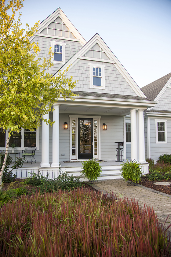


While I’m not at all into the way the current siding on my home is mixed and matched, there are better ways to do it. I love the monochromatic look of this place that combines three types of light grey siding in different designs. It’s such a nice architectural callout that adds loads of appeal and interest, so consider mixing profiles to accentuate your homes’ best features. (i.e. You can add distinction to traditional-style homes with authentic keyways in staggered edge and straight edge designs.)
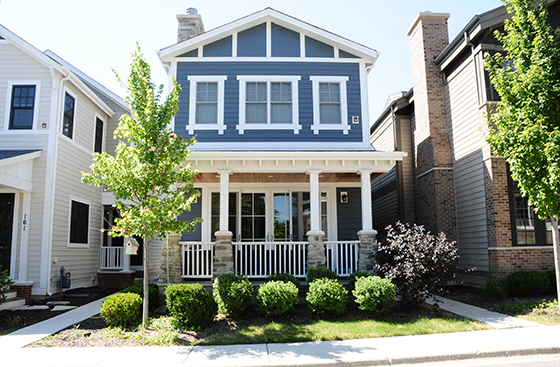


While I’m looking into ideas to update the exterior of my place, I’m not currently ready financially to undertake such a big project. Instead I’m focusing on smaller things that are more affordable yet still add curb appeal.

• landscaping my small front yard with perennials that will come back year after year
• potting colorful seasonal flowers for both the front and back porches
• buying quality outdoor furniture that has a modern design

You might also consider:
• painting your front door to change things up
• adding solar lighting to walkways
• changing out any porch light fixtures
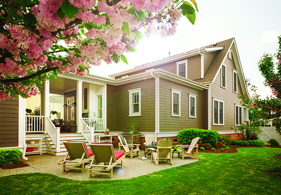


I have a solid idea of what I’m looking to do on my home, but if you need some help check out James Hardie’s site for additional design inspiration. And if you’d like to check out their siding in person be sure and order some free samples to compare – choose from textured, smooth, or beaded. Their fiber cement products are engineered for climate, HZ5 products resist shrinking, swelling, and cracking even after years of wet or freezing conditions while HZ10 products resist damage from hot, humid conditions, blistering sun, and more. James Hardie’s products won’t be eaten by animals or insects and have been proven more fire resistant than wood or vinyl siding. With all of that assurance you can feel good about how you dress your home.


This post sponsored by James Hardie. All words and opinions are my own. Thank you for supporting the brands that help Design Crush create fresh content! Follow James Hardie on Twitter, Facebook, Pinterest, Instagram, Houzz, and YouTube.

0

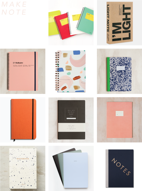
Make Note

ROW 1: Color Index Lined Notebook // I’m Light Notebook   ROW 2: Extra Large Rollbahn Spiral Notebook // Moglea Painted Seashape Notebook // Papier Tigre Ruled Notebook   ROW 3: Shinola Medium Hard Linen Journal // Public Supply Extra Large Soft Cover Dot Grid Notebook // Paperways Large Notebook   ROW 4: Splattered Notebook // The School of Life Set of 3 Minimalist Notebooks // StudioSarah Notes Notebook

0

Sophie Smallhorn


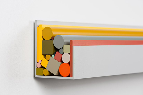
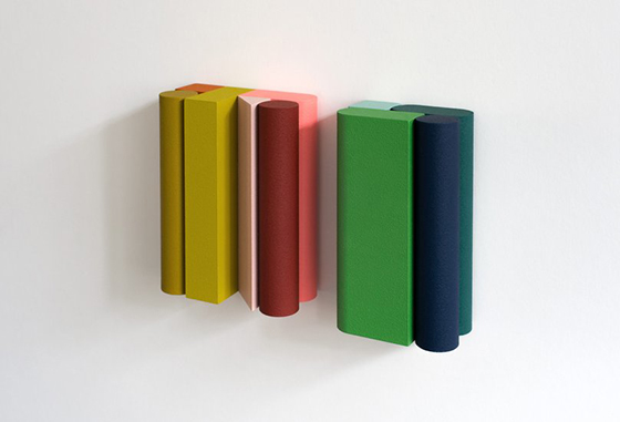
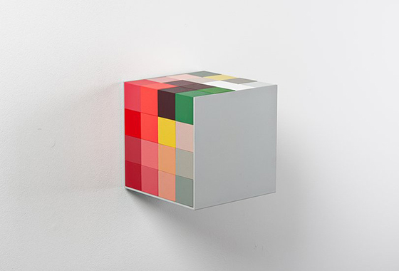
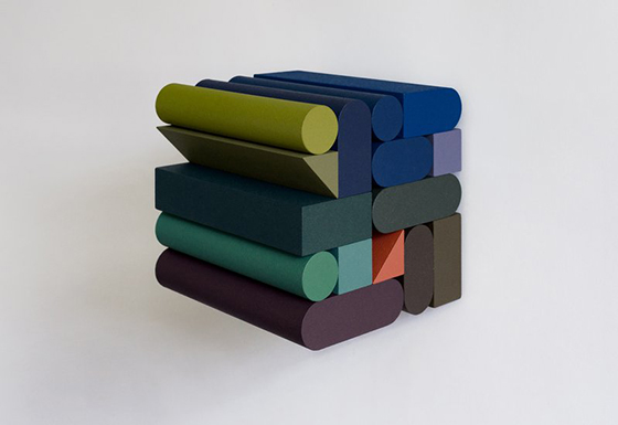
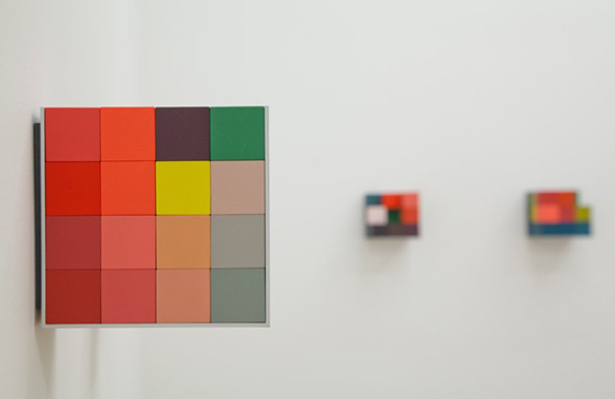
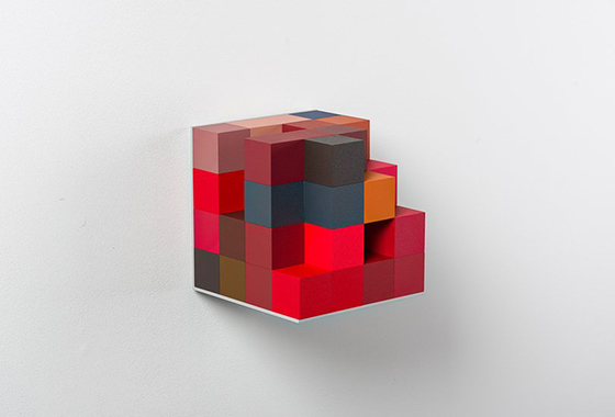
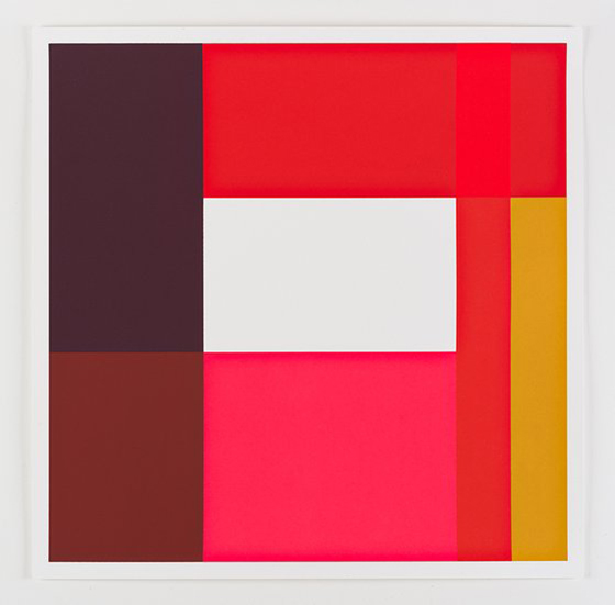
They say the happiest people work in an industry doing something similar to what they loved doing as a child. I’d say Sophie Smallhorn is living life to the fullest through her explorations of the relationships between color, volume, and proportion. Her portfolio site doesn’t state what materials are used, but I’d like to think they’re children’s blocks.


0

Airea Floor Mats


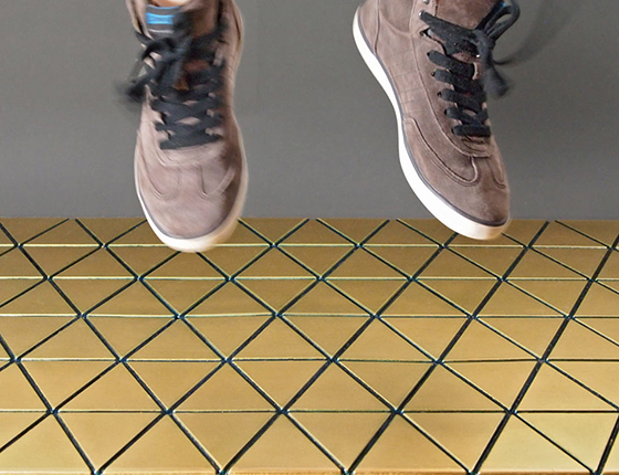
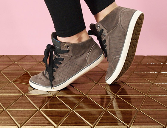
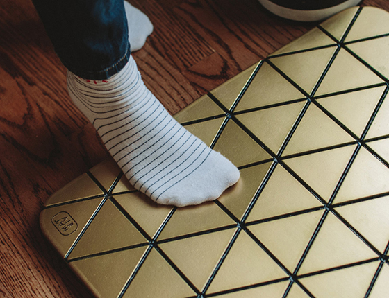
I’ve been on the lookout for some new rugs for my kitchen, but maybe rugs aren’t the answer. When I’m in there I’m either cooking or entertaining and always standing, so perhaps some good looking anti-fatigue mats would be a better solution. Airea floor mats flex with every step thanks to their modern geometric design, they’re also touted as being super durable and water resistant. Sounds like a win-win to me.


0

Lucy Mail


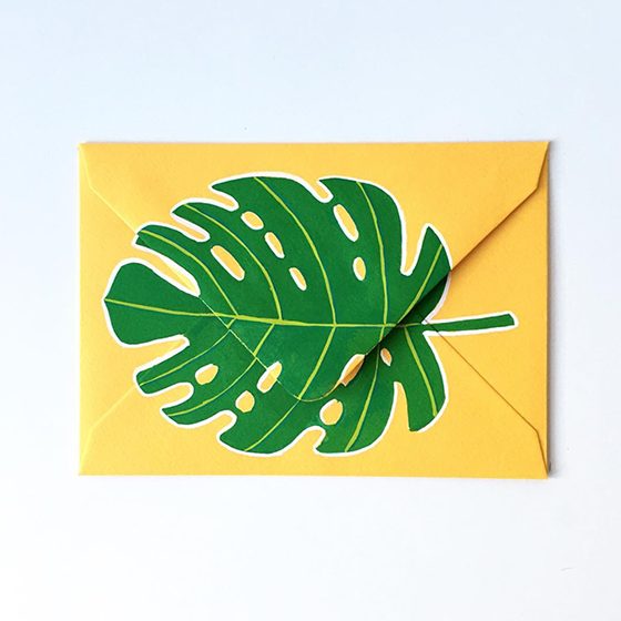
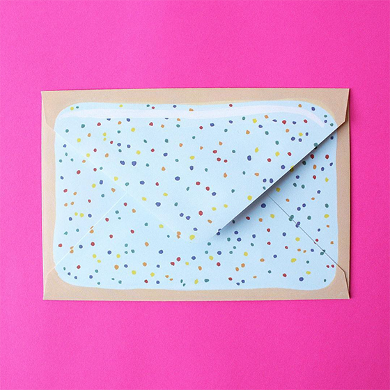
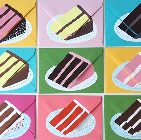
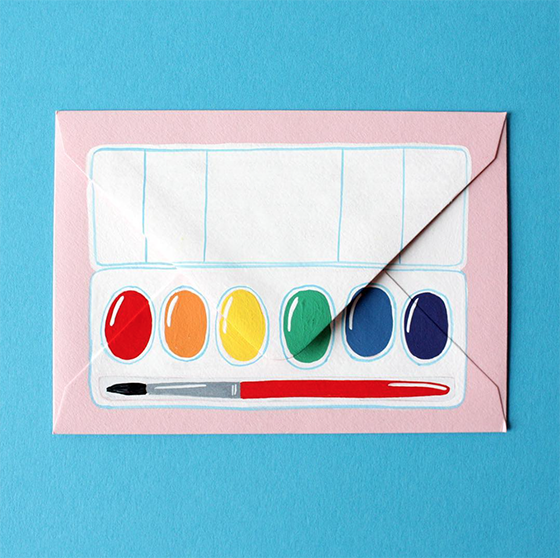
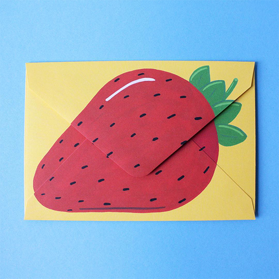
Lucy Holcomb started painting fun objects on cards and envelopes years ago – monstera leaves! Pop Tarts! hot dogs! – and recently turned it all into a legit business. She started off sharing her creations on Instagram and her following grew organically from there. Now you can pick up her work for yourself at Lucy Mail!


0

Porch Tales


I’m an autumn girl at heart, but I’ve really been enjoying the heck out of this summer! All of the bits and pieces of work that have been put into the back and front yards over the past two years seem to finally be paying off, and I’ve been spending much more time enjoying the outdoors than usual.


There were a few things I wanted to knock off my to-do list before the temperature starts to dip again – landscape the small front yard, replace the porch light fixture with something more modern, strip and paint the back deck, and repaint the porch swing.

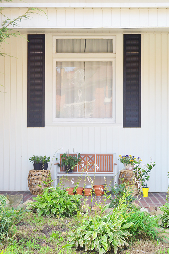
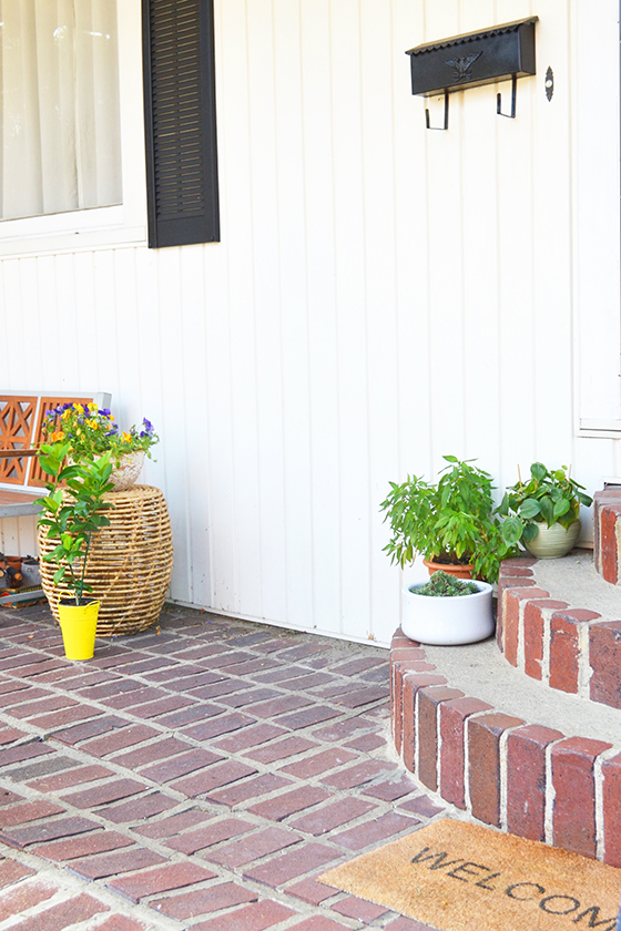
The front yard is looking rough in these photos that were taken in the midst of a July dry spell, but I managed to plant some new things this spring! Three peony bushes, some white poppies, and a few others joined the hosta and irises that was already there. (Now to move all of those river rocks!)


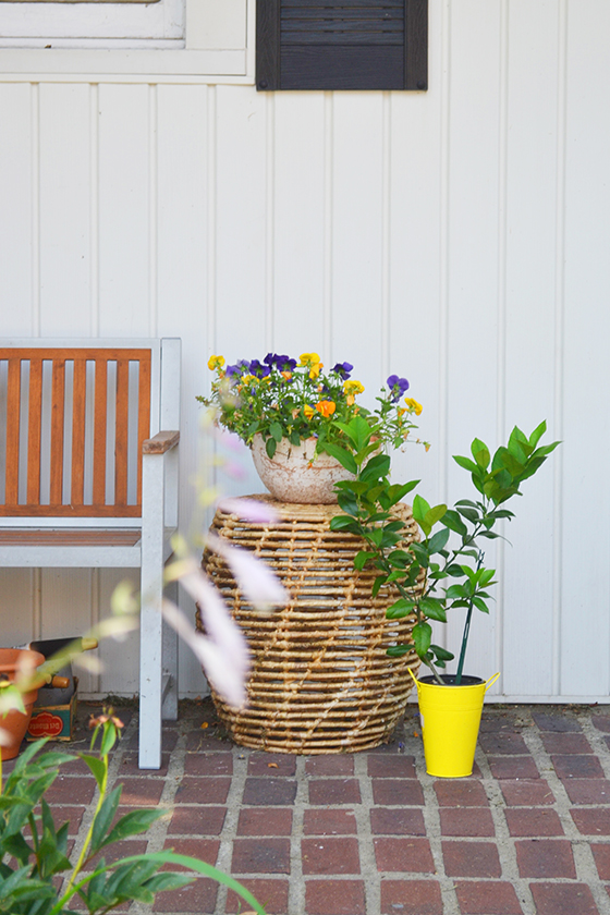
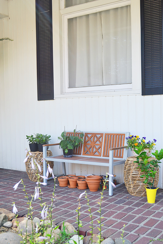
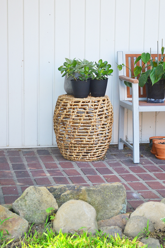
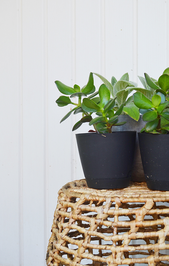
I also potted a bunch of things for the porches – herbs, hen and chicks, and lambs ear just to name a few. Add in the indoor plants I’d brought out for the summer and I realized that what was lacking were a few accent tables to set them on top of. A pair of woven Kai Water Hyacinth indoor-outdoor tables were the perfect thing because they pull double-duty when I’m entertaining as a place to set drinks and things. Cheers to the current wicker trend because I’m loving it and they’re wearing wonderfully.


Can you tell I’ve been using the bench and tables as my potting area as well? I really need to get that situation under control, but also kind of like how all of those stacked terra-cotta pots look just hanging out.

Project Repaint the Porch Swing is about 50% finished after cleaning off decades of grime. Initially I’d planned on painting it a semi-gloss black to match the front door, but now I’m second-guessing myself and considering a stain. Either way it’ll be back in action by fall and – most importantly – out of my driveway.

Unfortunately we’ve had an incredibly rainy summer here in Pennsylvania, so I had to make the decision to put off redoing the deck until next spring.


I picked out a fresh new light fixture for the front porch – this matte black Vance LED Outdoor Ceiling Light that oh so modern – and that’s where the good news on that project comes to a full stop. After removing the ancient pendant that was up there, we discovered the wiring was a huge (RE: unsafe) issue and that this project may have been a blessing in disguise. The grounding wire was blackened and charred while the other two wires were both white, rather than one black and one white. Essentially the light that I used every evening could have sparked at any time, and now it’s turned into a rewiring project as well. I’m looking forward to getting it wrapped up soon so that I can share that as well!


In the meantime, I need to replant that little Meyer lemon tree in the yellow pot and keep all my fingers crossed that the herbs survive once I have to bring them indoors. But first I think I’ll go have some iced tea on the porch…

This post sponsored by Lamps Plus. All words and opinions are my own. Thank you for supporting the brands that help keep Design Crush creating fresh content!
0

Otis Jaxon’s Ear Climbers


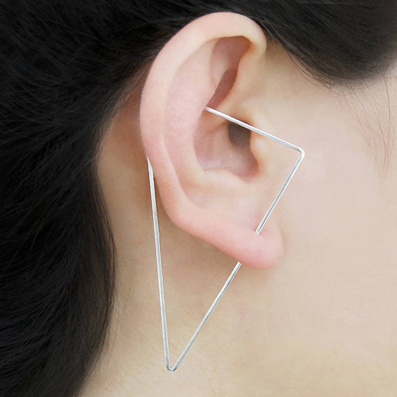
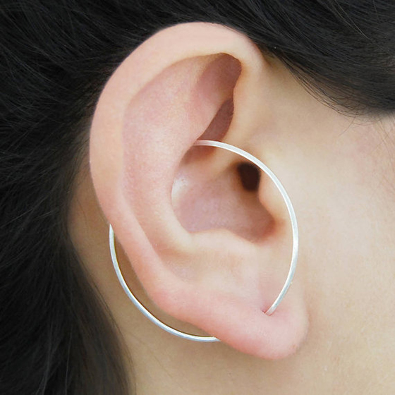
Love the look of multiple piercings, but don’t want to go through the effort? Check out Otis Jaxon‘s ear climbers – their innovative design blends earring and ear cuff to give you the look without the permanence. Just insert the earring through your normal lobe piercing, then twist upward and place in the dip at the top of your ear. They’re available as pairs or singles in triangle, circle, square, and heart shapes in multiple metals.


0

TWOONE aka Hiroyasu Tsuri


TWOONE, aka Hiroyasu Tsuri, has a way of creating mixed media art that makes me want to be a fly on the wall. TWOONE’s latest project is 100 Faces, a collection of portraits created over a two year period. They’ve also been combined into a book, along with reference photos and sketches for you to browse!

Shop TWOONE’s work 


0

Electric Confetti


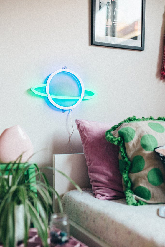
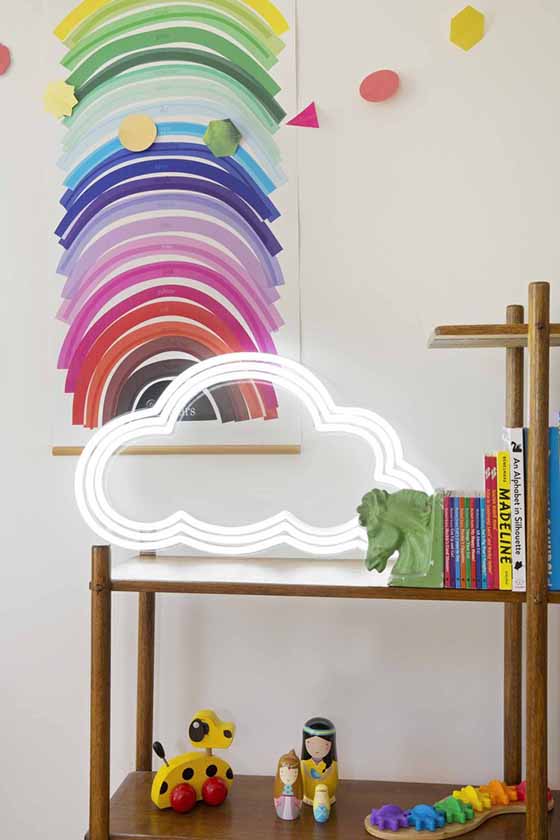
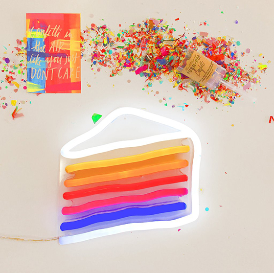
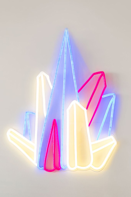
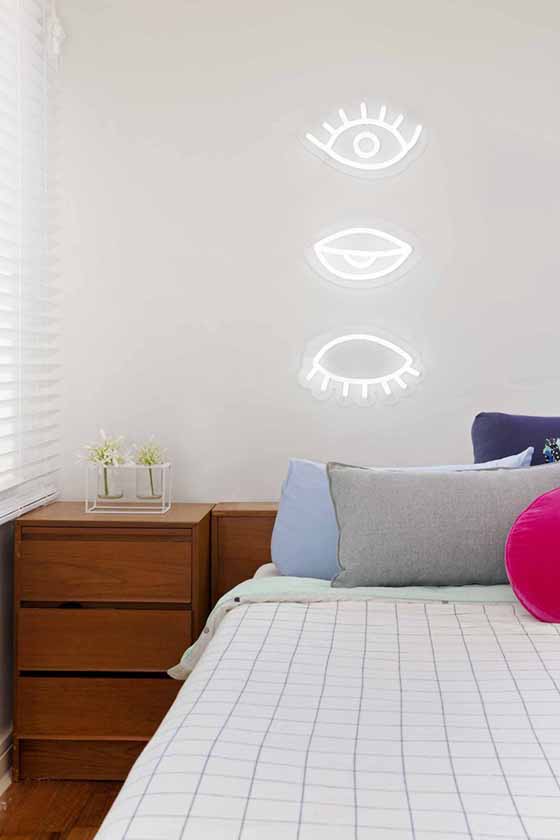
I’ve had my eye on neon wall art for several years now, but the closest I’ve gotten to pulling the proverbial trigger is printing a poster of a photo I shot of one. (Girls! Girls! Girls!) Recently I came across Electric Confetti, a shop that creates custom neon signs as well as sells ready mades. It’s a bold statement for sure, but with the right messaging worth every dang cent.


0

Dana Hargrove


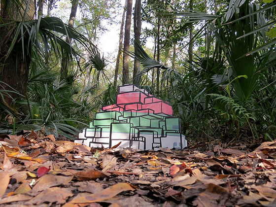
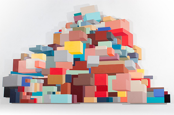
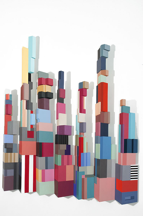
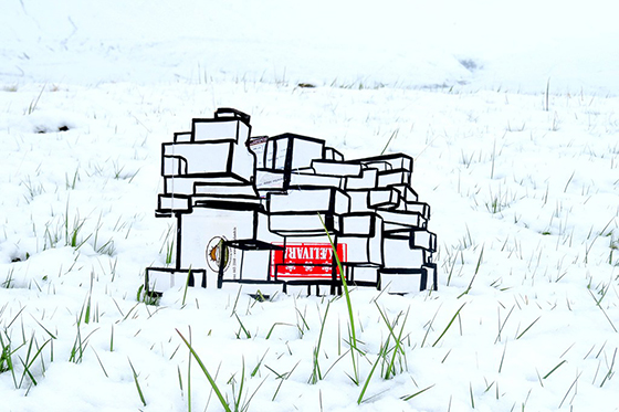
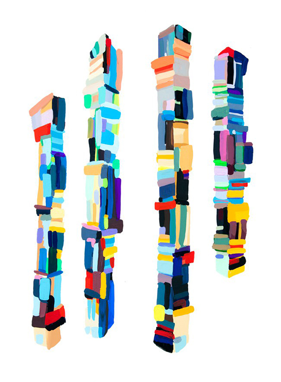
You know just how much I love art that’s something other than first perceived. Dana Hargrove‘s pieces are acrylic paint on wood, but you might think some of them are stacks of colorful blocks and I wouldn’t blame you. My favorites are the in situ pieces as well as the installations hung to show off their shadows.


0