4 Ways to Give a Traditional Space a Modern Touch

HP x360-4-Design Crush


The biggest issue I faced when picking up and moving halfway across the country into my new home was that it was 114 years old. It doesn’t get much more traditional than this colonial beast, but when you fall in love with a space that’s the opposite of your aesthetic what’s there to do? I’m partnering with HP x360 #BendTheRules + Meghan Trainor’s That Bass Tour to talk it out and share four ways I’ve modernized my home.

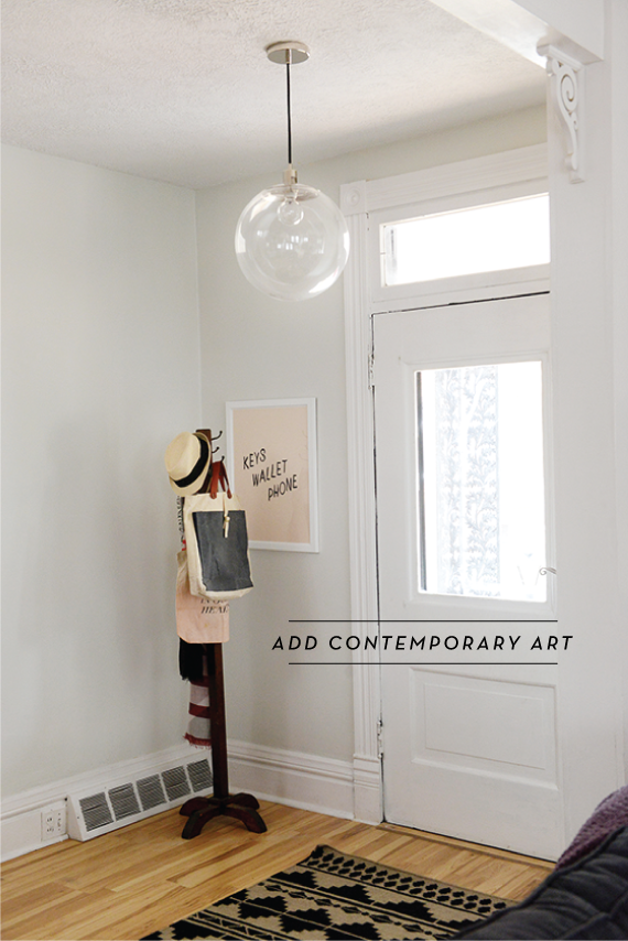
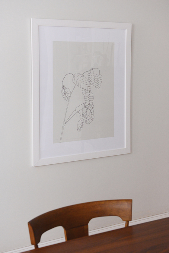
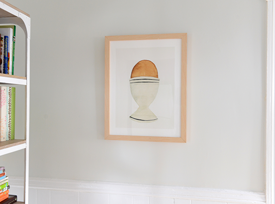
Add Contemporary Art. This tip is first for a reason, and that’s because it adds the biggest dose of personality right off the bat. I’ve added pieces and prints of all shapes and sizes through my home, grouping the smaller together and leaving the oversized to stand on their own. One thing I abided by was sticking to the same frame style and color – simple and white. It helps to pull everything together and achieve the sleekness I was after.


HP x360-6-Design Crush


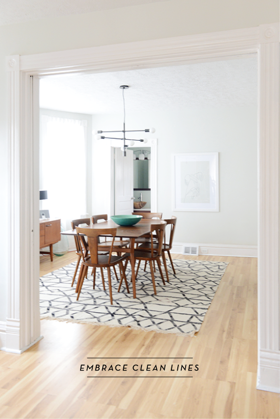
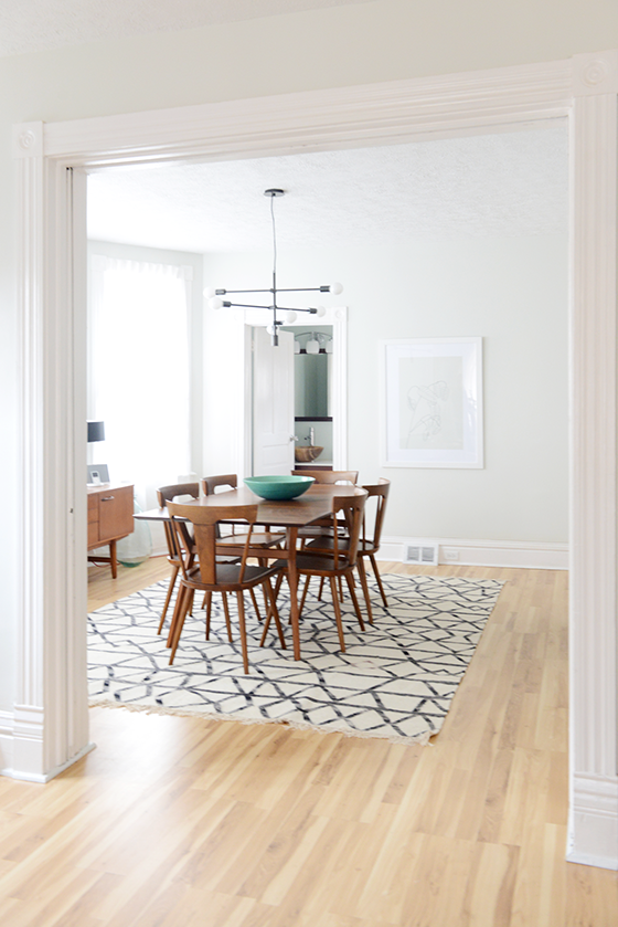
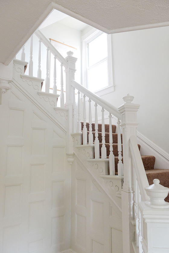
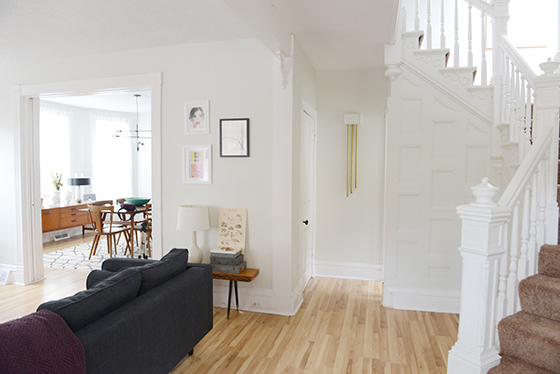
Embrace Clean Lines. Furniture, light fixtures, all of it. I love how the simplicity of almost all of my dining room in particular is the polar opposite of the ornate banister on the stairway and the 10-inch moldings throughout the house. It allows you to appreciate what the space does best without competing with it, which should really be the end goal of every design decision you make.


HP x360-3-Design Crush


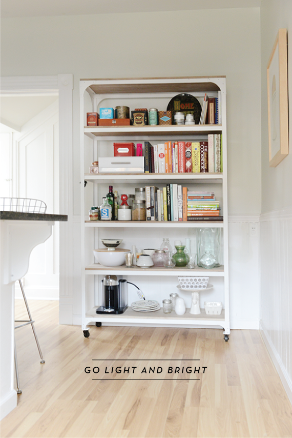
Go Light and Bright. Before I moved in the moldings and framework were thankfully already painted white, but the walls were a buttercream yellow. Safe for staging, but not even a little bit my taste. So within two months I had painted the entire interior (you read that right, all of it) a lovely white-grey/grey-white. The natural light bounces throughout now, creating an almost gallery-like feel that makes every room feel bigger.


HP x360-5-Design Crush


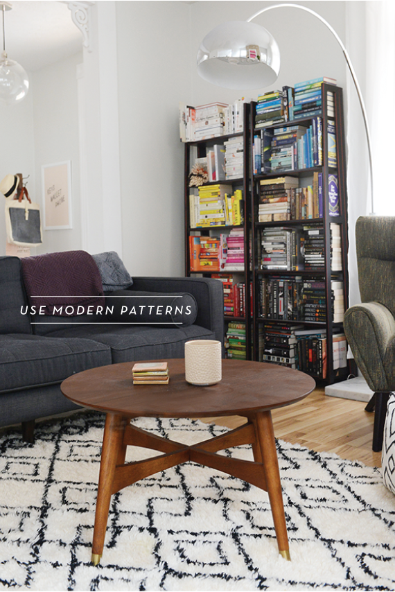
Use Modern Patterns. I like to keep my patterns in check by using them sparingly and choosing modern global repeats. It keeps things feeling fresh and contemporary while breaking up the monotony of large fields of color for your eye. I prefer to neutral tones, but that doesn’t mean you should shy away from color if that’s your aesthetic.


HP x360-1-Design Crush


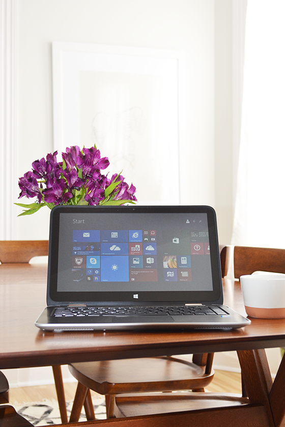
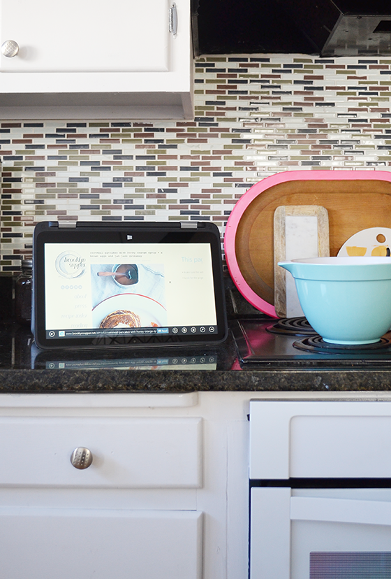
The HP x360 has four great things going on for it, too. Actually four modes – notebook/laptop, tablet, stand, and tent – in one device. I’ve especially loved using tent mode in the kitchen, it’s so convenient to have my favorite recipes at arm’s length while I make dinner. Its touchscreen properties also make the tablet mode perfect for flipping through my emails in bed first thing in the morning (bad habit, I know). The compact size and weight are perfect for carrying the x360 around the house from one room to another like I tend to do through the day. See all four modes here, along with more info on HP + Meghan Trainor’s That Bass Tour and episodes from the fan-generated documentary being created using the HP x360 Convertible PC.


HP x360-2-Design Crush

This post sponsored by HP. Be sure to follow along with the Meghan Trainor tour by watching Behind The Scenes episodes or following @HP for updates. Thank you for supporting the brands that support Design Crush!

5

Casper

Casper-1-Design Crush


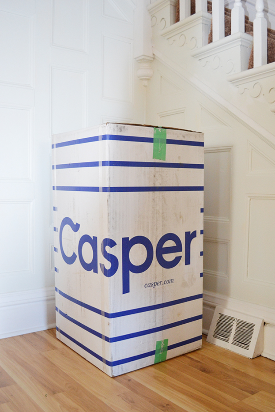
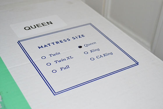
Last week a beautiful thing showed up on my doorstep in a large cardboard box. A MATTRESS.


Casper-2-Design Crush

Casper-3-Design Crush


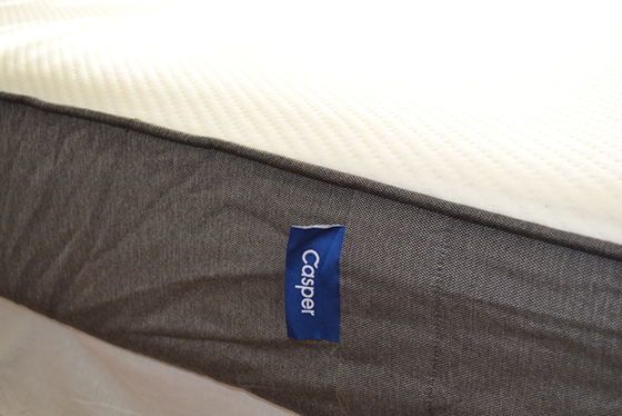
It’s pure magic that something as large as a queen size mattress can be folded over upon itself and delivered on a doorstep. My 8-year-old spring mattress had seen better days and my lower back was letting me know about it. Because mail delivery mattresses are a popular thing lately I looked into a few different options, but one came out on top – Casper.


Casper-4-Design Crush


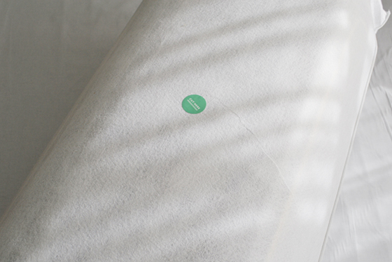
After I hauled the burrito-like bedroll out of the box (and took a breather, because let’s be honest), I hauled it onto my box spring and cut along the spot they indicated. And then I stood back and watched as it grew, and grew, AND GREW. It was like an air mattress inflating without the air!

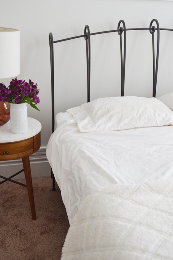
Then voila – I had a new mattress.

I laid down on the thing immediately and basked in the glory of my brilliance and handiwork. When I was finished I noticed that the Casper mattress was supporting my body in all the right places. There was no pressure on my hips or shoulders, my lower back wasn’t arched in space, and I wasn’t sinking.


Casper-5-Design Crush


Each Casper is made from support foam topped with memory foam topped with an inch and a half of high-performace latex that helps keep the bed cool as you sleep. (I can hardly wait to test this out come summer.) Going a step further in sourcing, the knit fabrics come from South Carolina, the wovens from Belgium, and they’re all sewn together in Illinois and South Carolina before being distributed out of New York. And it doesn’t hurt that both Casper‘s site and social media presence have a great sense of humor about them, an all around great brand that I’m happy to support.


Casper-6-Design Crush


Each mattress is backed by a 100-night, no-hassle return policy, and 10-year full warranty. Oh, and free shipping both ways even if you decide to return it. So if you think a Casper mattress might be for you and want to give it a go, email me at designcrushing@gmail.com and I’ll help you out with a code for $50 off!

I received product in exchange for this post. All words and opinions are my own, as always. Thank you for supporting the brands that help keep Design Crush going!

3

Big + Bold Statement Art

Big + Bold Statement Art-Brittany Ambridge-Design Crush

Brittany Ambridge

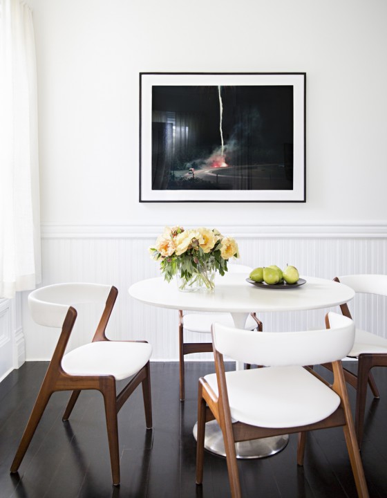
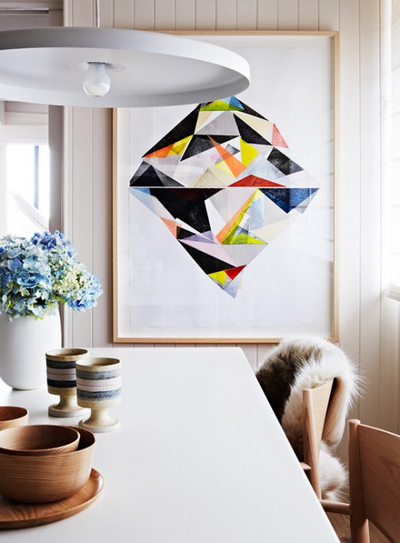
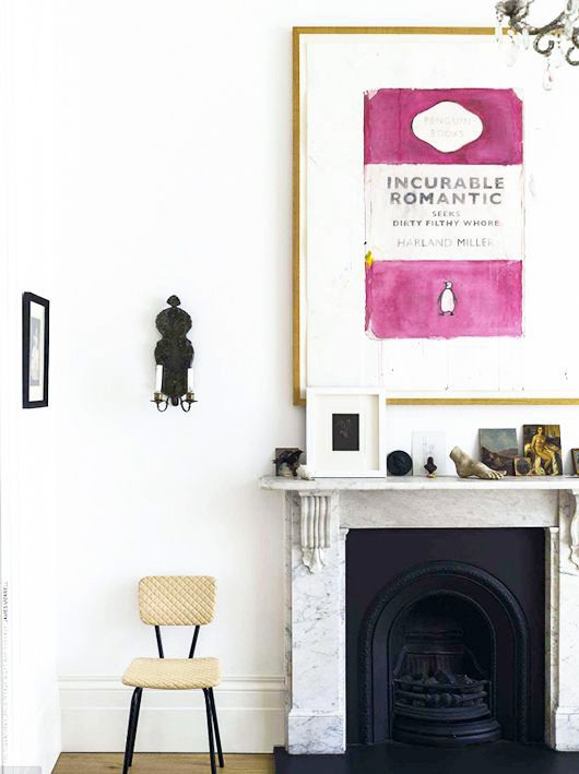
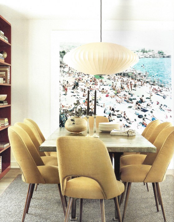
It’s a trend that’s been slowly building momentum over the past year – big + bold statement art. While the gallery wall doesn’t seem to be going anywhere anytime soon, it’s being given a run for its money by the impactful look of one large piece. So clean and simple, such a focal point. All of these things resonate with my heart and the clean aesthetic I gravitate towards. Feel free to go as big or as bold as you dare, an wall-sized mural is as much fair game as a massive canvas. The beauty of it all is that this treatment works in nearly every room, from dining room to bedroom and everywhere in between.


Big + Bold Statement Art-Armelle Habib-Design Crush

Armelle Habib


Big + Bold Statement Art-Vogue Living-Design Crush

Vogue Living


Big + Bold Statement Art-Nickey Kehoe-Design Crush

Nickey Kehoe


Big + Bold Statement Art-Oliver Gal-Design Crush

Oliver Gal

1

Plant Talkers

Plant Talkers-1-Design Crush


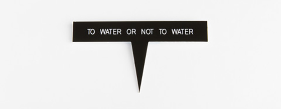
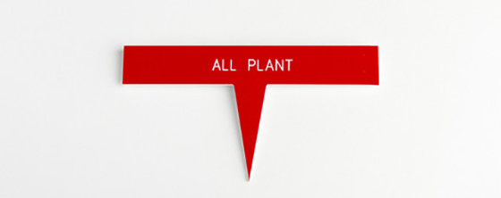
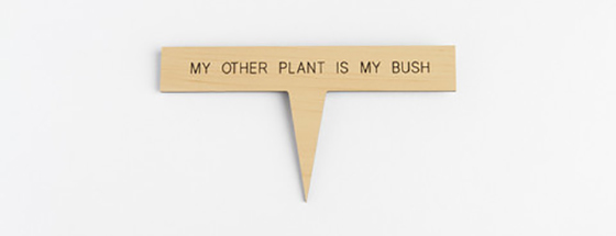
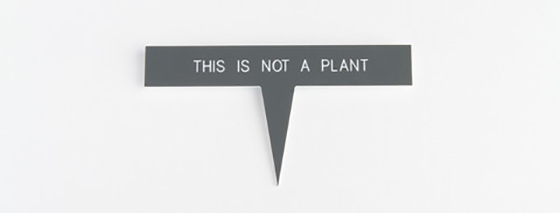
Another of my plants bit the dust last week, A CACTUS. It became mushy even though I was barely watering it. So now I’m thinking maybe that particular species of flora and I just don’t get along since it’s the second I’ve sent to the grave. These Plant Talkers Plant Labels seem like perfect timing, now if only the little guys could talk.


Plant Talkers-3-Design Crush

Plant Talkers-2-Design Crush

Plant Talkers-5-Design Crush

Plant Talkers-4-Design Crush

(via Swissmiss)

0

Happy Weekend

1-Design Crush

2-Design Crush

3-Design Crush

4-Design Crush

5-Design Crush

6-Design Crush

7-Design Crush

8-Design Crush

9-Design Crush

10-Design Crush

01/ A mirrored teacup that reflects its patterned saucer perfectly.
02/ This Shanghai speakeasy is only accessible through a vintage Coke machine!
03/ Zsanett Szirmay converts folk embroidery patterns into paper scores for music boxes.
04/ Tattly Does Good by by connecting artists with not-for-profit organizations.
05/ The Runbell helps runners clear a path on the go.
06/ Invisible Boyfriend can help you fake a rebound relationship.
07/ No Vacancy captures abandoned hotels from around the world.
08/ What’s painting with drones like exactly?
09/ A collection of glamorous pin-ups of your favorite television characters.
10/ Uttaporn Nimmalaikaew creates holographic portraits painted on layers of fabric and netting.

This week on Design Crush:
We fell short last week and had to push links to Happy Monday!
High contrast, flash-heavy photography from Benoit Paille.
Well constructed leather goods to corral your technology from This Is Ground.
Beautiful firework-like flower arrangements from Sarah Illenberger.
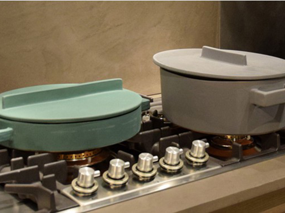
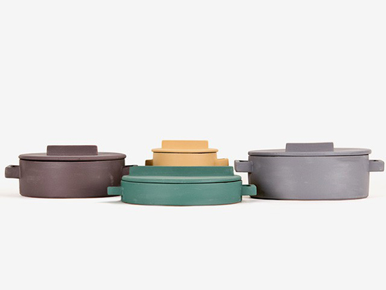
Flat-out obsessed with the terra cotta cookware from TERRA.COTTO.
Laurel Canyon Dreaming captures the best side of natural specimens for your walls.
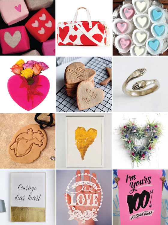
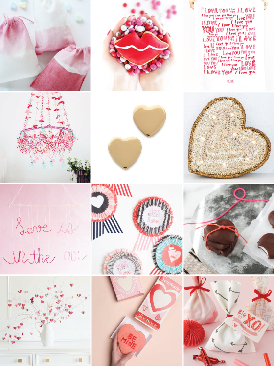
Check out these 24 Valentine’s Day gifts, projects + recipes!
The evolution of a snowy, evolving town from the brush of Lars Daniel Rehn.

Design Crush elsewhere:
The most show-stopping lighting types for your bathroom.

0

24 Valentine’s Day Gifts, Projects + Recipes

Valentines-1-Design-Crush

ROW 1: DIY Felt Treat Boxes // The Getaway Duffle Bag // Easy Homemade Valentine’s Chocolates    ROW 2: Queen of Hearts Neon Pink Heart Vase // Graham Cracker Conversation Hearts // Golden Protective Hand Ring    ROW 3: Anatomical Human Heart Cookie Cutter // Gold Heart Print // Heart Wreath No. 1    ROW 4: Courage, Dear Heart Print // All You Need is Love Handcut Paper Art // I’m Yours 100% Screen Printed Poster


Valentines-2-Design-Crush

ROW 1: Dip-Dyed Valentine’s Day Bags // Lip Donuts // Love is the Best Medicine Tea Towel    ROW 2: Valentine’s Day Polish Chandelier // Dear Valentine Stud Earrings // DIY Sequin Marquee Heart    ROW 3: DIY String Words Wall Hanging // DIY Valentine Award // Organic Heart Shaped Peppermint Patties    ROW 4: DIY Valentine’s Day Branch Tree // Conversation Heart Cookies + Printable Box // No-Sew Valentine Treat Bag

0

Terra.Cotto

Terra.Cotto Cookware-1-Design Crush


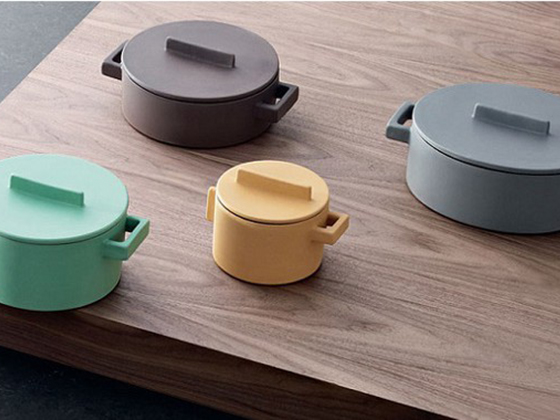
While I love spending time in the kitchen cooking, and more specifically baking, I love ogling beautiful kitchenwares even more. The latest on my wish list is the terra-cotta cookware of Terra.Cotto. Colorful, modern in design, and eco-friendly, these pieces are right up all of my alleys. Oh, and they’re recognized as the highest quality terra-cotta cookware in the world!


Terra.Cotto Cookware-2-Design Crush

Terra.Cotto Cookware-3-Design Crush

(via bltd)

0

January Marketplace Refresh

January is the perfect time to take a look at life and maybe make a few changes. I’m not talking huge life altering things, more like tiny refreshes with a focus on increased quality in life and home. I’ve updated The Marketplace with plenty of new goods to make your January refresh a reality. Plenty of new home goods, art, and more – here are just a few of my favorite pieces.


January-Refresh–Great.ly-Design-Crush

The Family of Things: Woodland and The Family of Things: Polar can add a bit of magic to your walls. A colorful geometric pillow cover packs a punch of color for your living room or bedroom. This navy dot cotton scarf is a great piece to layer with to keep out the chill. Use this cork bowl in the kitchen to corral all of that lovely citrus bounty. The understated Nebula Bangle will work hard all winter, then transition with your wardrobe to spring. Don’t forget about your skin – use this detox body oil in your bath and on your body. Make your time in the kitchen happier with this sweet hand block printed tea towel.

See all of or makers and their goods over on The Marketplace!

0

Custom Color Matching with Sherwin-Williams

Sherwin-Williams-1-Design Crush


When I moved into my new space this past September it was painted the universal house staging color of buttercream. While a lot of people might be okay with that – it’s a neutral, isn’t offensive, etc – it may as well have been neon green to me. It was the very first thing I knew I had to tackle to make this place feel like home.


Sherwin-Williams-2-Design Crush


I’ve always had dreams of an entirely white and bright home. One that radiates light and would be the perfect gallery-like backdrop for the myriad of art I possess and love. After obsessing over paint chips I came to the conclusion that a ready-made color wasn’t going to be the answer, so I teamed up with Sherwin-Williams to do a custom color match.


Sherwin-Williams-3-Design Crush


I pried a piece of shoe board off in a doorway and headed over to my local Sherwin-Williams to get their expert opinion and advice. The assistant manager, Jared, gave me a few different color match options after scanning the piece of already painted wood. The two of us spent about fifteen minutes tweaking things until I was 100% happy with the shade. I opted for the darkest to create a small contrast between the walls and 10-inch molding that’s present in the whole house.


Sherwin-Williams-4-Design Crush


I went with Sherwin-WilliamsEmerald line because I’ve used it several times in the past and love the coverage and low odor. Jared also made sure I knew exactly which brushes would be best for the different areas of detail, as well as extension rollers that would help 5-foot-two-inch me reach the top of the 10-foot ceilings. After about thirty minutes I left with the confidence and know-how to tackle this project – did I mention that I’m painting the entire house this shade? Because yeah. The whole enchilada. The end result was a shade of not-white-grey/not-grey-white.


Sherwin-Williams-5-Design Crush


One long weekend and four helping hands later the first floor, staircase, and half of the second floor was done! I’ll be knocking the other two bedrooms and finished attic off the list as soon as it warms up a bit this spring. I’m thrilled with the result so far and guests who have seen the before and after love the look, too.

(See the entire first floor – living room, dining room, and kitchen.)

Photos: Quelcy Kogel

Product and consultation provided by Sherwin-Williams. All words and opinions are my own. Thank you for supporting the brands that help keep Design Crush going!

16