Amelia Millard

Don’t adjust your screen! Amelia Millard‘s latest collection reads as if viewed from a dream or veil, maybe even a pair of rose colored glasses. Her fashion-inspired paintings are flawless and modern, sometimes with erotic undertones.



Don’t adjust your screen! Amelia Millard‘s latest collection reads as if viewed from a dream or veil, maybe even a pair of rose colored glasses. Her fashion-inspired paintings are flawless and modern, sometimes with erotic undertones.



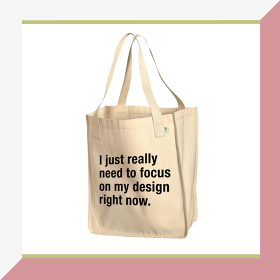
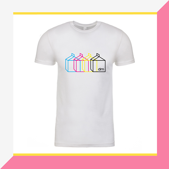
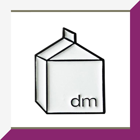
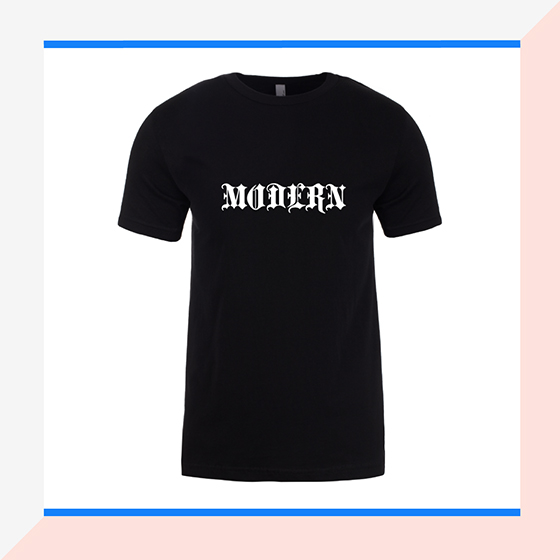
This past spring a lot of my time was spent designing for a project my friend Jaime and I had been discussing for a long time, and now it has a name – Milk Factory. Design Milk’s first collection of merchandise includes t-shirts, stickers, a tote bag (my favorite), and an enamel pin. We did a test run pop-up at the Milk Stand at ICFF in May before the shop opened and it went really well. All of the products are proudly printed by Commonwealth Press right here in Pittsburgh, PA and Milk Factory is happy to ship internationally. The plan is to add more items as we come up with additional cheeky things we’d want to buy for ourselves!


All of the pieces in Danielle “Bhavya” Winter‘s Following the Moon series begin with photos that she has taken of the moon. Through layering and merging Winter’s able to recapture the initial feeling from the moment she looked up into the sky.
Shop Danielle “Bhavya” Winter’s work





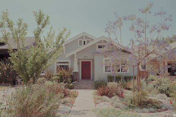
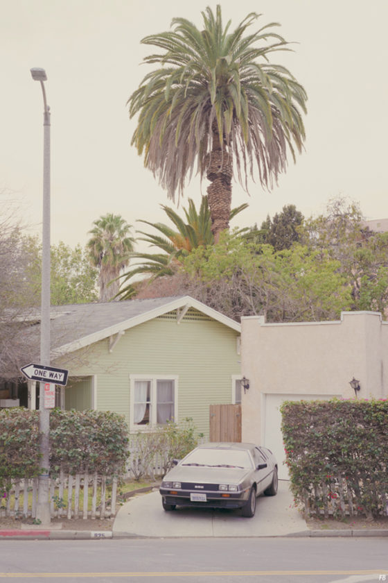
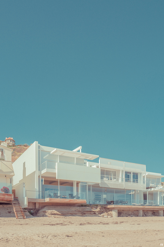
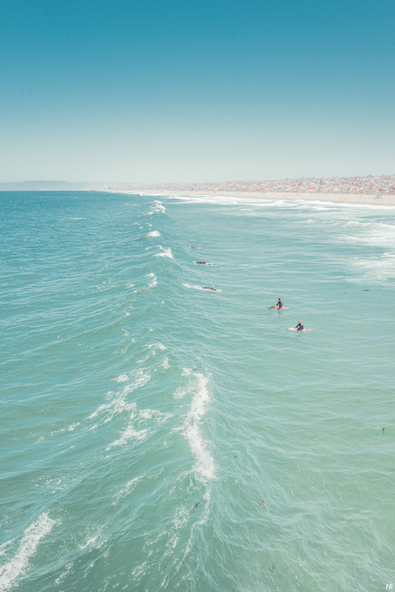
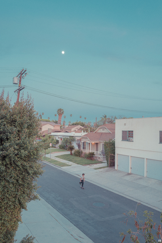
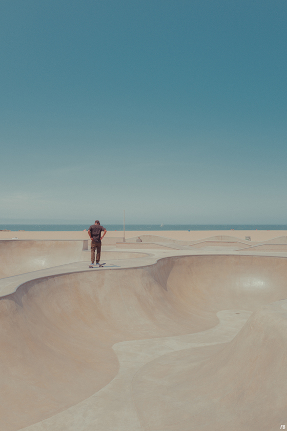
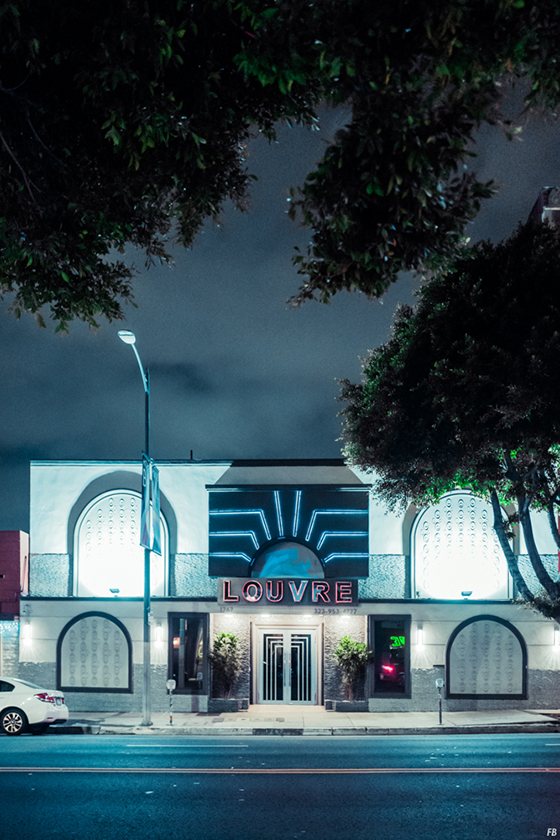
French-born, New York-dwelling Franck Bohbot‘s photos all have a touch of the theatrical about them. His past work on film sets lends the formal and aesthetic influences of cinematography to his work, as well as a documentarian feel. The way Bohbot views L.A. in his Angels series isn’t necessarily the way billions of minds across the world imagine the city, but if you’ve ever visited and stepped outside of Hollywood you know it’s the truth.
“Almost everyone has some idea of what Los Angeles is, even if they’ve never been there. Home to Hollywood, the city churns out myth after American myth. Some see the city as a necessary part of a glamorous life — they migrate there to become stars. Others live ordinary lives and work ordinary jobs in this city of spectacle. Here, even the metallic glinting pole of exercise equipment along the shoreline, or a solitary streetlight in neon darkness, or a thrust of power lines cutting across the sky, captures something essential about the so-called “city of angels.” by Sarah V. Schweig

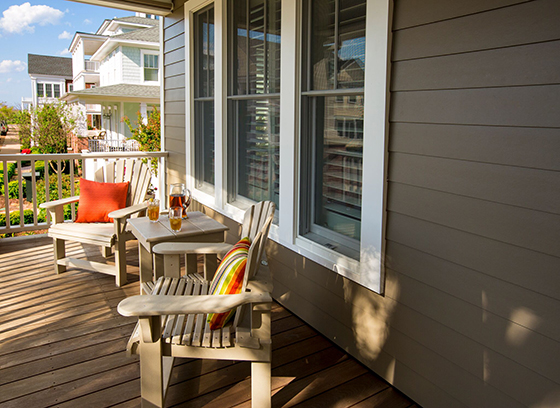
It’s been nearly four years since I found myself buying an old house and moving back to the Pennsylvania town where I grew up. As you’ve seen, since then I’ve put my modern and eclectic stamp on the 118-year-old structure through projects and updates while trying to retain its character. I’ve added window shutters to the front facade, switched out all of the interior doorknobs, and replaced the front and backdoor entry sets among many other things.
The exterior is still not where I’d like it to be however, and doesn’t match up with my aesthetic. My hope is to give it a much needed facelift with new siding, as well as boxing in those columns and adding a porch that most certainly existed at some point in the past.
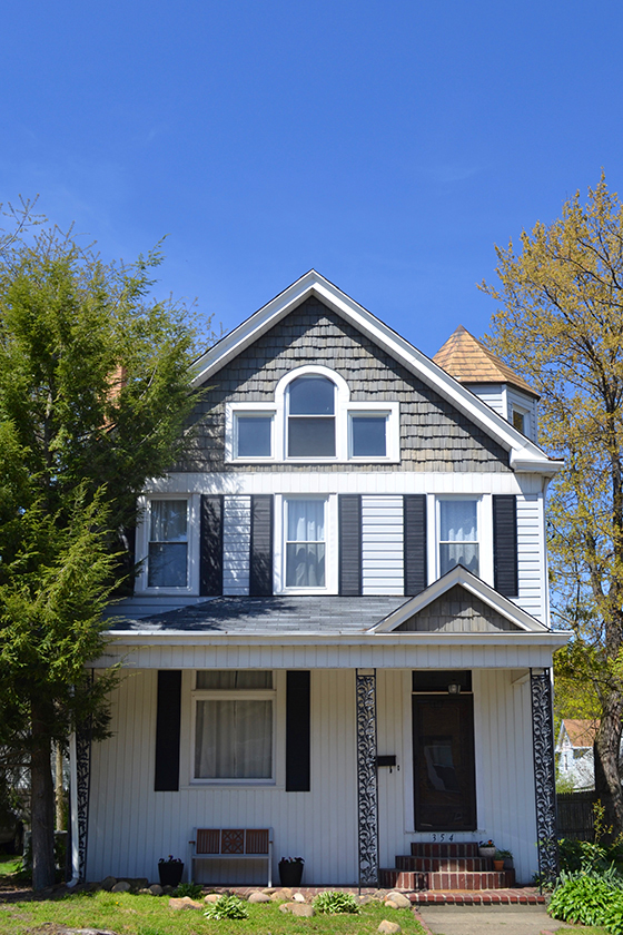
For your reference, this photo was taken last summer. The light fixture and mailbox have been replaced and some new plants have been added to the front flower bed, but that’s the extent of this past year’s progress.
One of my biggest peeves about the curb appeal – where the majority of the house’s character lies – is the mix of sidings used, both in colors as well as directionality. While I understand that this is an aesthetic some prefer, I’d love to have wide plank horizontal siding in one style and one color.
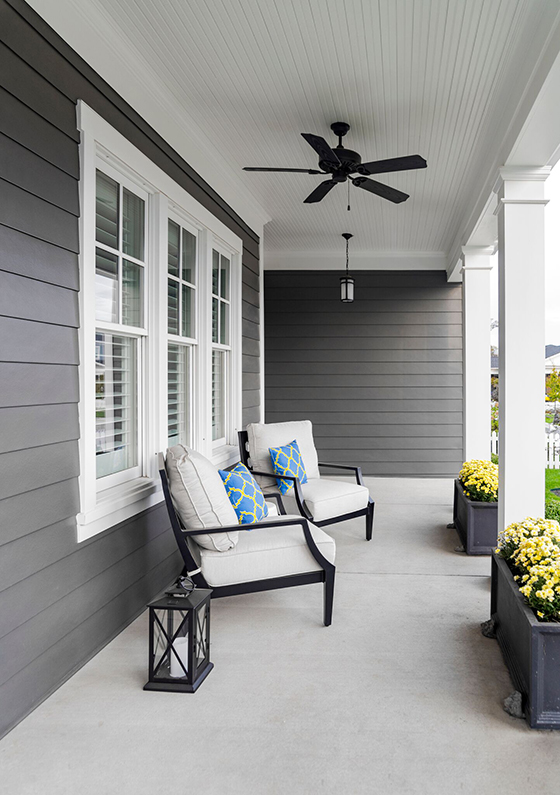
Something like this.
After putting some research time into this eventual project, I realized what a massive collection of products James Hardie has to offer as well as the quality that backs them up. Their product line offers a great selection of profiles, textures, widths, and colors, while their commitment to artistry and innovation allows for timeless designs and performance.

Now for the nitty gritty. James Hardie‘s ColorPlus Technology coats surfaces, edges, and features of each siding plank uniformly while multiple layers of color are baked onto each board for a great finish and a strong bond that resists chipping, peeling, cracking, and fading for years to come. With HardiePlank lap siding, HardieShingle siding, and HardiePanel vertical siding, you have the design versatility to achieve a look that’s sure to stand out on your street. They also allow you to enjoy the peace of mind that comes with a 30-year non-prorated warranty on siding, a 15-year non-prorated warranty on trim, and ColorPlus Technology with a 15-year limited finish warranty.
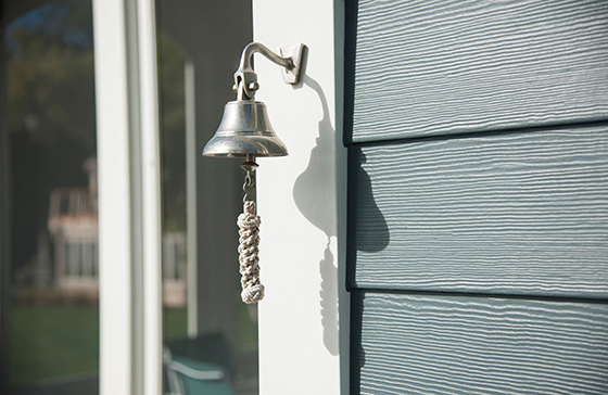
Only James Hardie fiber cement products are Engineered for Climate. In the northern U.S. and Canada, HZ5 products resist shrinking, swelling, and cracking even after years of wet or freezing conditions. (Perfect for climate zones that experience it all, like Pennsylvania!) HZ10 products resist damage from hot, humid conditions, blistering sun and more. These products are actually tougher than the elements – they stand up to storms and harsh weather, are water resistant to protect against swelling, warping and cracking, and also resist mold. They’re fire resistant and her reduce the time and money you’d spend on maintenance of other materials. With all of these assurances you can feel good about everything James Hardie has to offer.

At this point I have a specific idea of how I’d like to add more character to the exterior of my home, but if you need some help check out James Hardie’s site for additional design inspiration. And if you’d like to check out their siding in person be sure and request some free samples to compare – choose from textured, smooth, or beaded.

This post sponsored by James Hardie. All words and opinions are my own. Thank you for supporting our carefully chosen partners that help keep Design Crush creating fresh content! Follow James Hardie on Twitter, Facebook, Pinterest, Instagram, Houzz, and YouTube.
Posted In behind the scenes, living, outdoors, sponsored post
Freelance illustrator and artist Marta Zafra has a very diverse body of work, her art both familiar yet unique in its portrayal of the everyday. The familiar is often transformed into the bizarre, the past often revisited, and the real made unreal.




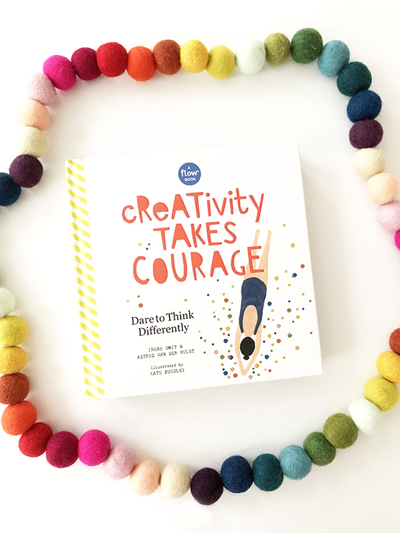
Creativity tends to show up in my life as a feast or famine – is it like that for you, too? This year has particularly been full of highs and lows and I’m hoping everything will even out soon enough, after all challenging times generally point towards periods of growth.
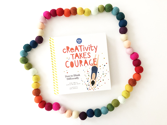
The latest book from the co-founders and creative directors of Flow Magazine, Irene Smit and Astrid Van der Hulst, and Workman Publishing couldn’t have better timing. Creativity Takes Courage: Dare to Think Differently was released earlier this week. (If you’re unfamiliar with Flow, it’s a magazine that celebrates creativity, imperfection, and life’s little pleasures.) This is a creative book like no other – simultaneously a practical, hands-on guide to stretching your creative muscles as well as an inspirational book that focuses on the pleasure of the process.
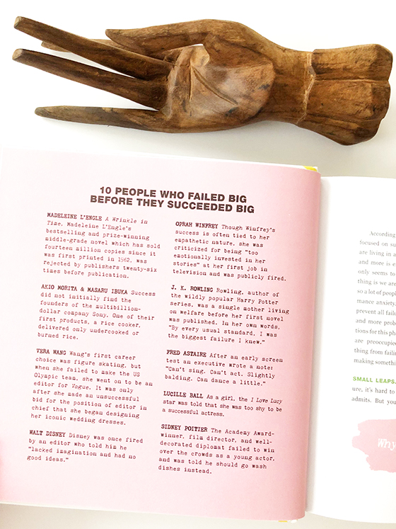
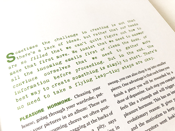
Creativity Takes Courage is organized around a series of twelve so-called dares that are intended to break you out of your usual creative habits and provide a fresh perspective to help you step outside of your comfort zone. (And man, do I need that frequently!) It’s a book both about creativity and a book that inspires creativity with tons of prompts, tips, and challenges to complete in your own time.
Most chapters end with an And Now You section of questions, the answers to which can be written directly right in the book. These questions follow the theme of the chapter – reexamining something you may consider a failure that could be seen as a learning process or questions that might help you break down a new project or challenge into more manageable parts for example.
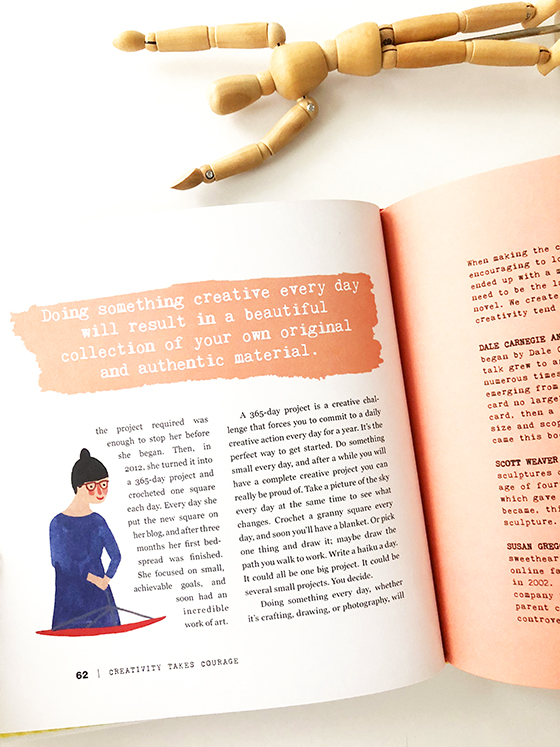
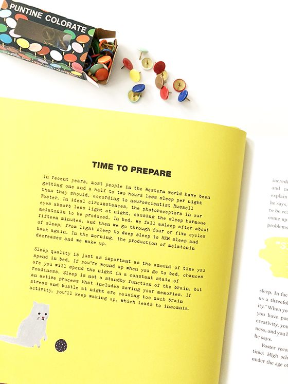
There are lots of pull-out extras throughout the book – probably my favorite parts! Use the daily project notebook for getting started and focused on something as simple as saving your shopping list or receipts, drawing a cloud, or writing something positive on the sidewalk with chalk. Read about the importance of sleep in creativity, then decorate your sleeping space with tear-out inspirational images. Pull out the included Polaroid-style photo frames to use in framing your favorite photos, or use them to help you frame a scene before taking a picture.
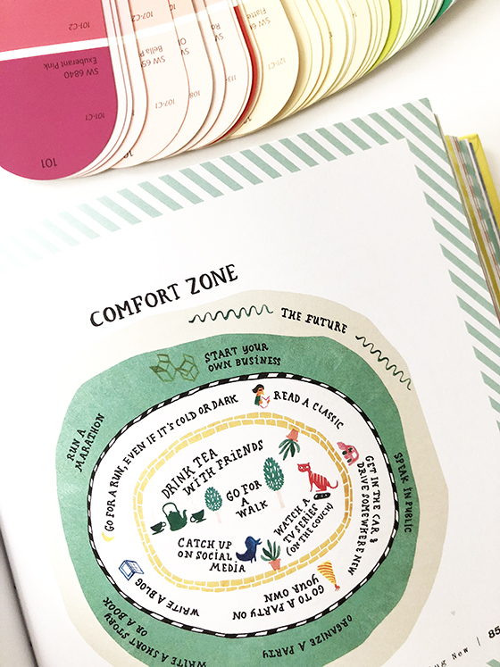
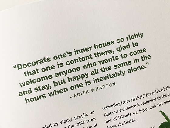
Not every single page includes an interaction– there are also essays about and lessons on how to get started on a new project without getting overwhelmed, stepping outside of your comfort zone as a means to unlocking creativity, and learning how to enjoy being alone and doing nothing at all among others.
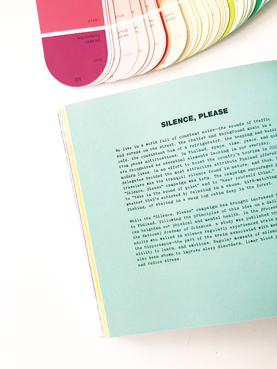
There’s no right or wrong way to use Creativity Takes Courage! Make your way straight through or jump around among the dares. Tear out pages to put on the refrigerator or mail some to a friend. Keep it by your bedside to work through when you first wake up or before you go to sleep. Dog-ear it, use it to your advantage, and realize what a gift true creativity can be.
Want to win a copy of Creativity Takes Courage: Dare to Think Differently for yourself or a friend? Keep scrolling for a ton of ways to enter!
This post sponsored by Workman Publishing. All words and opinions are my own. Thank you for supporting our carefully chosen partners that help keep Design Crush creating fresh content!
Posted In behind the scenes, create, read up, sponsored post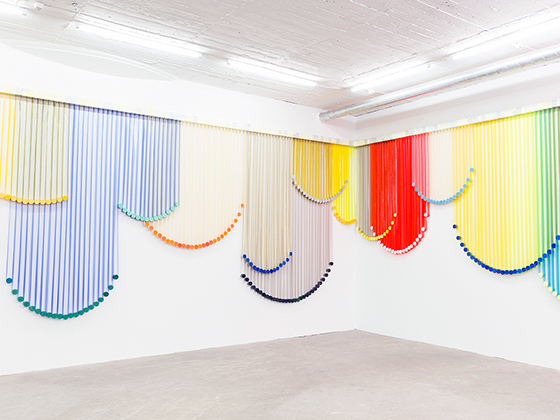
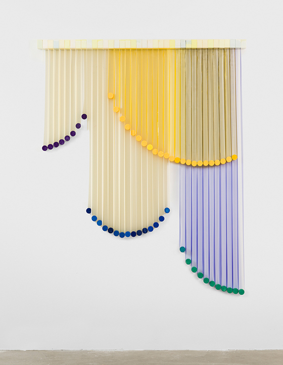
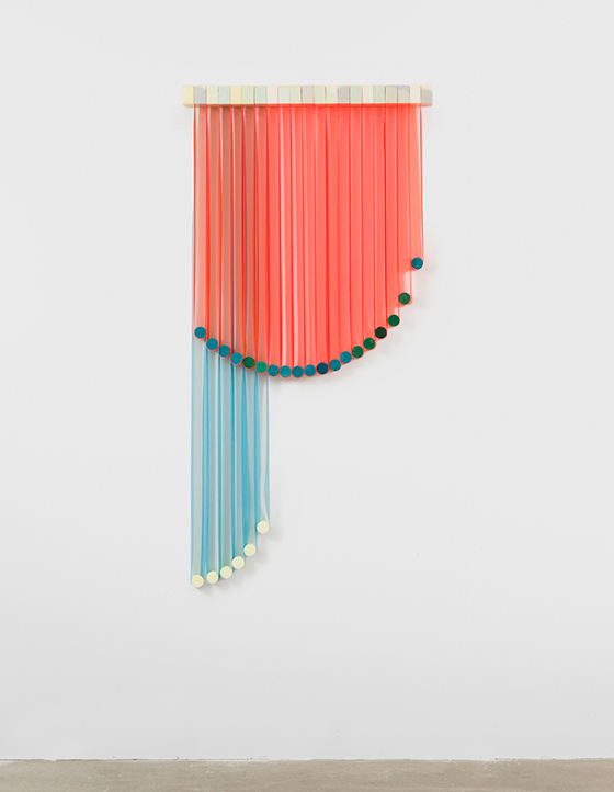
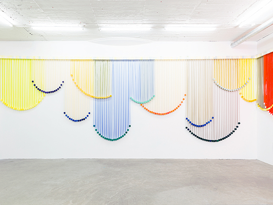
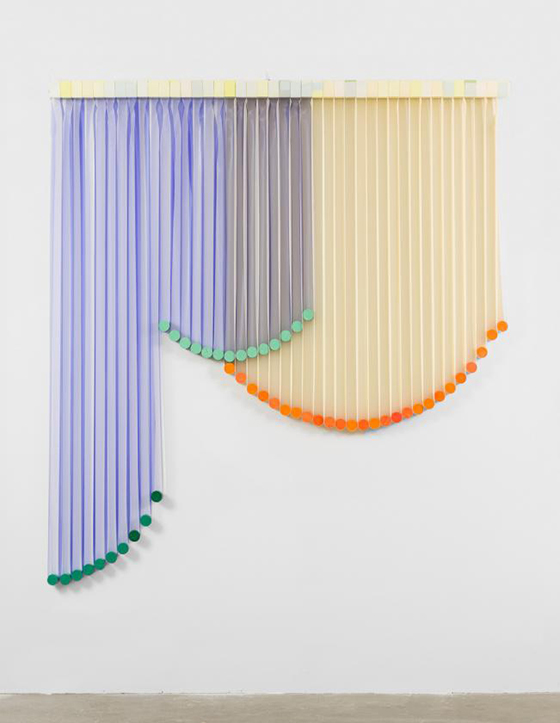
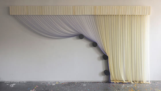
Perhaps you’ve heard of legendary artist Sol LeWitt, but did you know he has a very talented daughter named Eva LeWitt? Some of her latest work is this installation made from polyurethane foam, latex, and plastic that’s entitled Untitled. Once installed the 13 pieces resemble overlapping curtains with a variety of shapes, colors, and textures giving each its own personality, while the materials they’re made from both hold them up and weigh them down.

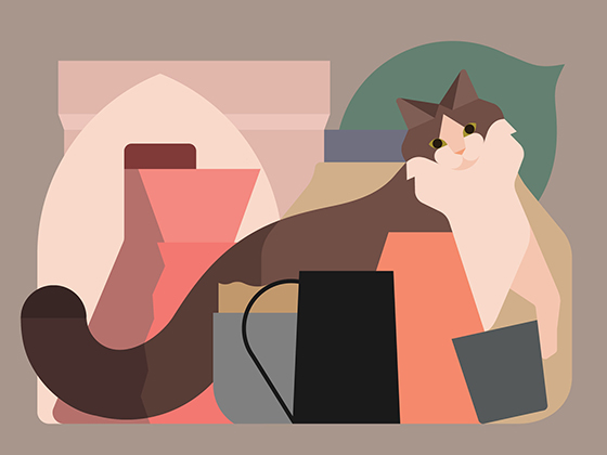
UK-based illustrator Rob Bailey‘s art is as lovely to look at as it is flat, which is to say very. Most pieces rely heavily upon great shapes and color choices that will pick up the slack from lack of details.




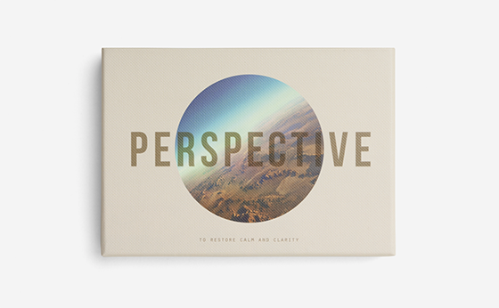
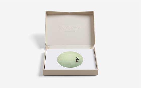
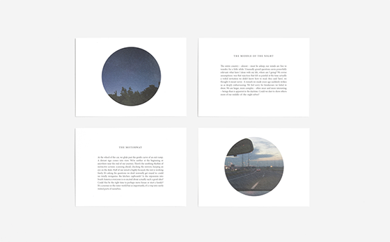
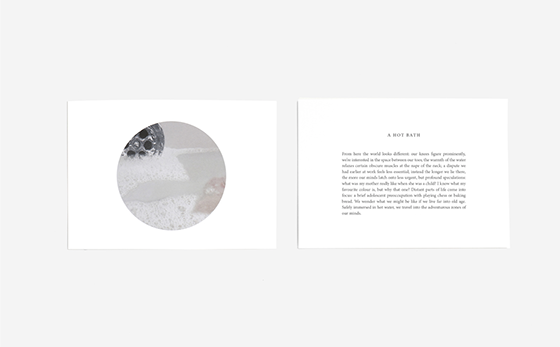
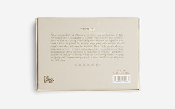
Who doesn’t need a little bit of perspective now and again? Cards for Perspective is a collection of twenty cards featuring fresh views on life to help you restore calm and clarity.
We mistake what is manageable for a catastrophe; we despair of ourselves too soon; we alienate others by over-reacting; we don’t notice and appreciate what there is still to be grateful for; we forget we’re going to die and that a lot of today’s headache will soon be forgotten. These cards provide eloquent invitations to recover a wiser, calmer, redemptive perspective on our lives.
