Little Corners: Pattern Pulp

At home with Shayla Kulik of Pattern Pulp.

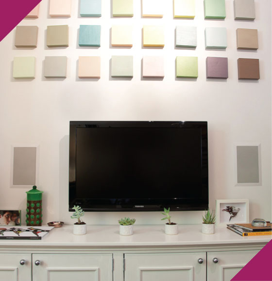
Okay. We all have that troublesome spot above the TV. What do you do with it? Will art compete, will it be asymmetrical in a bad way, what on earth will complement, won’t break the bank and be fairly easy to install? I figured my best bet was to order mini canvases, paint and arrange on the wall. I did them in two phases and I’ll say I’m quite pleased with the results. The hardest part was hanging the grid. Here’s how they went up.


When my husband and I eloped, we actually considered making this our announcement art. Everything about the way our toothbrushes fall, tilt and slink (they’re rarely upright) reflects the nature of our relationship – quirky, fun and perfectly suited!


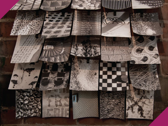
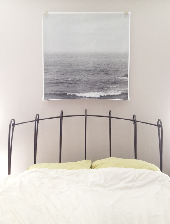
This is my favorite DIY piece. I travel quite a bit for Pattern Pulp and am forever snapping photos of print and texture inspiration. At the suggestion of a friend, I started desaturating my photos and printing them on matte card stock for the living room wall. Lately the mini canvases have served as inspiration for the painting class I’m taking at SVA.


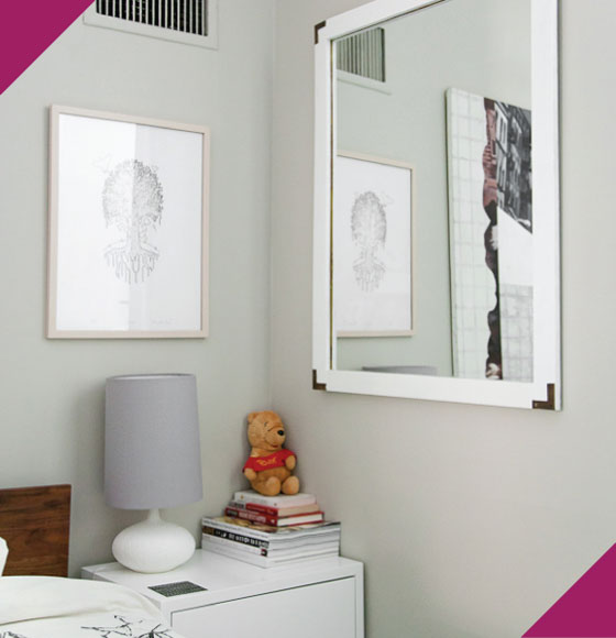
This is my special little nook in the bedroom, and yes, that’s Pooh and I’ve had him since 8th grade. In lieu of babies and pets, he gets more than his fair share of attention. The mirror was a steal for $15 at Housing Works and after a fresh coat of white glossy paint, it actually looks brand new. That said, I’m waiting for it to crash in the middle of the night, it’s literally hanging on a wire thread.


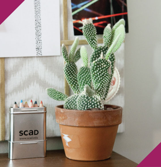
Count me in as a plant lover. Unfortunately I’m without a green thumb and post all of my sad plant stories to Instagram. That said, this little guy’s been growing Little Shop of Horrors style for the past few months. The SCAD pencils are a handy addition to the desk for when I need to do a quick and colorful sketch.

3

Moonrise Kingdom


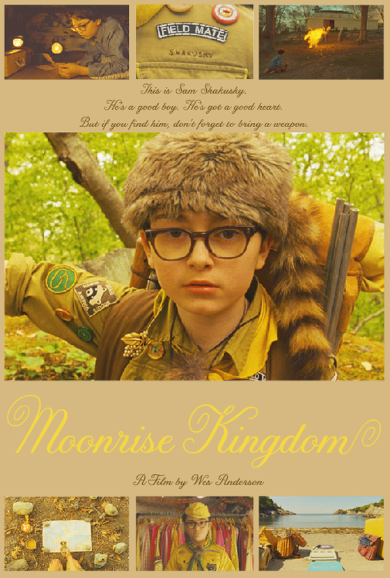
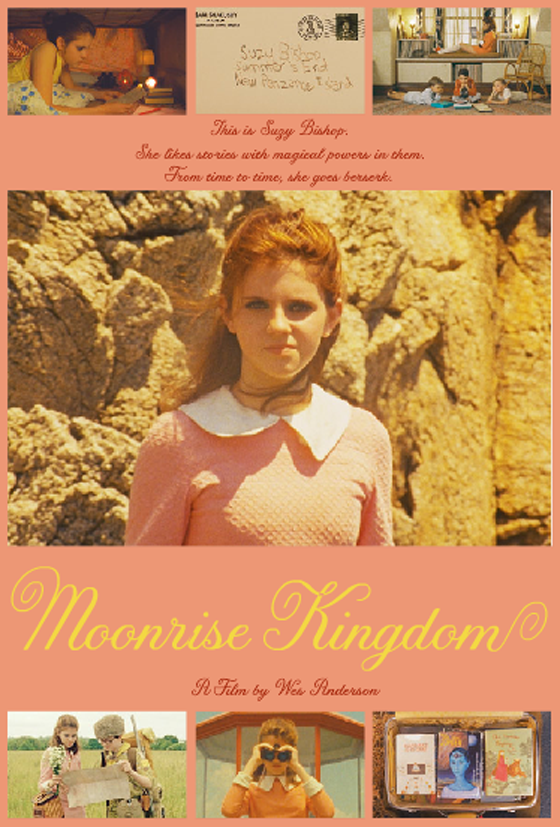
It’s been far too long since a new Wes Anderson flick graced my life. Far, far too long. May 25th is going to be amazing because I’ll most likely be one of the nerds waiting in line to see Moonrise Kingdom. If you haven’t yet, check out the trailer here! (character posters via indiewire)
8

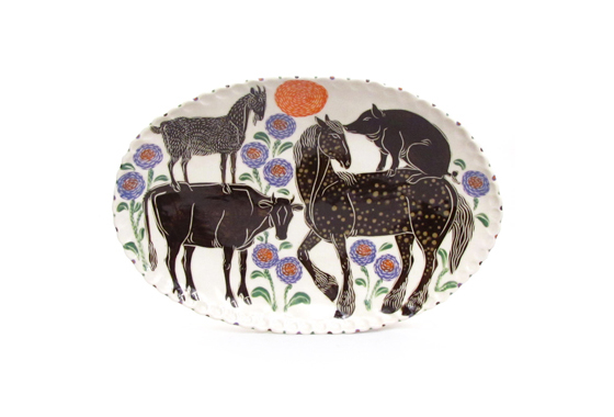
Sue Tirrell

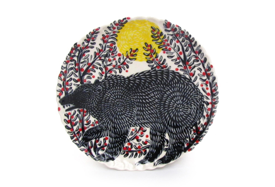
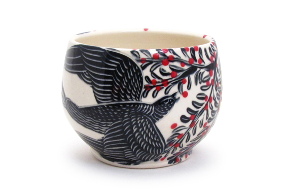
Animals + color + pattern = Sue Tirrell. The Montana sculptor and potter has this way of making all of the elements work in perfect harmony, and I can’t get enough. Sue’s pieces blend Western culture, folk art, and the contemporary perfectly. (via Design Sponge)

2

Sky Umbrella

What’s better than a classic black umbrella? Tibor Kalman’s Sky Umbrella, that’s what. No matter how rainy it is outside, blue skies are somewhere overhead – always a good reminder. MoMA Design Store is celebrating its 20th anniversary right now by running a contest on how to style the iconic piece. (Ironically I snapped these photos under clear skies, less than 12 hours after an entire week of storms and tornadoes.)

PS: Use the code “SKY20” for 20% off all versions of the Sky Umbrella from today (4/17) through April 30th!


Disclosure: This is not a sponsored post. The MoMA Store approached me about styling a Sky Umbrella to celebrate its anniversary, and I accepted because I love both the product and the establishment. All opinions are my own.

3

Amy Sia

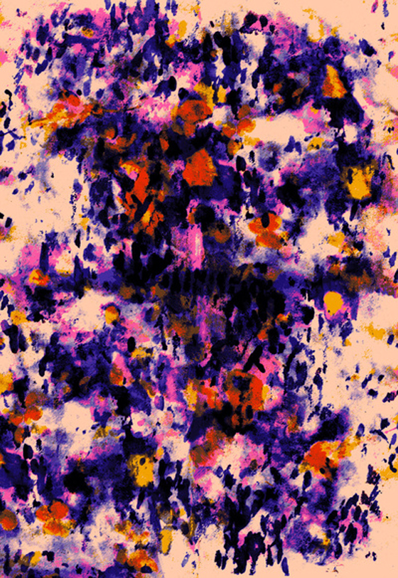
I was recently introduced to the work of London-based textile print designer Amy Sia, and became immediately smitten with her bold, feminine, colorful work. It gives me such a happy feeling and leaves me smiling ear to ear. Lucky for me (and you), we can buy Amy’s work through Society6 as prints, canvases, and iPhone cases.

5

Happy Weekend


01/ Where rot meets fascination.
02/ Outdoor rugs made of rocks – so smart.
03/ Chalktrail looks like the best time!
04/ Paper towels colored with leftover egg dye.
05/ I used to dye flowers like this as a kid!
06/ Typography + Knives
07/ These dip-dyed paper placemats are such fun!
08/ Wishing I were patient enough for this ombre nail job.
09/ I don’t use glass paint nearly enough, check out these tumblers.
10/ Fantastic patterns on every one of these Coaster Puzzle Trays.

4

Little Corners: Hank + Hunt

Today we’re popping in to check out Hank + Hunt‘s (aka Jenny Batt’s) home base!

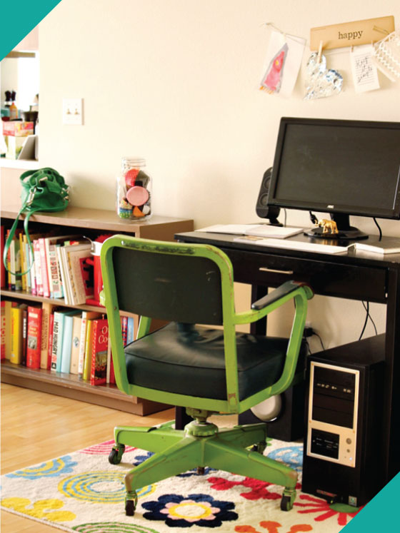
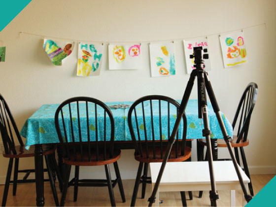
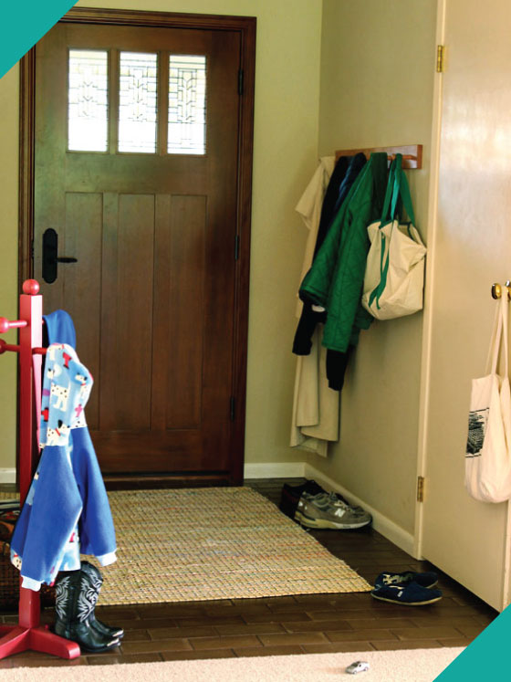
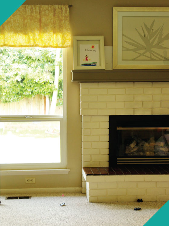
My favorite part of the house is the giant dining room / work area that I have. There is a huge picture window and gorgeous light.  It is where I make everything, shoot everything, and blog everything. I love the wall of windows I have to the backyard, which is so green and wonderful, I have massive bright orange poppies coming! I love that we have a gas fireplace and can flip it on with the flip of a switch. It is AWESOME. This house is much bigger than our last one, and it has a foyer! A foyer! Hooray! I never knew how much I liked them until I didn’t have one.


2