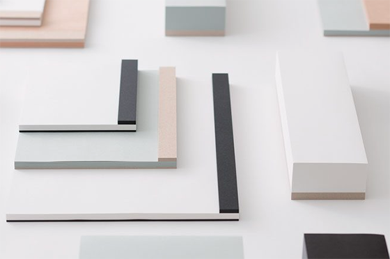
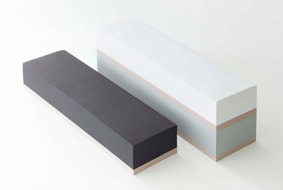
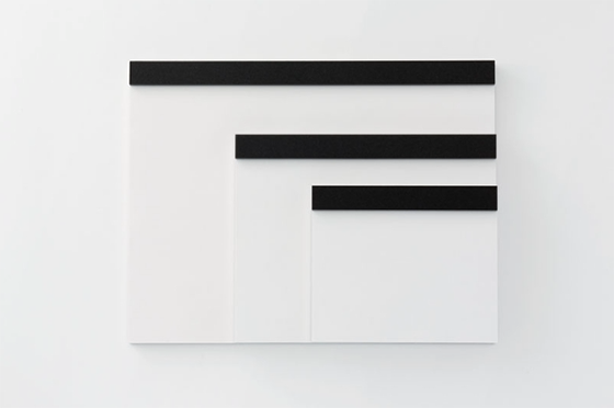
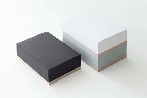
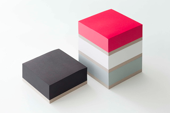
As their name might suggest, Ito Bindery got their start 70 years ago as a bookbinding company. Based out of Tokyo, these guys also manage to create some of the sleekest drawing pads and memoblocks I’ve seen. If you like a clutter-free workspace I’m betting you’ll love these supplies just as much as I do.
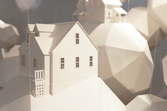
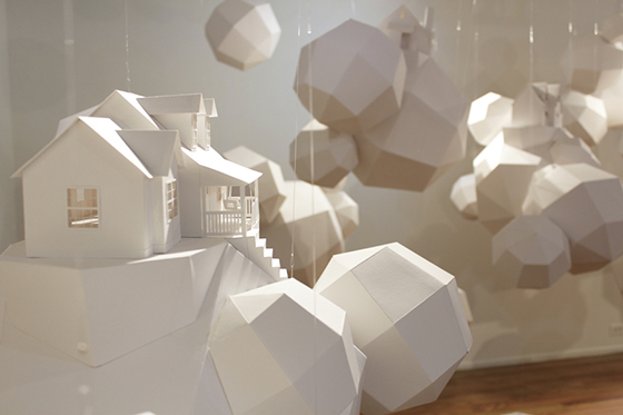
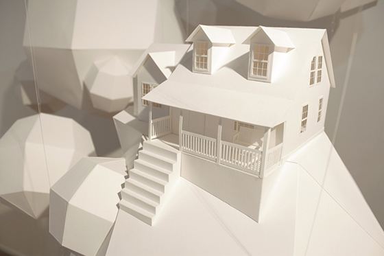
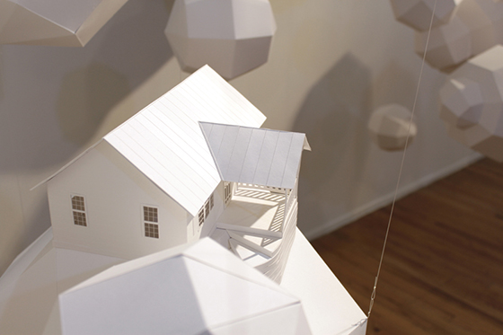
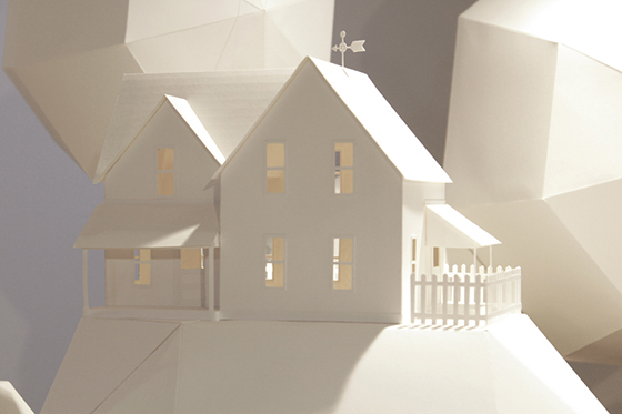
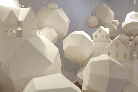
Dream houses belong in the clouds, especially the pristine paper variety. Artist Nicki Crock‘s Dream House paper installation is the stuff we aspire to, all placed neatly in a field of accompanying troposphere.
You’re probably changing up your wardrobe for autumn, but have you thought about changing up your fragrance? Warm weather scents tend to be lighter, more floral or fruity. While cool weather scents can afford to be a bit stronger, think musks and earthy undertones. Do you change your scent with the seasons?
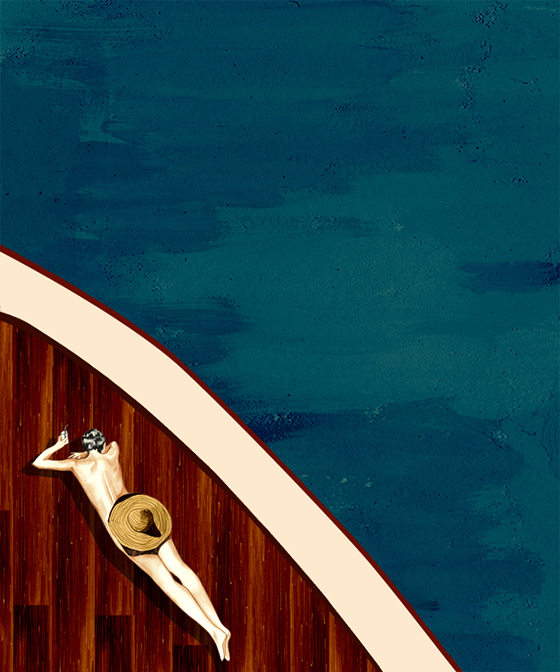
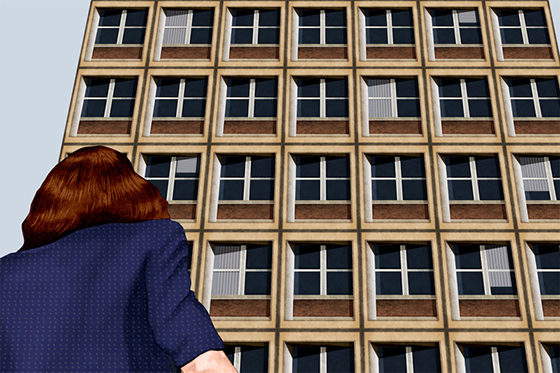
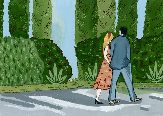
Los Angeles-based Gigi Rose Gray has a name and face as chic as the mysterious ladies she illustrates. Through lurid side glances, hidden faces, and artful cropping, Gray creates a story in every piece that leaves us begging for more information.
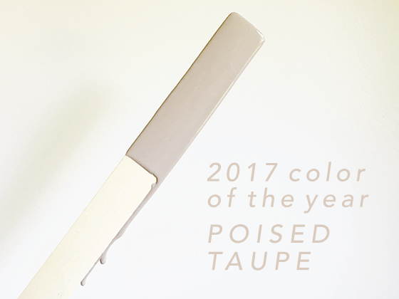
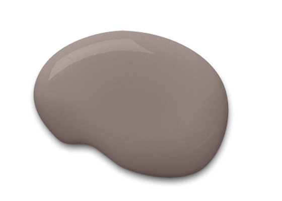
Let’s start this off honestly: Browns are not my bag. So when my long-standing partner Sherwin-Williams approached me about sharing their 2017 Color of the Year – Poised Taupe – I was unsure. In my mind taupe is a drab nail color my mother used to wear in the 90s, one that I didn’t like then and didn’t feel much differently about now.
But then I actually saw the color in question, and I was proven wrong once again in life. Because this taupe? This taupe, Poised Taupe, was unlike anything I’d seen before. Plenty of grey undertones, even a little violet in some light, a modern take on a classic color.
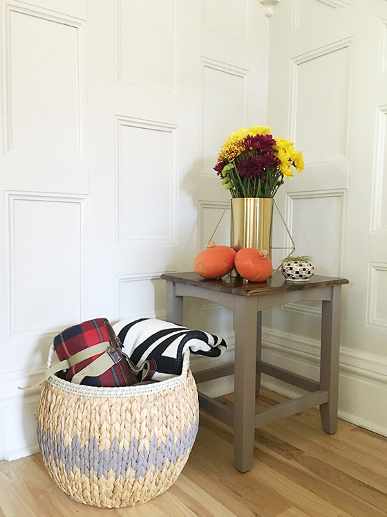
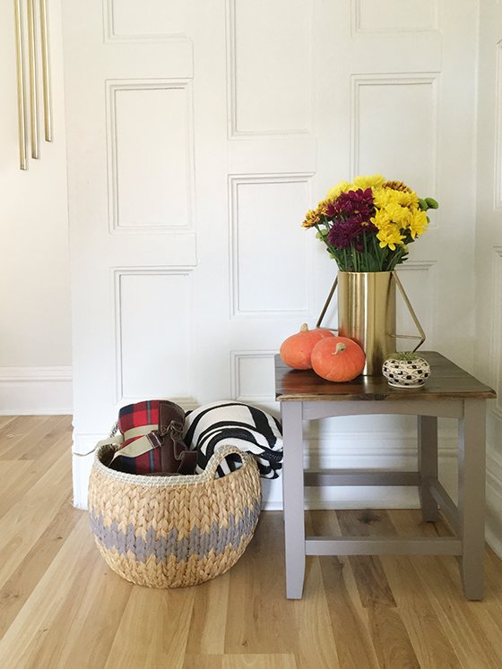
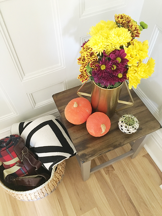
After considering where Poised Taupe might fit into my home I had the answer. A small wood side table that had banged up legs and had seen better days could use a bit of a makeover, a second chance at life. I was also curious how different textures might take the paint, so I decided to give a seagrass basket that I keep blankets in an upgrade as well.
I left the surface of the side table unpainted for a bit of extra contrast. After giving the legs and underside a light sanding, I wiped them off with a cloth and swiped on two light coats of Poised Taupe in Sherwin-Williams‘ ProClassic formula with a satin finish.
My seagrass basket took a bit more time, but I found painting each little section therapeutic. After pouring through pattern options online I went with a simple zigzag – because sometimes simple is best, ya know? I love the update and how it feels a little bit like a fair isle sweater for the cooler months that are nearly here. For this mini-project I went with the Poised Taupe in Sherwin-Williams‘ Emerald formula (my favorite!), also in a satin finish.
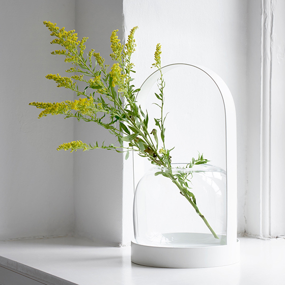
For a color I wasn’t so sure about, Poised Taupe sure seems to fit right in in my home with its earthy feel. Both the side table and basket are currently front and center when you walk in the door, nestled in the nook of my staircase. It’s the perfect place to put a vase of fall flowers and drop your keys.
This post sponsored by Sherwin-Williams. All words and opinion are my own. Thank you for supporting the brands that help keep Design Crush creating fresh content!
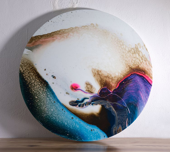
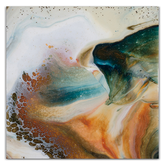
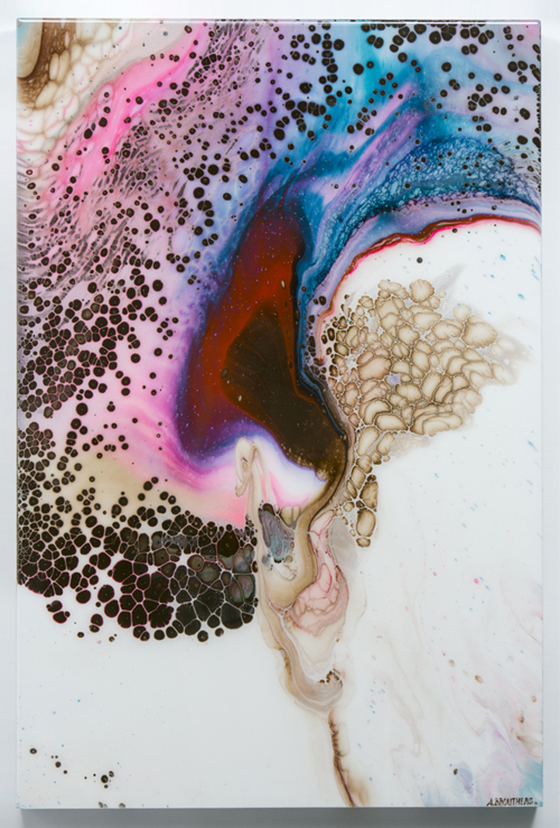
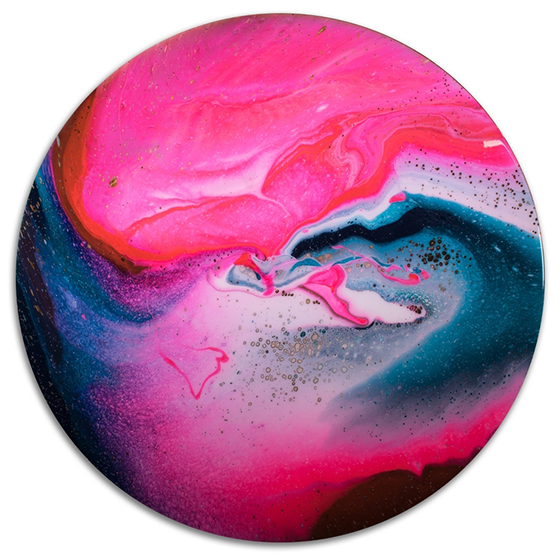
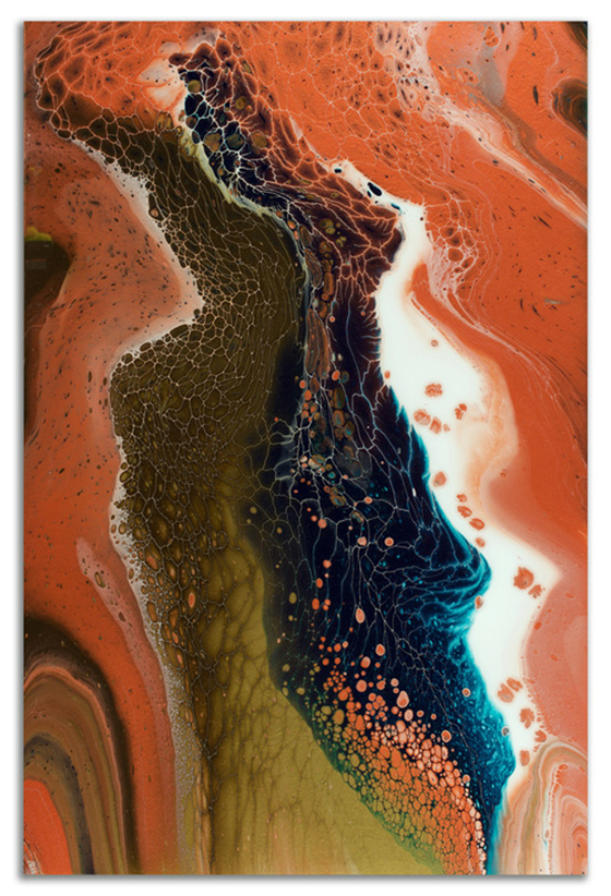
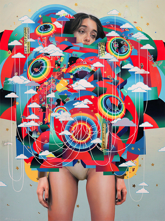
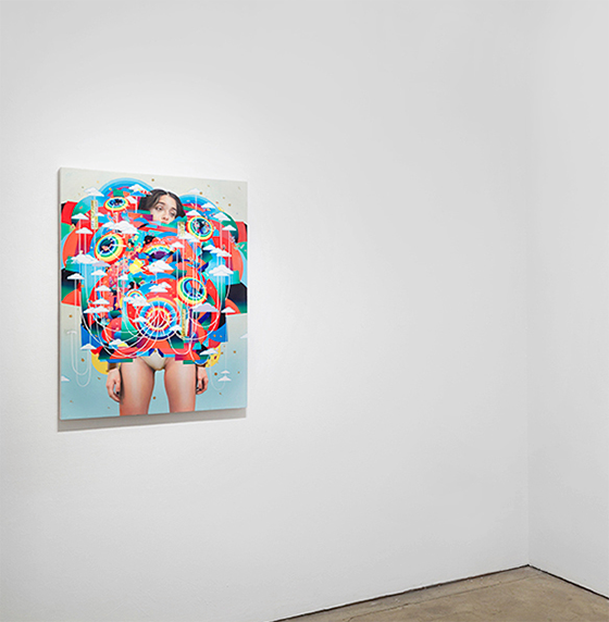
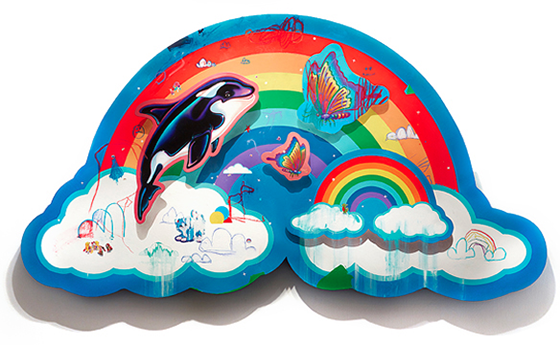
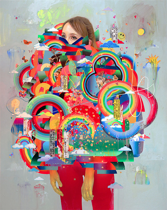
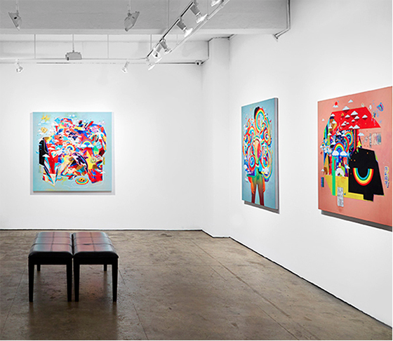
I know I’ve come across something really special when choosing only five or six images to share seems like a daunting task. Arthur Brouthers‘ creations stopped me dead in my tracks and I had to know more about his process and inspiration.
The innovation of the technique I utilize in my work is based on years of experimentation with acrylic paint, various mediums, and manipulating the environment. The results are not entirely predictable; which parallels the natural world my work emulates. The amorphous shapes and colors are easily found in nature; whether being under a microscope, through a telescope, or viewed by our own eyes. I pour the paint and create a reaction that mimics natural phenomena, forming images in an unorganized unity. A thick clear medium is often applied to finished pieces, providing a looking glass into an ever evolving natural reaction. The viewer is left to find resonance between the piece and their own perception.
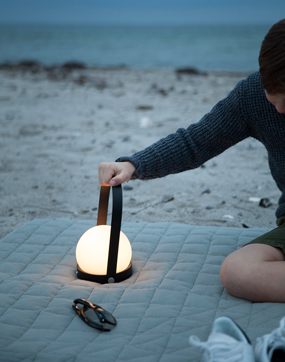
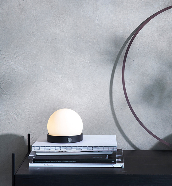
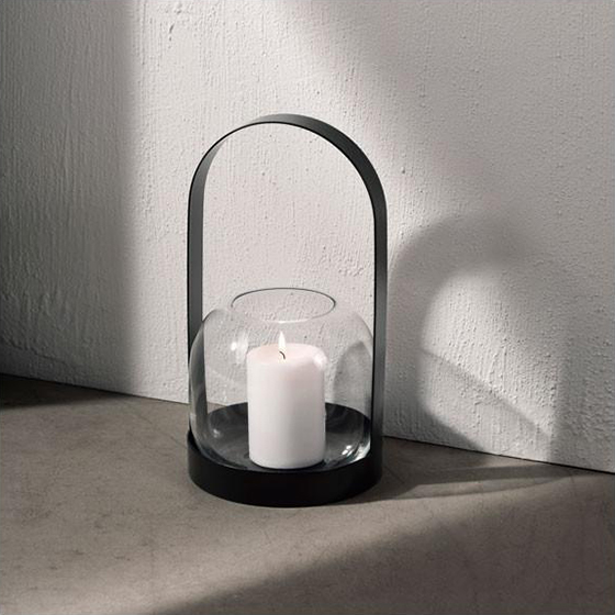
Autumn has finally shown its face in Pennsylvania, making me want to nest, wear socks, and light candles. I’m loving these two pieces from Norm Architectures – the Carrie Lamp and the Carrie Lantern – for creating a cozy evening ambiance. The Lamp is an upgrade of the Lantern, it’s USB-rechargable LED powered while the Lantern relies on a candle. (It can also function as a case though, so bonus.)
There are elements of Lisa Frank and everything else shiny, happy, and good in the mixed media art of Erik Jones. Ten-year-old me would have loved and appreciated these chaotic works that use watercolor, acrylic, colored pencils, wax pastels, and oil paint as much as 36-year-old me does.
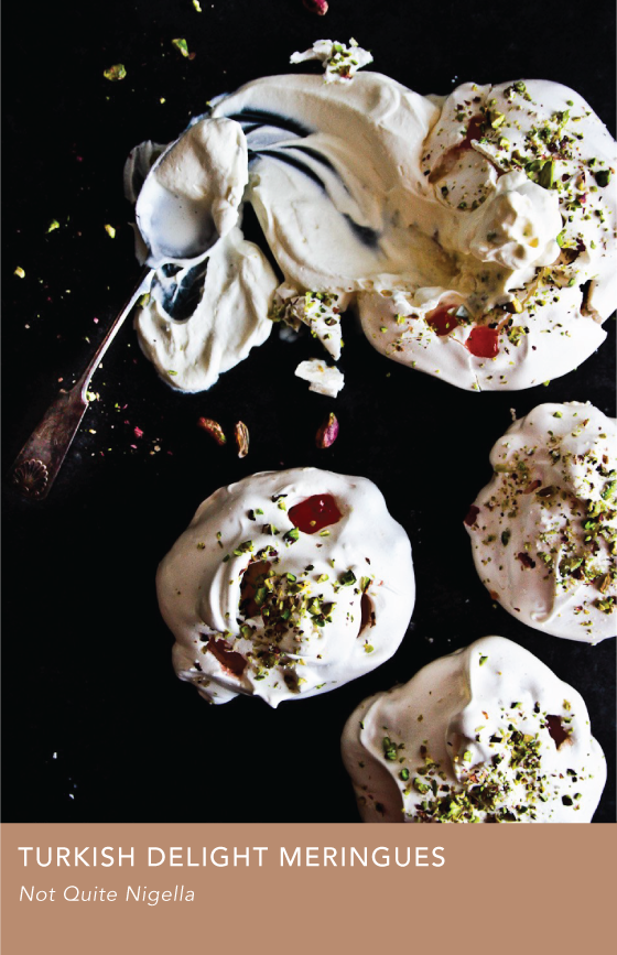
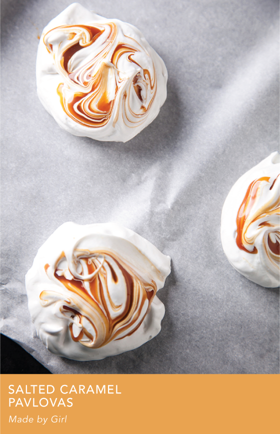
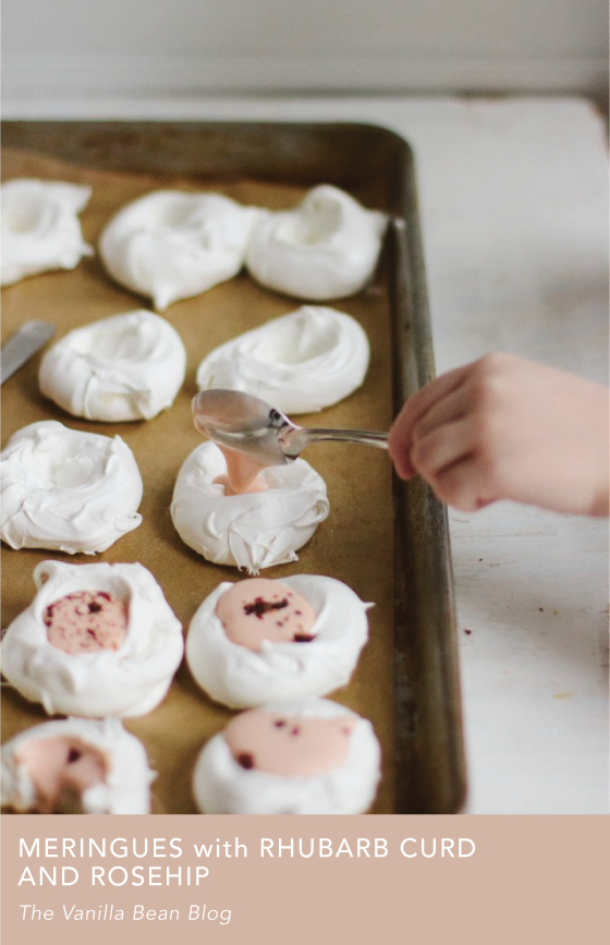
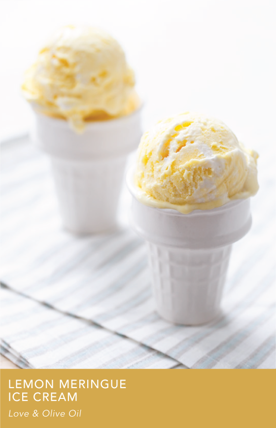
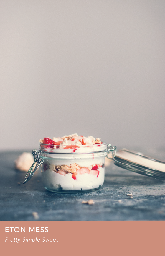
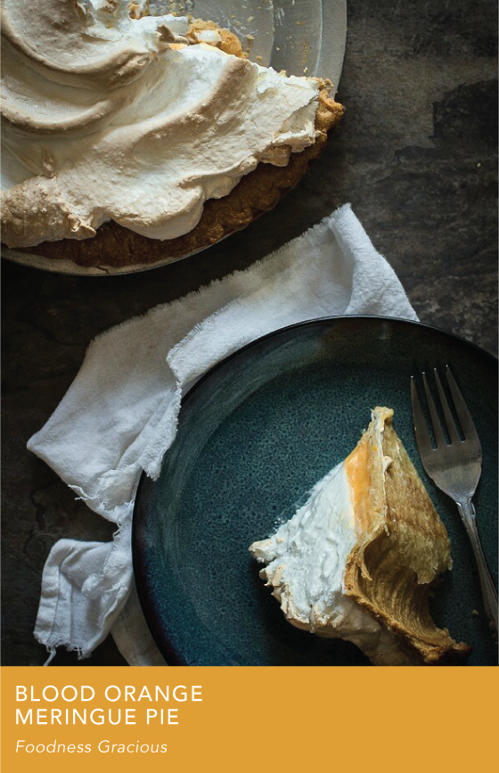
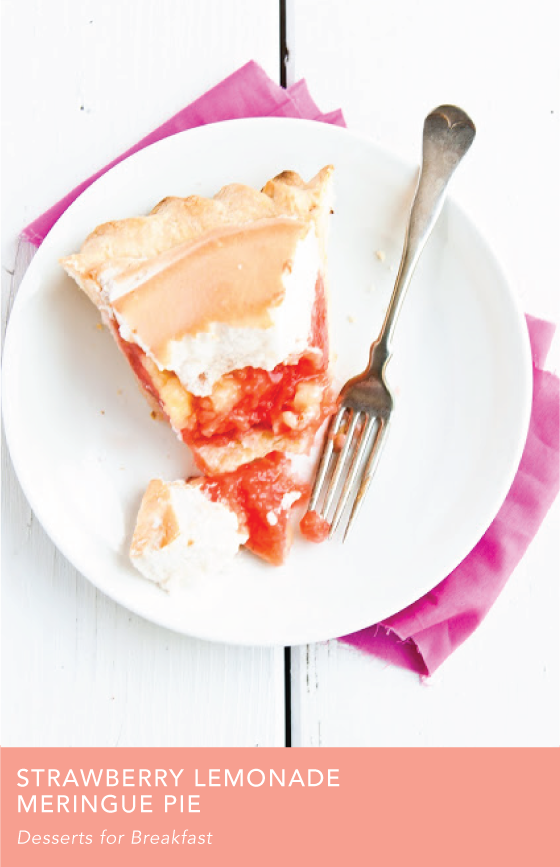
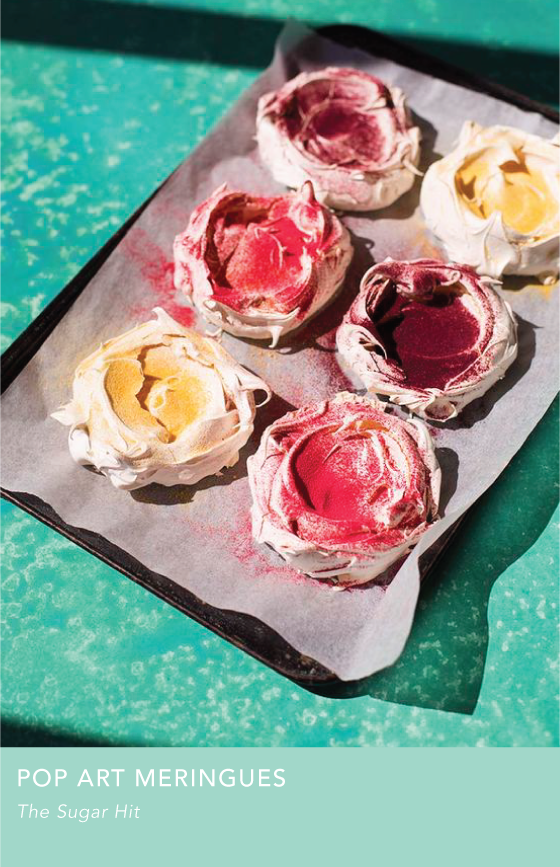
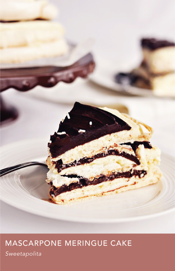
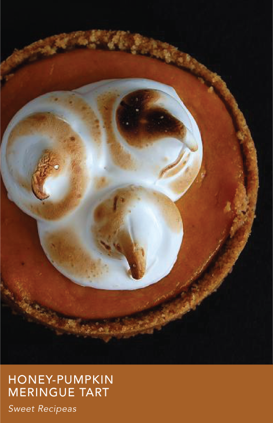
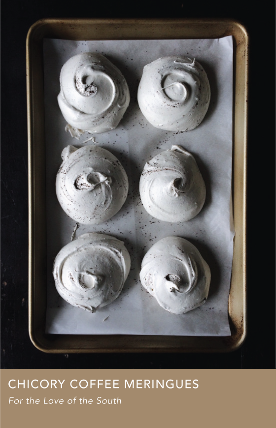
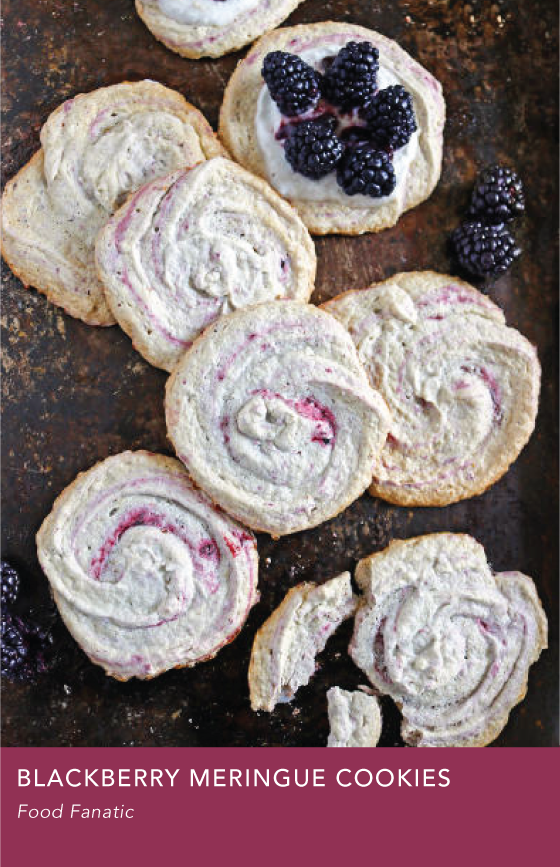
Long story short: I can’t eat meringue because it makes my tongue itch. (An egg white allergy? Who knows.) But I think it’s so luxurious looking and love the idea of it, so much so that I want to make some for others to enjoy at some point. Have you had it? Do you love it? Here are twelve delicious looking recipes to investigate.
Click on each image to go to the recipe. All photos copyright of their respective sites unless otherwise noted.
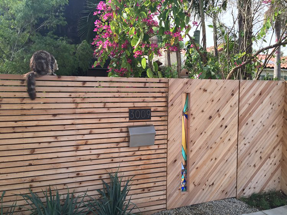
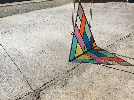
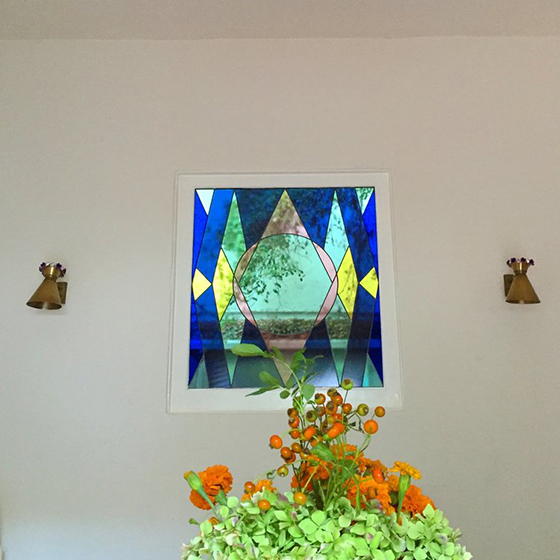
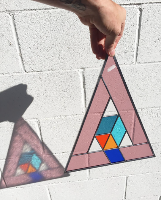
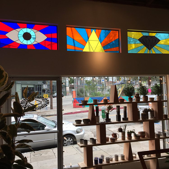
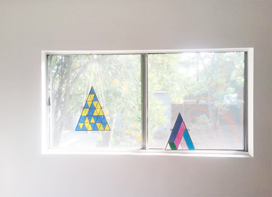
The stained glass work of David Scheid makes my stomach drop out, plain and simple. Any time you combine an ages old art form (stained glass) with an aspect that feels fresh (colorblocked geometry) I’m sold. Scheid splits his time between creating custom pieces and one of a kind triangles sold online. I’m so into it. All of it. Sign me up.