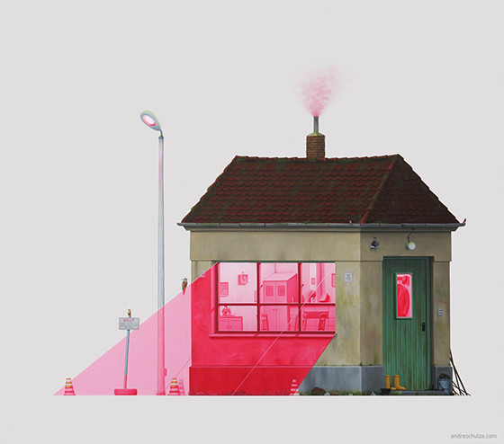
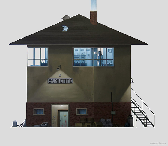
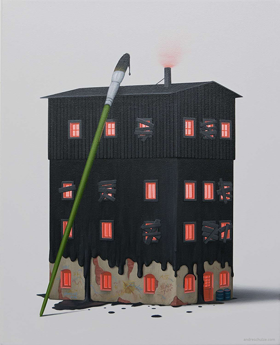
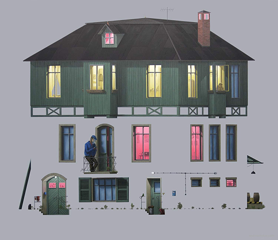
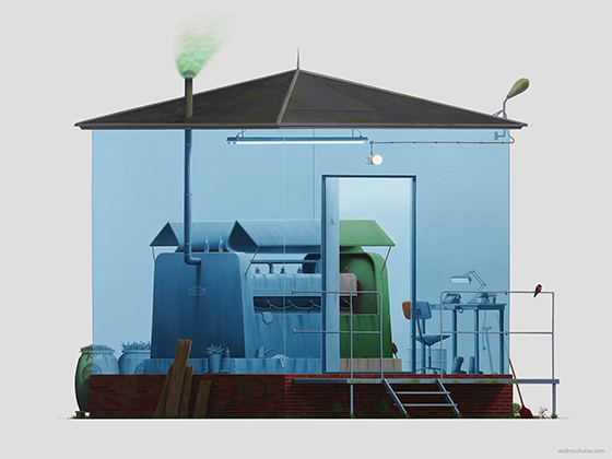
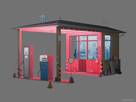
German artist André Schulze takes his inspiration from the East German landscape and architecture he encounters biking around Dresden. After photographing industrial architecture, rail architecture, nameless buildings, and typical houses, Schulze turns them into paintings to preserve what is slowly disappearing from the East German landscape.
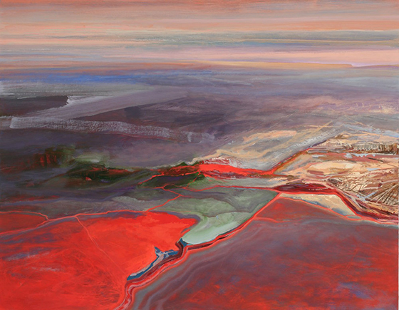
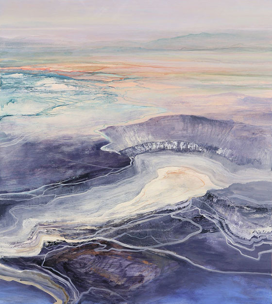
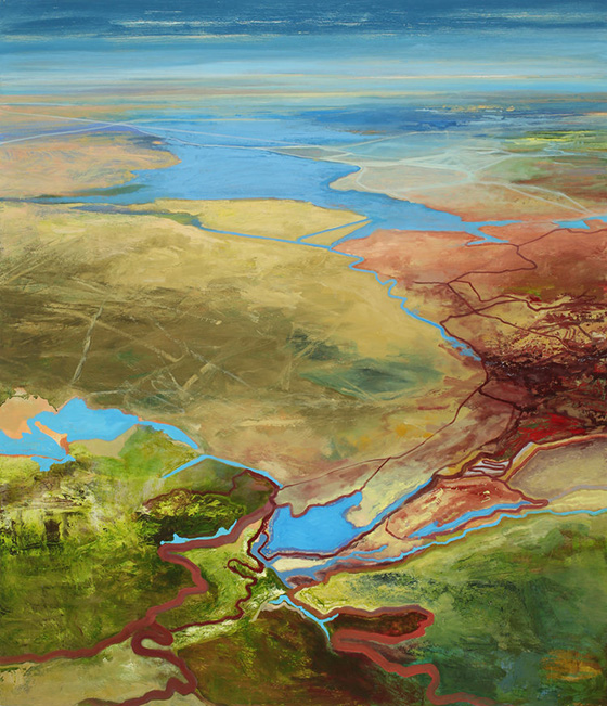
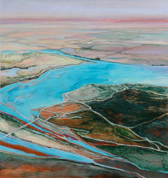
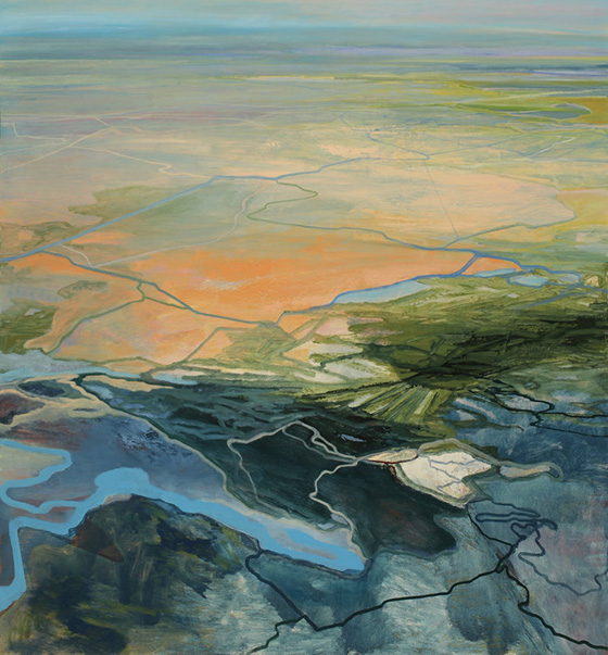
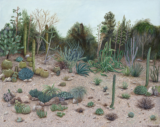
Philip Govedare‘s interpretation of our many landscapes are compelling and beautiful. The light, color, texture, and atmosphere he brings to each helps give meaning to each place.
My work is both a response to and an interpretation of the world, but it also imparts sentiment through projection that comes from a perspective of anxiety about the condition of landscape and nature in our world today. I endeavor to create a fictional response to an observed phenomenon, a metaphor that is infused with a blend of celebration, apprehension and doubt about our place in the natural world. In this manner, this work may allude to the past and simultaneously project into the future.
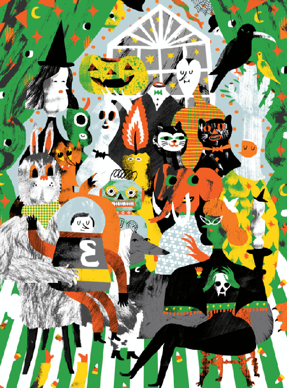
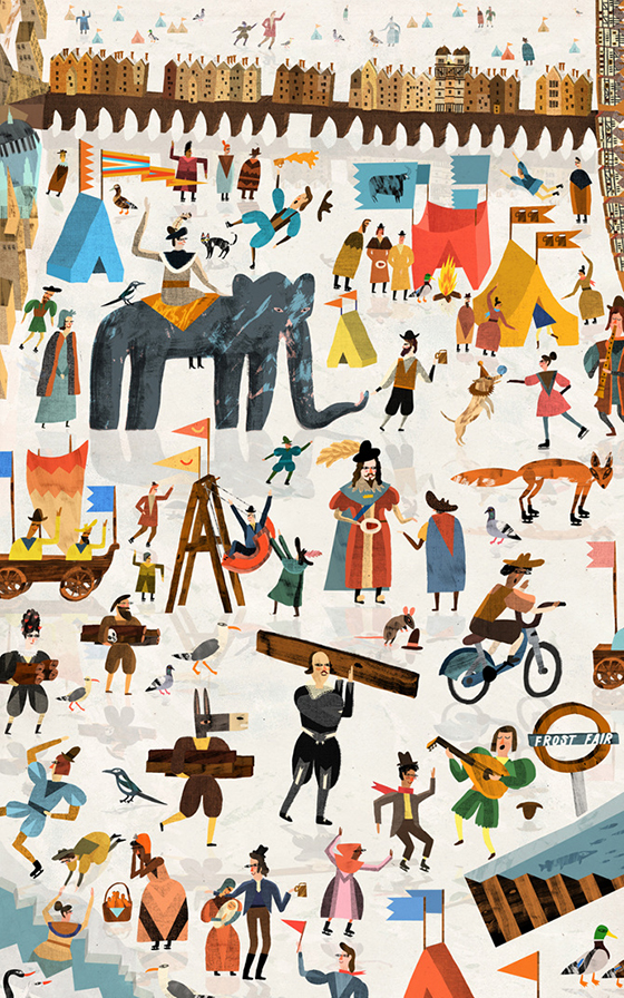
Fun, lively, mysterious – illustrator Nicholas Stevenson covers all these adjectives and more with his richly colored imaginary scenarios. My favorite? His Diary of a Time Traveller pieces created for a children’s book of the same name.
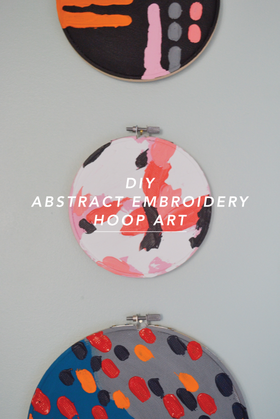
Welcome to our second new series of 2017! After nearly ten years of sharing the creativity of others, I thought it was high time we started creating more ourselves. These projects are just as much for me as they are for you. Working in a creative industry tends to have the opposite effect of what you might expect, and my own personal art has taken a backseat. I aim to change that starting with this post.
So, what can you expect? A loosely guided art project once a month that leaves plenty of room to explore and make your own. I’ll share my own take on it and leave you to the rest with a list of supplies and your own hands.
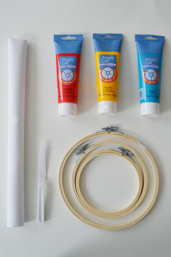
Supplies
• embroidery hoop(s)
• embroidery fabric
• acrylic paints
• palette knife (a disposable plastic knife will do in a pinch)
• acrylic paint brush
• jar with water for rinsing
• paper towels
• paint palette (or paper plate)
• scissors
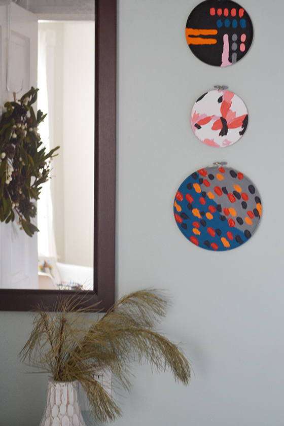
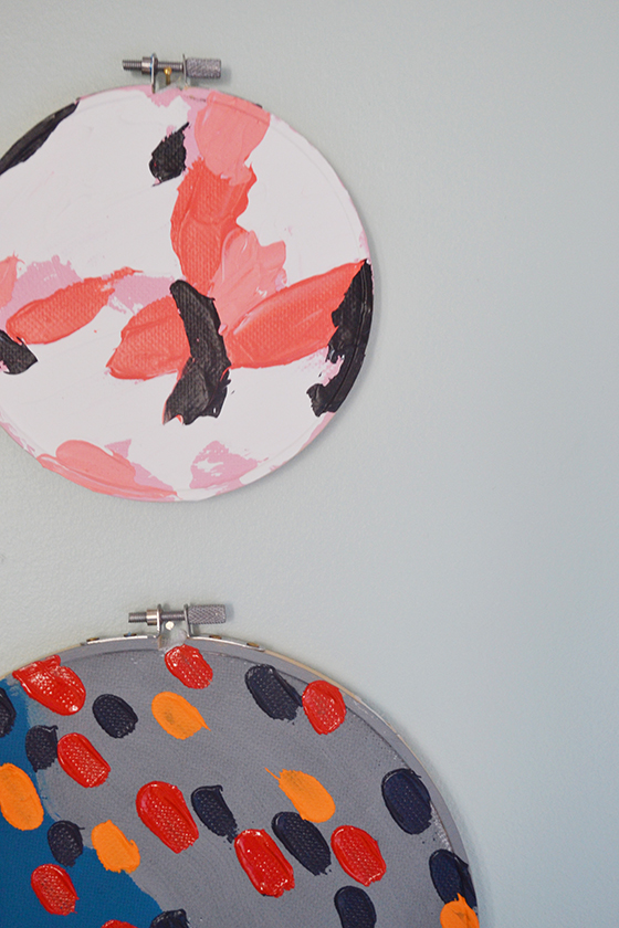
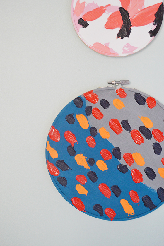
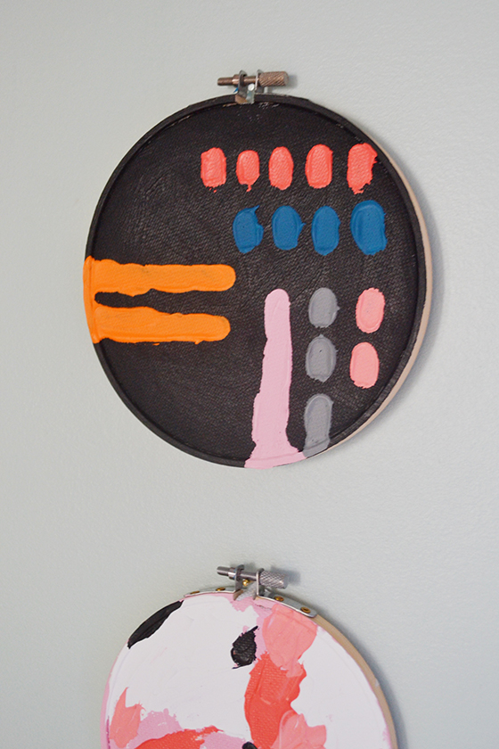
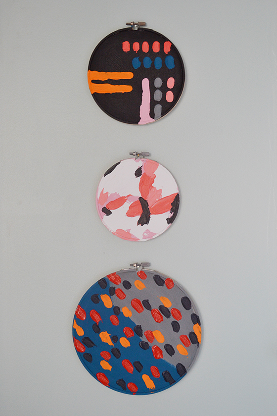
I began by finding two color palettes I liked that could be easily mixed and matched – mainly blues, corals, goldenrod, and grey. I also knew that I wanted my three hoops to be related in style to look cohesive when hung together, and I accomplished that in two ways. First I made sure to use colors from the first two pieces together in the third, and second I made each painting slightly more organized in style than the previous. (Can you tell the order?)
Begin by disassembling the embroidery hoop and stretching the embroidery fabric over the inner hoop before pulling the fabric taut and replacing and tightening the outer hoop. I waited until the end of the project to trim off excess fabric from the back, but you could do that now as well.
Next you’ll want to pick up that paint brush and paint the entire “canvas” background however you see fit, making sure to paint over the top edge of the embroidery hoop as well. (Sidenote: this is the only time I used a brush throughout)
After the background is dry it’s time to put that palette knife to work. Squeeze each of your chosen paint colors onto your palette, and if you’re mixing a new color remember that it’s always better to mix too much than too little because it’ll be nearly impossible to recreate that color again. Load up the underside of the knife with a dollop of paint and use it as though you’re icing a cake. I didn’t bother waiting for colors to dry in between, just used a gentle hand to avoid mixing. The paint should be thick enough on the fabric that you can see definition, no need to refrain.
Once finished I let these guys hang out for a solid 24-hours to dry. Those thick layers of paint will take at least that long to set up fully. I then used some small finishing nails to hang them on the wall, just under each hoop closure.
I hope you love this new series and will join me in bringing more creativity into your life! And if you complete any of the projects I’d love to see – just tag @designcrush.
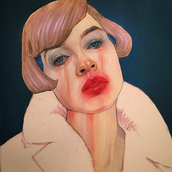
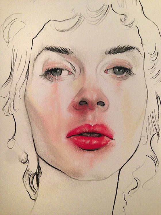
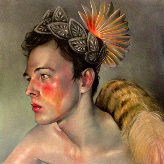
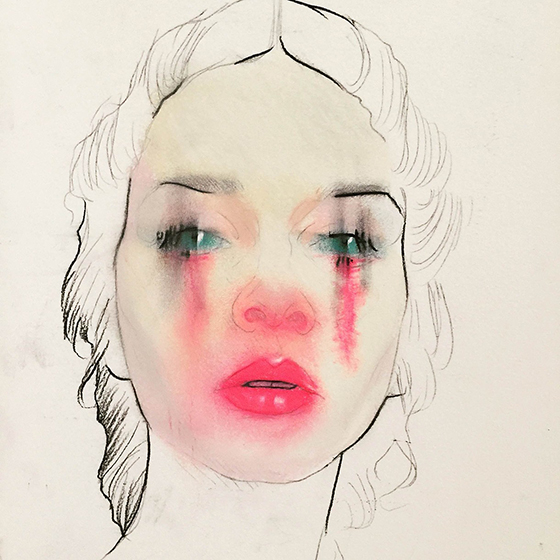
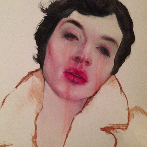
Miami-born artist Barnaby Whitfield works with a slew of mediums – pastel, oil, chalk, charcoal, and more – to create portraits that feel as though they have one foot in this world and the other in the next. Each one looks as though it’s breaking through the veil.
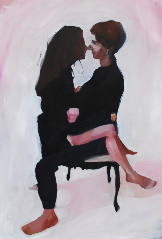
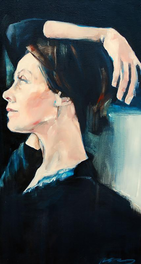
I really like how Ruth Shively‘s paintings go between a little detail and a lot, all depending on the piece. An indication of a face holds the same amount of weight as more detailed hair elsewhere.
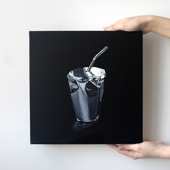
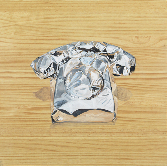
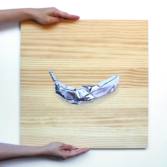
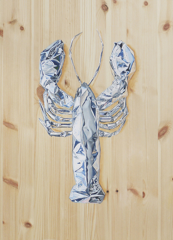
Gemma Gené‘s Unapologetic Paintings look like objects wrapped in tin foil, but in actuality are oil paint on wood. In this series the object is hidden by its skin or wrapping and is only revealed by the viewer’s imagination.
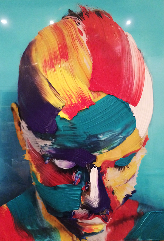
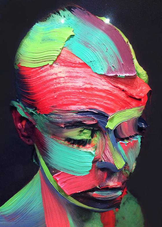
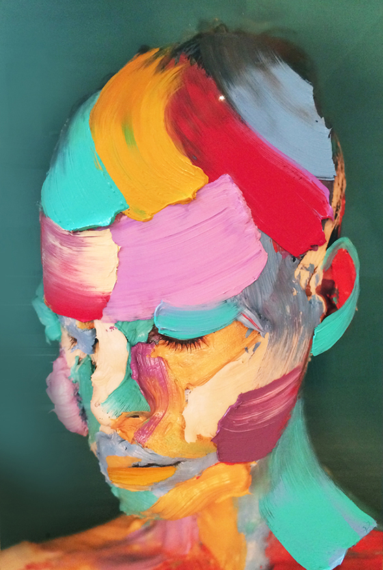
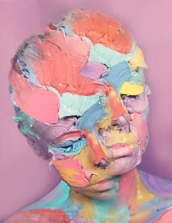
Meet artist Sophie Derrick. Yup, that’s her – right there under all of those layers of paint. Sophie uses her own body as a canvas before photographing the results and then painting on top of those as well, blurring the lines between painting and photography in the process.
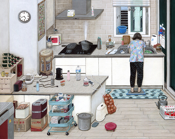
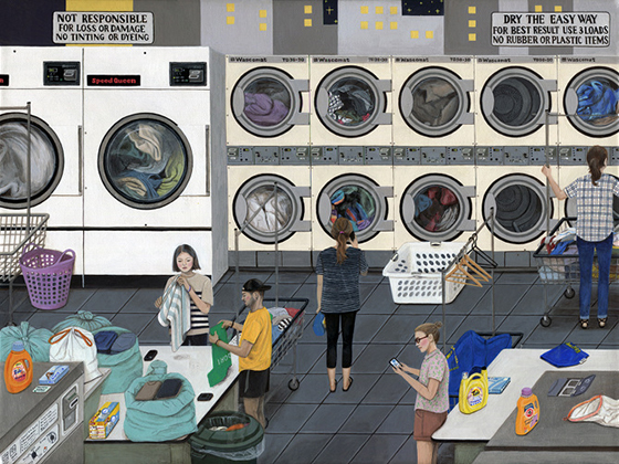
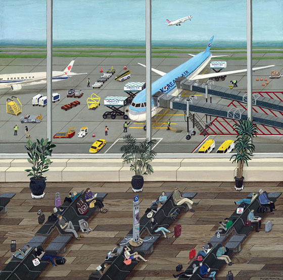
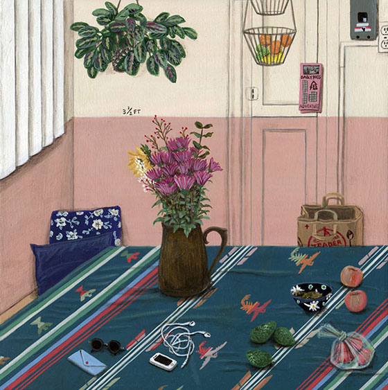
Just when everyday life seems to be exceptionally boring, a superbly talented artist like Paige Jiyoung Moon pops up on my radar as a reminder that it’s anything but. In fact, it’s quite beautiful. Paige’s slice-of-life paintings and drawings turn mundane tasks like doing the dishes and going to the laundry mat into well thought out scenes full of color and detail.