Happy Weekend

1-Design Crush

2-Design Crush

3-Design Crush

4-Design Crush

5-Design Crush

6-Design Crush

7-Design Crush

8-Design Crush

9-Design Crush

10-Design Crush

01/ How to Make Your Cat an Internet Celebrity and achieve financial freedom.
02/ Pizza in the Wild is exactly what you’re expecting.
03/ Vans has teamed up with the ASPCA with some awesome cat and dog covered kicks.
04/ Meet Puk – a super awesome suspended fruit basket.
05/ The Black Dogs Project shows the beauty of the most neglected shelter animals.
06/ Food becomes abstract art in Cut Food.
07/ Sirs Ian McKellen and Patrick Stewart take on NYC like tourists.
08/ A cardboard cathedral made from 98 cardboard tubes and 8 steel shipping containers.
09/ Watch what happens when you put 8 million flower petals inside a volcano.
10/ These vertical playgrounds looks like so. much. FUN.

This week on Design Crush:
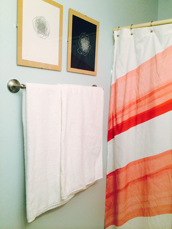
I made my guest bath a little less blue, a little more light for SWPaintingWeek.com.
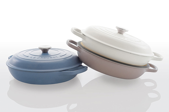
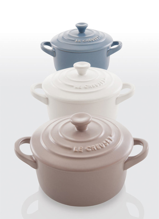
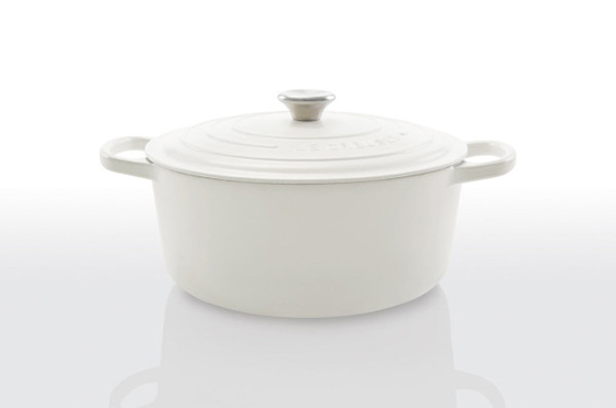
Le Creuset’s Matt Collection is incredible.
Jujujust works magic in her fiber art and other creations.
I’m so excited to be opening up a boutique with GREAT.LY next month!
You need to make this Overnight No-Knead Bread this weekend. You’ll thank me later.
Lovely family trees that are perfect for Mother’s Day or any day.
Eight prints: April edition.
What You Are, Be a Good One is a book full of beautifully illustrated quotes.
The wild and wonderful watercolors of Sara Falli.

0

Le Creuset Matte Collection

Le-Creuset-Matte-Collection-1-Design Crush


When Le Creuset revealed their new matte collection a few weeks ago (it’s now in stores) I most definitely did a combination hold my breath/squeal/internal happy dance. I’m excited to check out these new muted tones from the company that’s known for bright and glossy pops of color in the kitchen in person.
 

Le-Creuset-Matte-Collection-2-Design Crush


Le-Creuset-Matte-Collection-3-Design Crush

0

A Little Less Blue, A Little More Light

SW-NPW-1-Design-Crush


After our teaser last week, I’m back today with my bathroom reveal for National Painting Week! That’s right, I went with a subdued version of the color that was already in play. There’s just something about a blue of any hue that feels refreshing. And because this is also the bath directly across from the guest room I wanted to keep things in the same color family to feel slightly related.


SW-NPW-6-Design-Crush


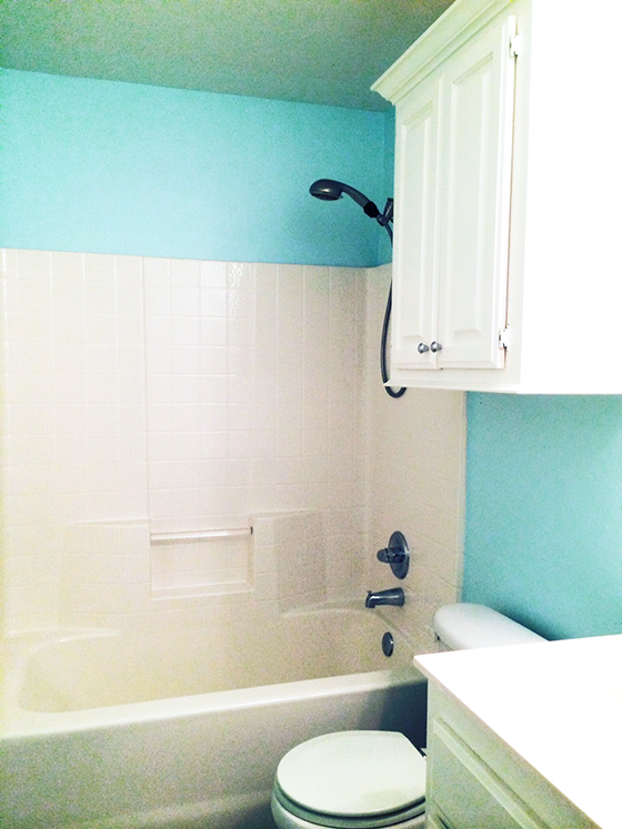
In case you need a reminder (it is Monday after all), here’s the bare bones empty before shot. My goal was to make this windowless hall bath as appealing as possible to buyers since I’m gearing up for a move and will soon be putting my home on the market.


SW-NPW-9-Design-Crush


SW-NPW-8-Design-Crush


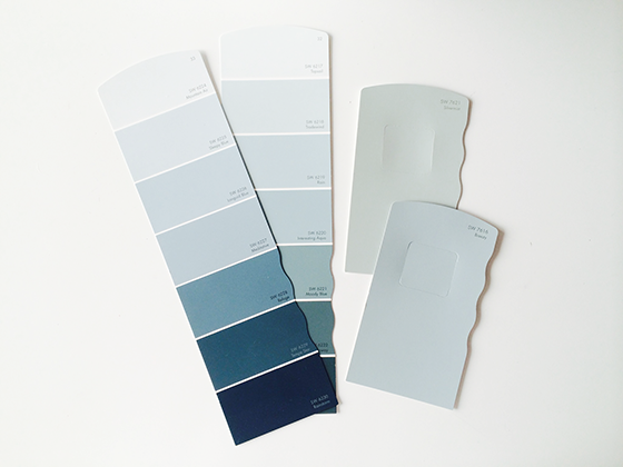
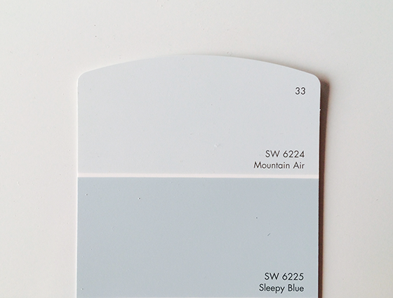
I visited my local Sherwin-Williams store and picked up some paint chips to test against the light about a week before painting. This is definitely an important step, colors that differ only slightly can look hugely different depending on what light they’re in. The winner was Mountain Air, a super light blue-grey that feels unbelievably fresh and welcoming.


SW-NPW-2-Design-Crush


SW-NPW-3-Design-Crush


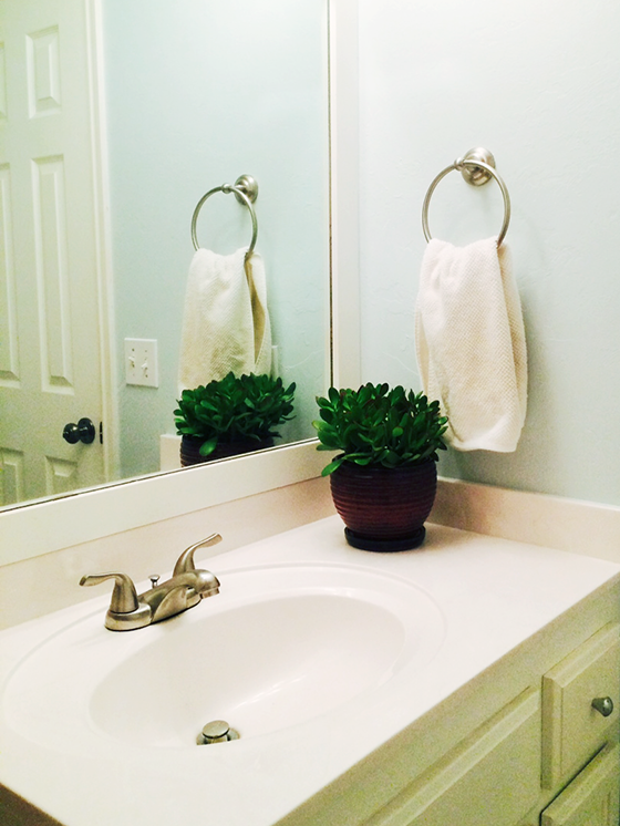
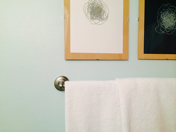
I really love how Mountain Air looks with the other elements I’ve added to the room – a new jade plant (that will hopefully survive!), a shower curtain with a splash of coral, and a few abstract drawings are all helping me achieve a relaxed feel. I also bought some new white towels and hardware to add to the equation for an overall refresh.


SW-NPW-5-Design-Crush


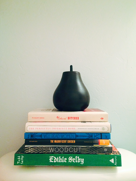
And then I went a little overboard and added a stack of favorite books because, well, it is a bathroom. I also like the pops of color and type they bring to the room. All in all I’d call this project a huge success! I think when I remove the pieces of my personal style any potential buyer should be able to picture themselves putting their own spin on this room.

Check out my fellow bloggers sharing their blue projects today for SWPaintingWeek.com – Remodelaholic gave her daughter’s room a refresh and The City Sage gave a side table new life. Tomorrow tune in to Vintage Revivals, Four Generations One Roof,  and Simply Grove to see how they worked their magic with green!

Disclaimer: This is a sponsored post for which I received compensation. All words and opinions are my own. Thank you for supporting the brands that help keep Design Crush going!

6

Howkapow Spring Collection

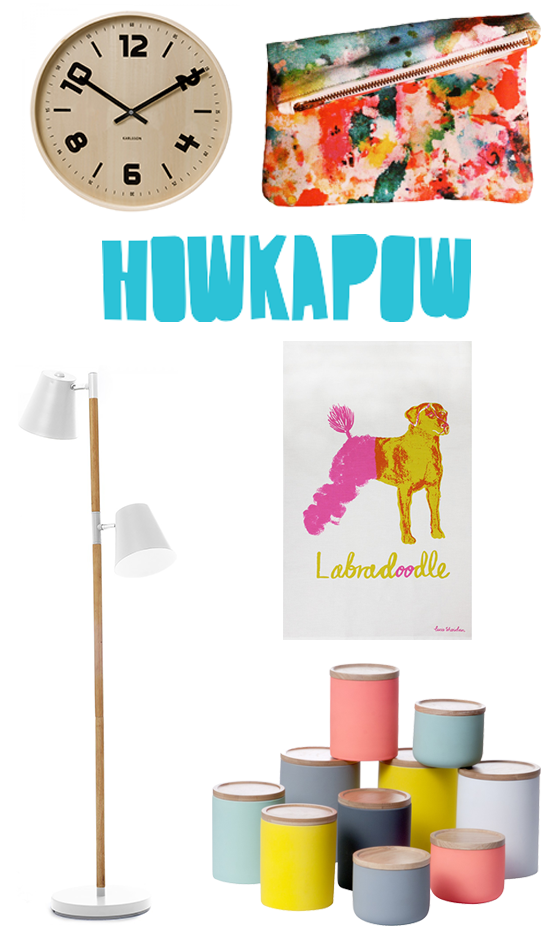
Bristol, England-based Howkapow brings a smile to my face every time I visit them online. Their shop is full of innovative, fun, interesting work from breakthrough talent as well as a few carefully-chosen independent, family-run brands. There’s an ever-changing collection of unusual pieces at affordable prices, and their spring collection was just recently released so I thought I’d share a few of my favorites with you.


Howkapow-Spring-14-Design-Crush

Wooden Dutch Wall Clock // Art Pop Mini Clutch // Rubi Floor Lamp // Labradoodle Tea Towel // Silk Canisters

0

Moving Prep

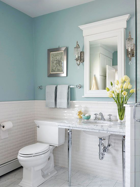
Among the long list of things required for my upcoming move is prepping my house for sale. Oh, the intimidation. I always knew I wouldn’t be in this home for that long in the grand scheme of things, so most updates and decor decisions were made with that in mind. The few places I strayed were my guest room, my front door, and my hall bath – which I  painted a Tiffany blue the weekend I closed on the place. While I love the pop of color it brings to the windowless room, I realize that potential buyers may not feel the same way.


National Painting Week Teaser-1-Design Crush

PHOTO: Better Homes & Gardens

When Sherwin-Williams asked me to team up with them once again for National Painting Week I knew this was the room that needed my attention most. My goal was to have it blend in a bit more with the rest of the house’s relaxed and muted palette while still retaining the feel of being light and open. The wall color was close to the above blue, but kickier with a touch more green. (Just trust me for now.)


National Painting Week Teaser-2-Design Crush

PHOTO: dustjacket attic

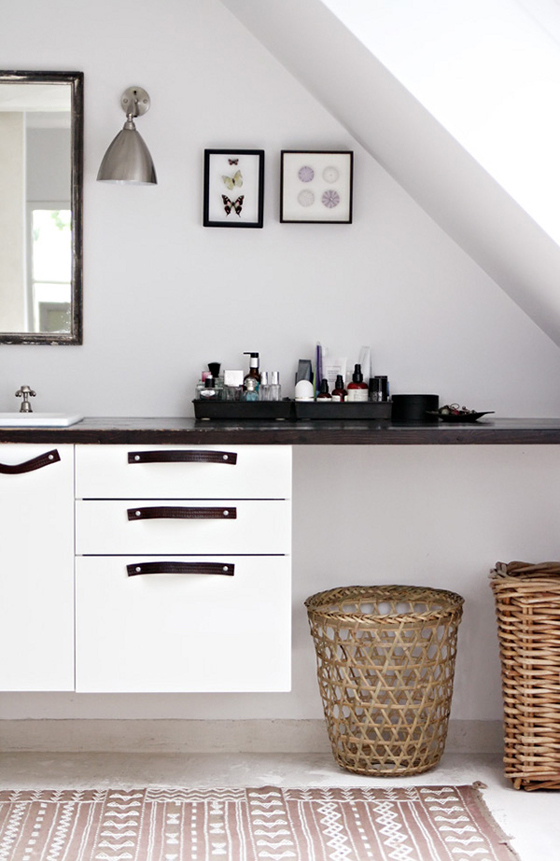
The way I saw it I had three options. One was the obvious route of straight-up white. There’s something innately refreshing about a blank canvas, and surely that would appeal to buyers when they were trying to envision themselves living here.


National Painting Week Teaser-3-Design Crush

PHOTO: Canadian Home Trends

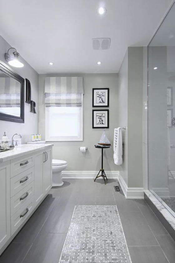
The second was a neutralizing grey. Something light with some yellow undertones for warmth that would pull in the dappled brown floor tiles. Plus, nearly everything goes with a good grey.


National Painting Week Teaser-4-Design Crush

PHOTO: Better Homes & Gardens

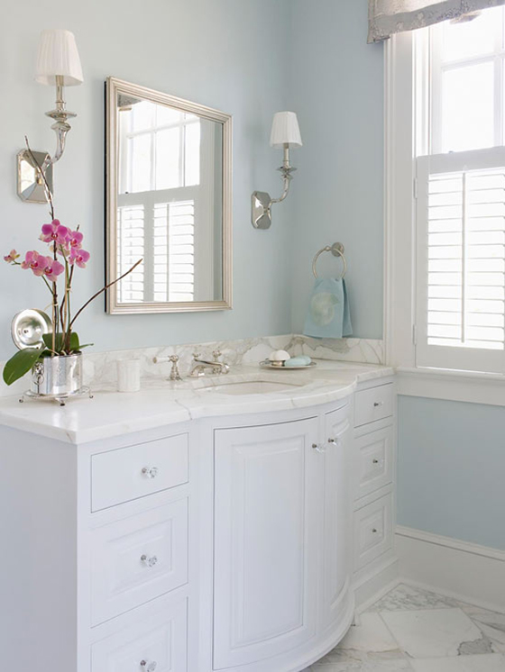
The third option would be to stick with the blue, just tone it down a bit. Blue bathrooms always seem to have a spa-like quality to them that no other color comes close to.

I’ll be sharing my full bathroom reveal April 7th. SWPaintingWeek.com will be sharing inspiration, ideas, and more to get your creative juices flowing for your own painting projects all week long so be sure to check in. There will also be projects from 14 other design bloggers celebrating National Painting Week, so get ready for things to get colorful!

Disclaimer: This post is sponsored by Sherwin-Williams. Though I have been compensated, all words and opinions are my own. Thank you for supporting the brands that help keep Design Crush going!

0

Happy Weekend

1-Design Crush

2-Design Crush

3-Design Crush

4-Design Crush

5-Design Crush

6-Design Crush

7-Design Crush

8-Design Crush

9-Design Crush

10-Design Crush

01/ Nice Nosing You, a photo series that gets up close and personal with dog snouts!
02/ All Hail the King explores the different personas of Walter White.
03/ Check out these custom rolling pins that print across dough!
04/ Incredibly detailed macro photos of butterfly and moth wings.
05/ Beach trash found in New York Harbor is given a new life in Found in Nature.
06/ An NYC cyclist-inspired print made with seven different bike tires.
07/ Field Note’s Sherwood edition features covers made of American cherrywood!
08/ Mirror Culture uses 6,000 CDs and fishing line to reflect crazy light.
09/ Four posters inspired by Wes Anderson’s most popular films.
10/ What happens when you zap instant film with 15,000 volts?

This week on Design Crush:
Two illustrators, two cities, two coasts – loving Hello NY and Meanwhile in San Francisco.
Beauty tips and tricks on the cheap.
Crushing on Barbara Macfarlane‘s energetic city maps.
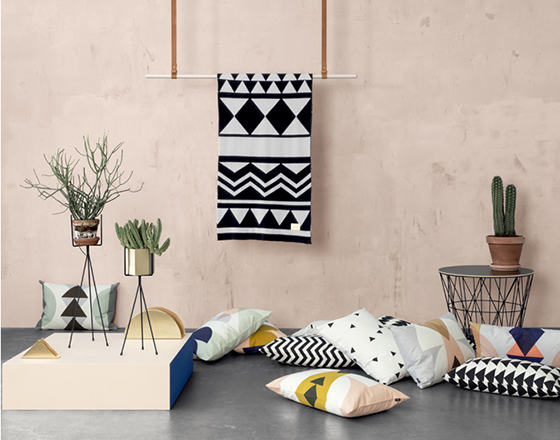
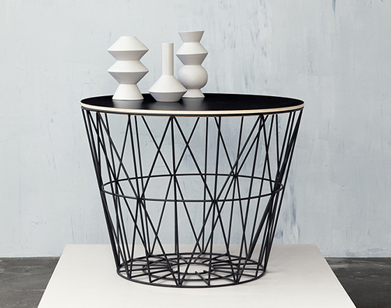
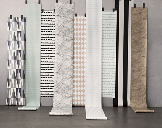
ferm Living’s spring collection is definitely channeling the season.
Dreamy mid-century pastel illustrations of homes from Chris Turnham.
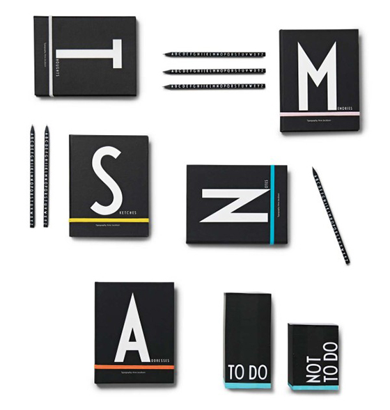
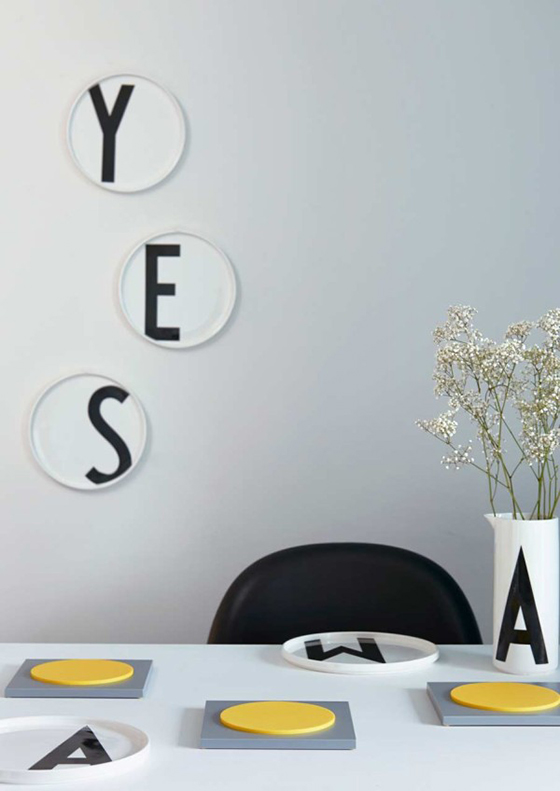
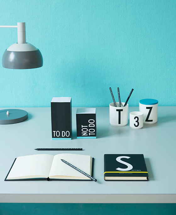
Graphic home and office goods from Design Letters & Friends.
Retro-modern art featuring top musicians from Tuna Bora.
ALERT! Trending: Fiber Tapestry Art!
Collages that I’d like to turn into fabric from Kate Lewis.

1

Standing Bowls

Fort Standard-1-Design Crush


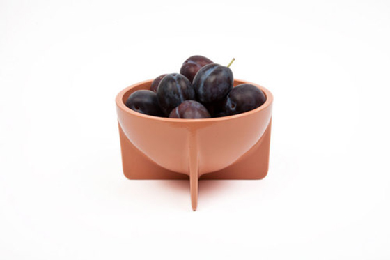
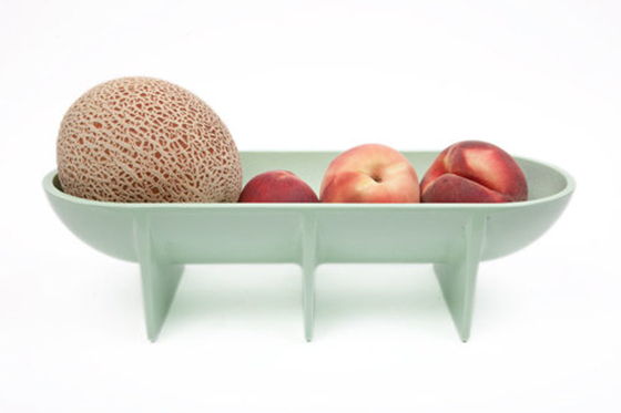
I love the shape and design of these Standing Bowls from Fort Standard. At first glance I thought they were ceramic or porcelain, but nope – they’re sand cast aluminum! That means these guys are completely food safe and great for everyday serving and use. I’ll take the big guy for my fruit dish!


Fort Standard-2-Design Crush

0