Welcome Part 5: the Hall Bath.
 My hall bath is probably what I would consider the most fun looking room in the house. Yes, that’s right, I just called a bathroom “fun looking”.
Originally this room was slated to be painted beige. But when I had some of this robin’s egg blue (the actual name of the paint has long since left my memory) left from another room I decided to go for it. I already had the shower curtain and the prints for the walls, so it played into my colorful scheme perfectly.
 One of the (many) nice things about all the color is that I don’t have to really worry about bath towels ever not matching! It’s also really fun to accessorize for this space, which is what I’m in the process of doing right now.
There are really only two changes I’d like to make in the near future: install a wall mounted shower rod and replace the faucet fixture for the sink.
 Miraculously, all of the different colors don’t make this space feel any smaller than it already it. I blame it on the white cabinetry.
 brushed nickel double handle bathroom faucet •
satin nickel screw mount shower rod
The Daily Eat: Beachy Green Pesto Pizza.
I’ve tried pesto on lots of things, but never pizza. And pizza seems sort of a like a no brainer match. Now my stomach is straight up growling at the sight of this Beachy Green Pesto Pizza!
Posted In recipesAaron Feaver.
Aaron Feaver is an obviously gifted photographer. The way he makes his work look so effortless and in the moment is proof enough of that.
I’m head over heels for his Oceanside series where he perfectly captures the hazy, hot days of summer.
Posted In create, photographyMad Props: June.
 June was a stellar month for blogging and one of Design Crush’s biggest Mad Props ever! Thanks for all the creativity and inspiration, everyone.
Win It: Heather Kintner Winner.


Congrats Jen! Sounds like your sister’s bachelorette party is going to be amazing. I’d also like to Heather for doing this giveaway! I’m a big fan of her work and if you haven’t already, stop by her etsy shop and take a look around.
Welcome Part 4: the Dining Area.
 My dining area is tiny. There’s only room for a four seat table and my bar cabinet. But it’s the perfect size for me right now.
The first thing I did, before I even had any furniture for the space, was replace the existing light fixture with this structural one that a lot of you will recognize from IKEA. It doesn’t emit a lot of light, but with the patio doors being right there I don’t really depend on it for that purpose anyway. It’s definitely something that has better looks than function, but it remains of my favorite things in the house.
 Because of the limited space I really wanted two things out of a table. I wanted it to have nice lines and I wanted it to not stand out against it’s surroundings too terribly much. Luckily I was able to find a set that met both of those requirements and not break the bank. Once again, thank you IKEA!
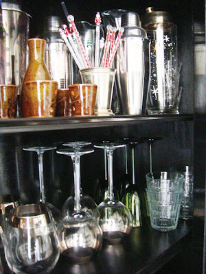
 Somehow over the years I’ve acquired quite a collection of barware. I love chrome and glass and wanted to be able to showcase it instead of hiding everything behind cabinet doors. Thankfully, this china cabinet that I restored has a glass door, allowing me to do just that.


