A Moving Update

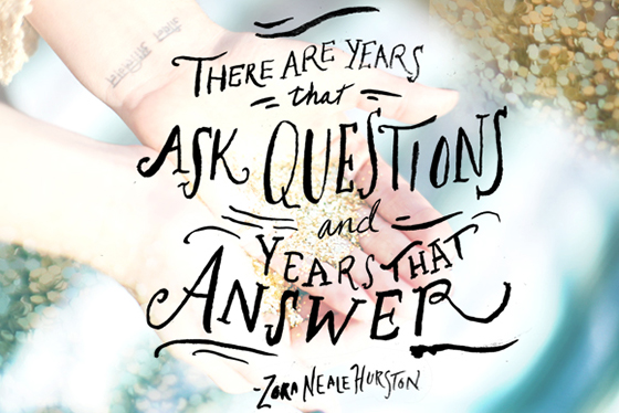
Zora neale Hurston-Design Crush

Image: Free People Blog

It’s been a few months since I’ve shared the news that I’m moving back to my hometown of Pittsburgh this year, so I thought I’d give you a candid little update on the process.

This is easily my most stressful move ever. Never before have I dealt with selling and buying homes simultaneously, let alone halfway across the country from one another. So many firsts. The real estate market is hot in Pittsburgh right now, but I honestly haven’t found many houses that I can picture myself living in. And the majority of homes in my price range are much older than here in Oklahoma City, so I guess I’ve been spoiled a bit and am having a tough time coming to grips with how much renovation I’m willing to take on. (Though it would definitely make for some good blog content.) I need to make the time to schedule a trip to check things out in person but keep putting it off. Because of the temperature of the market basically anything I’m into is snatched up immediately. Womp womp. I’m hoping to share more in this arena once I start narrowing it all down to some serious house choices, and I hope you’ll come along for the ride/panic attack.

On the financial front, after months of putting off pre-approval on a home loan I finally got it together and sent everything off this past weekend. Being self-employed the bank basically wants my first born child. Though I’m making a considerable amount more now than when I was approved for my first home loan in 2008 they’re requiring a cosigner. I realize this isn’t unheard of, but it feels like a gigantic defeat and maybe a little bit like punishment for being unmarried and self-employed. Luckily my stepdad is great and has offered to fill that gap, so hopefully I’ll soon know what I’ve been approved for this go around. (Fingers crossed, everything takes longer in Self-Employedville.)

This past week I started packing up – “decluttering” – my house so that it’s ready to go on the market once a few of these other kinks are worked out. It feels cathartic to be able to take my time and get rid of things that I don’t want to schlepp with me instead of just shoving everything into boxes all willy nilly. A few of the better discards are being set aside for an Instagram sale I plan on having in a few weeks for local OKCers (pick up only) – so if you’re nearby stay tuned!

So there you have it. This move, along with some health issues that have popped up, have made 2014 quite the handful. I’m trying desperately to keep the end game in mind, but some days it’s harder than others and the negative side wins over completely. I know these are total first world problems too, which then makes me feel guilty. It’s an infinite loop, y’all!

2

Helena Wurzel

Helena Wurzel-1-Design Crush


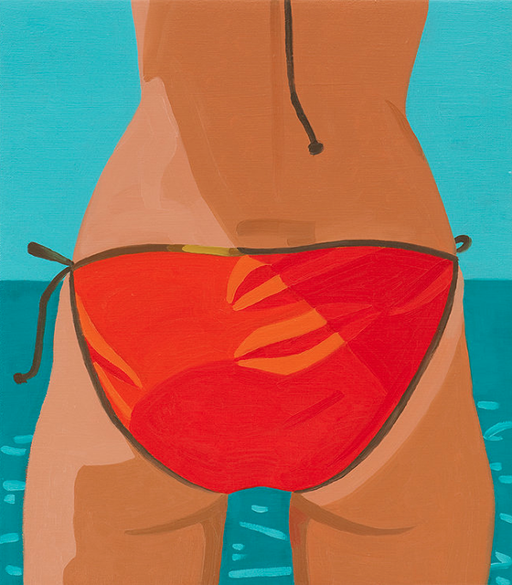
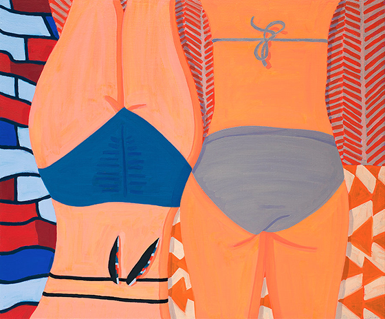
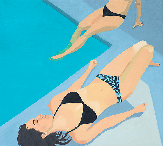
Butts have maybe never looked as good as these ones from Helena Wurzel! (Yup, that’s a sentence I never anticipated typing.)  Wurzel’s paintings of women lounging around and in pools are perfect for channeling that summertime vibe, and remind me of lazy days spent at the beach with girlfriends.  Helena’s paintings are on display at Jonathan Adler in Los Angeles and she also works as an independent artist for KateSpade Saturday – a busy lady for sure! Pick up some of her work for your own space at 20×200.


Helena Wurzel-2-Design Crush

Helena Wurzel-3-Design Crush

0

Happy Weekend

1-Design Crush

2-Design Crush

3-Design Crush

4-Design Crush

5-Design Crush

6-Design Crush

7-Design Crush

8-Design Crush

9-Design Crush

10-Design Crush

01/ A minimalist depiction of mental disorders.
02/ This zen rock garden is actually full of Japanese candy!
03/ Hilariously true animated gifs of basic tips and etiquette for surviving in NYC.
04/ Painstakingly crafting portraits of musicians made from cornflakes.
05/ Ringly lights up and buzzes when your phone needs you!
06/ This retired Boeing 727 was converted into a home in the woods. Would you dare?
07/ Picnic Lounge is an oversized blanket that resembles an antique rug. Clever.
08/ Smart ads for Keloptic turn impressionist art into realism.
09/ Social Planes take you offline – download, write, fold, and fly!
10/ When baristas and bartenders joins forces we are blessed with coffee cocktails.

This week on Design Crush:
Have you entered our Soundfreaq Sound Rise giveaway?! Wake up with this alarm/bluetooth speaker hybrid, it’s sure to get your day off to a good start.
Eight art prints I wish I had room for on my walls this month.
Melissa Zexter hand-embroiders her own photography in the most beautiful way.
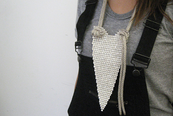
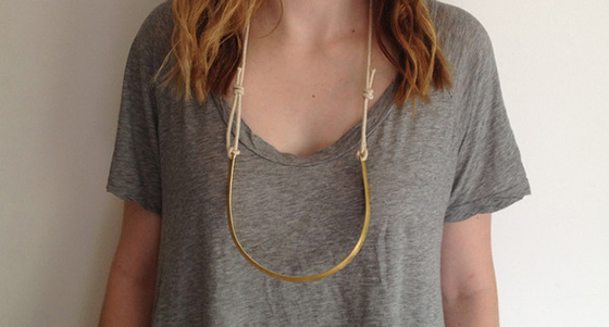
Industrialist meets rugged glam in the design of Maslo Jewelry.
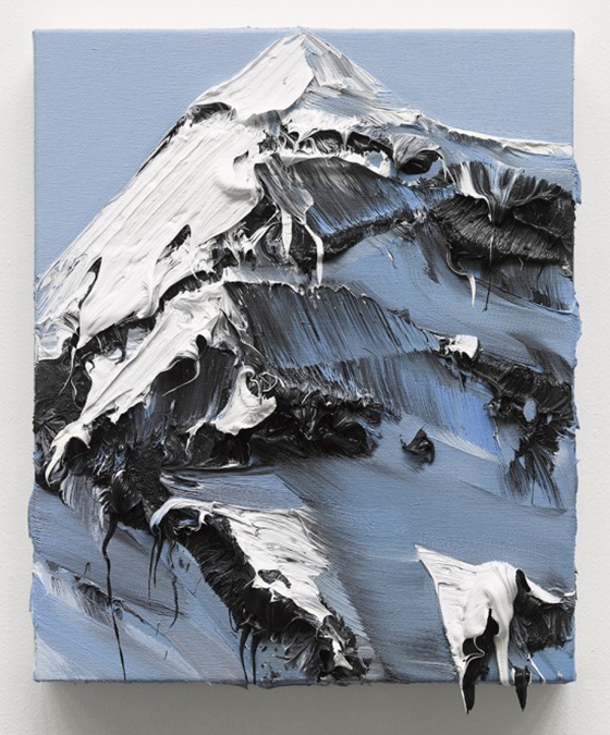
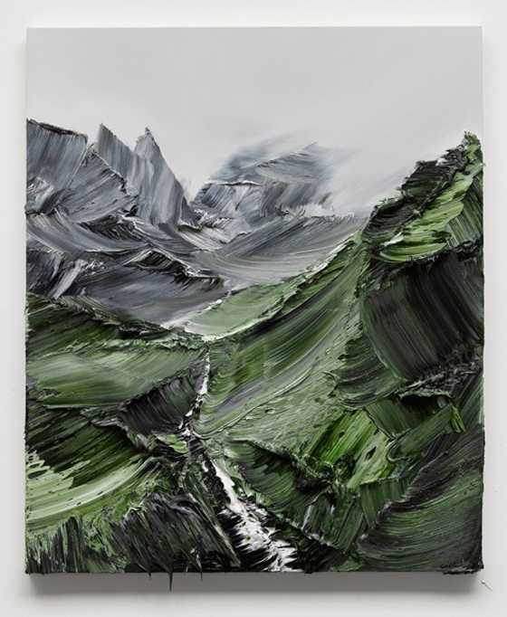
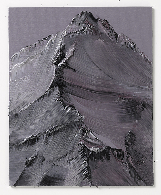
Crazy incredible paintings/sculptures from Conrad Jon Godly.
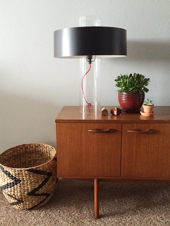
I’m slowing going minimalist with my style and this modern lamp is my latest addition.
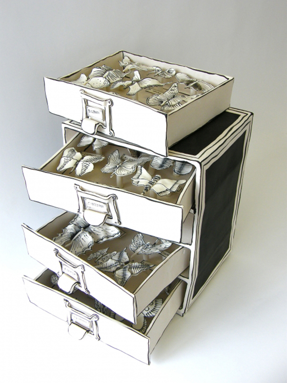
Childhood dreams and sketchbook drawings come to life thanks to Katharine Morling.
If you’re looking for a super easy project this DIY Matchstick Holder is where it’s at!
After seven years of blogging we finally have a Design Crush identity suite like pros.

0

Design Crush Identity Suite + 7 Years of Blogging!

MOO-1-Design-Crush


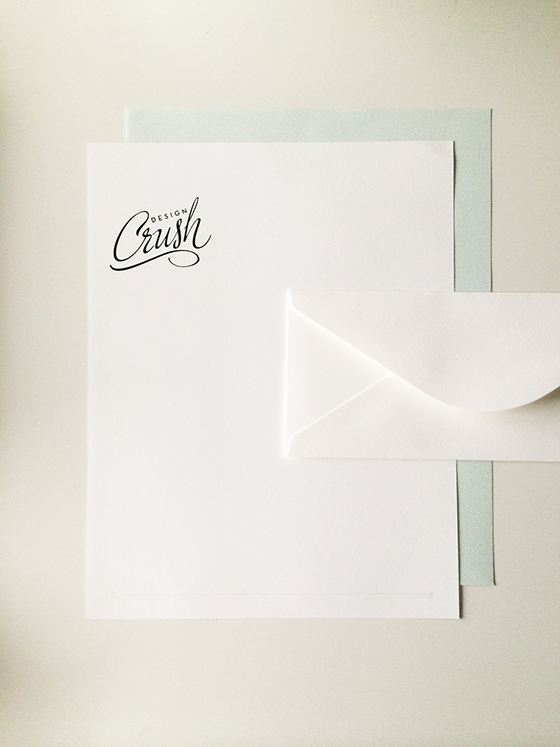
So it turns out I’m a bad blogger and missed Design Crush’s 7th birthday last Thursday – whomp whomp. But it also turns out that seven years of blogging means you’re kind of legit, and what better way to proclaim it that with an entire identity suite of paper goods from MOO.


MOO-2-Design-Crush


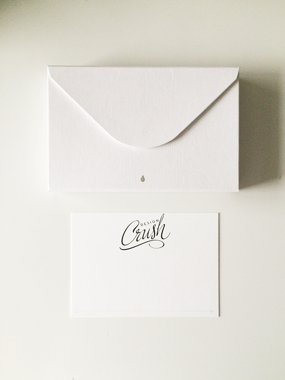
I went all out designing letterhead, postcards that double as notecards when slipped into an envelope, business cards and mini cards, and mailing labels. I pulled in elements from Design Crush’s site design like the diagonal stripes, dotted line, arrow, and signature green to keep the branding consistent. But if you’re not a designer, no biggie. MOO has plenty of templates you can use instead for an equally custom look.


MOO-3-Design-Crush


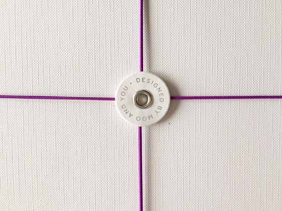
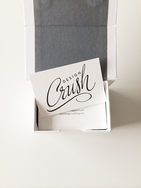
I opted for MOO‘s Luxe line, paper and card stock that go above and beyond to leave a stellar first impression. Each piece of our identity suite was packaged in a box with magnetic closure for maximum protection against crushed corners and the dangers of messenger bag interiors and office drawers and shelves.


MOO-5-Design-Crush

MOO-4-Design-Crush


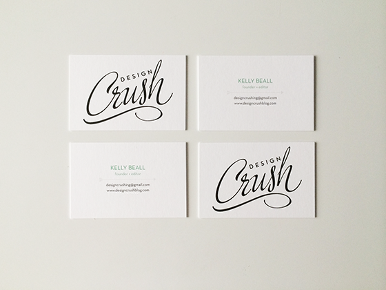
One of my favorite things to design – aside from logos – are business cards. For awhile now I’ve been wanting a super pared down version in black and white, so I decided to go for it and may never go back to anything more complicated. I love the simplicity and stark contrast!


MOO-6-Design-Crush


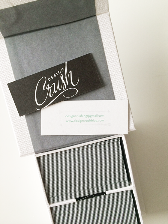
For the mini cards I changed things up slightly by adding a touch of our signature green and reversing out the logo on black. I imagine I’ll be using these for more casual contacts, so didn’t include my name or phone number.


MOO-7-Design-Crush


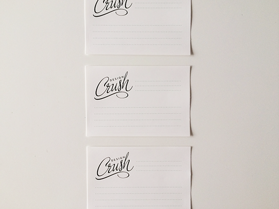
These sticker labels are super simple and can be used to organize things in my office or for the more obvious purpose of addressing packages going in the mail. Sufficed it to say I now feel prepared to handle any sort of communication emergency with all of my crisp and clean identity suite goods!

I received product from MOO for use in this post.

1

Make It: DIY Matchstick Holder

DIY-Match-Holder-1-Design-Crush


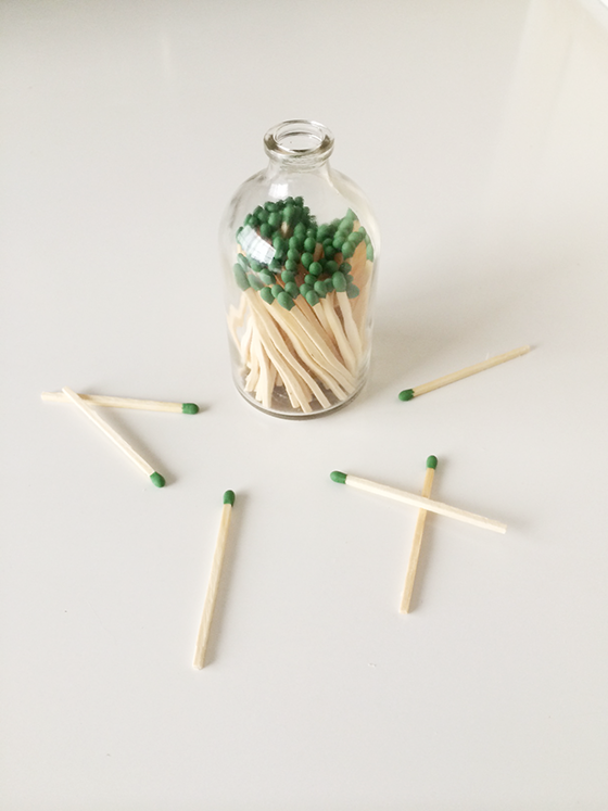
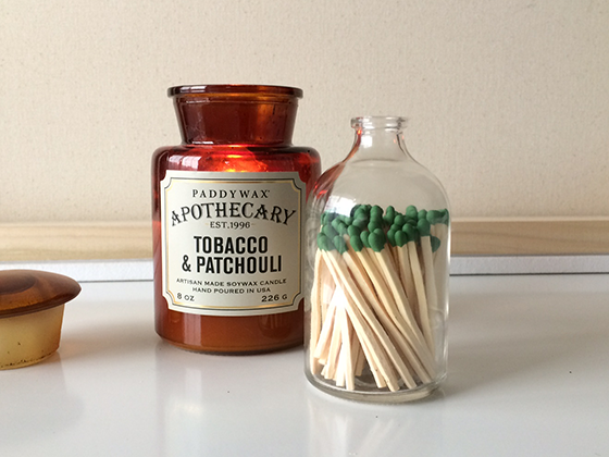
Yup, I know. It looks like I just plopped some matchsticks in a glass bottle and called it a day. While DIY matchstick holder is definitely one of the simplest projects I’ve ever done, there are a few more steps to it… but not many.


DIY-Match-Holder-2-Design-Crush


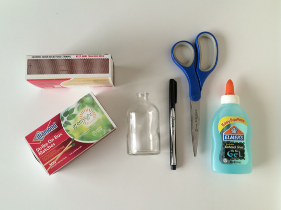
Supplies
• small glass bottle (I picked mine up at Michael’s for $1)
• strike on box wooden matchsticks
• pen
• scissors
• tape
• glue


DIY-Match-Holder-3-Design-Crush


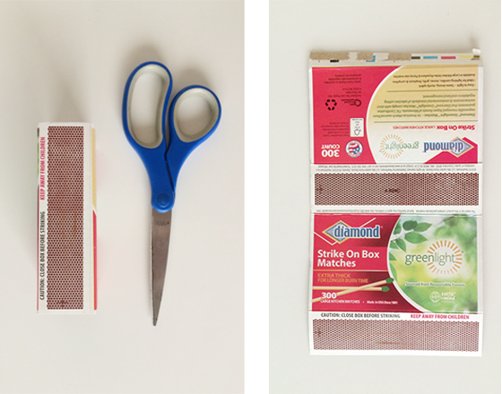
First thing first, dismantle the box sleeve that has the striker. Be as gentle as possible and flatten that bad boy out, and then grab your scissors.


DIY-Match-Holder-4-Design-Crush


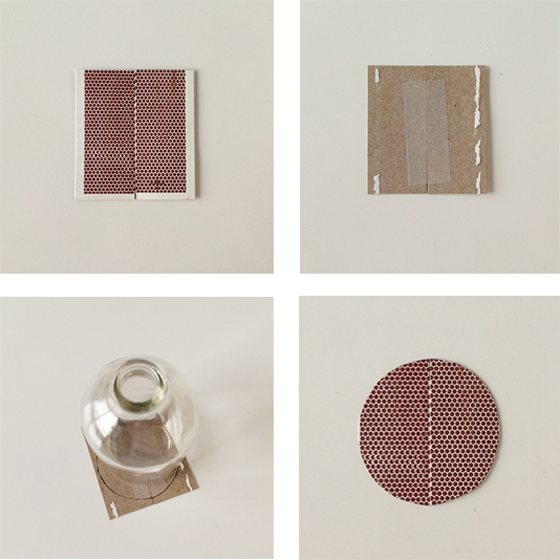
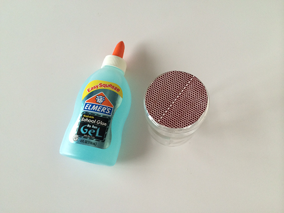
Trim off the striker panel, then cut it in half. Match the two sides up together (trimming them up to match if you were a little off), then flip over and tape on the back side. Place your glass bottle on top of the joined together pieces, center and trace. Trim around the circle (or whatever shape you end up with) and stay to the inside while cutting so that the end result is slightly smaller than your tracing.


DIY-Match-Holder-5-Design-Crush


Flip the bottle over and apply a few thin concentric circles of glue, align the striker shape you just created and press firmly. And, well, that’s basically it. You could add some craft paint or wash tape to the exterior for a little something extra, but I’m a simple kind of girl who prefers the look of wood and glass alone. (And though this isn’t really a Father’s Day DIY, I know my Dad would agree if it were for him!)


DIY-Match-Holder-6-Design-Crush


Add as many matches as you can while leaving enough breathing room for them to move around a bit. You want to be able to actually remove them for use after all! Like I told you, easiest DIY ever. I think this guy would make a great little hostess gift when paired with a candle or grilling accessories for get togethers this summer, don’t you? Or, like I said, maybe even Father’s Day this Sunday. (wink, wink)

7

Katharine Morling

Katharine Morling-1-Design Crush


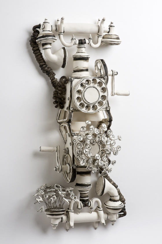
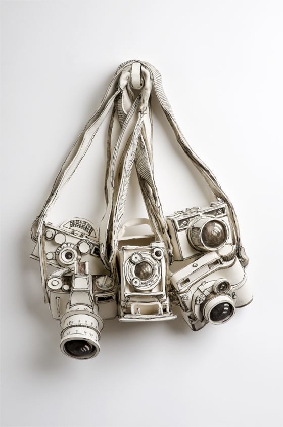
Katharine Morling‘s ceramic pieces feel like a combination of childhood dreams come to life and sketchbook drawings. In other words, perfectly lovely and quirky. The UK-based artist has been at it since 2003, creating pieces that are open to interpretation and invite curiosity and questions.
 

Katharine Morling-2-Design Crush

Katharine Morling-3-Design Crush

(via The Jealous Curator)

0

Going Minimalist

Lamps.com-1-Design-Crush


As I prep my house to go up on the market at some point this year, I’m realizing more and more about how my style has evolved since I moved in nearly six years ago. I’ve always been a tchotchke and accessories kind of girl but I’m thinking that’s going to change. I’ve gotten a head start on packing up a lot of smaller things, which has got me thinking about my next home and how I’d like it to be. My house is already more pared down than usual and I have to say, I’m loving it. Piece by piece I’ve been making small changes here and there, choosing things that serve more than one purpose. Am I becoming what I’ve always longed to be – a minimalist?

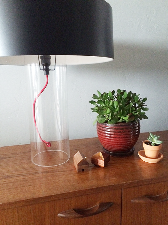
Case in point is the newest addition to my lamp addiction – Sonneman‘s Level Table Lamp. I love the mixed materials used in the design and that it’s not as feminine as a lot of other pieces in my home. Because it’s so sculptural it feels like form and function in one. Not to mention just how fantastic it looks atop the vintage Danish modern credenza in my living room! I have a feeling that this is a sign of how my decorating choices are going to be from now on.


Lamps.com-2-Design-Crush

For this sponsored post I received product from Lamps.com. As always all words and opinions are my own. Thank you for supporting the brands that help keep Design Crush going!

2

Conrad Jon Godly

Conrad jon Godly-1-Design Crush


Conrad Jon Godly‘s paintings are the work of my dreams. Seriously, I have daydreams about being able to heavily layer paint on a canvas in such beautiful ways. And I can think of few subjects more perfect suited for Godly’s technique than the craggy mountain ranges and peaks that he tackles with such aplomb.


Conrad jon Godly-2-Design Crush

Conrad jon Godly-3-Design Crush

2

Maslo Jewelry

Maslo Jewelry-1-Design Crush


Every piece of Maslo Jewelry is produced by hand in Richmond, VA by designer Nicole Maslowski. I love how her collections – these three pieces are from three different ones – swing between minimal industrialist and rugged glam in their designs. Perfect for the girl who likes a little bit of the unexpected in her life. (Psst… check out the prices!)


Maslo Jewelry-2-Design Crush

Maslo Jewelry-3-Design Crush

0