Alt Winter 2015

Alt Winter 2015-1-Design Crush


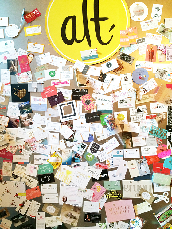
A few weeks ago, on a cold Wednesday, I headed off to Alt Summit in Salt Lake City. It was my sixth time speaking and it’s become that point in the year when I reassess my goals and mission for Design Crush, and connect with potential sponsors and like-minded people who see the value in blogging. Every January I come away feeling refreshed and refocused.


Alt Winter 2015 Brooke Dennis

Brooke Dennis for Alt Summit

The evening I flew into town Overstock hosted a dinner at Rest for some of the attendees. I didn’t have a real feel for the brand prior to that point, to be honest. But I’m going to be completely transparent here when I say that sometimes getting to know the people behind the company can completely change perception. Just a super lovely, very real team that was easy to talk to and hang out with and an insanely delicious meal (beer can chicken, paella, ceviche, pickled onion rings +more).


Alt Winter 2015-3-Design Crush


Thursday morning started bright and early thanks to jet lag and a poor night’s sleep – does anyone else have that issue the first night in a hotel? My roommate, Tabulous Design, and I took advantage and had a nice little breakfast (I’m obsessed with the Grand America‘s muesli and lattes) before talking to a few sponsors. I had to miss my friend Lisa Congdon‘s opening keynote for a few meetings, but everyone raved about it through the rest of the conference.


Alt Winter 2015 Brooke Dennis

Brooke Dennis for Alt Summit

My panel was one of the very firsts – Pinterest: Community Growth, Revenue Streams, Driving Traffic – with Alexandra Evjen, Rachel Faucett, and Sara Martineau. Among all of the panels I’ve ever been lucky enough to participate in, this one was prepared to the nines. These ladies know their stuff in a big, big way and they’re excited about it too. If you’d like a few bits of advice that we talked about check out Alex’s post-Alt post.


Alt Winter 2015-5-Design Crush


Wednesday night brought with it a Downton Abbey themed dinner. Proper and elegant with flowers I couldn’t stop taking photos of, the night ended up being an early one for me. After dressing up in a dropped-waist, short-sleeved seafoam colored dress and (heavy) statement necklace I just couldn’t hang after my four hours sleep the night before. Several episodes of The Big C later and I was passed out cold.


Alt Winter 2015-6-Design Crush

Alt Winter 2015-7-Design Crush


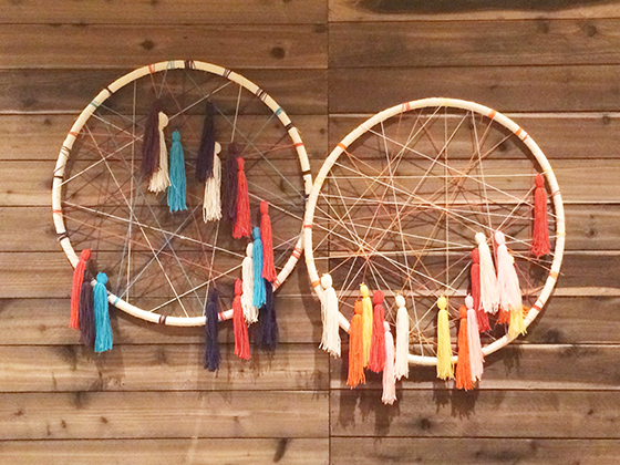
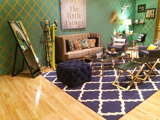
While at Alt I also teamed up with Microsoft and Wayfair in their #DreamStudio, one of the sponsored lounges. They divided the space into three areas – craft room, kitchen, and living room/office – and had a few bloggers giving mini session on fun topics like Upcoming Art Trends in-between the main panels. Because I spent most of my time here I didn’t get to attend any panels other than my own, but I loved getting to connect with other attendees about something I’m passionate about!


Alt Winter 2015-8-Design Crush


Alt Winter 2015-9-Design Crush

Alt Winter 2015-10-Design Crush

Alt Winter 2015-11-Design Crush

Alt Winter 2015-12-Design Crush


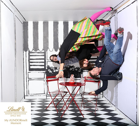
Friday evening were the Mini Parties, basically my favorite part of every year. Alt takes over part of the third floor of the hotel and each room is a different theme, most rife with photobooth opportunitues. My partners in crime were my roommate Tab and Dottie and Alix (aka Modern Kiddo). We had an agenda to take the best possible photos and stuck to it for three straight hours – the last one is clearly our money shot!


Alt Winter 2015-13-Design Crush


I normally stay In SLC through Saturday and leave Sunday, but this year there was a ridiculous price difference in flights so I said goodbye Saturday afternoon after a leisurely breakfast and some good conversation with longtime friends. If you missed out this go around and are dying to attend Alt tickets just went on sale for Alt Summer!

(Alt 2010 (day 1 + day 2), Alt 2011, Alt 2012 (what I learned), Alt 2013,  Alt 2014)

1

January Marketplace Refresh

January is the perfect time to take a look at life and maybe make a few changes. I’m not talking huge life altering things, more like tiny refreshes with a focus on increased quality in life and home. I’ve updated The Marketplace with plenty of new goods to make your January refresh a reality. Plenty of new home goods, art, and more – here are just a few of my favorite pieces.
 

January-Refresh–Great.ly-Design-Crush

The Family of Things: Woodland and The Family of Things: Polar can add a bit of magic to your walls. A colorful geometric pillow cover packs a punch of color for your living room or bedroom. This navy dot cotton scarf is a great piece to layer with to keep out the chill. Use this cork bowl in the kitchen to corral all of that lovely citrus bounty. The understated Nebula Bangle will work hard all winter, then transition with your wardrobe to spring. Don’t forget about your skin – use this detox body oil in your bath and on your body. Make your time in the kitchen happier with this sweet hand block printed tea towel.

See all of or makers and their goods over on The Marketplace!

0

Custom Color Matching with Sherwin-Williams

Sherwin-Williams-1-Design Crush


When I moved into my new space this past September it was painted the universal house staging color of buttercream. While a lot of people might be okay with that – it’s a neutral, isn’t offensive, etc – it may as well have been neon green to me. It was the very first thing I knew I had to tackle to make this place feel like home.


Sherwin-Williams-2-Design Crush


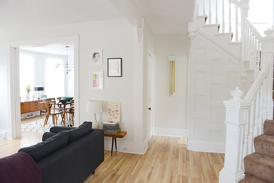
I’ve always had dreams of an entirely white and bright home. One that radiates light and would be the perfect gallery-like backdrop for the myriad of art I possess and love. After obsessing over paint chips I came to the conclusion that a ready-made color wasn’t going to be the answer, so I teamed up with Sherwin-Williams to do a custom color match.


Sherwin-Williams-3-Design Crush


I pried a piece of shoe board off in a doorway and headed over to my local Sherwin-Williams to get their expert opinion and advice. The assistant manager, Jared, gave me a few different color match options after scanning the piece of already painted wood. The two of us spent about fifteen minutes tweaking things until I was 100% happy with the shade. I opted for the darkest to create a small contrast between the walls and 10-inch molding that’s present in the whole house.


Sherwin-Williams-4-Design Crush


I went with Sherwin-WilliamsEmerald line because I’ve used it several times in the past and love the coverage and low odor. Jared also made sure I knew exactly which brushes would be best for the different areas of detail, as well as extension rollers that would help 5-foot-two-inch me reach the top of the 10-foot ceilings. After about thirty minutes I left with the confidence and know-how to tackle this project – did I mention that I’m painting the entire house this shade? Because yeah. The whole enchilada. The end result was a shade of not-white-grey/not-grey-white.


Sherwin-Williams-5-Design Crush


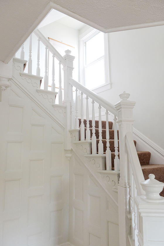
One long weekend and four helping hands later the first floor, staircase, and half of the second floor was done! I’ll be knocking the other two bedrooms and finished attic off the list as soon as it warms up a bit this spring. I’m thrilled with the result so far and guests who have seen the before and after love the look, too.

(See the entire first floor – living room, dining room, and kitchen.)

Photos: Quelcy Kogel

Product and consultation provided by Sherwin-Williams. All words and opinions are my own. Thank you for supporting the brands that help keep Design Crush going!

16

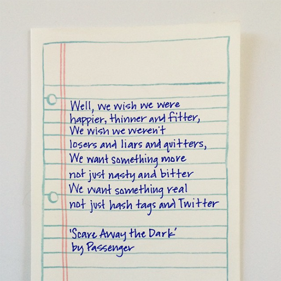
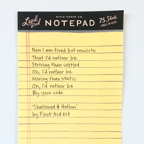
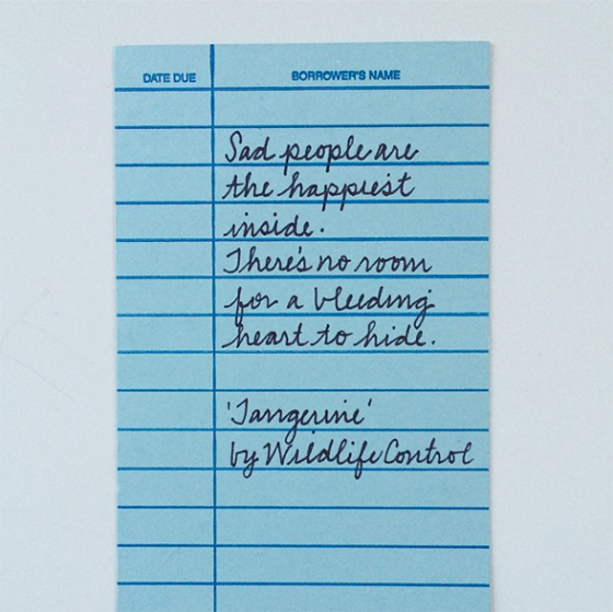
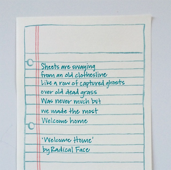
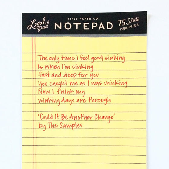
#365lyrics

#365lyrics-1-Design Crush


Before I introduce you to this year’s 365-day project, I just want to take a moment and thank you all for embracing last year’s #365quotes project and making it so rewarding. I never could have anticipated the response I received and I’m crossing my fingers that you’ll all roll with the punches and embrace #365lyrics just as much. That’s right, this year’s days are going to be filled with meaningful lyrics that resonate – whether that’s a punch in the gut, an eye-opening string of words, or a huge belly laugh. You can join in by following @designcrush on Instagram if you’re not already, and feel free to leave your favorite lyrics in the comments here or there.


#365lyrics-2-Design Crush

#365lyrics-3-Design Crush

#365lyrics-4-Design Crush

#365lyrics-5-Design Crush

0

Framebridge

Framebridge-1-Design-Crush


I have a confession to make. I’m a legitimate print hoarder.

I’d guess I own around forty pieces of varying shapes and sizes, but only about half are actually framed. As someone who likes to change up the art in her home frequently this presents a little bit of a problem, and if you visit you’ll often find pieces hung by metal clips/pants hanger/washi tape.


Framebridge-2-Design-Crush


Because I’m such a portrasti-framer (Can that please be a thing?) I’ve become very excited about affordable online framing. And one in particular, Framebridge. Basically you visit their site, then input the size of your piece and choose a frame style and a mat if you’d like one. Framebridge calculates the cost and then gives you the option of receiving a tube or flat mailing supplies or using your own. They email you the free shipping label to print and affix and you’re set. You can also send them a file you wish to have printed and framed.


Framebridge-3-Design-Crush


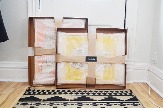
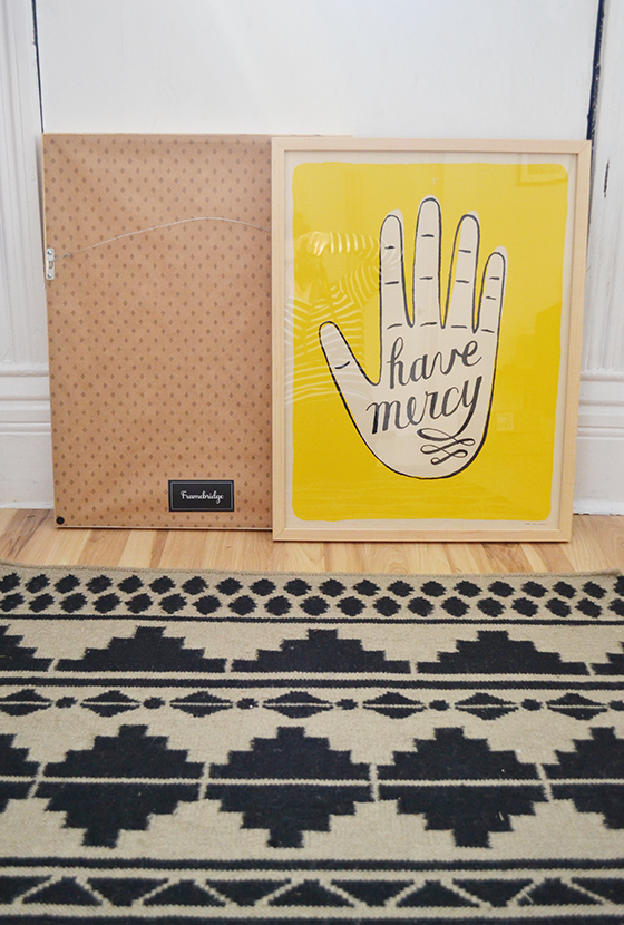
A few weeks later your art shows up back at your house and ready to hang! I’ve used a similar service in the past that I was not nearly as impressed with. Framebridge‘s attention to detail and protective packaging had me smiling from ear to ear. Each frame comes with a bracket and nail to assure an all-around quality experience (and eliminates the need to dig through your own things to track one down).


Framebridge-4-Design-Crush


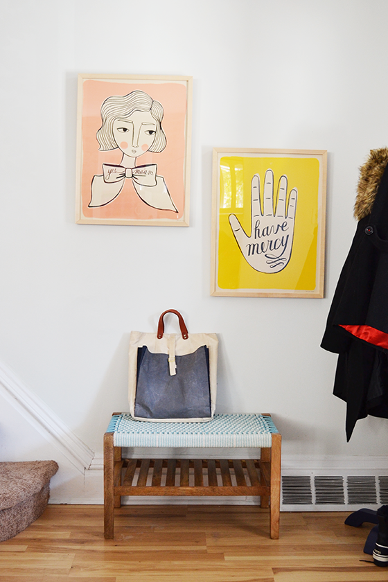
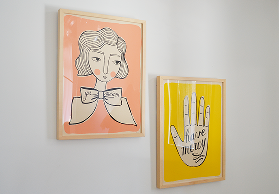
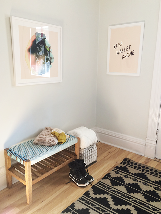
These are two screen printed posters by Jordan Grace Owens that I’ve owned for just over a year, previously victims of the aforementioned pant hanger treatment. I chose a simple thin natural wood frame – the Marin – for both pieces so as not to detract from the art, and I also opted for no mat. The end result is just what I envisioned, two pops of color to welcome guests into my home in the entryway.


Framebridge-5-Design-Crush


Try Framebridge for yourself before January 29th and receive 15% off any order with the code DESIGNCRUSH!

This post is sponsored by Framebridge. I received product and compensation in exchange for my thoughts of the experience. All words and opinions are my own. Thank you for supporting the brands that help keep Design Crush going!

0

Making the Entry Winter-Ready

Winter-Entry-Target-4-Design-Crush


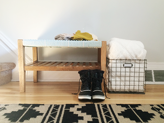
I’m trying to live a slightly more minimal lifestyle these days, but winter with all of its layers is trying to throw a bit of a wrench in my best laid plans. Scarves, hats, gloves, boots – the necessities of cold weather are no fun to corral. My usual (bad) habit it to shove as much as possible into the pockets of the coat I just took off and hang it on the stairs’ bottom newel post.


Winter-Entry-Target-2-Design-Crush


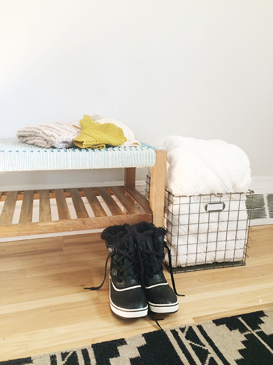
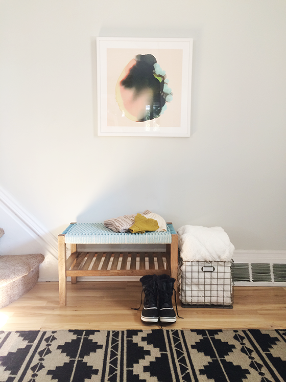
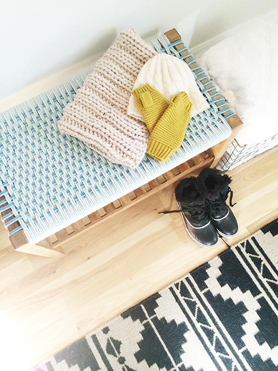
My solution was to take those unfortunate habits and make them work to my advantage. By adding a wooden bench with woven accents I created a small storage area right out in the open. Boots can be tucked underneath while other cold weather gear can be stacked on the lower shelf. It will also make a great place to sit to lace up footwear, as well as a spot to put friends’ bags when they’re over for a visit.


Winter Entry-Target-1-Design Crush


The pastel blue seat of the bench will make transitioning to spring and summer easy with its breezy feel. And I’m also really feeling the combination of the woven pattern next to my tribal throw rug. Completely unexpected and slightly out of my comfort zone, but it seems to be working well.


Winter-Entry-Target-5-Design-Crush


I tucked a white sherpa throw into a vintage metal crate nearby for those extra cold Pennsylvania days that will be here soon enough. The idea being that you walk in the front door, take all of your outdoor gear off, and grab a blanket to cozy up with immediately. (It’s especially going to come in handy after I come inside after taking down those Christmas decorations!) So take that winter, because I’ve got you all figured out.


Winter-Entry-Target-3-Design-Crush
AdvertisementAdvertisement

This post is sponsored by Target. Shop Home Décor for modern luxury made easy.  All words and opinions are my own. Thank you for continuing to support the brands that keep Design Crush going.

5

Creating a Holiday Candy Buffet

Target-Candy-Buffet-9-Design-Crush


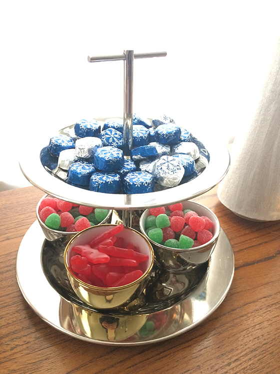
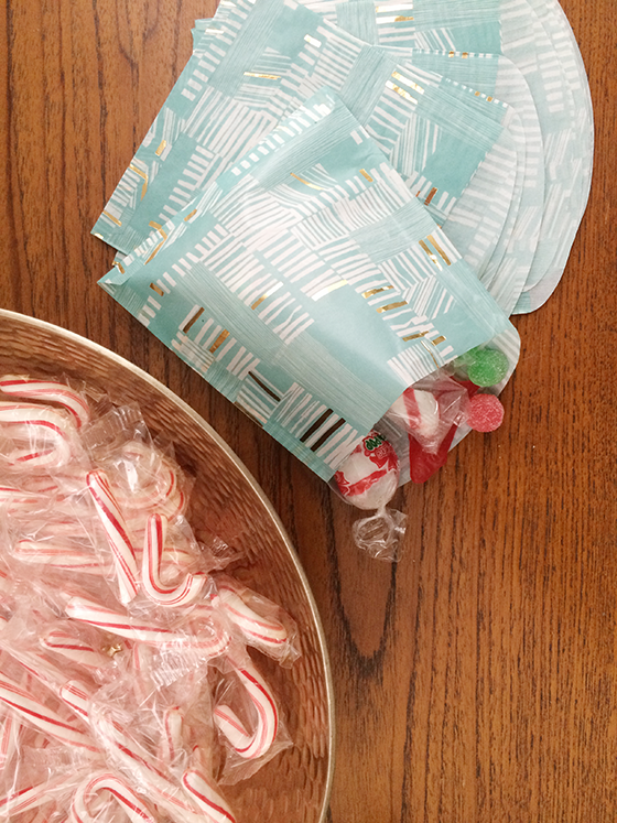
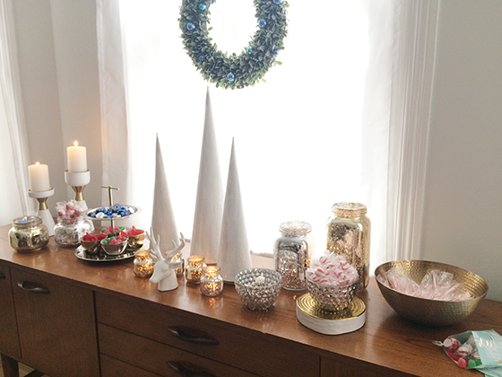
It’s holiday party season – are you organizing one this year? I’ve been having a few friends over here and there, which I much prefer to one grand shindig. More quality time to talk and just hang out at the speed I prefer. I wanted to pull together a little takeaway for each gathering and came up with this candy buffet in my dining room as a sweet treat to end the evening.


Target-Candy-Buffet-2-Design-Crush


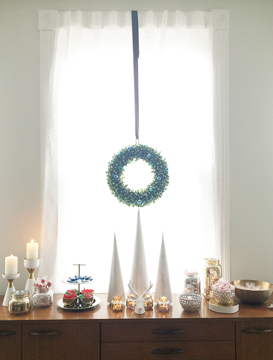
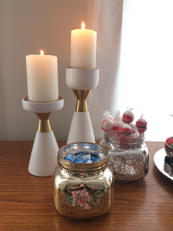
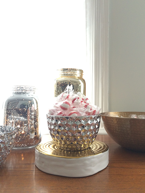
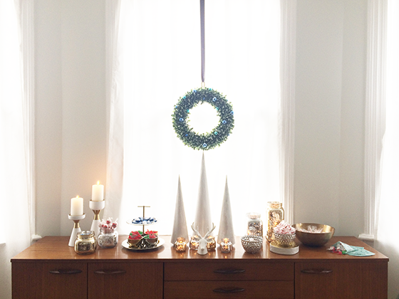
I used the metallic tones I tend to gravitate towards during the holidays as a starting point. Lots of glass jars of different sizes, small porcelain bowls, gem-cut mercury glass bowls, a metal hammered gold bowl, and a few pieces that I already had tucked away round out the spread nicely.


Target-Candy-Buffet-3-Design-Crush


Target-Candy-Buffet-4-Design-Crush


Layering different heights adds visual interest that pulls you right through the buffet as you gather your goodies on the go. I stuck to a palette of silver, blue, red, and green candy and was sure to include lots of different types – chocolate, fruit flavored, chewy, hard – lots of different textures and flavors to satisfy even the choosiest visitor!


Target-Candy-Buffet-5-Design-Crush


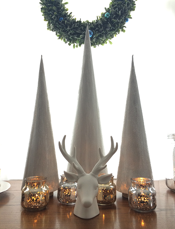
The main focal point is a group of three paper trees I made a few years ago, a sweet white ceramic stag head, and several tea lights in small mason jars to add lots of sparkle and shine to the surface. A flocked wreath hanging in the overhead in the window added some extra holiday spirit.


Target-Candy-Buffet-6-Design-Crush


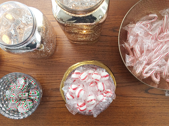
Of course we couldn’t forget the most iconic Christmas classics – candy canes and peppermints. Miniature candy canes are perfect for adding to a cup of hot chocolate. Use one as a stir until it dissolves for a twist on the old standby.


Target-Candy-Buffet-7-Design-Crush

Target-Candy-Buffet-8-Design-Crush

Target-Candy-Buffet-1-Design-Crush

The buffet is easy to replenish as things run out between get togethers and looks pretty enough when not in use. Hope your holiday season is stress-free and sweet!

Shop the buffet: Ceramic Stag Head // Small Gold Metal Hammered Serving Bowl // 18″ Flocked Wreath with Blue Ornaments // Assorted Porcelain Dip Bowls // Silver Mercury Glass Cereal Bowl // Small Frosted Gold Mason Jar // Medium Frosted Silver Mason Jar // Medium Frosted Gold Mason Jar


This post is sponsored by Target. Shop Home Décor for modern luxury made easy.

AdvertisementAdvertisement

1

The Kitchen

354-Kitchen-7-Design-Crush


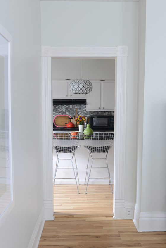
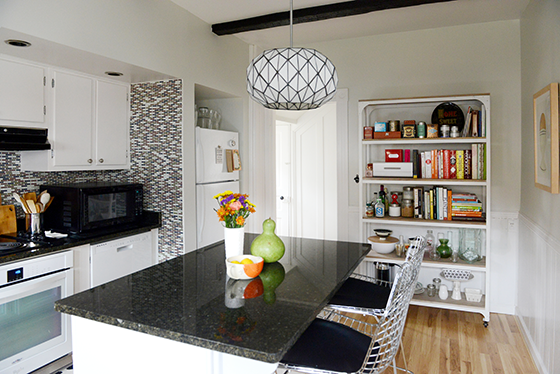
Today I’m sharing the last room on the first floor, the kitchen. (The second floor bedrooms and office will be along come spring when I can get around to doing some more decorating.) We’re also going from my favorite room to the one I fight with most often. The kitchen has more “fast fixes” in it than any other part of the house, at least that I’ve found so far. If you look at the doorway floor above you’ll see that the floor of the entire room has been built up about an inch, and both doors into it require you to physically step up. It’s been missed by many a person, many a time.


354-Kitchen-1-Design-Crush


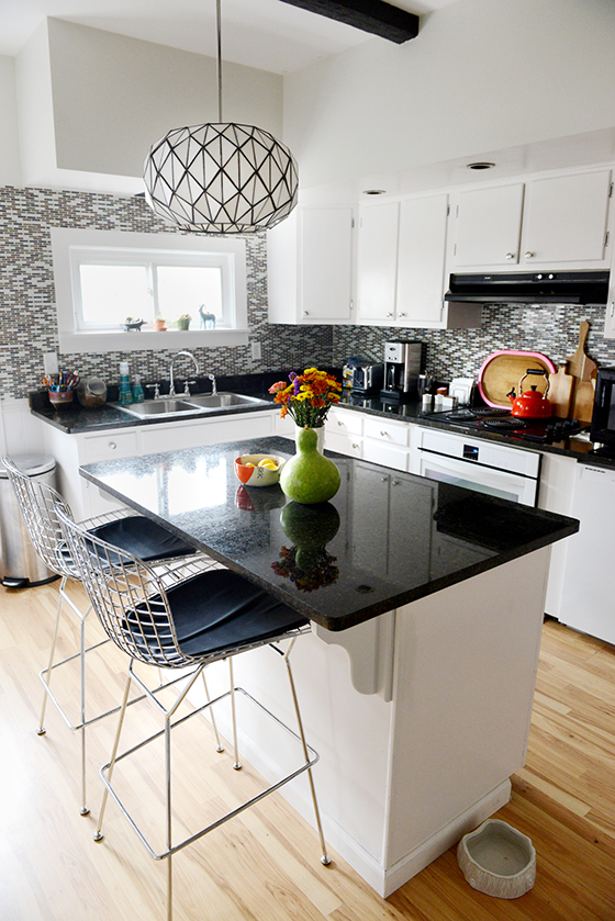
So here we are, and that’s alotta tile. Someone must’ve scored a serious deal because half of the kitchen is covered in the stuff. The plan is to tear it down in a year or so – when those painted 1950s cabinets gets replaced – and instead do a half wall of white subway tile.


354-Kitchen-2-Design-Crush


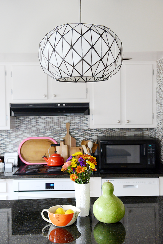
One of my favorite parts of the room is the Tetra Pendant from Lamps.com that I put in about a month after moving it. With all of the spaces quirks and problems I feel like this pulled a lot of things together and gave it at least a touch of my sensibilities. It’s the first thing that everyone sees when they walk (or trip) into a room that really needed a focal point.


354-Kitchen-3-Design-Crush


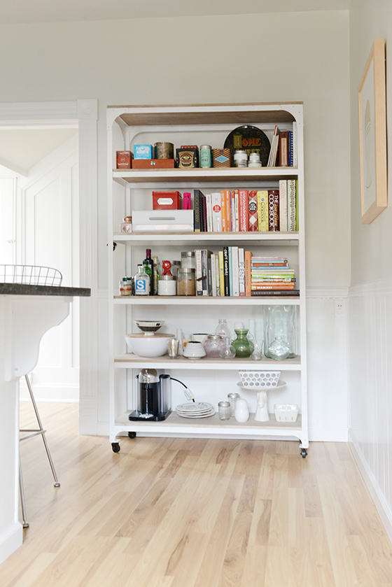
The kitchen in my last house had about twice as much cabinet space, it was the room that sold me the house when it came down to it. Here I had to downgrade to a standard fridge from a double-door as well as bring in some additional open shelving. There’s also a small closet/pantry next to the back door that I plan on adding shelves to after the new year.


354-Kitchen-4-Design-Crush


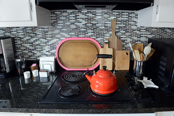
My biggest pet peeve might be that there’s no stove, only a separate oven and cooktop. An old cooktop. That someone spray painted black. There actually wasn’t even an oven when the place went on the market, it was a contingency I added during negotiations. The exhaust hood is equally ancient and I can’t stand that the microwave has to be where it is. But at least the oven is brand new and white.


354-Kitchen-5-Design-Crush


I really like being able to have my cookbooks at arm’s reach, and because there’s not much wall space for art the covers act as just that. I’m also able to display my little vase collection and the ridiculous amount of tea that I rotate through.

There’s definitely a ways to go with this room before I’m satisfied, but I’m also happy with what I’ve been able to do with it on the budget I’ve allowed myself while saving up for bigger renovations.


354-Kitchen-6-Design-Crush

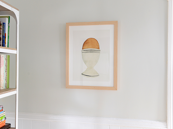
Tetra Pendant c/o Lamps.com // Whitewashed Wood + Metal Shelves c/o West Elm // Edith Bar Chairs – Lulu & Georgia // Le Creuset Red Tea Kettle // The Humble Egg c/o Minted // white sweater knit vase – Target, no longer available

Photos: Quelcy Kogel

4

Redraven Studios

Red Raven Studios-1-Design Crush


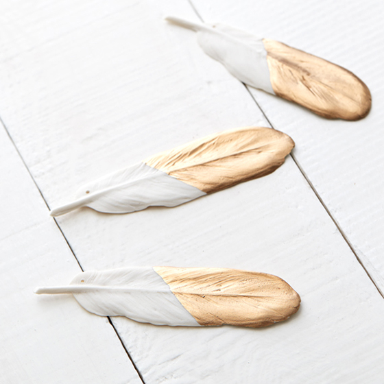
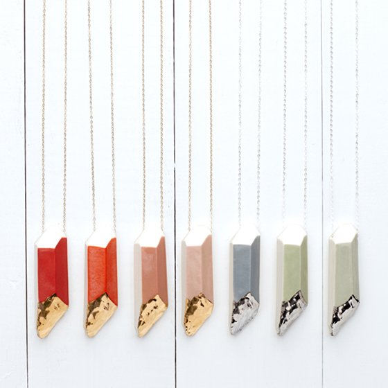
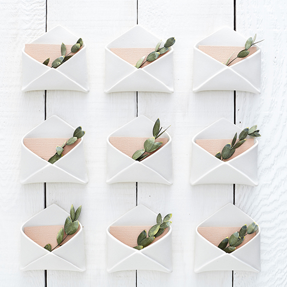
I began following Redraven Studios several years before moving back to Pittsburgh, in fact I didn’t even know they were from my hometown at that point. Founder Amy Hamley and her husband Ryan create the prettiest porcelain pieces – I had their Good Luck Porcelain Horseshoe hanging above my front door for several years and it was always complimented. This holiday season I’m eyeballing the Porcelain & Gold Leaf Feather Ornament for my tree (and maybe a few lucky recipients) along with the Canyon Series Dinnerware that is forever on my Wish List.


Red Raven Studios-2-Design Crush


Red Raven Studios-3-Design Crush


Red Raven Studios-4-Design Crush


Red Raven Studios-5-Design Crush

1

The Dining Room

354-Living-Room-1-Design-Crush


You’ve seen the living room, now it’s time to get a little more formal.

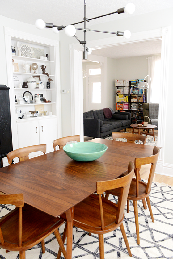
But first you’ll have to excuse me while I go absolutely ape over my dining room. I love this room more than any other space in any place I’ve ever called home. Everything about it. The huge windows, the stunning light, the floor to ceiling built-in… I could go on.

There are pocket doors between the living and dining rooms (seen here), but they’re blocked off for some unknown reason. I’ve done some investigating (and removing of pieces of frame), but can’t figure out where the problem lies. Looks like it’s a job for the professionals.

I’ve never had a dining room before, and I’ve longed to be the kind of girl who had dinner parties and holiday get togethers at her house without the room to do so. The dining room turned out to be more than I could have hoped for with a mix of old vintage pieces that have followed me around a bit and some new.


354-Living-Room-3-Design-Crush


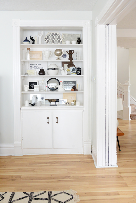
I was worried the built-in was too busy with my treasures, but a friend reassured me it was a-okay since I stuck to black and white. In the cabinet underneath I store about half of what I refer to as my “entertaining ware” – or the things that only come out a few times a year. I’m thinking I’d maybe someday like to paint the back of the built-in a color like deep turquoise or goldenrod to add a pop, but I’m fantastic as is for the time being.


354-Living-Room-4-Design-Crush


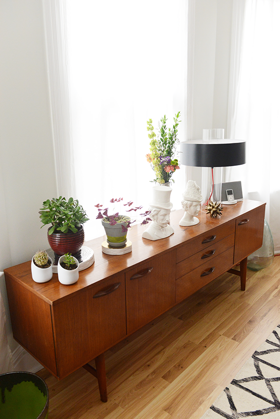
In my last house this vintage mid-century credenza was in my living room, holding my television, records, DVDs, etc. Here it’s serving its rightful purpose as a buffet and hiding the other half of that “entertaining ware.” (Fist pump.) I’m bound and determined to cover it from edge to edge in plants to take full advantage of all that glorious light I mentioned. In fact I’ve added an aloe plant and a Christmas cactus since these photos were snapped a few weeks ago.


354-Living-Room-5-Design-Crush


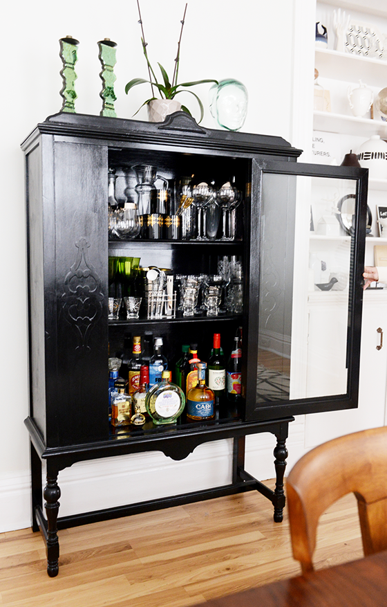
Another piece that’s followed me a few times is this Depression-era kitchen cabinet that I use as my bar. It’s been one of my favorite possessions for a long time now and it feels so right in this house that’s full of character since it has plenty as well.


354-Living-Room-2-Design-Crush


The original bath (the first of two) is off of the dining room, which is definitely strange. But it’s been renovated and now features a killer glass bowl sink and vanity that you can just see in this shot. I can’t really imagine making overnight guests use it as theirs, so for the time being I mainly use it to bathe the dogs. Since I plan on staying here for some time I can see maybe eventually tearing out the tub and making the pantry that butts up against it on the kitchen side larger. Time will tell.


354-Living-Room-7-Design-Crush


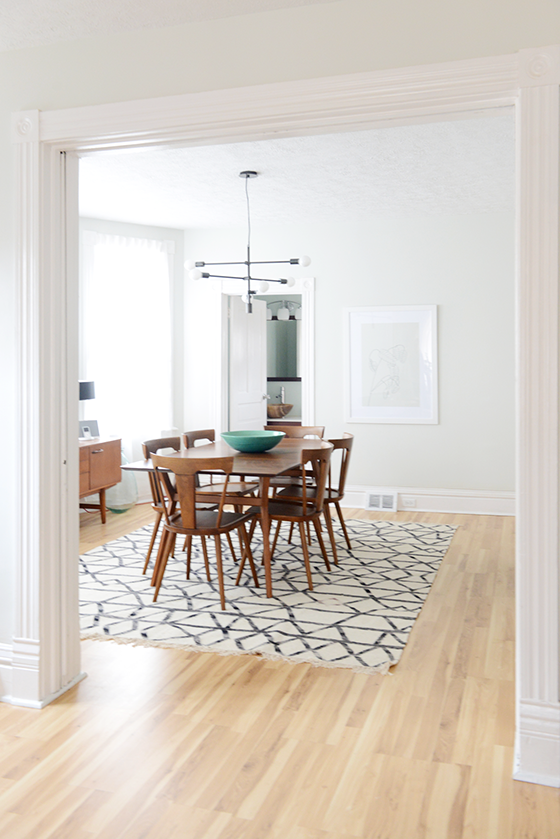
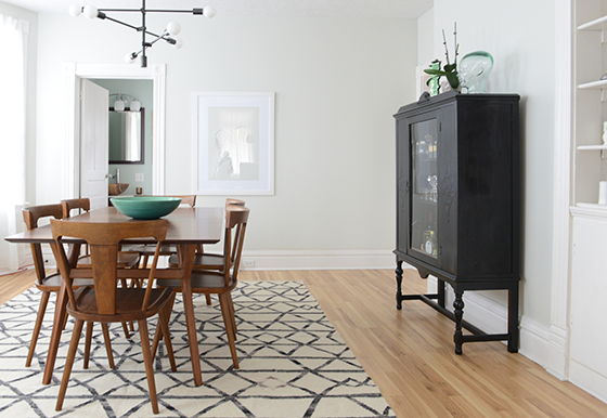
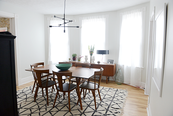
That floor rug just makes the space, don’t you think? I love how it adds a hit of pattern to my otherwise minimal dining room. The mid-century table and chairs set the tone for many dinners to come and the light fixture might as well be a piece of art in itself. (A huge, massive thank you to West Elm for reaching out for a collaboration!) I gave it all a test run last weekend for a birthday party and people gravitated towards the room like a magnet, I don’t think I’ve ever received so many compliments on decorating before. Like I said, OBSESSED.


354-Living-Room-8-Design-Crush

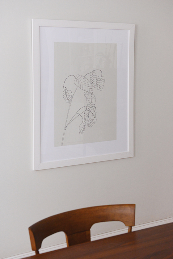
Parker Expandable Dining Table c/o West Elm // Splat Dining Chairs in pecan c/o West Elm // Torres Wool Kilim Rug c/o West Elm // Mobile Chandelier c/o West Elm // credenza (vintage) // bar cabinet (vintage) // large green bowl – handmade // large glass vessel – Pier 1, no longer available // aqua bamboo bowl – Target, no longer available // Sonneman Level Table Lamp – Lamps.com // Male and Female Socialites Busts – immLiving // silver trunk vase – Target, no longer available // Grass with Seeds – Minted

Photos: Quelcy Kogel

16