The New Design Crush Headquarters
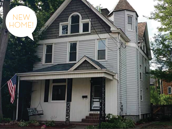
After eight months of searching for the perfect home in Pennsylvania, I’ve finally found it. And made an offer. And am buying it.
You’ll have to forgive the shoddy realtor photos, but I don’t have any of my own. Because I’ve never actually set foot in this house. I KNOW. I’m buying it based on these photos and a video my Mom shot on her iPhone when touring it for me. Let me tell you, buying a place halfway across the country is no piece of cake! But I’m excited to share of these photos with you and take you on the journey.
Let me start by saying that this is not the type of house I thought I would end up with. Mainly because it’s not what I was looking for or like anything that’s ever been my taste. I’m clean lines, modern, open spaces. And without the renovations that have been done on this 1900 colonial I wouldn’t have given it a second glance. But a few weeks ago I spied it online, and then later that same day both my realtor and my Mom sent me a link to it as well. My response: I like a lot of the inside, but am not into the outside. And part of that still stands true, but it’s grown on me considerably. So about a week later I sent both of them to take a peek in person and the three of us all fell head over heels. As far as the facade goes, I’d love to add a wooden porch the width of the house that eliminates those three strange steps up to the front door probably about more than anything else. But like a lot of things I want to do to the interior, all in good time.
But you probably want to take a peek for yourself at the new Design Crush headquarters…
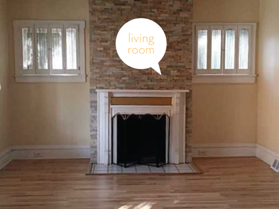
The floors throughout the first floor have been refinished and (supposedly) the entire place was taken down to the studs. This is the living room right off the left of the foyer once you come in the front door. I love the high ceilings that run throughout this level. Right off the bat I’ll be pulling down those curtains in the little windows flanking the floor to ceiling fireplace and painting out the gold piece in the middle of the mantle. Eventually I plan on swapping out that tile in the hearth and painting the entire space white. I’ve always liked the look of a clean palette and really want my furnishings to be what brings color and personality to the house. The stone fireplace is much better in person (or so I hear) and is comprised of uneven bits and pieces.
To the right side of the frame is a huge open doorway into the dining room. The photo online is awful, but what you’ll find are three large windows forming a bay on the outer wall and a small built-in that’s thankfully already white. Off of the dining room is a fully renovated 3-piece bath and a small hallway to the kitchen.
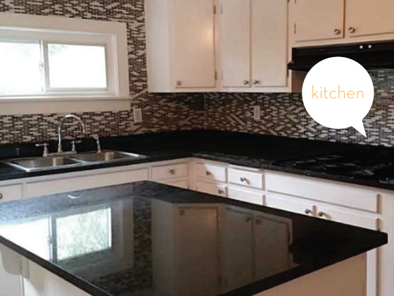
Nicely refinished, but those the cabinets are dated and only made fresh by a coat of paint. They’ll need replaced sooner than later. Glass tiling in kitchens and baths is a trend currently, but one that I’m not entirely on board with. (Are people getting hugely amazing deals on it? What is the deal?!) It will suffice for now, but the larger plan is to tear it out and do a half wall of white subway tile with white paint (again) above. I’m also debating whether or not I’ll replace the black granite with something different. The right wall in this photo has a cooktop (soon to be replaced with a range before closing) and a nook for the fridge. The opposite two walls are half white beadboard and half white paint. Completely livable at this point. In the corner they form I’m hoping to put up some open shelving for pretty cookbooks and serving pieces. One of my favorite parts – not pictured – are the beams on the ceiling. A total dream!
To the left there is also a doorway out to the deck and backyard, which we’ll get to in a minute, and a pantry. To the right is a doorway that leads around to a nook that has a door to the basement, as well as a hallway with a coat closet before you’re back in the foyer. I love the full circle layout a lot.
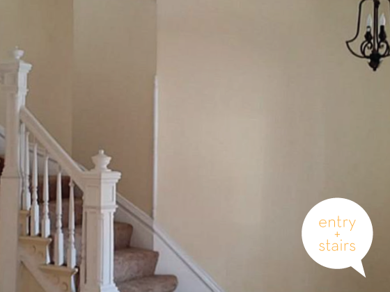
Which leaves us here. The front door to the right (not pictured) has a half window and needs a coat of paint and that’s about it. This staircase curves up and to the left with a window set about halfway up. I’m not at all keen about the carpeting that leads the way up to and covers almost the entire second floor. Eventually I hope to replace it all with wood that closely matches the first floor, but that will require some savings. In the meantime, it will be good traction for the dogs since we’ve never lived with stairs before.
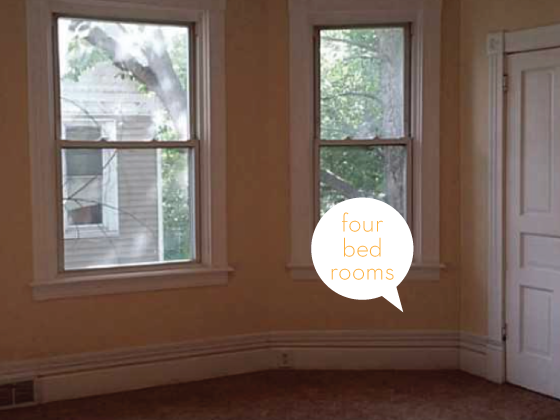
The second floor has one small bedroom with wood floors that will be my office, and three other bedrooms that all look about the same. Like this. (Not nearly as dark and dingy as this shot implies.) Again, several windows forming a large bay and a seriously decent-sized closet considering this place was built in 1900! There’s also another fully renovated 3-piece bath.
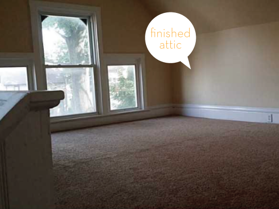
Continue up a switchbacked set of stairs to the third floor finished attic. Those windows are on all four side and total showstoppers! Again, I’m not fond of the carpeting, but at least it’s all new throughout. This floor is actually comprised of two huge rooms, one of which I’m hoping to make the master and the other the walk-in wardrobe of my dreams. This plan all depends on whether or not the central AC that’s going in before closing can have its ducts run up all three floors. A bit of a challenge, or so I’m told. I’m not sure what plan B is if that’s not a possibility.
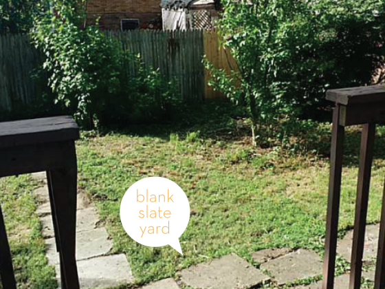
The back yard is a total blank slate, you can only see about a fourth of it here. Not large by any means but comparable to what I currently have. The deck is new and beautiful and I’m already imagining having my morning coffee on it, throwing parties, and about a hundred other things! I’m also looking forward to pillaging my green thumbed Grandma’s yard for peonies, lilacs, and poppies to plant.
Closing is scheduled for September 8th, so I hope to have some better photos for you at that point. Thanks for indulging me while I share the new digs!
Posted In my life


