Going Minimalist

Lamps.com-1-Design-Crush


As I prep my house to go up on the market at some point this year, I’m realizing more and more about how my style has evolved since I moved in nearly six years ago. I’ve always been a tchotchke and accessories kind of girl but I’m thinking that’s going to change. I’ve gotten a head start on packing up a lot of smaller things, which has got me thinking about my next home and how I’d like it to be. My house is already more pared down than usual and I have to say, I’m loving it. Piece by piece I’ve been making small changes here and there, choosing things that serve more than one purpose. Am I becoming what I’ve always longed to be – a minimalist?

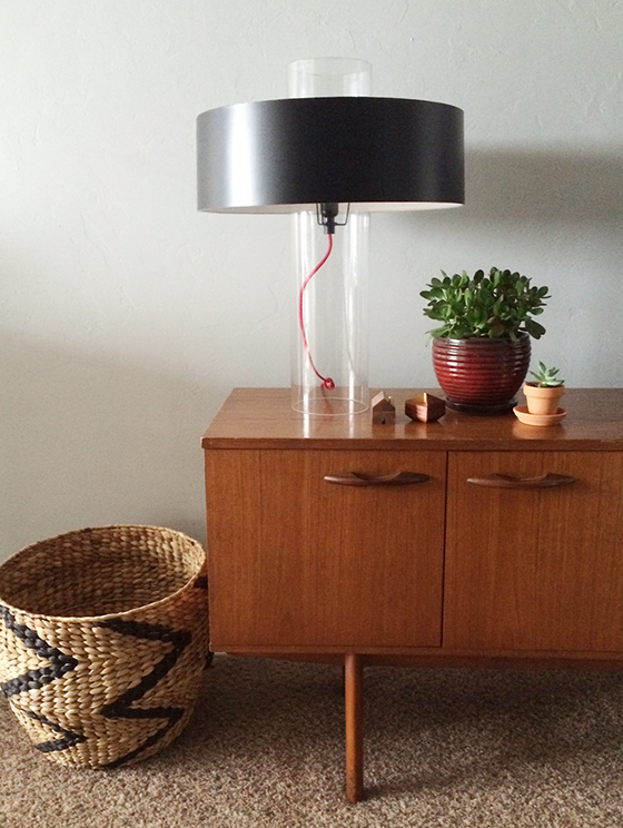
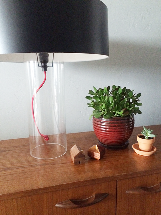
Case in point is the newest addition to my lamp addiction – Sonneman‘s Level Table Lamp. I love the mixed materials used in the design and that it’s not as feminine as a lot of other pieces in my home. Because it’s so sculptural it feels like form and function in one. Not to mention just how fantastic it looks atop the vintage Danish modern credenza in my living room! I have a feeling that this is a sign of how my decorating choices are going to be from now on.


Lamps.com-2-Design-Crush

For this sponsored post I received product from Lamps.com. As always all words and opinions are my own. Thank you for supporting the brands that help keep Design Crush going!
2

Soundfreaq Sound Rise + Giveaway

Sound-Rise-1-Design-Crush


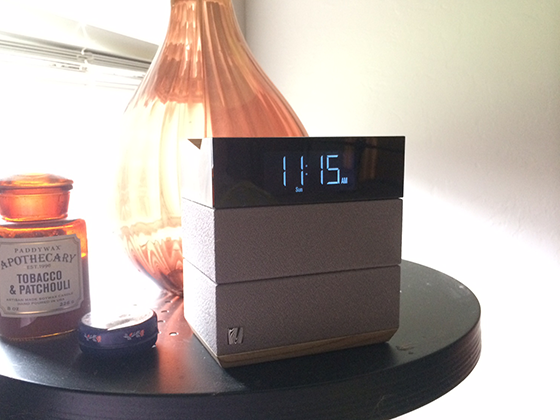
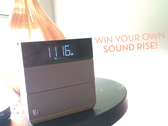
If you’re like me you prefer to wake up to one of your favorite mellow tunes rather than the jarring blare of an alarm clock. Those first few minutes of the day can determine your mood for hours (especially on a Monday), and Soundfreaq created the alarm clock/bluetooth speaker hybrid Sound Rise with just that in mind.


Sound-Rise-4-Design-Crush


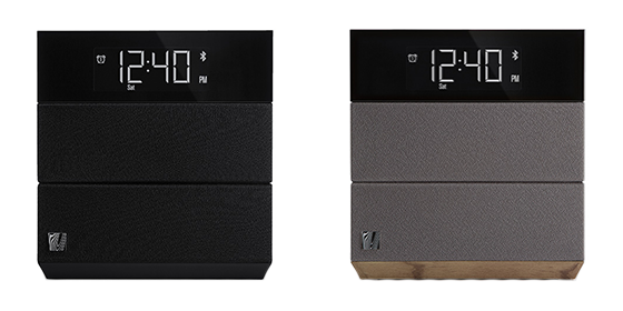
The stacked design looks right at home on your bedside table in either black or wood tones, and the sound quality is seriously impressive. You can also enjoy solid sound while you get ready or soft music to relax to while falling asleep. Control the tone of your music with neutral, warm, and bright options for a customized experience. One of my favorite Sound Rise functions is the ability to set different alarm times for weekdays and weekends – who hasn’t accidentally set their Saturday wakeup for 6am? The worst. And you can even blackout the digital display, perfect for someone light sensitive like myself. Sound Rise features a USB power port you can use to keep your phone charging while you sleep, without having to fuss with a dock of any kind. Just one last thing: a nap timer. Soundfreaq has seriously thought of everything!


Sound-Rise-5-Design-Crush


And now the part you’ve been waiting for – a chance to win your own Sound Rise! Get every day off to a better start by entering any number of ways below, but do it before Sunday, June 15th at 11:59 pm.
a Rafflecopter giveaway

0

Big Happy Family

Urbio-1-Design-Crush


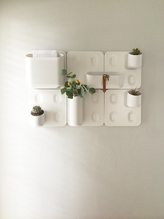
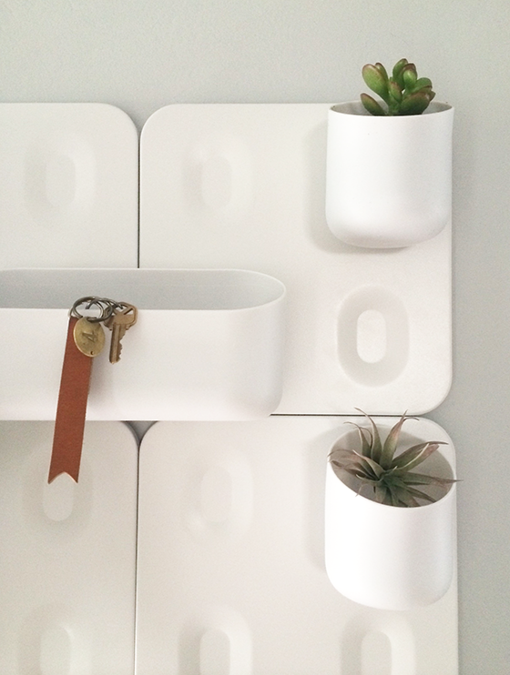
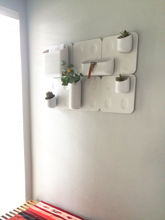
Modular things make me stupidly happy, so it was a no brainer that I needed the Big Happy Family in my life. But which part of my home to organize? I could get culinary tools in order or plant an herb garden in the kitchen. The office could stand some wrangling in terms of small supplies that I’m forever misplacing. But the entryway, yes. That was the answer.


Urbio-2-Design-Crush


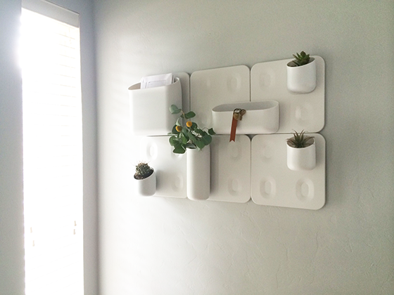
The differently sized magnetic modules were perfect for what I had in mind, some organization and some green all in one place. The Big Happy Family was fairly easy to install, all it takes is some sheet rock anchors and screws. The wall plates snap easily onto the brackets that get attached to the wall, then the various modules attach to the plates via magnet. This makes removing everything such a breeze and reorganizing the modules on a whim super simple.


Urbio-3-Design-Crush

Urbio-4-Design-Crush


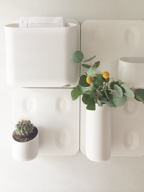
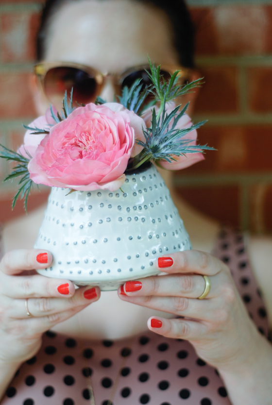
I used the small Shorty modules for plants – a cactus, a succulent, and an air plant – and I love how easy it is to remove each one when it comes time to water. (I’ve been known to be clumsy!) Outgoing mail finds a home in the Wide Mouth, while the String Been makes an ideal vase for clippings from my yard or flowers from the market. And the Wide Mouth is a perfect catchall for my keys and whatever else I don’t want to forget when dashing out the door to meetings and hot dates. (Ahem.) I’m thrilled with this new addition and am looking forward to figuring out new purposes for Big Happy Family as time goes on!


Urbio-5-Design-Crush

This is a sponsored post by Viesso. As always, all words and opinions are my own. Thank you for supporting the brands that help keep Design Crush going!
0

A Chair Fit for a Boss Lady

Quill-1-Design-Crush


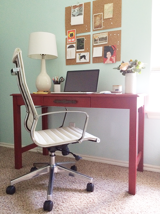
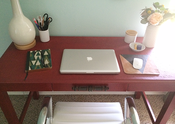
For as much time as I spend in my office, a good desk and chair setup is key. I’m ready to update my desk, but finding a solid chair that’s both stylish and comfortable was on top of my list of must haves. Though I get up what seems like a hundred times an hour, my lower back starts to ache by early afternoon like clockwork. I’m not even going to show you my old chair – let’s just say it was a super cheap kitchen design from a place that rhymes with SPIKEA.

It was far past time to upgrade, and I have to sing the praises of the Office Star OSP Furniture Mid-Back Executive Chair after using it for about a month now. It keeps my back supported in all the right places and has just the right amount of cushion – the main qualities I was looking for. And after my previous setup, having armrests is a total luxury! (Who knew?)


Quill-2-Design-Crush


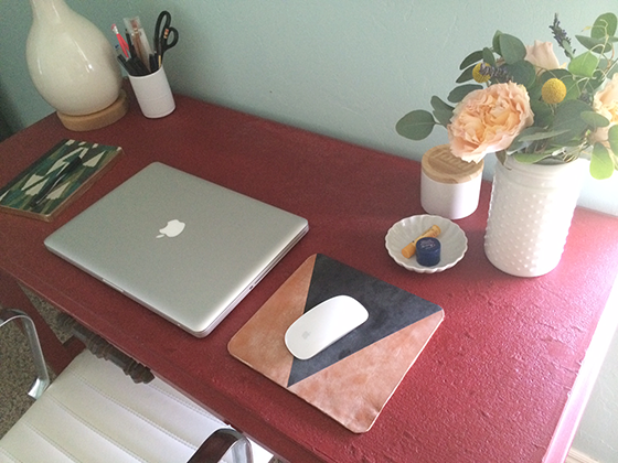
I like to keep my space as clutter-free as possible, but I must admit this is the cleanest it’s been in some time. A vase of fresh flowers, a candle (this one’s blueberry muffin!), and lip balms to feed my addiction are always on hand. The only thing missing is my planner which is never far from reach. My new chair stays true to my MCM sensibilities as well as the predominantly white accessories that dominate my office space, which I love.


Quill-3-Design-Crush

Disclaimer: This post is sponsored by Quill. As always all words and opinions are my own. Thank you for supporting the brands that help keep Design Crush going!
1

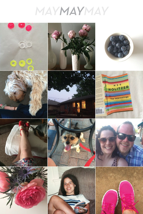
Insta May

InstaMay-Design-Crush

Loved the leftovers from our Paint Dipped Copper Necklace project.

Of course I’m on the peony bandwagon – they’re one of my favorites.

I’m also on the blueberry bandwagon, eating them by the handful lately.

Had some QT with one of my favorite pups at Chirps & Cheers.

One of the prettiest evenings of the spring spent in a friend’s backyard at twilight.

I read The Interestings, maybe my favorite book so far this year.

I’ve been wearing my red Swedish Hasbeens constantly!

Bebe enjoyed her first patio dinner of the year at The Mule.

One of my oldest friends from college was in town, I don’t see him nearly enough.

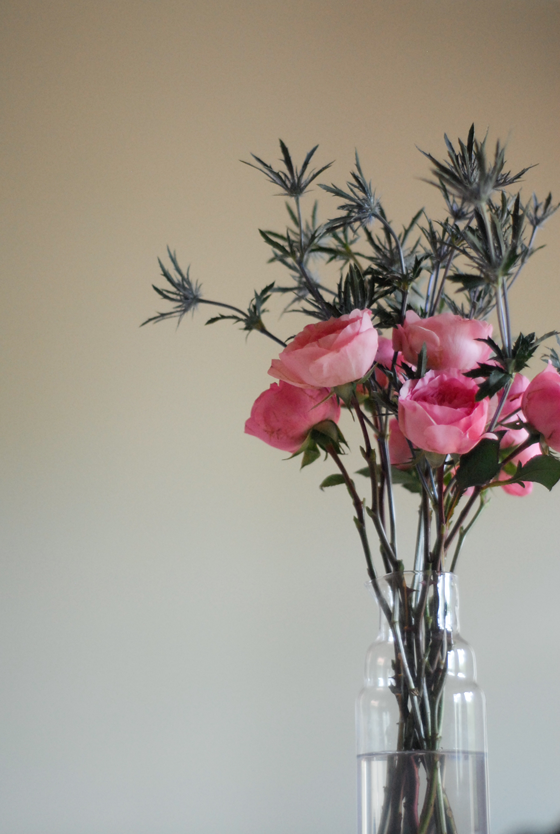
I’m really happy with how these remixed grocery store flowers turned out.

Turned back time to the day I had my braces removed! Ahh!

Picked up a new pair of sneaks for otherwise unfun athletic-type activities.

Follow @designcrush on Instagram.

0

Organizing the Past

Kolo-Havana-1-Design-Crush

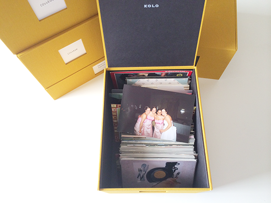
The first wedding I was ever in, my best friend’s from high school. I’m second from the right.

Prior to the digital photography age I was all about film. There’s something so lovely and unpredictable about it because you only have so much control over the outcome and the subject matter. And who can forgot waiting for it to be developed or finding an old mystery roll?! If it was an exceptionally promising set you might even spring for the one hour service.

That’s not to say I don’t love digital photography, too. We’re a society of instant gratification which makes it a great fit, and it’s always nice to be able to retake a wonky photo instead of waiting days only to see the moment was lost. But what to do with all of those prints?


Kolo-Havana-2-Design-Crush

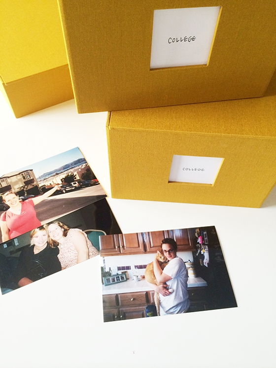
On my first trip to San Francisco, senior year of college. At a college advertising competition in Austin, TX. With my cat, Peanut.

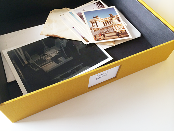
Last week I spent an entire afternoon figuring that out with the help of Kolo‘s Havana photo boxes. I separated all of my photos – even the ones that had been in the cardboard Lion King box since the dawn of the mid-90s – into time frames. High school, college, portfolio school, and family photos. Each one was delegated a box, with the exception of college which took up two. It was definitely time-consuming, but so much fun looking back through those periods of my life. I used the plastic dividers that came with each Havana box to roughly separate major events, though I definitely need to back through and do a better job at some point. I also tossed extremely blurry photos and what can only be described as awful shots from many a photography class right into the trash.


Kolo-Havana-3-Design-Crush

My Grandpa and I riding on a ferris wheel. Photos of Europe taken by my Mom’s godfather.

Older family photos went into a larger, flatter Havana box to accommodate the crazy sizes of some of the shots. I’m still tracking down errant photos that have escaped the confines of my prior “system,” but that’s half of the fun! I love how easily accessible my collection is now, and also that it’s perfectly suitable for display. Each box is covered in gorgeous Indian Yellow fabric that goes perfectly with my mid-century decor. I’m hoping my next home has built-ins so that I can show off my memories.

Disclaimer: This post is sponsored by Kolo. All words and opinions are my own. Thank you for supporting the brands that keep Design Crush going!

0

Design Crush The Marketplace

Greatly-1-Design Crush


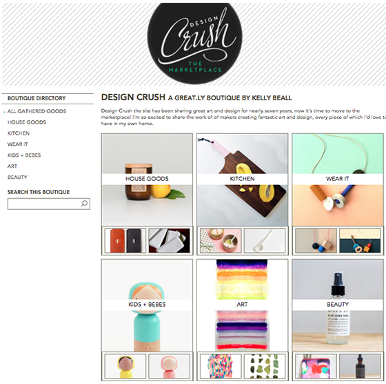
I’m three shades of excited to share something that’s been in the works for months – Design Crush The Marketplace has opened! I’ve teamed up with the newly launched GREAT.LY to bring you some of my favorite handmade goods from all sorts of talented makers. The shop is set up much like Design Crush the site, full of fantastic art and design that you can decorate your home and yourself with. I’ll be keeping it stocked with fresh and exciting things that get updated frequently, so I hope you’ll pop over and take a look for yourself. In the meantime, here are a few of my favorites from each category!


Greatly-house-goods-Design-Crush

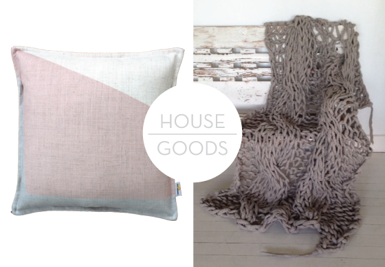
Pink Block Cushion by Ellie Bradley // Extreme Handknitted Woolen Cabled Throw by Jacqui Fink


Greatly-kitchen-Design-Crush

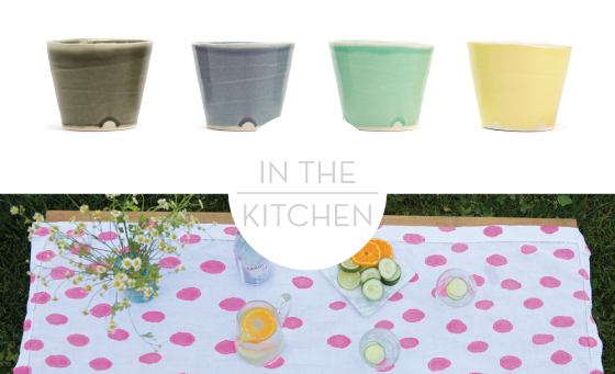
Madison Rocks Cup by Keith Kreeger // Hand-Painted Hot Pink Linen Table Runner by Sensible Habit


Greatly-wear-it-Design-Crush

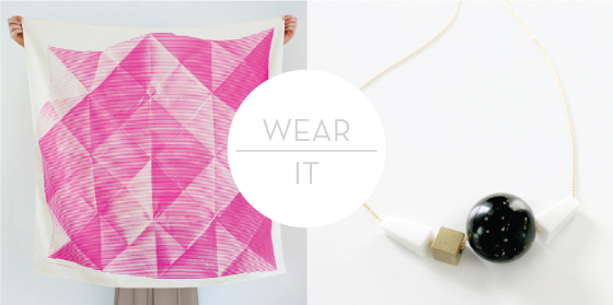
Folded Paper Furoshiki Japanese Eco Wrapping Scarf by Kyoko Bowskill // Geometric Lucite + Brass Bead Necklace 02 by Adelia Mae


Greatly-bebes+kids-Design-Crush

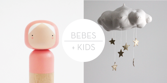
Coral Kokeshi Doll by Sketch Inc // Gold Star Cloud by Jahje Ives


Greatly-art-Design-Crush

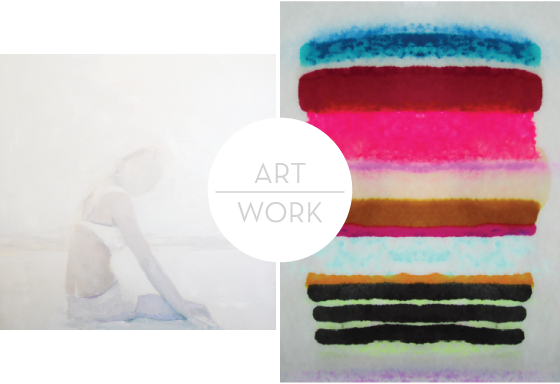
Fading Lake Day by Lisa Golightly // Desire Fine Art Giclée by Kristi Kohut


Greatly-beauty-Design-Crush

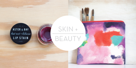
Beet Root + Hibiscus Lip Stain by Erin Hammond // Hand-Painted Zipper Bag by Kelly Zellers

8

Modern Classroom Style

Bing-in-the-Classroom-4-Design-Crush

Bing-in-the-Classroom-1-Design-Crush

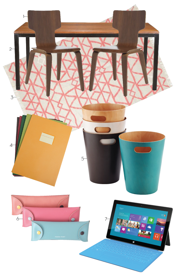
1 // 2 // 3 // 4 // 5 // 6 // 7

This post was created in partnership with Bing.

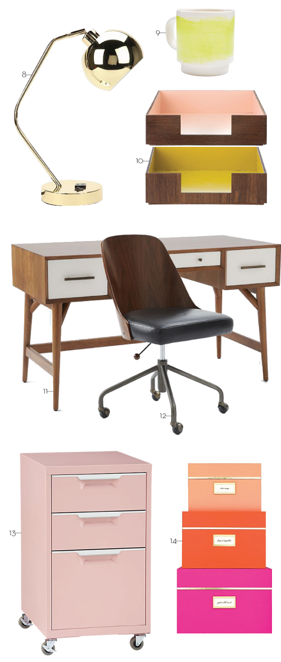
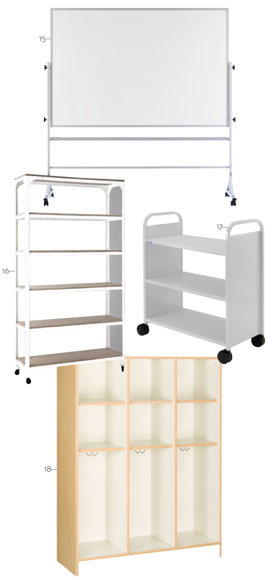
Whenever I think back to my school days, I can’t help but laugh and shake my head at the classroom settings. Desks that didn’t match, busted equipment, and old chalkboards. And I attended a highly rated school, so I can only imagine what lots of others have had to deal with. It wasn’t until my sophomore year in high school when a large-scale renovation took place (think classes in trailers) that I started to appreciate my surroundings considerably more. Why was there such a lack of color, pattern, and design? If you’re wondering how my dream classroom might look, well, here it is!

One thing students and teachers shouldn’t have to worry about is access to great technology, Bing in the Classroom is an initiative to help bring just this to schools. When they work with Bing in the Classroom, schools receive access to ad-free, safe, private searches by Bing, digital literacy lesson plans, and opportunities to earn free Surface tablets for their classrooms through Bing Rewards! You can show support for #adfreesearch right here.


Bing-in-the-Classroom-2-Design-Crush

8 // 9 // 10 // 11 // 12 // 13 // 14


Bing-in-the-Classroom-3-Design-Crush

15 // 16 // 17 // 18

1

Insta April

InstaApril-Design-Crush

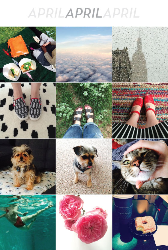
I started off the month with a trip to Ventura, California for Craftcation where I spoke on panels about advanced social media and how I stay on track with my business.

April is generally a crazy busy travel month for me, and this year was no different.

A week and a half later I was at the New York City International Auto Show to help Nissan out with some social media efforts and check out the new incarnation of the Murano.

I’ve been wearing these three pairs of shoes as my spring staples – Bucketfeet, my 20 year old (!) Birkenstocks, and a new pair of Swedish Hasbeens (that I’m still breaking in, hence the bandages).

Bebe got a much needed haircut, check out her Before and After!

I discovered that Rainey has a head shaped like a hamburger that’s too much fun to squish.

While in NYC I went to the best party at a town home with an indoor pool that had a glass wall. Add synchronized swimmers and it got even better.

I’ve been having a moment with garden roses.

Another NYC moment, the most mouthwatering square doughnut covered with toasted coconut and filled with coconut cream. I still wake up in the morning thinking about it.

Follow @designcrush on Instagram.

0