Valspar Loves Architecture

Valspar Fluropon-1-Design Crush


Living in a home that was built in 1900 has helped me come to appreciate the beating a structure can take from the elements. Whether it’s wind, rain, snow, or ice, the exterior of a space needs to be able to take a lot to help protect whatever lies within its walls.

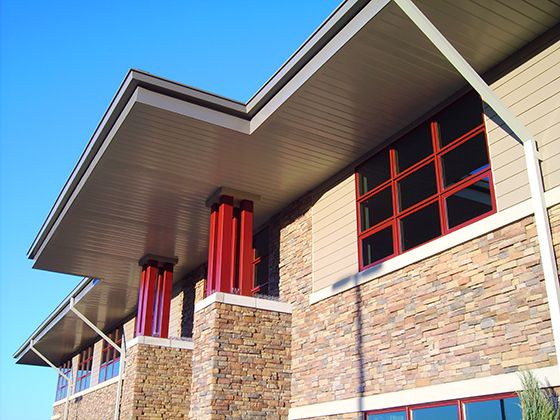
Valspar is no stranger to helping protect architectural integrity, or to developing the technologies that keep buildings of all types looking their best inside and out. As one of the leading manufacturers of architectural coil and extrusion coatings in the world they carry a proud history of innovation, while their commitment to durability and an ever-expanding palette of color offer unlimited design freedom to countless industries and projects.


Valspar Fluropon-2-Design Crush


Valspar‘s latest additions, ones that were developed in direct response to customer feedback, are Fluropon Extreme and Fluropon Pure.

While Fluropon Extreme is a good choice for a variety of uses, it’s especially well suited to tough installation processes such as roofing. No other coating offers both resistance to abrasion and a smooth finish.

Fluropon Pure is ideal for buildings with extreme environmental requirements or anywhere you may desire a greener product. With reduced hazardous materials, these coatings are formulated with both the environment and our grandchildren in mind. It’s even LEEDv.4 and Living Building Challenge certified and Red List compliant!


The latest color palette, Rustia, is being introduced at the American Institute of Architects (AIA) Convention and Expo May 19th to 21st. Rustia features a soothing, nature-inspired palette that’s never before been available in the Fluropon line, one that provides a calming invitation to linger and savor.

If you’ll be in attendance at AIA, you’re invited to swing by Valspar exhibit no. 3621 to speak with them about the new products and palette in person. You can also attend the Valspar Learning Lounge at the AIA Expo for CEU (Continuing Education Units) courses.


If you’re interested in learning more, download a brochure on Valspar‘s Fluropon Extreme or Fluropon Pure. Or opt to order a product sample online to try either one for yourself.


Fluropon Pure_logo


This post sponsored by The Valspar Corporation. As always all words and opinions are my own. Thank you for supporting the brands that help keep Design Crush creating fresh content! Follow Valspar on Twitter and LinkedIn to stay up to date.
0

Reinventing My Design Obsession + HP Spectre

HP Spectre-3-Design Crush


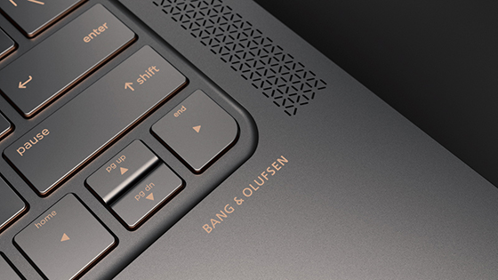
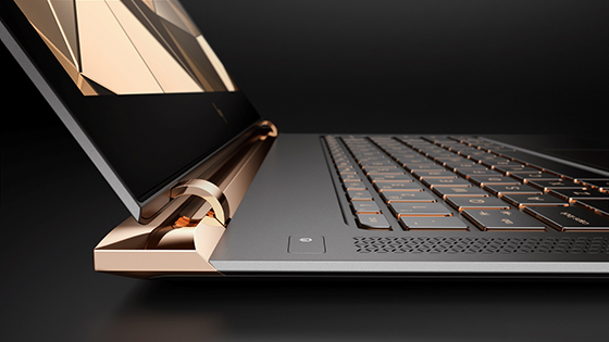
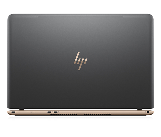
When it comes to technology I’m most definitely drawn to a certain aesthetic, one that overflows into every other realm of my life. Clean lines, modern look, and limited color palette. I always looks forward to what’s next from HP, our longstanding partner, like their recently released PC with incredible craftsmanship and style – the HP Spectre. The resulting technology is a form of reinvented obsession, and delivers a luxurious computing experience that should resonate with all design-minded folks. HP reimagined every element during the design process to ensure the best user experience as well as maximum performance. The end result is a PC that doesn’t compromise on style, function, or performance.


HP Spectre-4-Design Crush


The idea of reinventing obsession is nothing new to me, I do it on a daily basis both here on Design Crush and as a graphic designer. Each day and every project requires me to reevaluate, refocus, and bring my best creative self to the table. It’s not always easy but Spectre is a source of inspiration, in particular its modern color palette. I’ve found myself inexplicably drawn to shades similar to its high contrast matte aluminum body and glossy copper trim over the past few weeks in everything from design projects to my own home.


HP Spectre-6-Design Crush

HP Spectre-5-Design Crush

HP Spectre-7-Design Crush

HP Spectre-1-Design Crush

You may have also noticed that HP has debuted a sleek new logo, a modern take on the two letters consisting of little more than four slashes. When working on my bread and butter, logo and branding work, I tend to think minimally when starting work on a new brand. This redesign reminds me that in design simple is usually best. A rule of thumb that I live by is to take away, then take away some more until nothing is left but the necessities.


HP also collaborated with two world-renowned designers to create exclusive limited edition Spectres that highlight the intersection of art and technology. Dutch-born, London-based designer Tord Boontje created the HP Spectre by Tord Boontje that exhibits delicate, intricate, dreamlike patterns across the laptop. Los Angeles-based jewelry designer Jess Hannah created the HP Spectre by J. Hannah with opulent 18K gold. Both will be auctioned off for charity.

This post sponsored by HP Spectre as they #ReinventObsession. All words and opinions are my own. Thank you for supporting the brands that help keep Design Crush creating fresh content!
0

A Floral Laden Spring Brunch

Fancy Feast Medleys-1-Design Crush


While the temperatures as of late can be described as nothing other than frigid, I’m starting to have spring on the brain in a big way. And nothing says the hope of spring quite like a bounty of florals and lighter cuisine to help pull us out of winter’s grasp. So last weekend I invited some friends over to take advantage of a cold, bright late Sunday morning.


Fancy Feast Medleys-2-Design Crush


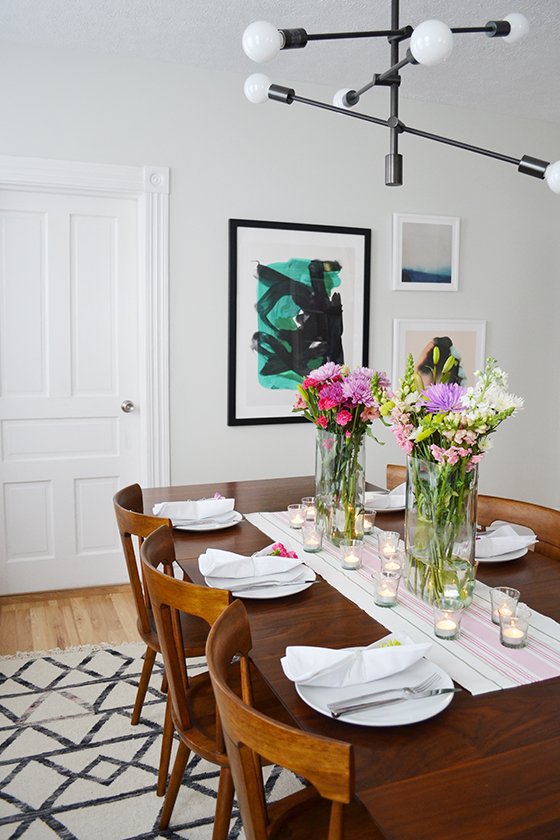
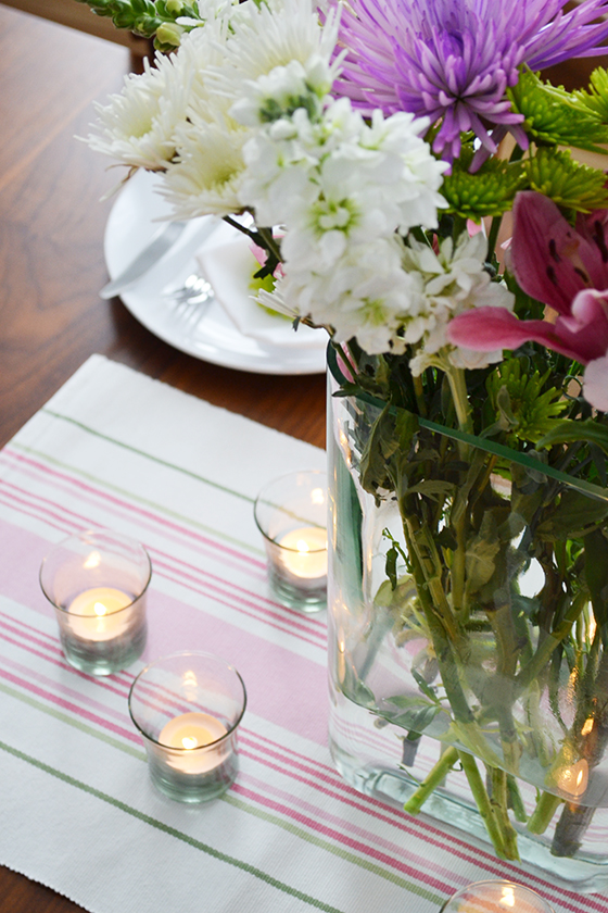
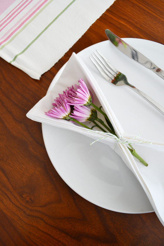
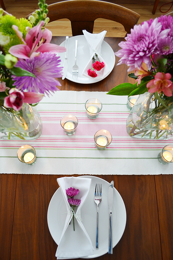
I pulled together the table the day before to make Sunday morning as easy as possible, and the entire house felt instantly brighter! A pink and green striped runner, a dozen votive candles, and two big vases full of flowers were front and center. Then each place setting received a few blooms for a special touch, all tied up with a length of green and white baker’s twine. If you don’t own an affordable set of simple white dishes I couldn’t recommend doing so more – I use them for every single get together.


Fancy Feast Medleys-3-Design Crush


Because my dining room buffet is overflowing with plants, most of my get togethers that include eating are buffet style on the kitchen island. Waiting around the corner were five simple dishes – sweet potato and spinach breakfast casserole, crispy sweet potato roast with herbed coconut creme fraiche, roasted garlic and tomato lentil salad, strawberry cream cheese breakfast pastries, and brown butter banana pudding. I pulled together most of these dishes the night before so all I had to do was finish up Sunday morning.
 

Fancy Feast Medleys-4-Design Crush


I’m thrilled with how simple yet put together everything felt, and my guests seemed to echo the sentiment as we first indulged and then sat talking over coffee through mid-afternoon.


Fancy Feast Medleys-5-Design Crush


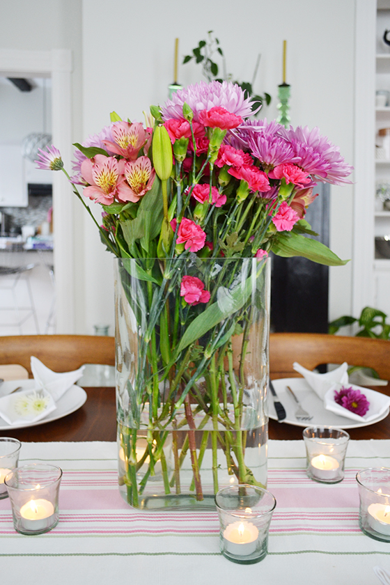
Messy floral arrangements are some of my favorites, especially with a mix of varietals like I used here. I purchased two of these matching vases a few years back and love them because they’re the perfect height, no views across the table are blocked. I’ll even use them for shorter blooms to create a more artsy piece.


Fancy Feast Medleys-6-Design Crush


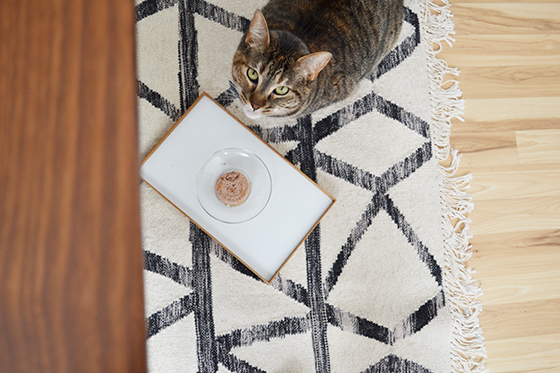
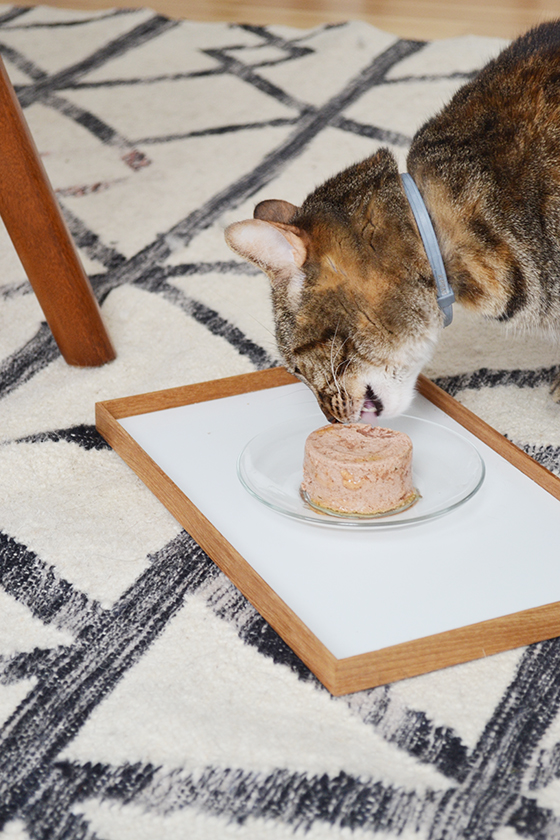
Whether you know me in person or on the web, you probably know how much I love my five pets. (Like, a lot.) I’m definitely guilty of spoiling and including them in festivities whenever possible. My youngest cat, Rainey, loves being around the table when it comes time to eat – you’d think she was one of the dogs the ways she sits patiently waiting. But the one way I don’t indulge my cats is by giving them table food. It was easy to keep those laser-like stares at bay by treating her to a can of Fancy Feast Medleys.


Fancy Feast Medleys-7-Design Crush


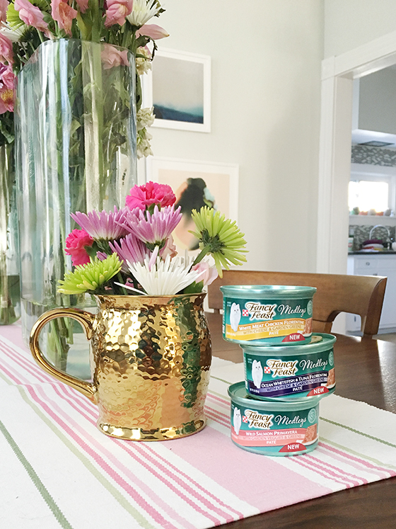
We were both excited when Fancy Feast introduced four varieties of pate to their Medleys line. Each can is full of inspired combinations of ingredients that Rainey couldn’t wait to devour. And because they have accents of vegetables, garden greens, or even cheese I can feel like I’m treating her to something special. Check out more information and get a free sample for your favorite feline companion at discovermedleys.com.


Fancy Feast Medleys-8-Design Crush


This post sponsored by Fancy Feast. I received compensation, though all words and opinions are my own as always. Thank you for supporting the brands that help keep Design Crush creating fresh content!

3

The Versatility of a Good Throw

Snowe Home-1-Design Crush


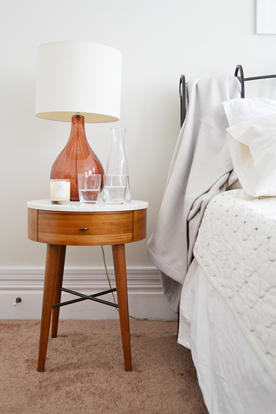
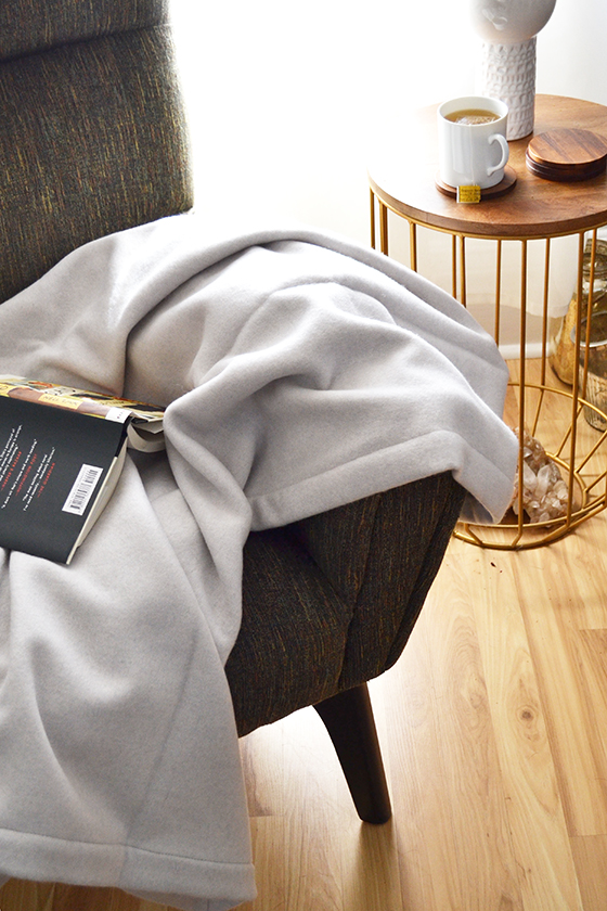
January is not only the coldest, but the month demanding the highest level of coziness. Thankfully Snowe recently released the perfect throw blanket for the job. I’ve been carrying it from room to room for the past week as I work through my day, because it’s just that functional and versatile. It’s a great throw to curl up with during a nap, and the super luxe cashmere, merino lambswool. and silk feel as amazing as they sound.


Snowe Home-2-Design Crush

Snowe Home-3-Design Crush


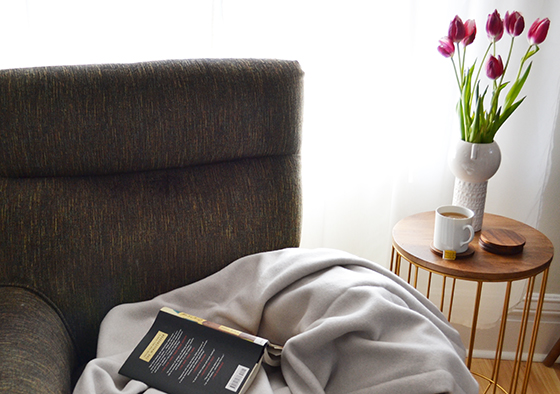
I’ve been trying to get back into my reading groove in the new year. This throw is the perfect thing to curl up with in my favorite chair – just add a book and a steaming mug of tea! Not only does this beauty look seamless in my living room, it’s also static resistant so it attracts less… like my pups’ hair.


Snowe Home-4-Design Crush

Snowe Home-5-Design Crush


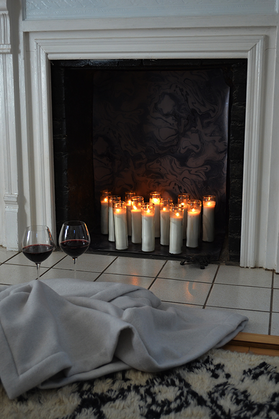
Last, but certainly not least, it’s ideal for curling up in front of the fireplace with a glass of wine. Just like all of Snowe‘s goods, it’s exceptionally made and thoughtfully designed. I’m looking forward to adding more of their pieces to my home over time.

This post sponsored by Snowe. As always, all words and opinions are my own. Thank you for supporting the brands that help keep Design Crush creating fresh content!

Mugs // Red Wine Glasses // Drink Essentials Set // Candle

1

Refocusing with Pique Tea

Pique Tea-1-Design Crush


It’s no secret that working from home can be a challenge some days. For every advantage (flexible schedule!) there’s a disadvantage (distractions!). As Design Crush has continued to grow as a business my approach has had to change, and the latest curve is one I can’t say I was expecting.

As a freelance or contract worker there’s always the fear that the current job I’m working on will be the last. It’s the nature of the beast, and in my case the anxiety – and I don’t like saying no because of it. In the past year I’ve said yes a few too many times, and found myself slogging through the last three months of 2015 with way too much on my shoulders. Namely, I was neglecting to make any time for myself.


Pique Tea-2-Design Crush


I knew I had to change up my routine and focus on the times during the day when I felt most productive as for that hour or two that left me dragging. I used to end my day during chillier months with a cup of tea, and thought that maybe rescheduling what used to be my downtime as a time to refocus might help me out.


Pique Tea-3-Design Crush


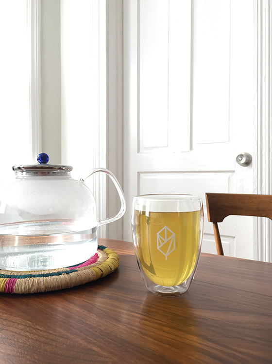
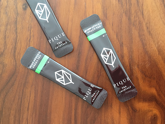
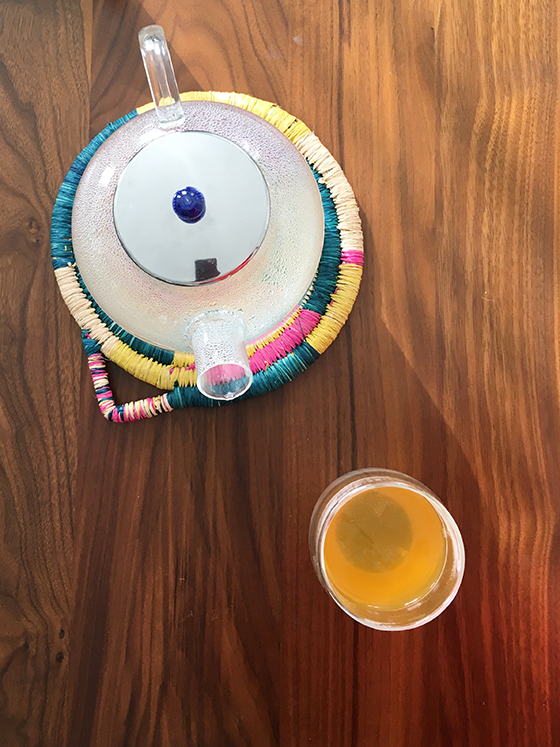
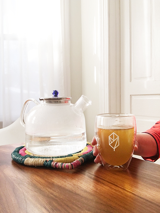
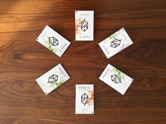
Then along came Pique Tea. Designed for excellence with every sip, Pique Tea has taken the tea world by storm with their new Tea Crystals. I love that even though my tea is ready in an instant the results aren’t compromised, the tea in my mug is pure and rich and tastes just as though I’d thoughtfully brewed it.


Pique Tea-4-Design Crush


So just how does Pique Tea achieve this tea crystal sorcery? It’s relatively simple – they brew high quality organic loose tea leaves, then when the perfect brew is reached they distill it into pure tea crystals. Basically taking the guesswork out of making a great cup of tea, and helping me avoid over-brewing by walking out of the kitchen and letting my tea steep for too long. (So guilty.) The hope is that a great cup of tea made easy will cause a ripple effect of feeling well, doing well, and doing more.


Pique Tea-5-Design Crush


But don’t take my word for it, try Pique Tea for yourself. Sign up for a free trial and receive all five flavors – Earl Grey, English Breakfast, Mint Sencha, Sencha, and Jasmine – to try on your own (that’s 14 sachets, or a week’s supply)! Now tell me, how do you make time for yourself during the weekdays?

This post sponsored by Pique Tea. All words and opinions are my own, as always. Thank you for supporting the brands that help keep Design Crush creating fresh content!

0

Bridge & Burn

Bridge & Burn-1-Design Crush


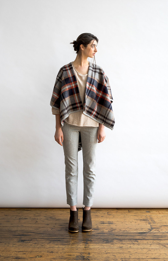
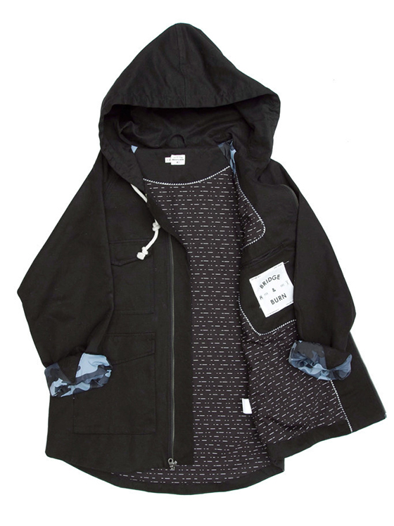
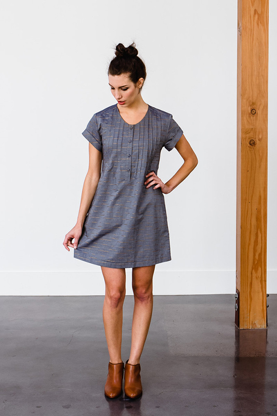
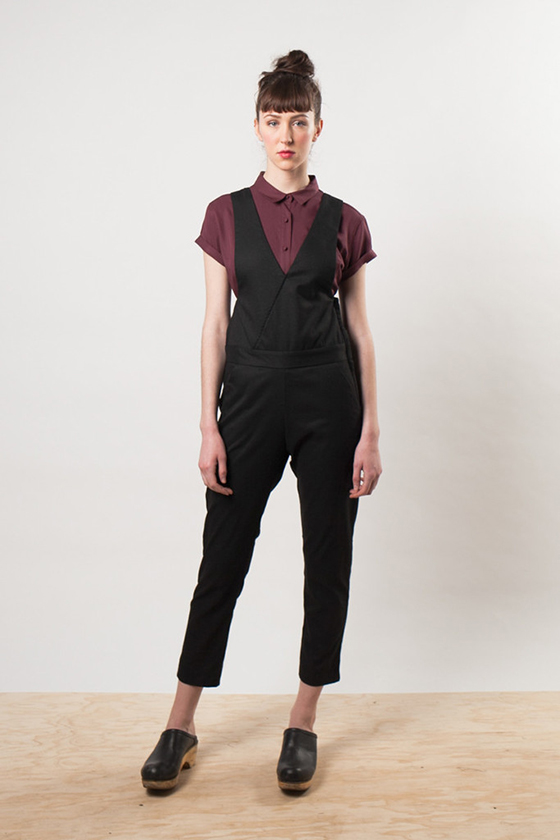
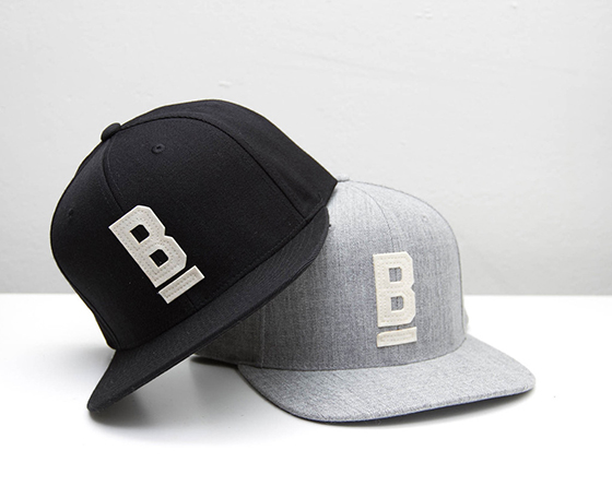
I’ve been a fan of Bridge & Burn from the start. Their classic, functional clothing designs are right in line with what I prefer to wear most days. Since 2009 they’ve been creating classic, understated apparel inspired by the natural beauty and culture of Portland. Each piece is designed right above their flagship store by a small team, meant to stand the test of time and be worn again and again – occasionally from the outdoors to dinner and back again! I picked up the Howell parka (below) and a few other pieces last month and am in love with the quality and fit of every one. This is a line that’s sure to be a staple in my closet for a long time to come.


Bridge & Burn-2-Design Crush

Bridge & Burn-3-Design Crush

Bridge & Burn-4-Design Crush

Bridge & Burn-5-Design Crush

Bridge & Burn-6-Design Crush

Oxbow Wool Wrap Scarf // Howell // Huron Chambray //
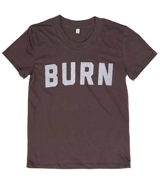
Burn Blackwash Tee // Penrose Black Overalls // B Flat Six Panel Hat

0

The Coffee Lover’s Gift Guide

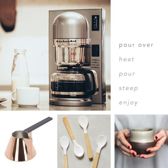
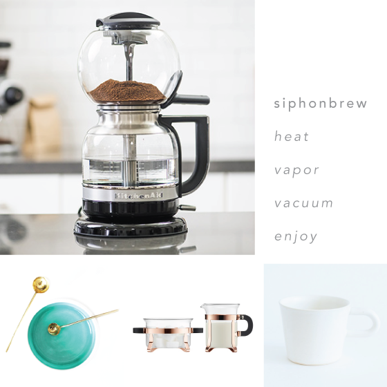
To put it simply, I adore coffee. I started drinking it when I was a kid, and as I grew older the ratio of milk to coffee changed drastically. These days I happily switch between French press, pour over, and drip depending on my mood and how much time I have to brew. One of my vices is seeking out the newest technology and products in the world of coffee, and a slew of the latest is from none other than KitchenAid. That’s right, the brand that’s responsible for one of the most iconic mixers is also fluent in coffee beans and modern design. I pulled together a few gift ideas for the coffee lovers in your life, depending on their preferred brewing method – have a peek below.


KitchenAid-pour-over-Design Crush

Brew Milk Pan // Merienda Flatware // Pottery Tumbler

I know what you’re thinking – that looks just like a drip coffee maker. But it’s not. For the coffeehouse experience at home, the new KitchenAid Pour Over Coffee Brewer precisely heats and pulses the flow of water, then steeps like a manual pour over which allows the grounds to bloom. The result is bright, clean, and full flavored coffee without diluting.


KitchenAid-siphonbrew-Design Crush

Salt + Sugar Spoons // Sugar + Creamer Set // White Kam Mug

The science and flavors of siphon brewing come from vapor pressure pushing the water up through the siphon tube. After that vacuum suction and gravity draw the coffee down through the grounds. The dramatic KitchenAid Siphonbrew has simplified this process to extract a cup of coffee that showcases all the flavors of your favorite beans. The brewer is made of high quality glass and stainless steel to be a true thing of beauty.


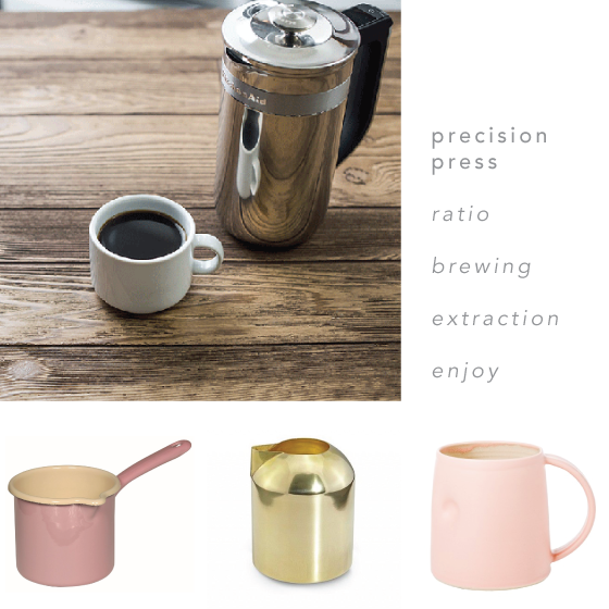
KitchenAid-precision-press-Design Crush

Enamelware Pink Spouted Milk Pot // Form Brass Milk Jug // Pink Everyday Mug

A French press brews a bold, full-bodied, robust cup of coffee. KitchenAid’s Precision Press was developed to ensure the best French press coffee can be brewed conveniently at home through simple technology and sleek, functional design. It even features an integrated timer and scale that  measures brew time and the precise ratio of coffee grounds to water for the perfect brew.


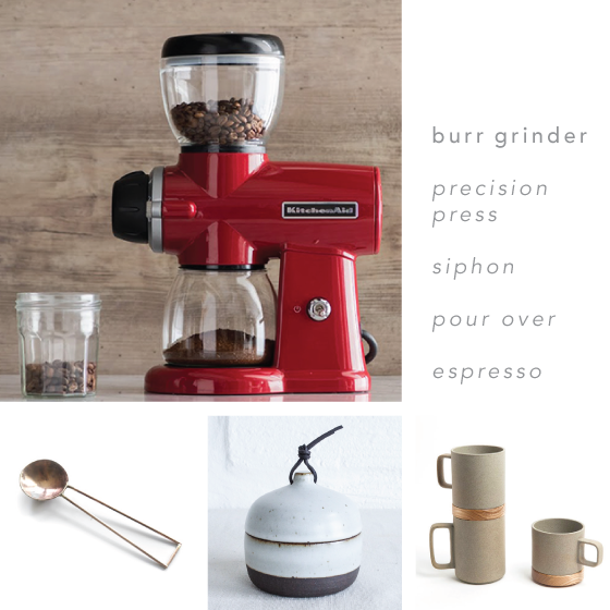
KitchenAid-burr-grinder-Design Crush

Apothem Bronze Coffee Scoop // Rounded Canister with Leather Tie // Hasami Brown Porcelain Mug

Each of these three brewing methods demands a specific grind size to extract the proper flavor. Grinding your beans to the precise size just before brewing is a key element in brewing the best possible cup of coffee. KitchenAid’s Burr Grinder offers a level of precision and consistency with its fifteen different grind sizes.


KitchenAid-5-Design Crush

This post sponsored by Single Edition Media on behalf of KitchenAid. All words and opinions are my own. Thank you for supporting the brands that help keep Design Crush creating fresh content! Follow KitchenAid online at Facebook, Instagram, Pinterest, and Twitter for product updates and discounts.

0

A Pantry Makeover with EasyClosets

EasyClosets-1-Design Crush


Another reminder that I’m in my mid-30s? The level of excitement I felt upon teaming up with EasyClosets to create an honest-to-goodness pantry. I could regale you with a verbal description of the before, but…


EasyClosets-2-Design Crush


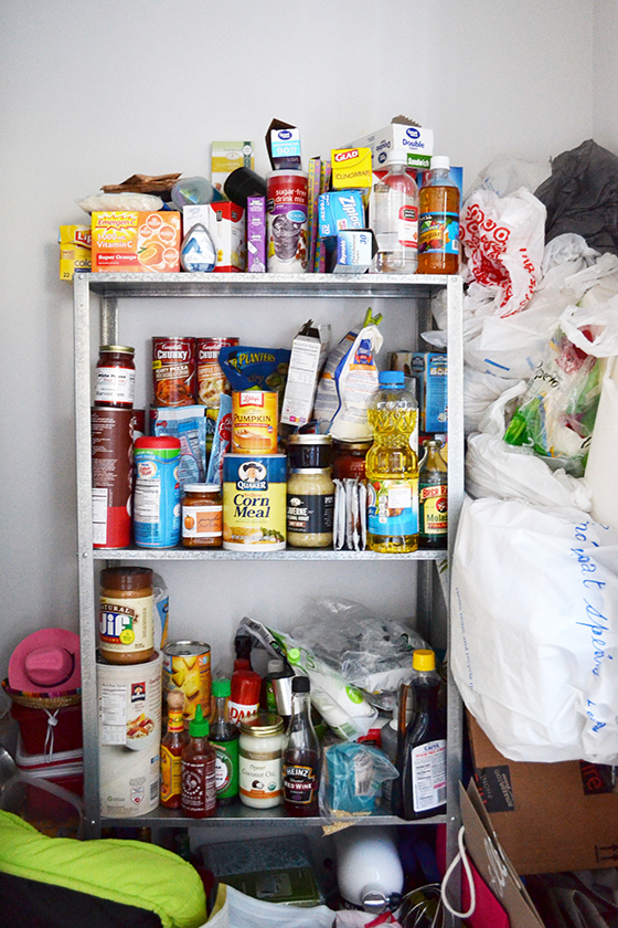
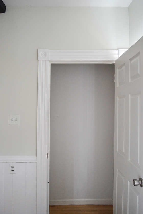
I’ll show you instead. Let me spell out a little about what your eyes are currently shying away from – a $15 shelf from Ikea, my tendency to hoard any and all bags, a dog bed, and a pink cowboy hat one dog wore for Halloween. And that’s only what you can see. An embarrassment to say the least, and a whole lotta unused space.


EasyClosets-3-Design Crush


Here’s what was underneath all of that: a clean slate. I’m not entirely sure what renovations took place to create this kitchen closet before the house became mine. A full bathroom is directly behind it, and the back wall is one of the only pieces of drywall in the entire house. There’s original molding on both sides of the door frame and the pantry door is the only new one in the place. But, a good empty space to start with – I’ll take it!


EasyClosets-4-Design Crush


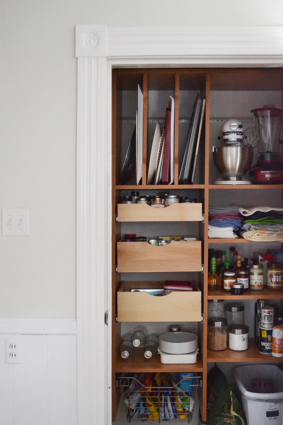
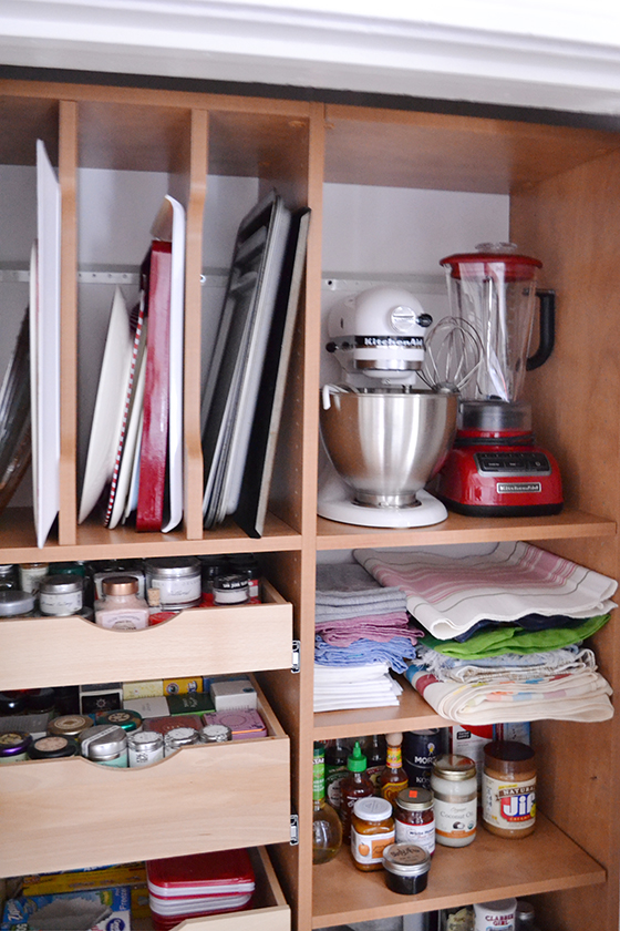
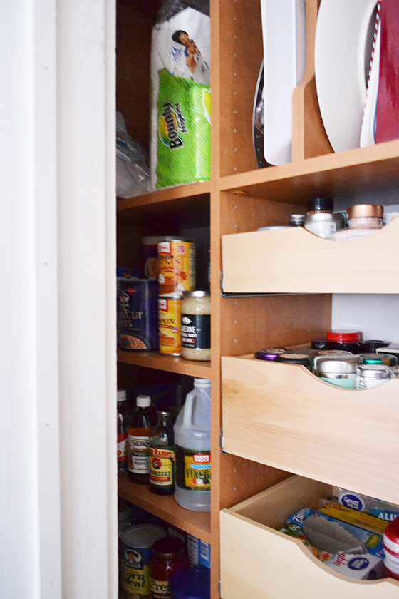
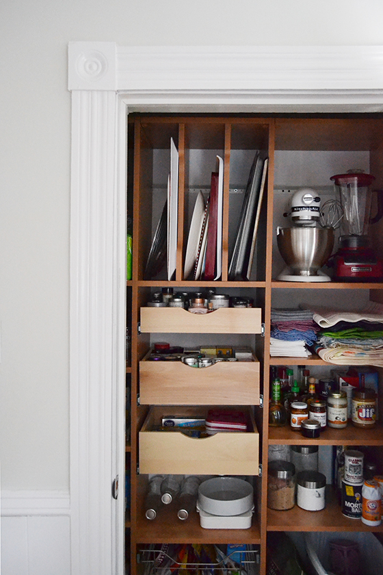
I worked one-on-on with a designer from EasyClosets to create a system that would fit my space and be functional for the way I wanted to use it. My main goal was to take some of the pressure off of the few kitchen cabinets I have by utilizing the closet to store cookie sheets and platters, large kitchen appliances, all non-perishables, recycling, and dog food.


EasyClosets-5-Design Crush


My designer, Patricia, offered up two different layouts after I provided her with the dimensions of the closet, then I took pieces from both and combined them into a third. I chose from EasyClosets impressive selection of finishes and hardware to get the look I wanted, something that would blend in with the rest of the kitchen. A few weeks later the system showed up in about ten boxes on my front porch, and that weekend my stepdad and I spent an afternoon putting it together. That’s really saying a lot because we’re not very handy and yet were able to create an entire pantry in a matter of a few hours.


EasyClosets-6-Design Crush


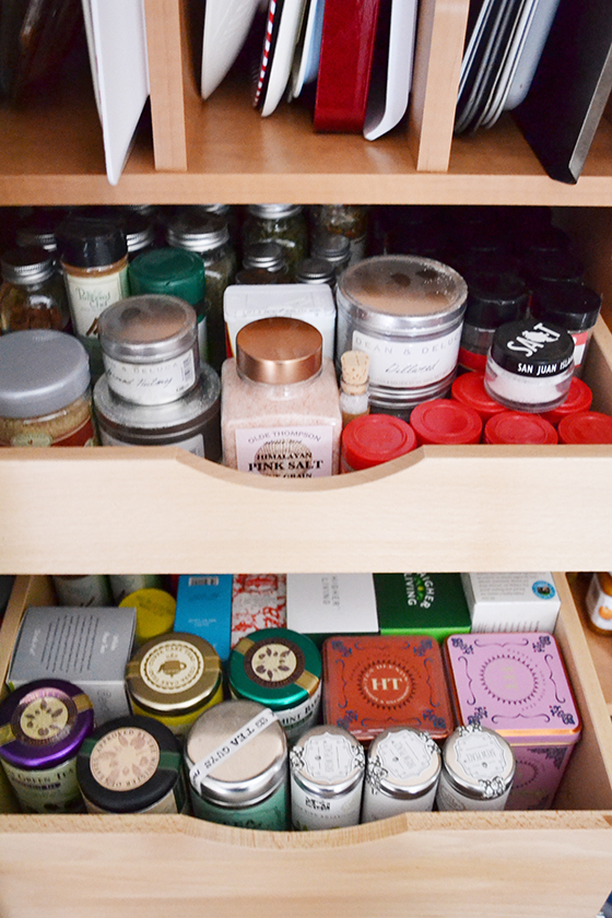
There are three sections, the left and right are full of shelves while the middle has drawers. I’m finally able to see all of my spices for cooking and baking as well as my (ridiculously robust) collection of teas! Even my table linens and a few serving pieces found a place to call home.


EasyClosets-7-Design Crush


I didn’t overly style the pantry because I wanted to showcase how it’s really used. I’m utilizing every possible inch of this closet now, and I couldn’t be happier with the end result!

This post sponsored by EasyClosets. All words and opinions are my own. Thank you for supporting the brands that help Design Crush create fresh content!

2

The Master Bedroom

Master Bedroom-1-Design Crush


I began sharing photos of my current home shortly after moving in last September, not all at once but as things came together. The master bedroom has been pulled together for over six months, but I kept putting off posting about his room for some reason. Maybe because a bedroom is about as personal as a home gets, or at least that’s my best hypothesis.

My bedroom has always been my sanctuary. Ever since I was an only child growing up it was the one space my introverted self could escape to, where I might pick up a book or draw for hours on end. I guess some things never change.


Master Bedroom-2-Design Crush


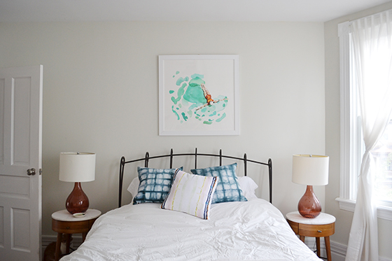
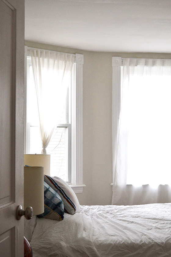
My favorite thing about this space is all of the natural light it gets through the west-facing windows. I painted the walls the same custom white-grey/grey-white as the rest of my home and hung simple white curtains to capitalize on it.

To be completely transparent, I’m bored of my metal bed frame that weighs approximately 300 pounds. It was my taste when I bought it nine years ago, but like many things that’s changed. Thankfully it’s rather plain, so I’ll deal with it for awhile longer. The same goes for the matching lamps, but I just haven’t come across the perfect ones to replace them yet.

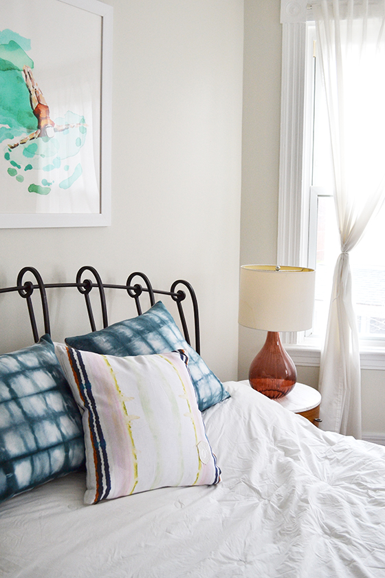
What I love are my matching Penelope Nightstands, throw pillows from Rebecca Atwood and Kristi Kohut, and the art – Float by Betty Hatchett. I chose this piece for over the bed specifically because it was so calming and reminded me of dreaming.


Master Bedroom-3-Design Crush


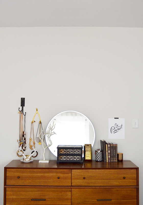
I also love my mid-century 6-drawer dresser to no end. Until this one came into my life last year I was still using the two cherry wood chests my grandparents bought me when I was ten years old. They’ve been relegated to the guest room for the time being and will probably be schlepped up to the finished attic eventually. Becky Simpson’s Be Present print hangs right next to the door as a reminder every morning.


Master Bedroom-4-Design Crush


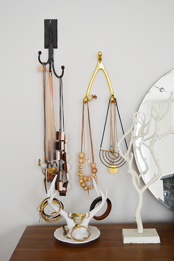
Jewelry is kept in order mostly where I can see it. Sentimental pieces and things I don’t wear on the regular are kept in the box on top of the dresser.


Master Bedroom-5-Design Crush


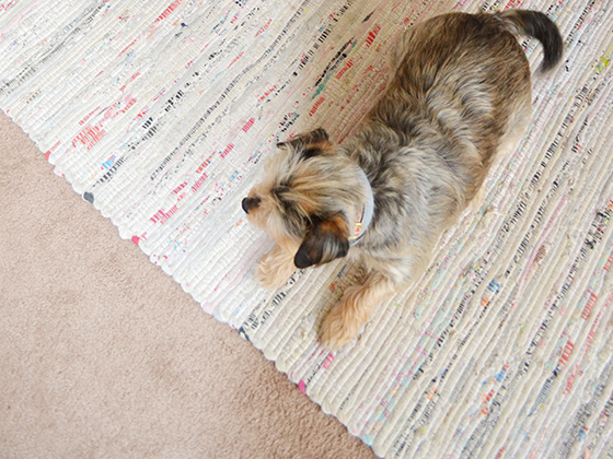
And here’s the dirty little secret that resides in the second floor hallway and bedrooms. Not Bebe, rather the wall to wall carpet. (Blech.) I couldn’t be less of a fan, but at least it was new when I moved in and it’s not an offensive color. To combat it I’ve gone with the rug-on-rug approach and laid down an 6×9 flat-woven rug by Safavieh that makes the space feel more pulled together through color and texture.


Master Bedroom-6-Design Crush


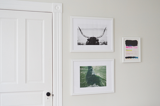
On the wall opposite the bed is the door to my walk-in closet, which I don’t know the history behind but am guessing was added at some point after being built in 1900. I really like how large and clean this wall is and didn’t want to clutter it up, so instead I settled on these three pieces – Staredown by Amy Carroll, Salinity Now by Denny Holland, and Find Your Bliss by Kristi Kohut – that are united by white frames.


Master Bedroom-8-Design Crush


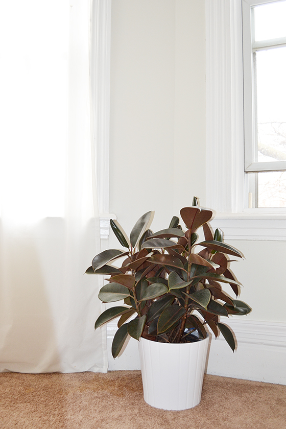
I’m slowly becoming a crazy plant lady and experimenting with what I can keep alive longest. This guy is the first of many floor plants that will be added through the next few months.

And that’s that! I’m hoping and half planning to get the guest room up to speed this spring, so hopefully I’ll be able to share that will you then.


Master Bedroom-9-Design Crush


Penelope Nightstands c/o West Elm // Shibori pillows from Rebecca Atwood // striped pillow c/o Kristi Kohut // Float, Salinity Now, and Staredown art c/o Minted // Mid-Century Six Drawer Dresser c/o West Elm // Be Present c/o Becky Murphy // rag rug (discontinued) c/o Rugs Direct // Find Your Bliss art c/0 Kristi Kohut framed by Simply Framed

1

Design Crush x Umbra

Design Crush x Umbra-Hub Ladder-2


I’ve teamed up with one of my favorite design brands, Umbra, to share how I’m using some of their clean-lined products this holiday season. Their wares are extremely well-designed and versatile, making them an especially good fit for small spaces where they can pull double-duty.

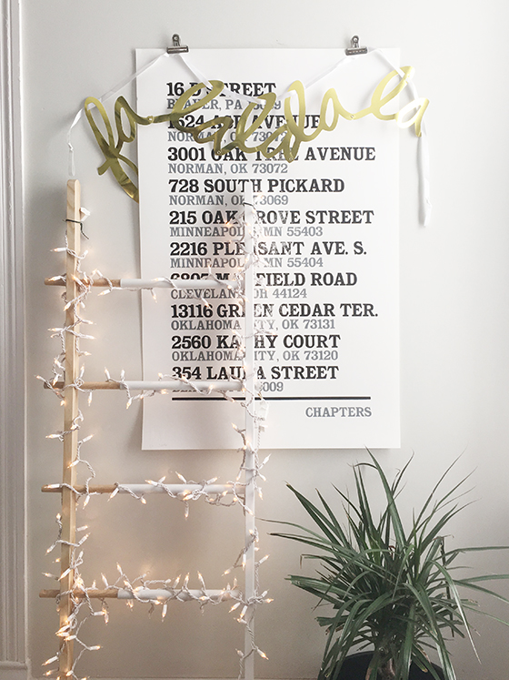
I’m starting with my favorite, the Hub Ladder. I wrapped the expandable beech wood and rubber-coated steel clothing (or towel) holder with 200 white lights for a sculptural Christmas tree alternative. Right now it’s my bedroom lending some festive and functional flair to the chaos.


Design Crush x Umbra-Touch Toothbrush Holder-2


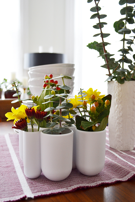
I always have fresh flowers (usually from the grocery store) in my home, so for Thanksgiving dinner I wanted to get extra creative. I used three Touch Toothbrush Holders as vases that formed a modern arrangement when clustered together. (Tip: It’s always a good idea to keep florals short so that guests can see one another across the table.)


Design Crush x Umbra-Prisma Wall Decor-3


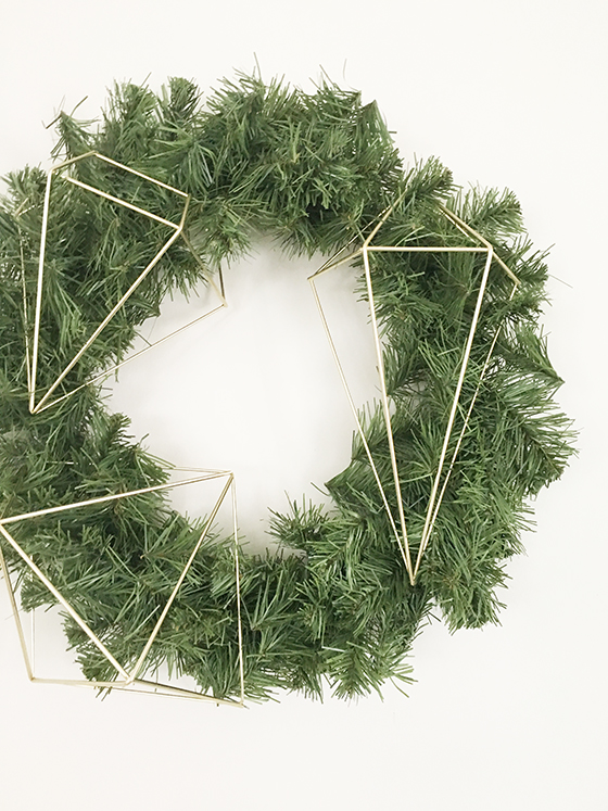
I took down two large pieces of art that hang in my entryway and replaced them with wreaths. Each one got decorated with half of a brass Prisma Wall Decor set, which couldn’t have been easier because the pieces could be hooked around the branches.


Design Crush x Umbra-Gazette Magazine Rack-1


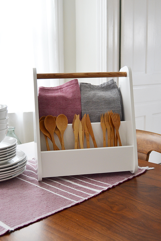
I use the Gazette Magazine Rack year round in my living room, but for dinner parties I give it a different job – as a utensil and napkin holder. When you’re short on space you can carry it around until everyone is set to eat, then set it down someplace out of the way.


Design Crush x Umbra-Toto-1


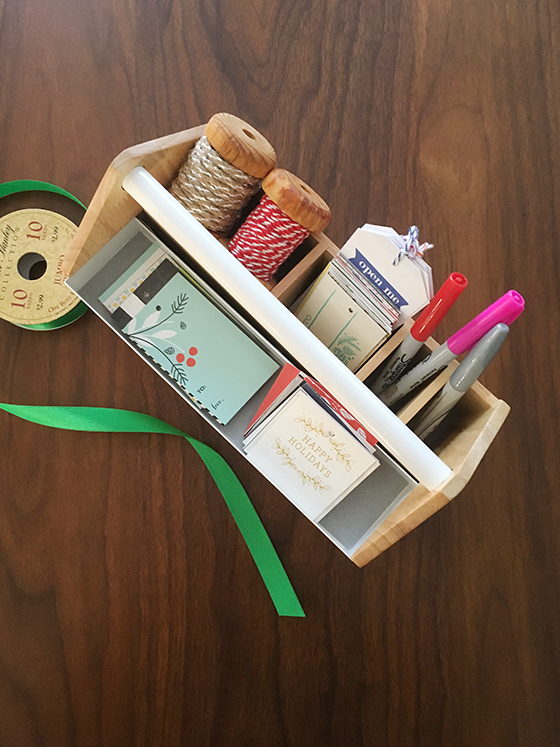
My Toto Storage Box usually lives on a bathroom shelf holding lipstick and nail polish, but during December it becomes a corral for some of my gift wrapping supplies. Sanity and patience are in short supply and this guy helps me out so I don’t lose it wondering where the pen/scissors/tape disappeared to.


Design Crush x Umbra-Corda-1


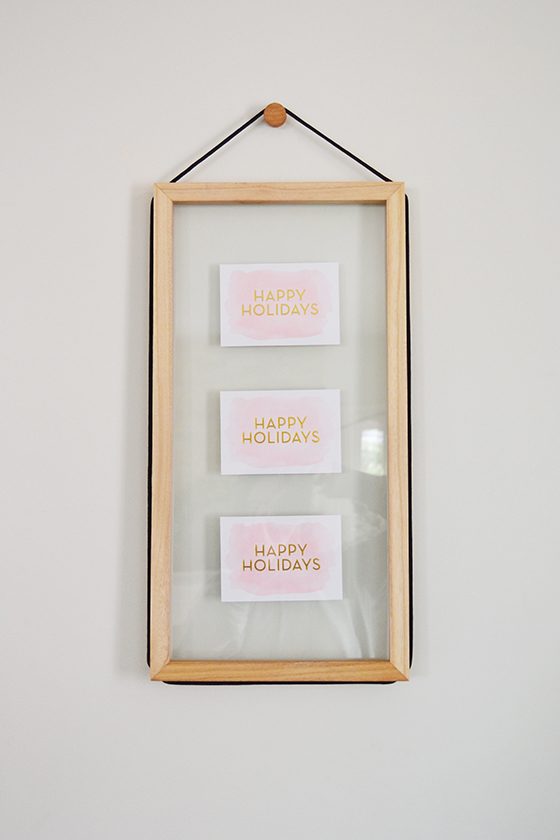
Every year I inevitably end up saving a few of my favorite holiday card designs. For what? I had no clue until now. I picked up a few Corda Photo Displays to make some seasonal art that I actually like. And because you hang this frame either vertically or horizontally I can swap out favorites every year.

It’s nice to be able to stick to your style and aesthetic no matter the time of year, and when you don’t have to reinvent the wheel to do it that’s all the better.

Thank you for supporting the brands that help keep Design Crush creating fresh content!

0