I Am Not a Graphic Designer.

Defined: Graphic Design involves effective visualization of communication concepts, primarily in print and electronic media (including interface design), in the context of business and technology, socio-political, cultural and educational environments, in transmitting government and institutional aims and services, and in visually explaining and exploring medical and scientific data and processes. Clients usually determine project aims. Graphic Designers help to achieve communication goals by analyzing, structuring, planning and creating images and text to enhance visual communication for specific purposes. They often act as consultants.
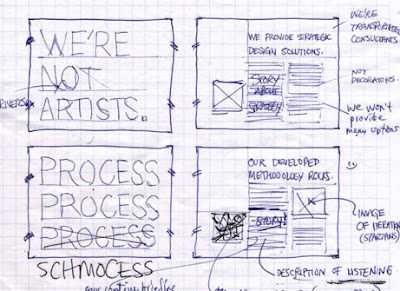

Here’s a really interesting article I came across by Mark Busse of Industrial Brand Creative, Inc. that speaks to the ever-changing roll of a designer in today’s world of communications.

0

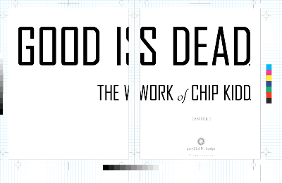
Good is Dead. The Work of Chip Kidd.

Chip Kidd is the closest thing to a rock star graphic design has. Kidd is recognized as a master of contemporary book design with his iconic covers, each a marriage of type and imagery. He’s basically influenced an entire generation of designers in every imaginable field.


And now he has a new book out. Chip Kidd: Book One collects all of his book covers and designs for the first time, as well as hundreds of developmental sketches and concepts. The book also showcases Kidd’s work with comics and graphic novels, including his collaborations with leading artists and writers in the field. Featured are projects for DC Comics, including Batman and Superman, as well as Kidd’s award-winning exploration of the art of Charles M. Schulz. Most notable, however, is the books design – a half cover relative to the full page layout. It’s going to be a handful to hold, but well worth it.

Check out Kidds site, too. I love the “design” design of it all.

0

Rethink: Contemporary Art.

Rethink of Vancouver, British Columbia is a cutting edge agency.

The agency’s philosophy – creative and otherwise – is pared down to the essentials. Pencil rough storyboard presentations (no PowerPoint). Notes in client meetings are taken on walls covered in chalkboard paint. Any leave-behinds are tucked into blank white folders, DVD covers, or booklets stamped with a small backwards circle R – the Rethink logo. Even business cards are generic – they’re plain white with blank spaces for the handwritten name of the staffer and a phone number or email address. The web site itself is a blank white screen with a small glyph saying “web site.” Pretty Cool.

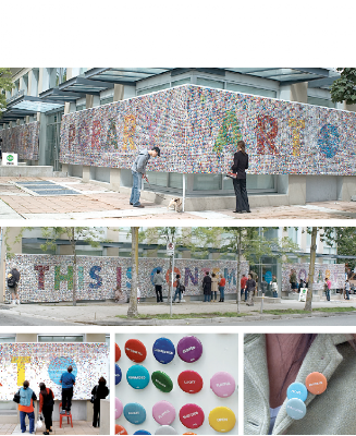
This is my favorite project of theirs. Fifty-thousand buttons were displayed, each printed with a single word representing one of a hundred possible responses to contemporary art. The public was free to walk away with as many as they wanted in this installation for the Contemporary Art Gallery in Vancouver.

0