Oblique Magazine Rack.

I love the simple, structurally clean design of the oblique magazine rack by designer Marcel Wanders. I’ve always hated stacking up magazines and great little books just because things start to feel cluttered. Although this is waaay out of my price range it’s a great alternative to the Magazine Pile and a nice way to show a particularly awesome spread in your favorite mag.

2

Walter Martin & Paloma Muñoz.

Walter Martin and Paloma Muñoz work as a team to create some of the most innovative, breathtaking art I’ve seen in recent memory. Specifically their Travelers series which is some of their latest work. Martin and Muñoz have taken snow globes and created moments that you’re sure to remember. Some are are filled with sadness, others everyday moments happening in the “snow.” All have a very serene quality which lends itself nicely to the emotions created by the artists.


6

Sugar Lump.

I can’t recall ever having used a sugar lump myself, but that’s not stopping me. I love the design and grid structure of the Sugar Lump by Kathleen Hills so much that it just might make me start asking “One lump or two?”

3

Colour Calendar 2008.

I’m obsessed with the 2008 Colour Calendar for so many reasons.

“This appealing, spiral-bound desk calendar is a bit like a Pantone book with room for notes; each day’s color brings its own scent, taste and sound, the implications of memory, the possibilities of the future. A beautiful little object, impeccably printed, for the desk or attaché case of a design aficionado, promising enjoyment long after 2008 is history. The appendix includes a calendar overview for 2008-2009, Pantone codes for the 365 colors, and blank pages for memos.”

:: via Monoscope

0

I Heart Cereal.

A lot. It’s perfect and I could probably eat it three times a day, every day, for a few years before I ever tired of it. These accessories available through Vincon would only serve to feed my cereal addiction in a more attractive way. So long ugly cardboard boxes and soggy spoonfuls. The stainless steel cereal dispenser is attractive enough to leave on the counter and the cereal spoon lets you eat first, drink second. (The spoons would also be fantastic to use with soup.)

3

Designer Crush: Mike Perry.

Mike Perry is a jack of all trades when it comes to design. Art direction, illustrations, typography, web? Check, check, check and check. I’ve mentioned his book – Hand Job: A Catalogue of Type – before and it’s been hanging out on my Wish List for a few months. Thanks to a Barnes & Noble gift card that won’t be the case for much longer. Hand Job is only one of his projects, just take a look at his site to see the lengthy list of accomplishments Perry has under his belt. In his spare time he runs a small design studio in Brooklyn. I’m 99% positive the man has no time for sleep.


1

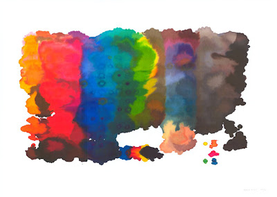
Pantone Pen Print.

The Pantone Pen Print is one of the coolest, most original ideas I’ve seen in awhile. Daniel Eatock actually completed the project back in 2006, but I’ve only just heard about it. It consisted of one complete set of Letraset TRIA Pantone markers arranged in the color spectrum and left for one month sitting on their uncapped points on a stack of 500 sheets of uncoated white paper. The results were incredible. The ink bled through 73 sheets of the paper. The numbering of each sheet corresponds to its position within the stack furthest from the top (i.e. 1/73, etc.). The pricing also corresponded similarly with 1/73 valued at £1, 2/73 at £2, etc. Of course by now everything has been sold out for ages, but I think a little home experimentation and patience might be in order on my part…


:: via NOTCOT

2

Juno.

I haven’t been this excited about a movie in a long time. I can’t wait to see Juno.

UPDATE: Saw it. Loved it. Immediately went on my Top 10 Favorites Movies list.

0