Big Happy Family

Urbio-1-Design-Crush


Modular things make me stupidly happy, so it was a no brainer that I needed the Big Happy Family in my life. But which part of my home to organize? I could get culinary tools in order or plant an herb garden in the kitchen. The office could stand some wrangling in terms of small supplies that I’m forever misplacing. But the entryway, yes. That was the answer.


Urbio-2-Design-Crush


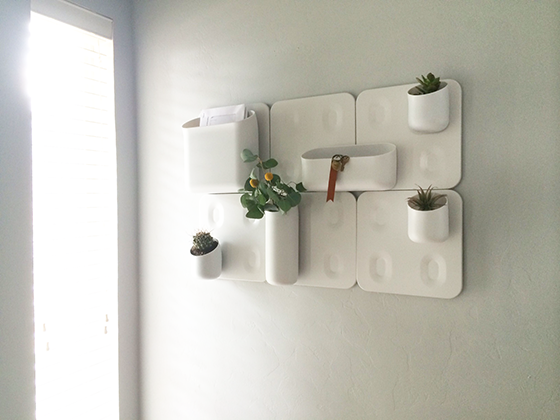
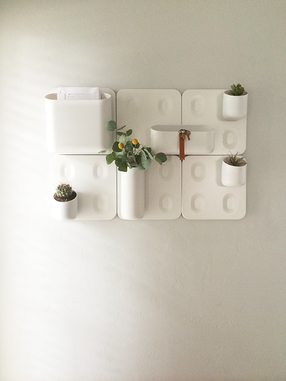
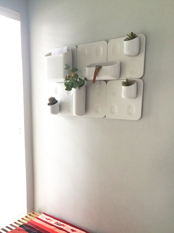
The differently sized magnetic modules were perfect for what I had in mind, some organization and some green all in one place. The Big Happy Family was fairly easy to install, all it takes is some sheet rock anchors and screws. The wall plates snap easily onto the brackets that get attached to the wall, then the various modules attach to the plates via magnet. This makes removing everything such a breeze and reorganizing the modules on a whim super simple.


Urbio-3-Design-Crush

Urbio-4-Design-Crush


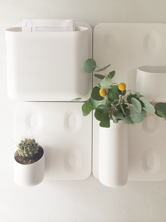
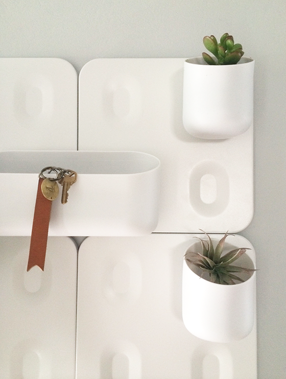
I used the small Shorty modules for plants – a cactus, a succulent, and an air plant – and I love how easy it is to remove each one when it comes time to water. (I’ve been known to be clumsy!) Outgoing mail finds a home in the Wide Mouth, while the String Been makes an ideal vase for clippings from my yard or flowers from the market. And the Wide Mouth is a perfect catchall for my keys and whatever else I don’t want to forget when dashing out the door to meetings and hot dates. (Ahem.) I’m thrilled with this new addition and am looking forward to figuring out new purposes for Big Happy Family as time goes on!


Urbio-5-Design-Crush

This is a sponsored post by Viesso. As always, all words and opinions are my own. Thank you for supporting the brands that help keep Design Crush going!

0

Quercus & Co.

Quercus & Co-1-Design Crush

Quercus & Co-2-Design Crush


My walls are practically bursting at the seams with art, but that doesn’t stop me from ogling everything at Quercus & Co. The Sydney-based wallpaper design and printing company shows off an obvious love of pattern and color and has a gift for combining the two. Every design available is either hand-painted or drawn before being printed onto eco-friendly paper. I’d be lying if I didn’t say my wish list has just grown by an item or two!


Quercus & Co-3-Design Crush


Quercus & Co-4-Design Crush

0

A Little Less Blue, A Little More Light

SW-NPW-1-Design-Crush


After our teaser last week, I’m back today with my bathroom reveal for National Painting Week! That’s right, I went with a subdued version of the color that was already in play. There’s just something about a blue of any hue that feels refreshing. And because this is also the bath directly across from the guest room I wanted to keep things in the same color family to feel slightly related.


SW-NPW-6-Design-Crush


In case you need a reminder (it is Monday after all), here’s the bare bones empty before shot. My goal was to make this windowless hall bath as appealing as possible to buyers since I’m gearing up for a move and will soon be putting my home on the market.


SW-NPW-9-Design-Crush


SW-NPW-8-Design-Crush


I visited my local Sherwin-Williams store and picked up some paint chips to test against the light about a week before painting. This is definitely an important step, colors that differ only slightly can look hugely different depending on what light they’re in. The winner was Mountain Air, a super light blue-grey that feels unbelievably fresh and welcoming.


SW-NPW-2-Design-Crush


SW-NPW-3-Design-Crush


I really love how Mountain Air looks with the other elements I’ve added to the room – a new jade plant (that will hopefully survive!), a shower curtain with a splash of coral, and a few abstract drawings are all helping me achieve a relaxed feel. I also bought some new white towels and hardware to add to the equation for an overall refresh.


SW-NPW-5-Design-Crush


And then I went a little overboard and added a stack of favorite books because, well, it is a bathroom. I also like the pops of color and type they bring to the room. All in all I’d call this project a huge success! I think when I remove the pieces of my personal style any potential buyer should be able to picture themselves putting their own spin on this room.

Check out my fellow bloggers sharing their blue projects today for SWPaintingWeek.com – Remodelaholic gave her daughter’s room a refresh and The City Sage gave a side table new life. Tomorrow tune in to Vintage Revivals, Four Generations One Roof,  and Simply Grove to see how they worked their magic with green!

Disclaimer: This is a sponsored post for which I received compensation. All words and opinions are my own. Thank you for supporting the brands that help keep Design Crush going!

6

Moving Prep

Among the long list of things required for my upcoming move is prepping my house for sale. Oh, the intimidation. I always knew I wouldn’t be in this home for that long in the grand scheme of things, so most updates and decor decisions were made with that in mind. The few places I strayed were my guest room, my front door, and my hall bath – which I  painted a Tiffany blue the weekend I closed on the place. While I love the pop of color it brings to the windowless room, I realize that potential buyers may not feel the same way.


National Painting Week Teaser-1-Design Crush

PHOTO: Better Homes & Gardens

When Sherwin-Williams asked me to team up with them once again for National Painting Week I knew this was the room that needed my attention most. My goal was to have it blend in a bit more with the rest of the house’s relaxed and muted palette while still retaining the feel of being light and open. The wall color was close to the above blue, but kickier with a touch more green. (Just trust me for now.)


National Painting Week Teaser-2-Design Crush

PHOTO: dustjacket attic

The way I saw it I had three options. One was the obvious route of straight-up white. There’s something innately refreshing about a blank canvas, and surely that would appeal to buyers when they were trying to envision themselves living here.


National Painting Week Teaser-3-Design Crush

PHOTO: Canadian Home Trends

The second was a neutralizing grey. Something light with some yellow undertones for warmth that would pull in the dappled brown floor tiles. Plus, nearly everything goes with a good grey.


National Painting Week Teaser-4-Design Crush

PHOTO: Better Homes & Gardens

The third option would be to stick with the blue, just tone it down a bit. Blue bathrooms always seem to have a spa-like quality to them that no other color comes close to.

I’ll be sharing my full bathroom reveal April 7th. SWPaintingWeek.com will be sharing inspiration, ideas, and more to get your creative juices flowing for your own painting projects all week long so be sure to check in. There will also be projects from 14 other design bloggers celebrating National Painting Week, so get ready for things to get colorful!

Disclaimer: This post is sponsored by Sherwin-Williams. Though I have been compensated, all words and opinions are my own. Thank you for supporting the brands that help keep Design Crush going!

0

Spring Update: Minted Art

Minted-1-Design-Crush


It’s been almost a week since the last snowfall, so I’ve decided that spring is definitely almost maybe here. Probably. Anyway, I thought I’d do my part to urge it on by starting some spring updates around the house.

My first refresh is the art in my master bedroom, because it’s been several years since I hung a large-scale photograph by Kelly Lynn Jones above my bed and called it a day. This room is my sanctuary and I really wanted to add to that vibe, especially considering my office is directly across the hall.


Minted-2-Design-Crush


I went with four prints from Minted that gave me that daydream-filled, relaxing feel that’s so necessary to helping me unwind at the end of each day. The color palette helps reflect it as well, while the white frames I chose for all four pieces hold everything together cohesively.


Minted-3-Design-Crush


To keep things interesting I made sure to select varied sizes – 30 x 40″, 24 x 18″, and 16 x 16″. To be honest, this is the most art I’ve had in this bedroom. Ever. I was nervous that it might start to feel cluttered or just be too much but it really isn’t, and I couldn’t be happier with the end result.

Staredown by Amy Carroll // Salinity Now by Denny Holland // Aperture 4 by Susie Allen
// Grass with Seeds by Jorey Hurley

This post sponsored by Minted. As always all words, opinions, and experiences are my own. Thank you for supporting the brands that keep Design Crush going!

1

Happy Weekend

1-Design Crush

2-Design Crush

3-Design Crush

4-Design Crush

5-Design Crush

6-Design Crush

7-Design Crush

8-Design Crush

9-Design Crush

10-Design Crush

01/ Skeleton Horse wins for best Halloween costume!
02/ A suspended bicycle roundabout over a highway in the Netherlands.
03/ Insane pumpkin arrangements make up the Great Jack O’Lantern Blaze.
04/ A beautiful old church was converted into a beautiful new bookstore.
05/ Loving this Day of the Dead sugar skull wallpaper!
06/ This cabin was built with $500 of repurposed windows!
07/ Shotgun shells are used to create beautiful mosaics.
08/ These PyroPet candles melt down to metal skeletons!
09/ A loving husband documented his wife’s battle with breast cancer.
10/ Camila Carlow sculpts human organs from foraged fauna.

This week on Design Crush:
Five of my favorite prints in Prints: October Edition.
Two fantastic new tile designs – Wave and Picket.
Inspired illustrations from Laia Arqueros.
I love sending pre-holiday notes, see eight of my favorites in Autumn Hellos.
Support the Humane Society of the United States by purchasing Bloggers Love Cats + Bloggers Love Dogs, two 13-month calendars for charity.
Check out this stunning jewelry collection – Erin Considine AW2013.
I hope you had a Happy Halloween!
Check out my Insta October.
A funny/tragic flip book for adults – Ten Thousand Stories.

2

Wave and Picket

Wave + Picket-2-Design Crush


Tiles can either be traditional and boring or fresh and interesting, there’s not really a lot of middle ground to be covered. Fireclay Tile recently released two new designs in their Debris series – Wave and Picket – that fall squarely (no pun intended) into the second category. Wave captures the feel of the undulating Pacific Ocean while Picket  transforms the iconic pattern into a bold, geometric design. Both use up to 70% recycled materials that are sourced with 200 miles of their Northern California factory – not only is that good for the environment, but it also results in one of the hardest tiles available.


Wave + Picket-1-Design Crush

0