Make It: Faux Stained Glass Windows

DIY-Faux-Stained-Glass-1-Design-Crush


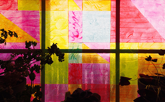
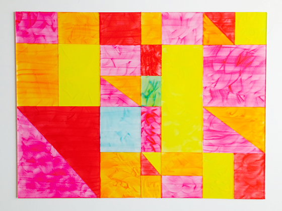
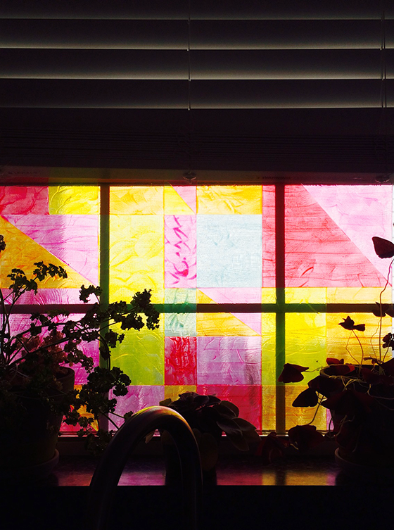
The window over my kitchen sink is one of my favorite places in the house. The few plants that I’ve managed to keep alive spend their time there, it gets great light for almost the entire day, and I love it when a breeze is blowing in. I thought I’d give it a little DIY attention by creating a sort of faux stained glass window, and I’m digging the new (not at all permanent) result!


DIY-Faux-Stained-Glass-2-Design-Crush


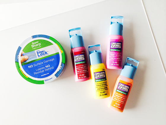
Materials:
plexiglass sheet cut to the size of your window
• piece of white paper or poster board
• ruler
• pencil
• stained glass paints
ScotchBlue™ Painter’s Tape
• smallish paint brush (I used one that is 3/4″ wide)
• paper towels


DIY-Faux-Stained-Glass-3-Design-Crush


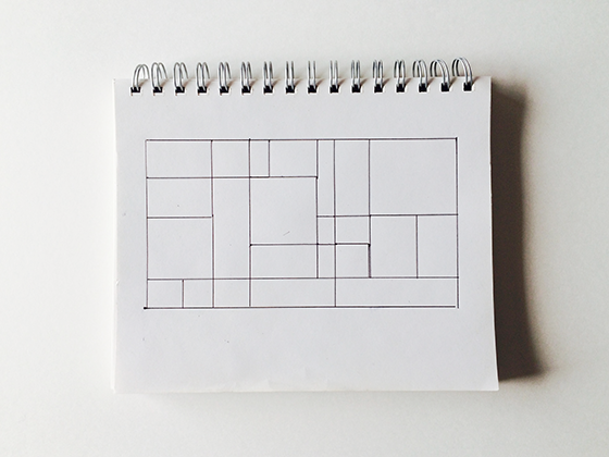
Let’s get started! First thing first, get out a piece of paper or your sketchbook and get to work drawing a rough idea of what you’d like your finished window to look like. I knew that I wanted something Mondrian-inspired with 4-5 colors.


DIY-Faux-Stained-Glass-4-Design-Crush


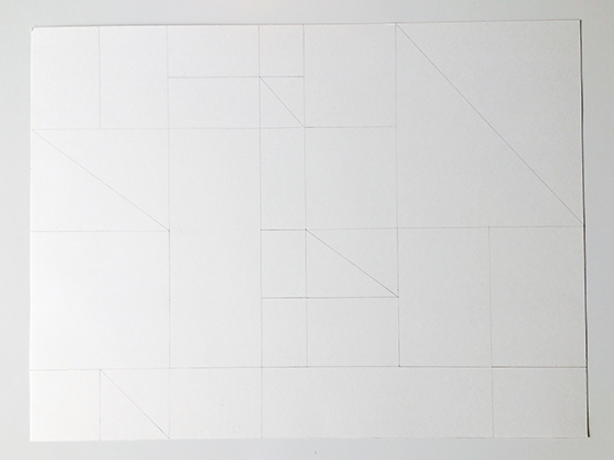
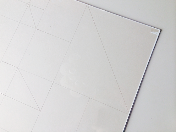
Next you’re going to transfer your idea to a piece of paper or poster board that’s cut to the same size as the piece of plexiglass. Like I said, the sketch was just a rough idea, this will be the real thing that acts as your direct template. I started by going off of my drawing and quickly branched out to something a little more geometric. Some of my original areas were too large, so I broke them down into triangles to add some interest. But really it’s all about what looks good to your eye.


DIY-Faux-Stained-Glass-5-Design-Crush


Once you’re content with your finalized drawing, lay it behind the piece of plexiglass. (There may be sheets of acetate on both sides for protection, so make sure you remove that first.) Use a small piece of tape in each corner to affix the two together.


DIY-Faux-Stained-Glass-6-Design-Crush


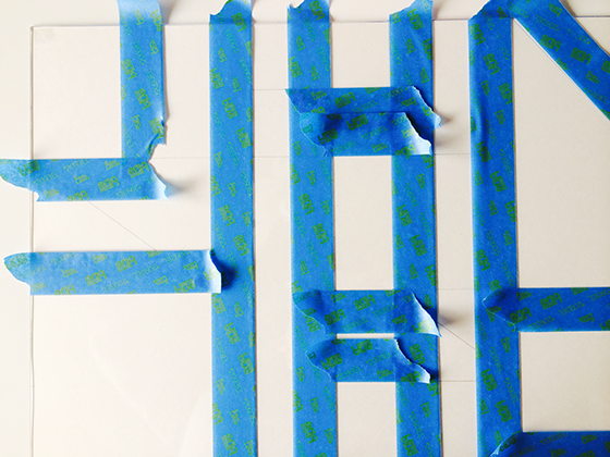
Now it’s time to get taping! You’ll need to work in small sections, I tried to tape off the largest areas first and went from there. There will be lots of drying time in between taping, so even though this project may take a bit to complete (depending on the size of your window) there’s considerable downtime.


DIY-Faux-Stained-Glass-7-Design-Crush


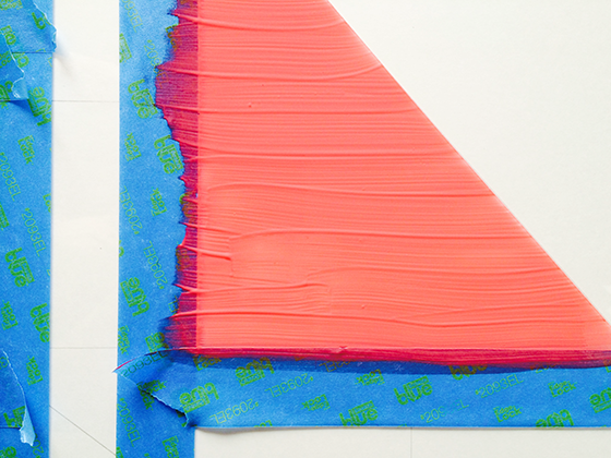
Once you’ve taped off all of the sections you’re going to want to take a minute and think about he layout of your color palette. You don’t want any sections touching that are the same hue. Prep the edges of your plexiglass by laying paper towels (or newspaper) under the entire perimeter. Once you’re all set, squirt a bit of your first color of paint onto a section and gently paint it using horizontal strokes. It will look  a little thin and that’s okay. Make sure and paint over the edge of the tape as you go. Rinse your brush and repeat until all taped off sections are painted. Now this is important, remove the tape while the paint is still wet. It’s crucial to creating a crisp line.


DIY-Faux-Stained-Glass-8-Design-Crush


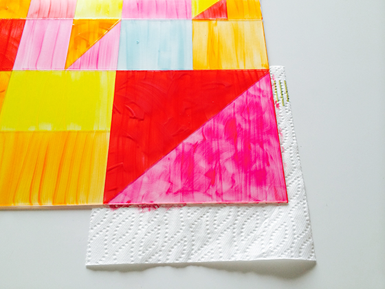
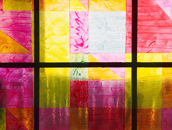
Wait 30 to 45 minutes for your newly painted sections to dry, then tape off a new set of shapes and repeat the process until they’re all filled in. At this point you might be happy and ready to call it a day. I opted to do a second coat because I’m crazy like that. This time around I kind of swirled my paint around instead of using clean strokes. Once it dries there’s more depth and unevenness, which makes it look more like stained glass.


DIY-Faux-Stained-Glass-9-Design-Crush


When you’re through remove the paper guide from the back of the plexiglass and have a good look. There might be an edge here or there that could stand a little touchup. Now it’s time to make your window happy! If there’s a ledge you might want to simply lean your work of art against the window, or use glue dots around the edges to make it a little permanent. Either way, voila!


DIY-Faux-Stained-Glass-10-Design-Crush


To help you get a head start on your own faux stained glass project, or whatever else you might have up your sleeve, we’re giving away a $50 e-GiftCard to Home Depot!

To Enter:
1. Join the Home Depot super fan program.
2. Pop back here and leave a comment letting me know you’re now a member.
3. Do it all before Tuesday, April 8th at 11:59pm CST.

We’ll randomly choose a winner the next day and let you know if you’re a winner!


DIY-Faux-Stained-Glass-11-Design-Crush

I am proud to be a 3M- sponsored blogger, and, as part of my responsibilities, I get the opportunity to evaluate new products from ScotchBlue Tape. Opinions are my own and additional product used in the project were selected by me.


Follow ScotchBlue on Facebook, Twitter, and Pinterest.
Follow Home Depot on Facebook, Twitter, and Pinterest.

11

A Dozen Ways to Decorate Eggs + Bing Rewards

At some point my Easter focus shifted from shoving chocolate bunnies and marshmallow Peeps into my face and onto the art of decorating an awesome egg. My mom and I have had a tradition of dyeing a dozen or two together each spring since I was little. I love our time spent together, but our go-to has been a box of Paas most years and I’m ready to mix it up a bit. Last year we branched out a bit by creating some ombre striped eggs and this year I’d love to take it even further.


A-Dozen-Ways-to-Decorate-Eggs-Bing-2-Design-Crush


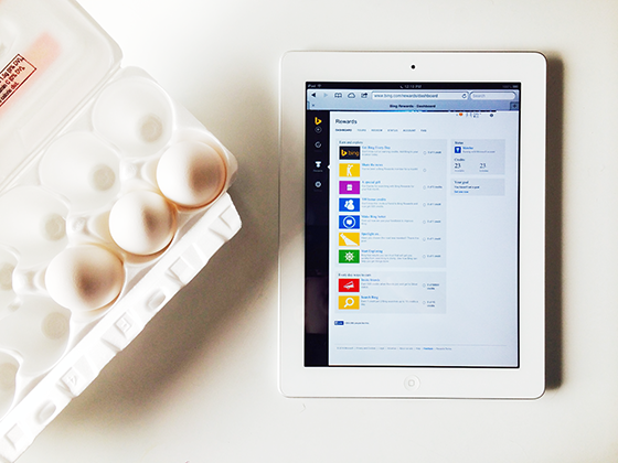
With Easter less than three weeks away, I started looking for my perfect project by doing a little research on Bing which is now iOS compatible. I recently switched my settings on my phone to make it my primary search engine, and to take advantage of Bing Rewards . Create an account for free and earn points that are good for gift cards to your favorite stores and other rewards by doing  searches. There are new opportunities to earn points daily. That’s right, earn points towards gift cards for projects you’re searching – magic.


A-Dozen-Ways-to-Decorate-Eggs-Bing-1-Design-Crush

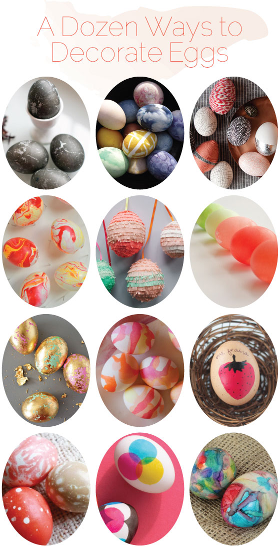
A bunch of colorful options popped up immediately and I narrowed them down. (I don’t like eating hardboiled eggs, so keeping them edible wasn’t necessary.) I ended up with a dozen keepers that are in the running and currently being passed on to the deciding deity – my mom – for a final decision. Which is your favorite?

ROW 1:Hibiscus Dyed Eggs // All-Natural Dyed Eggs // DIY Easter Egg Decorations    ROW 2: Marbelized Easter Eggs // Easter Egg Pinatas // DIY Kool-Aid Easter Eggs    ROW 3:DIY Gold Leaf Eggs // Watercolor Easter Eggs // DIY Fruity French Easter Eggs    ROW 4: Marble Easter Eggs with Kool-Aid // Dot Design Easter Eggs // Sharpie Tie Dye Easter Eggs

I’m required to disclose a sponsored partnership between our site and Bing. I have been compensated in exchange for this post in the form of payment, product or experiences. Thank you for supporting the brands that help keep Design Crush going!

0

Moving Prep

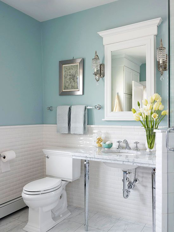
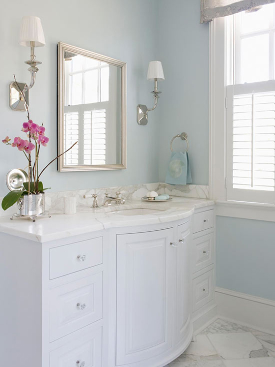
Among the long list of things required for my upcoming move is prepping my house for sale. Oh, the intimidation. I always knew I wouldn’t be in this home for that long in the grand scheme of things, so most updates and decor decisions were made with that in mind. The few places I strayed were my guest room, my front door, and my hall bath – which I  painted a Tiffany blue the weekend I closed on the place. While I love the pop of color it brings to the windowless room, I realize that potential buyers may not feel the same way.


National Painting Week Teaser-1-Design Crush

PHOTO: Better Homes & Gardens

When Sherwin-Williams asked me to team up with them once again for National Painting Week I knew this was the room that needed my attention most. My goal was to have it blend in a bit more with the rest of the house’s relaxed and muted palette while still retaining the feel of being light and open. The wall color was close to the above blue, but kickier with a touch more green. (Just trust me for now.)
 

National Painting Week Teaser-2-Design Crush

PHOTO: dustjacket attic

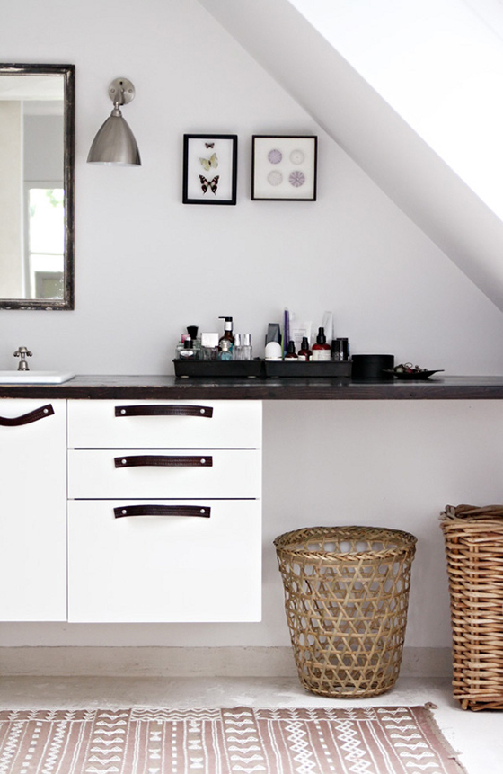
The way I saw it I had three options. One was the obvious route of straight-up white. There’s something innately refreshing about a blank canvas, and surely that would appeal to buyers when they were trying to envision themselves living here.


National Painting Week Teaser-3-Design Crush

PHOTO: Canadian Home Trends

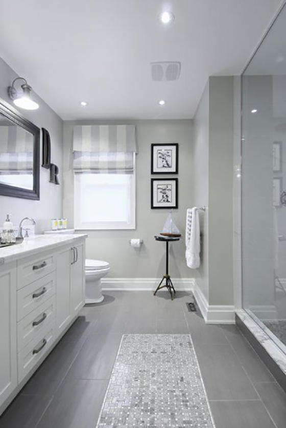
The second was a neutralizing grey. Something light with some yellow undertones for warmth that would pull in the dappled brown floor tiles. Plus, nearly everything goes with a good grey.


National Painting Week Teaser-4-Design Crush

PHOTO: Better Homes & Gardens

The third option would be to stick with the blue, just tone it down a bit. Blue bathrooms always seem to have a spa-like quality to them that no other color comes close to.
I’ll be sharing my full bathroom reveal April 7th. SWPaintingWeek.com will be sharing inspiration, ideas, and more to get your creative juices flowing for your own painting projects all week long so be sure to check in. There will also be projects from 14 other design bloggers celebrating National Painting Week, so get ready for things to get colorful!

Disclaimer: This post is sponsored by Sherwin-Williams. Though I have been compensated, all words and opinions are my own. Thank you for supporting the brands that help keep Design Crush going!

0

Happy Weekend

1-Design Crush

2-Design Crush

3-Design Crush

4-Design Crush

5-Design Crush

6-Design Crush

7-Design Crush

8-Design Crush

9-Design Crush

10-Design Crush

01/ Nice Nosing You, a photo series that gets up close and personal with dog snouts!
02/ All Hail the King explores the different personas of Walter White.
03/ Check out these custom rolling pins that print across dough!
04/ Incredibly detailed macro photos of butterfly and moth wings.
05/ Beach trash found in New York Harbor is given a new life in Found in Nature.
06/ An NYC cyclist-inspired print made with seven different bike tires.
07/ Field Note’s Sherwood edition features covers made of American cherrywood!
08/ Mirror Culture uses 6,000 CDs and fishing line to reflect crazy light.
09/ Four posters inspired by Wes Anderson’s most popular films.
10/ What happens when you zap instant film with 15,000 volts?

This week on Design Crush:
Two illustrators, two cities, two coasts – loving Hello NY and Meanwhile in San Francisco.
Beauty tips and tricks on the cheap.
Crushing on Barbara Macfarlane‘s energetic city maps.
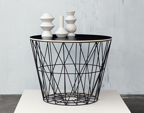
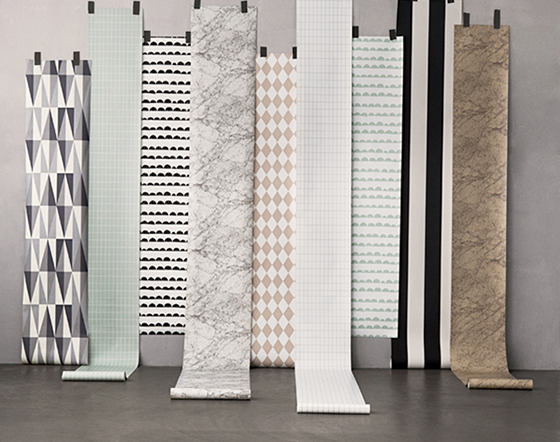
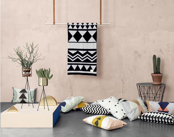
ferm Living’s spring collection is definitely channeling the season.
Dreamy mid-century pastel illustrations of homes from Chris Turnham.
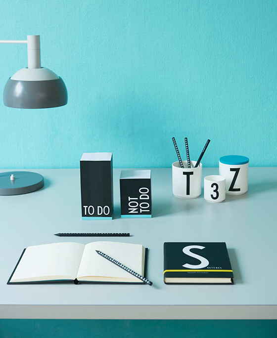
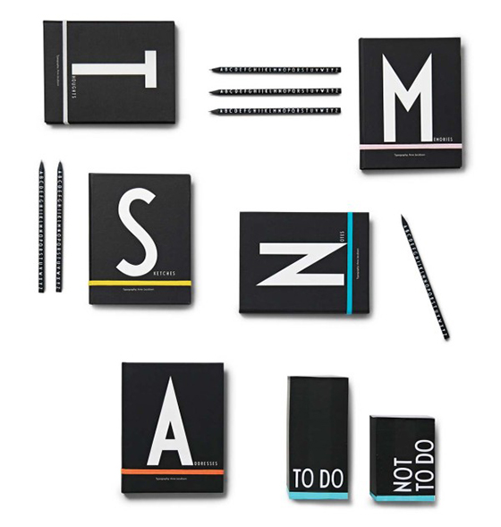
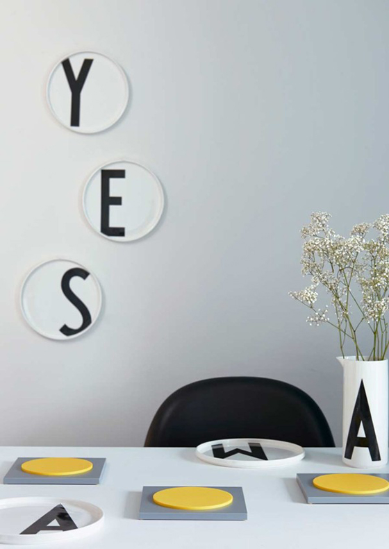
Graphic home and office goods from Design Letters & Friends.
Retro-modern art featuring top musicians from Tuna Bora.
ALERT! Trending: Fiber Tapestry Art!
Collages that I’d like to turn into fabric from Kate Lewis.

1

11 Apps Worth Your While

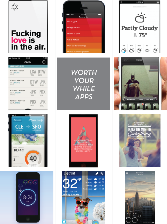
So many apps, so little time! I have to admit, I generally rely on the advice of others who’ve bought before to lead me in the right direction. For some reason I’m drawn to weather apps more than any other – I love clicking into each one to see if they’re predicting the same thing outdoors. I also really love travel apps that can keep me on schedule. What are your favorites?


Worth-Your-While-Apps-Design-Crush

ROW 1:Authentic Weather // Clear // Conditions    ROW 2:Flying // Giffer
ROW 3:Just Landed // Notegraphy // Over    ROW 4:Wake // Weather Puppy // Yahoo Weather

3

Standing Bowls

Fort Standard-1-Design Crush


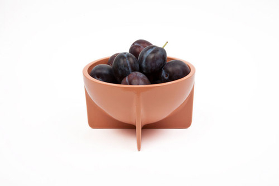
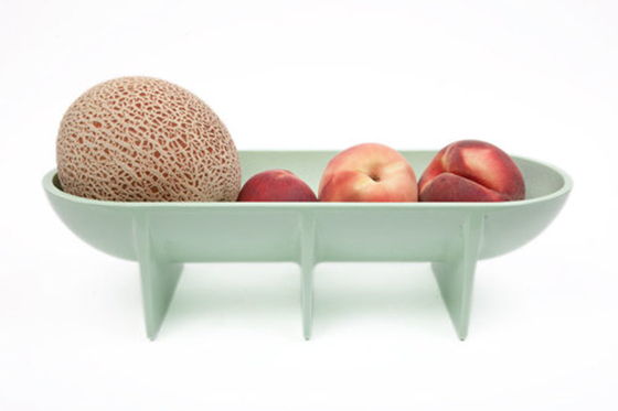
I love the shape and design of these Standing Bowls from Fort Standard. At first glance I thought they were ceramic or porcelain, but nope – they’re sand cast aluminum! That means these guys are completely food safe and great for everyday serving and use. I’ll take the big guy for my fruit dish!


Fort Standard-2-Design Crush

0

Time to Brag: Kolo’s Noci

Kolo-Noci-1-Design-Crush


So let’s get real. I love talking about my pets, an embarrassing amount really. I adopted my two oldest cats, Roxy and Peanut, when I was in college. I have almost an entire photo box full of their first few years of life, but then this thing called digital photography happened. Which meant that a decade later when I adopted my  dogs Piper and Bebe, and my kitten Rainey, everything had changed. Yes my iPhone is full of photos that I will most definitely whip out and gush about to you, but I don’t have any printed photos of my furry loves.


Kolo-Noci-2-Design-Crush

Peanut’s huge, manly tomcat toes make a cover appearance.

I first became acquainted with Kolo as a grad student, in fact I used one of their Newport album as my art direction portfolio right out of school! I love the clean lines of their photo books and the beautifully smooth, high-quality paper within. I swear, they have the ability to make even mediocre photography shine.


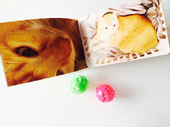
Kolo-Noci-3-Design-Crush

Just hanging out in a clothes basket, as you do when you’re a cat.

Kolo has grown as a brand since being founded in 1999, and now offers a great range of products. What really stood out to me is that they can “load” an album for you. You upload photos to their free unlimited photo storage, fill the album of your choice with the images, and Kolo prints it all using Canon technology with stunning clarity and color trueness for a super reasonable price. Trust me, these are not the cheesy photo books you’re familiar with. They’re quality in every way, including the environmentally friendly raw materials used in all Kolo products.


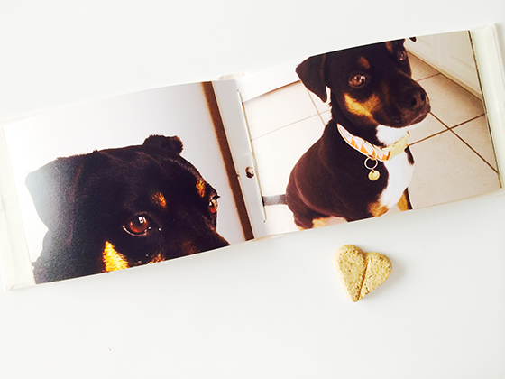
Kolo-Noci-4-Design-Crush

Piper uses those amber eyes to get every single thing she wants.

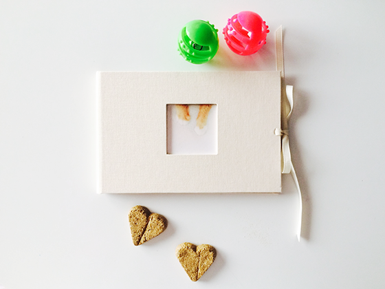
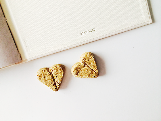
I filled the Noci with 24 photos of my five furry children between its Ivory covers. This was my first experience with Kolo’s Canon printing and I’m completely impressed. Not only do the colors pop right off the page, but the paper feels substantial and luxe. The Noci is the perfect size to create a brag book or remember a specific event, or for business it would work great as a small portfolio or product catalogue.


Kolo-Noci-5-Design-Crush

Bebe playing boss on Halloween and Rainey snug as a bug in a rug.

You’ll also be happy to know that most of Kolo‘s albums are available as printed books or as classic albums where photos can be swapped out. The Noci Original is the same price empty or loaded, which is crazy! My plan is to eventually have several of these cloth-bound albums lining a bookshelf in the fantastic color palette offered, they all work really well together because they’re designed to.


Kolo-Noci-6-Design-Crush

Disclaimer: This is a sponsored post. All words and opinions are my own. Thank you for supporting the brands that keep Design Crush going!

0