May 7, 2013
Dewey Howard
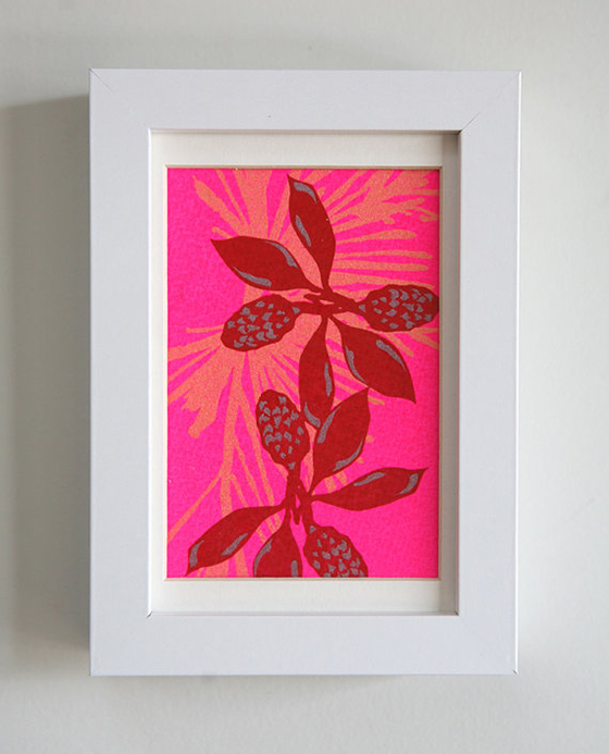
Loving these energetic colorful prints and cards from Dewey Howard! The neons, neutrals, and darks play so nicely with one other and would brighten up white walls quite nicely.

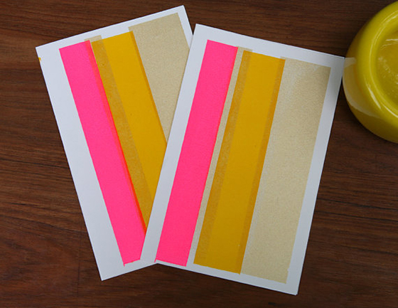
Loving these energetic colorful prints and cards from Dewey Howard! The neons, neutrals, and darks play so nicely with one other and would brighten up white walls quite nicely.
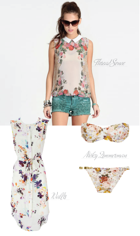
Floral Rhapsody Collared Blouse from ThreadSence // White Floral Print Shirt Dress from Wallis // Locket Floral-Print Molded Bikini by Nicky Zimmerman
These aren’t you grandma’s florals, that’s for sure. (Unless your grandma is prone to wearing a floral bikini, in which case I would like to make her acquaintance.) Sweet, bold, and everything in between – there’s no wrong way to wear this patterned trend!
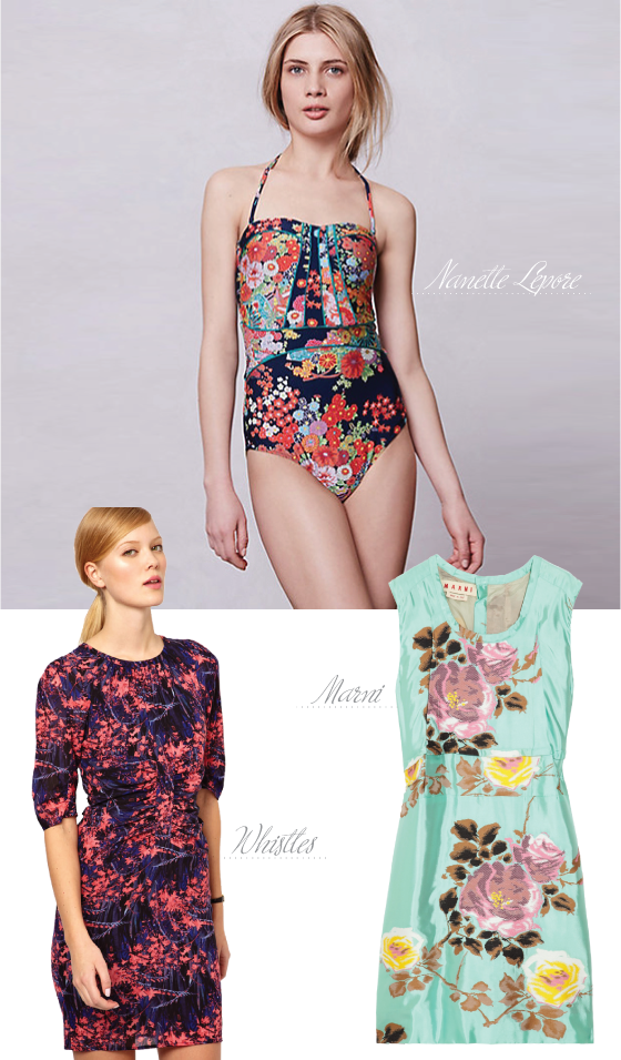
Kimono Floral Seductress One Piece by Nanette Lepore // Bella Tropical Floral Body-Conscious Dress by Whistles // Floral-Jacquard Dress by Marni
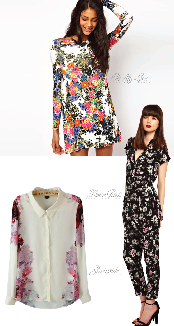
Swing Dress in Floral Print by Oh My Love // White Lapel Long Sleeve Floral Chiffon Blouse by Sheinside // Jumpsuit in Floral Butterfly Print by Eleven Paris
Posted In round up, wear it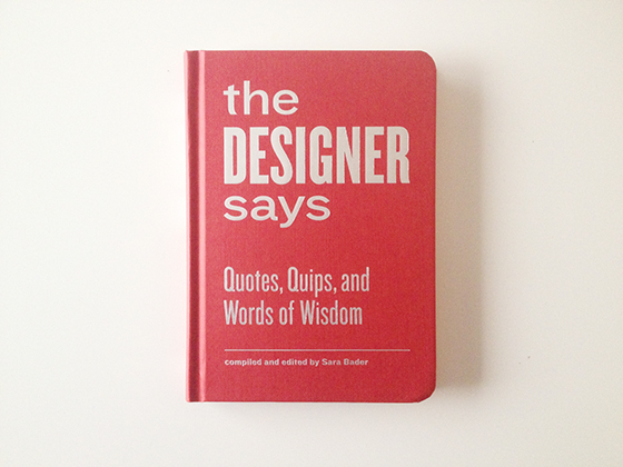
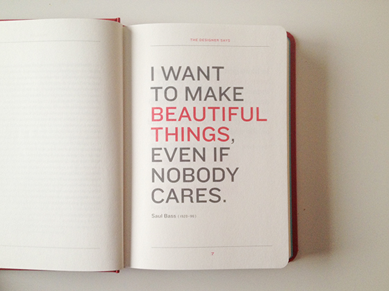
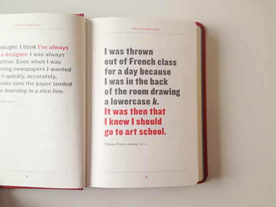
The graphic designer side of me knows I’ll be referencing The Designer Says on those uninspired, caught-in-the-headlights days for years to come. There has to be more than one gem in the hundred plus leading graphic design minds included between the covers. Their musings cover everything from failure to collaboration to staffing a studio. My biggest concern remains to be not ripping my own hair out…
Mother’s Day is an important occasion, especially when your mom is as fantastic at her job as mine. I’ve come up with some fun things over the years to show how much I appreciate all she’s done for me. Once it was a container full of memories rolled up on little pieces of paper that she could open throughout the year, another time it was a multi-course from scratch lunch. Since spring has finally decided to stay for awhile I think a picnic would be lovely, don’t you? Lots of little bites, a colorful setting, and even champagne!

ROW 1: Beach Blanket by Steven Alan // Pack a Picnic Basket by Kate Spade // Black Striped Balloons from Oriental Trading ROW 2: DIY MOther’s Day Bouquet from Paper n Stitch // Pack a Picnic Champagne Box by Kate Spade // Everyday Napkins by Alder & Co. ROW 3: Golden Stripe Highball Glasses by C Wonder // Marchena Salad Plates from Anthropologie // Ceramic Utensils from CB2

ROW 1: Raspberry Mint Mozzarella Skewers by Biscuits and Such // Parker House Rolls by Always With Butter // Orange Thyme Jam by Minimalist Baker ROW 2: Honey Feta Chicken Salad with Grapes and Almonds by Branny Boils Over // Secret Fruit Salad by Rachel Schultz // Magnolia Bakery’s Banana Pudding
Posted In holidays, mother's day, recipes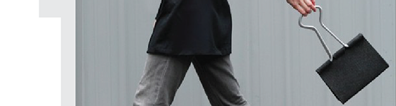


01/ The Clip Bag.
02/ Disney’s Sloth Princesses.
03/ You’re Officially Awesome!
04/ The power of reading. Literally.
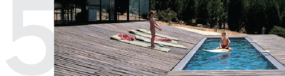
05/ I never thought I wanted a swimming pool. Until now.
06/ Petheadz – an Instagram series of pets and their owners.
07/ The most minimalist playing cards ever.
08/ Leather suitcase furniture, yup it’s a thing.
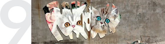
09/ Punk Kitty Graffiti – amazing.
10/ Red SOLO cups go fancy!
Miss anything on Design Crush this week?
Gem Scarves
The Animal Alphabet in Primitive Portraits
InstaApril
Modern Sprout Hydroponic Planter
Color with Confidence: Pantone + Valspar + Lowe’s
Brevity Signature Necklace
What Will You Make Today?
Quilt Collection
I Heart NYC
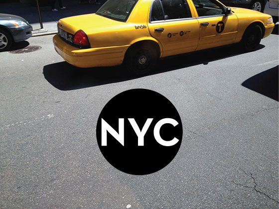
I miss New York, I think it’s a small part of my constant being. Luckily I get to visit a few times a year for work and manage to cram in everything personal at the same time.
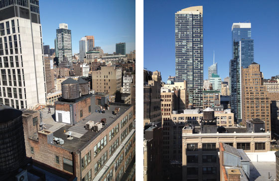
I never seem to get a view, but for this trip I was on the 23rd floor and it was a beautiful sight.
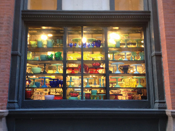
No trip is complete without popping into Fishs Eddy, and as luck would have it they were having a big sale! I picked up a little something for myself and a small Brooklyn themed gift for a friend who was moving out of town to remind her of her time here.
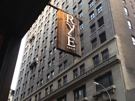
I love finding new gems in a city that’s forever changing. This time a few friends and I stopped by Rye House to catch up. I had the most delicious sweet potato perogies and will definitely be back to try more of the menu (and cocktails!).
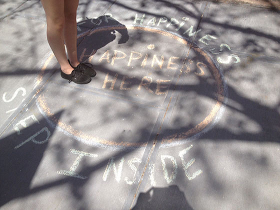
I had a chance to grab brunch at Tipsy Parson with a new friend I’d met in Austin. We walked around Chelsea a bit and did a little shopping, and when we came across this on the sidewalk Amber couldn’t resist jumping inside!
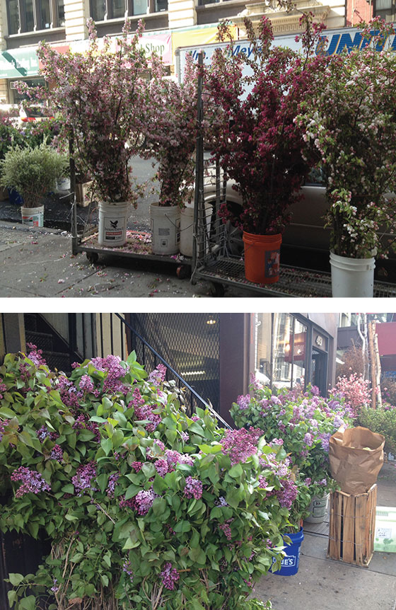
I stayed in the Flower District and couldn’t help but feel giddy each morning as I walked the streets. They were bursting at the seams with flora and fauna of all varieties, I wanted to make a massive bouquet to take home.
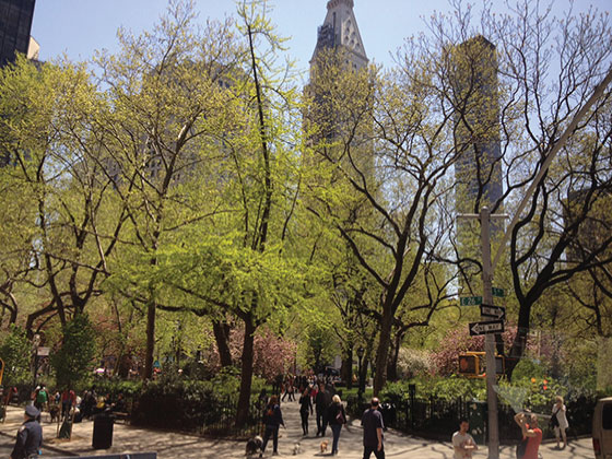
Madison Square Park was showing signs of spring – the trees were filling in nicely and it seemed like a million people were out and about enjoying the beautiful weather.
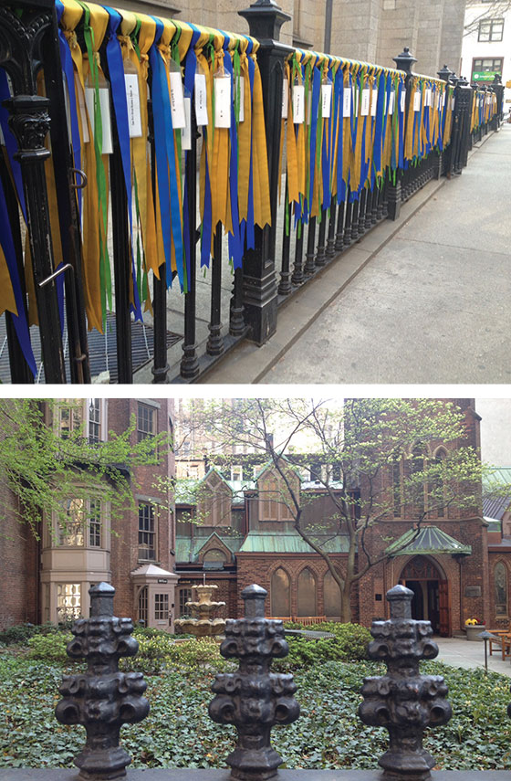
As I walked across Manhattan Sunday morning I came across a few hidden nooks and crannies.
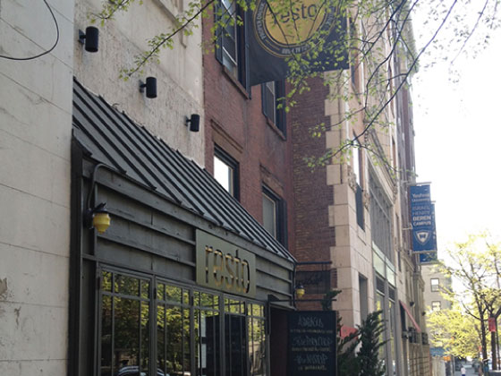
A few hours before leaving town I grabbed one last brunch at Resto with another friend. Until next time New York, I’ll be thinking about you!
Posted In my life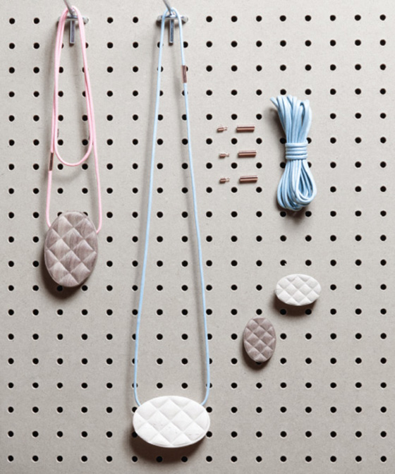
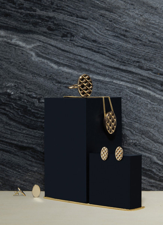
Loving these oversized pieces of jewelry that make up Alissia Melka Teichroew‘s Quilt Collection. Each piece is part minimal and modern, part textured and familiar. Those wood pendants are calling my name! (via Pattern Pulp)

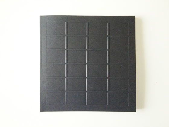
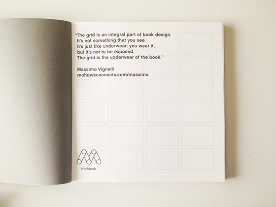
Massimo Vignelli has five decades of award-winning book design under his belt, so it’s only natural that he would support Mohawk‘s What Will You Make Today? campaign by co-developing a limited edition journal. Any designer knows how integral the grid is to designing, and the 7 x 7″ journal includes 100 interior pages with 24 perfect rectangles on each as well as debossed front and back covers with the same design.
Vignelli’s grid explanation is fantastic,“The grid is an integral part of book design. It’s not something that you see. It’s just like underwear: you wear it, but it’s not to be exposed. The grid is the underwear of the book.”
Massimo Vignelli Makes Books from Pentagram on Vimeo.
Posted In collaboration/project, notebooks + journals, paper goods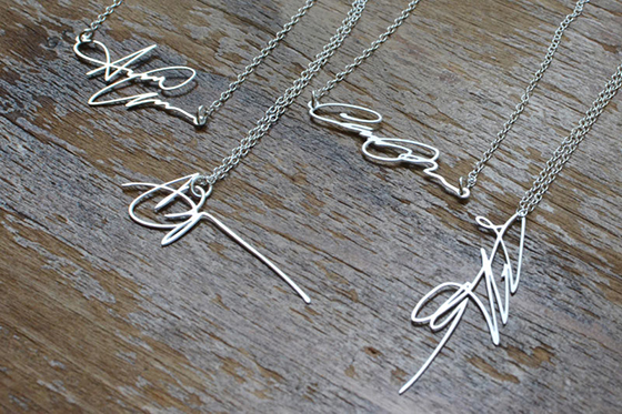
My signature hasn’t changed much over the years since learning cursive handwriting, and I sort of take solace in that. It’s my mark, my brand. I’d love to wear Brevity’s Signature Necklace as a symbol of that, of me. Sign a piece of paper five times and then Brevity chooses the version best suited to creating your personalized necklace. You can even choose whether it hangs horizontally or vertically. (via Design Milk)
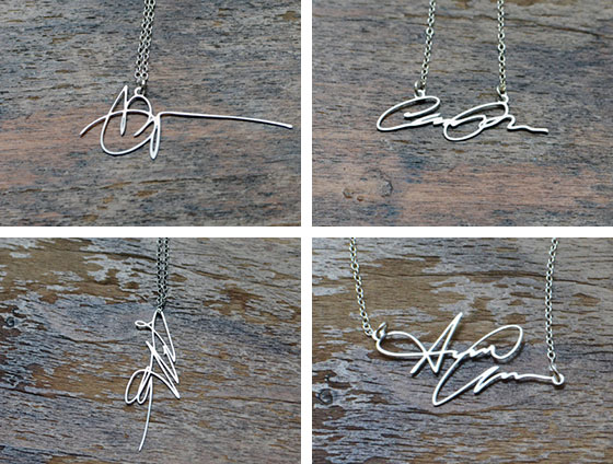
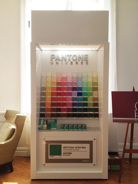
PHOTO: Kelly Beall
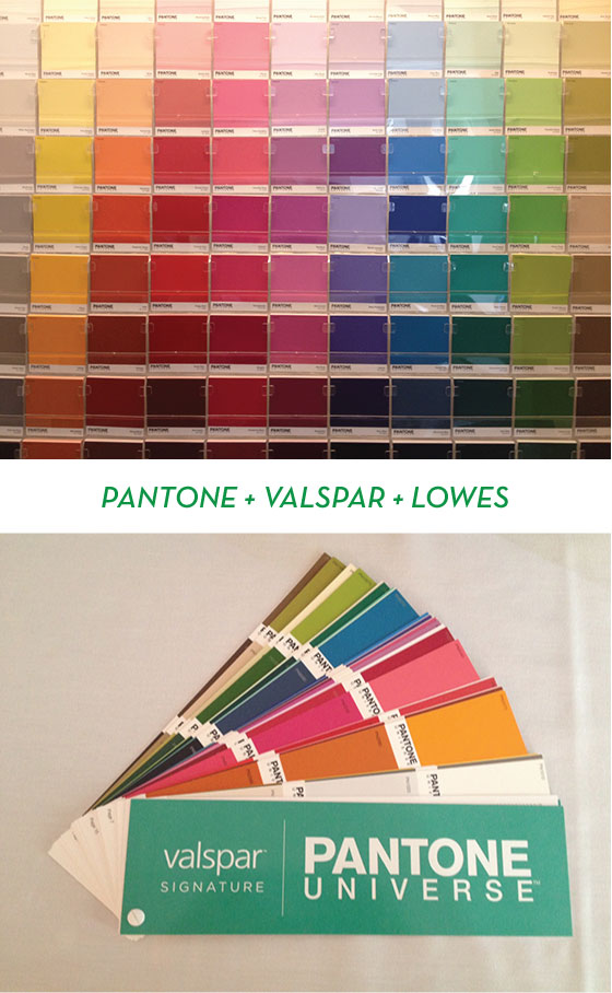
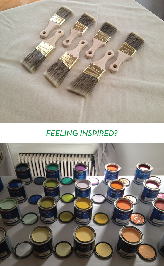
You just did a double-take, amiright? Well, I promise that this isn’t a 30-day late April Fool’s joke. Pantone, the global authority on and standard of color, has teamed up with Valspar to launch a new line of paint! The Pantone Universe Paint Collection will be available exclusively at Lowe’s beginning this month.
PHOTOS: Kelly Beall
The collection features 100 on-trend hues ranging from classic neutrals to eye-popping brights. It also includes the 2013 Pantone Color of the Year, Emerald, as well as the 2012 selection, Tangerine Tango!
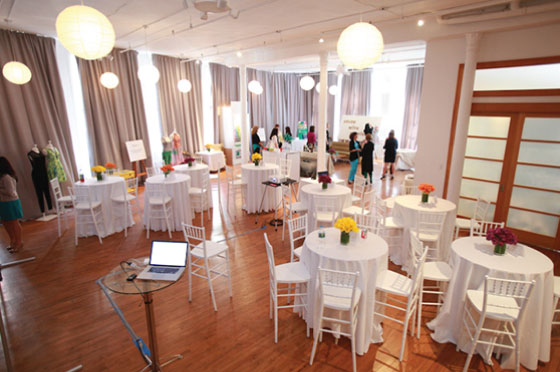
PHOTO: Edelman
This past weekend I visited NYC to participate in the 2-day Color with Confidence event along with several other bloggers and editors. Our first day was filled with inspirational talks from Executive Director of the Pantone Color Institute Leatrice Eiseman, interior designer Elaine Griffin, and fashion designer Nanette Lepore. These ladies were nothing short of lovely and brilliant.
TOP PHOTO: Edelman BOTTOM PHOTO: Kelly Beall
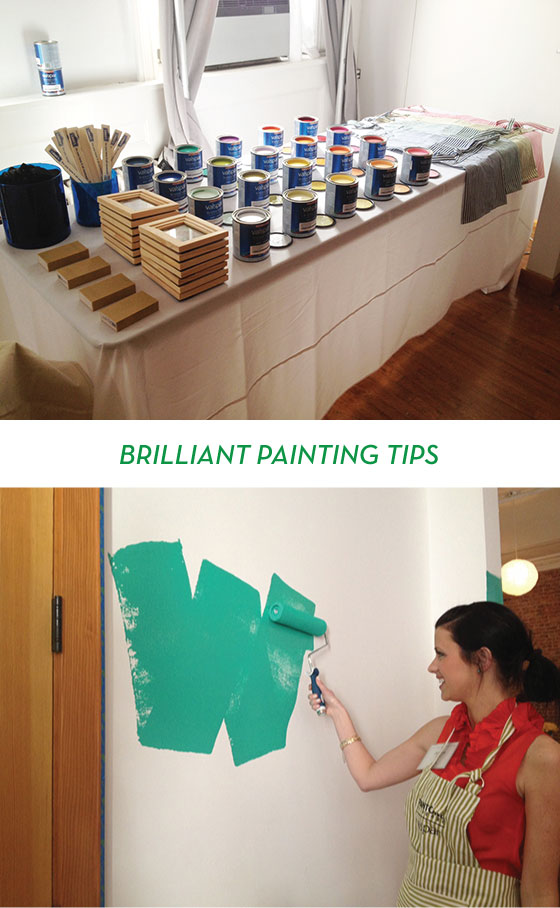
After listening to Leatrice, Elaine, and Nanette (and noshing on some tasty treats and colorful cocktails) we were taught the proper way to paint from Valspar’s Jill. I consider myself a fairly knowledgeable painter and was clueless on half of the tips she spilled!
• Use a wooden brush, it catches drips better.
• Use the handle of said brush to seal the edges of your painter’s tape.
• Remove your tape before the paint is actually dry to avoid peeling.
• Use high-quality brushes and roller to avoid shedding.
• A good paint roller is both washable and reusable.
• Load your roller with way more paint than you think necessary, four bathe + rolls in the tray is optimal.
• Paint in 4 x 4′ sections.
• Use a W technique (seen above). Make the letter W, then fill it in. Reload roller each time.
• Once the wall is filled go over it with vertical stripes of paint to even things out.
• Use a church key not a screwdriver to open paint cans.
• Put cellophane over the can opening before putting the lid back on to keep paint fresh for a year.
• Keep the paintbrush’s original packaging to retain shape.
• Always use a canvas drop cloth, it’s less slippery than plastic and absorbs drips immediately.
• Use a roller scraper to avoid wasting paint left in roller.
• Store paint in a cool place (i.e. not your garage – whoops!)
PHOTOS: Kelly Beall
We played around a bit choosing a color palette and talked to Nanette Lepore about how color inspires fashion. Then we mingled and headed home to rest up for the next day, when we’d finally get to dig in and get some paint on our hands!
PHOTOS: Kelly Beall
PHOTOS: Kelly Beall
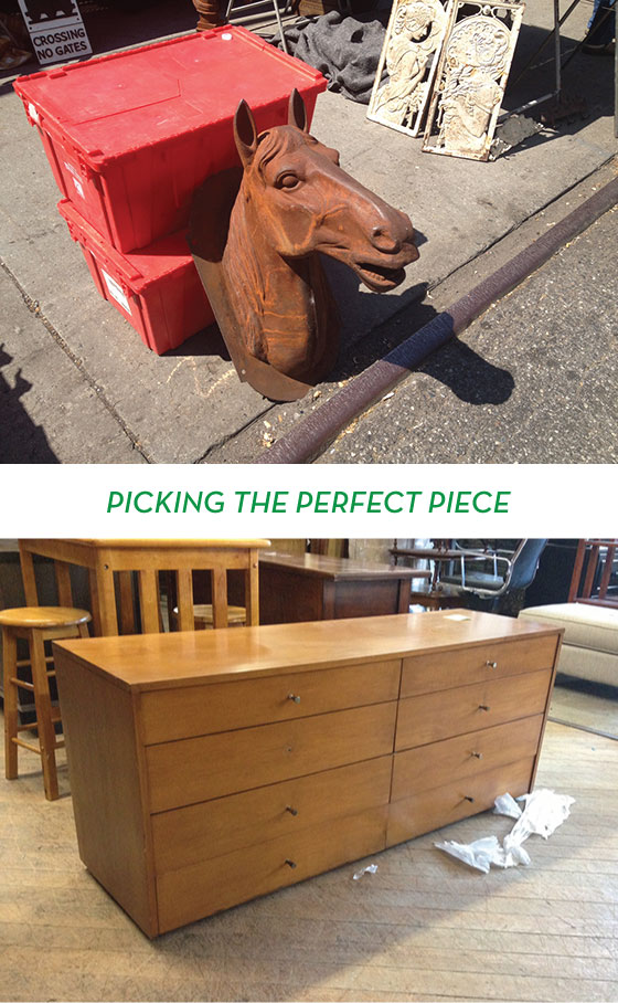
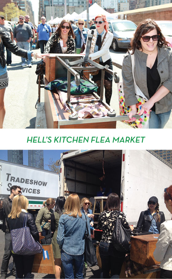
After grabbing breakfast,we all loaded into a black bus with tinted windows (so VIP) with a moving truck tailing us, and headed to Hell’s Kitchen flea market. It was a beautiful sunshiney day and we were chomping at the bit to find the perfect pieces to upcycle. The first thing that caught my eye was a beautiful metal horse bust. I was in love. But the vendor wanted $500 for it and would only negotiate down to $275. Waaay out of my budget. Later we stopped in at the Salvation Army and I found this dresser that would have been perfect in my bedroom, but it was unfortunately already sold.
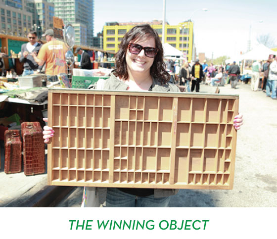
PHOTO: Edelman
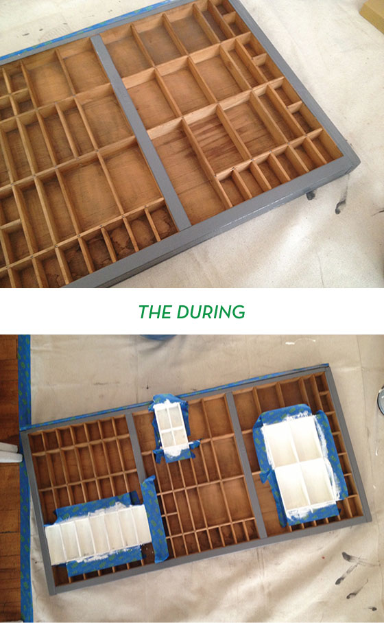
Luckily I’d picked up a just-in-case piece, this gorgeous typesetter’s drawer. I’ve been wanting one since high school and had never seen a specimen in such perfect condition, and with unfinished wood. Success!
TOP PHOTO: Edelman BOTTOM PHOTO: Kelly Beall
I suspect we all looked like a sideshow hauling pieces to the end of flea and loading them into our truck, but oh well. We had everything from a TV console to mirrors to end tables by the end of our excursion.
PHOTOS: Kelly Beall
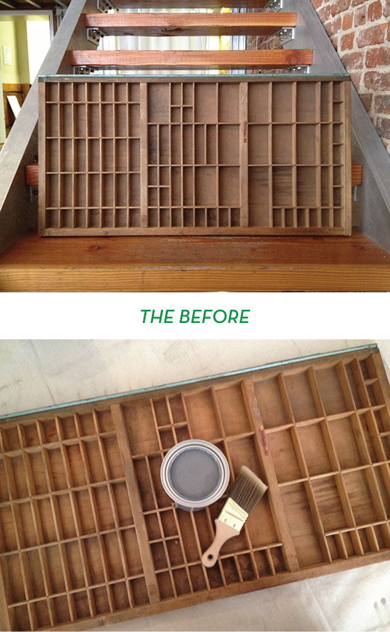
I didn’t realize just how dirty my piece was until I started wiping it down. So gross. (You can see the color difference between this photo pre-wash and the post-wash below.)
PHOTOS: Kelly Beall
It took me awhile to figure out just how I wanted to transform my newly acquired type drawer, but after some thought I decided to start by painting the borders a nice charcoal grey. When that didn’t seem enough I debated painting the entire interior, but it would have required smaller brushes and more time than I had. I settled on taping off a few “gallery sections” and painting them white, I’ll be able to use these areas to highlight special tchotchkes once I get it home and hang it on my office wall.
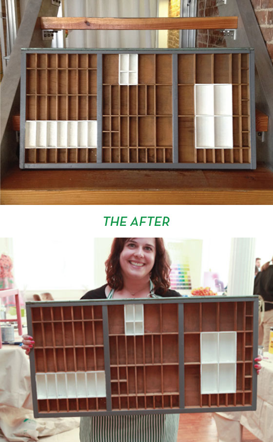
TOP PHOTO: Kelly Beall BOTTOM PHOTO: Edelman
I’m really happy with how it turned out! I plan on going over the white areas with a smaller brush and one more coat before calling it complete, but I’m counting this guy as a success. The Pantone Universe paint in Valspar’s Signature covered like a dream and was so incredibly saturated with color. I only did one layer of the grey if that tells you anything. Oh, and it dries to the touch in 20 minutes! I know you’re going to love it as much as I do.
Disclaimer: Travel and hotel in NYC provided by Pantone and Valspar. All words and opinions are my own. Thank you for supporting the brands that keep Design Crush going!
Posted In house and home, sponsored post, walls