A (Belated) Housewarming Party

a-belated-housewarming-party-0-design-crush


Hello, my name is Kelly and it took me just over two years to have a housewarming party. It’s a ridiculous thing and maybe I should have called the party I had last Saturday an open house, but a housewarming is what it was. Aside from my immediate family and friends there haven’t been a ton of guests and plenty of people were curious, or so the past 26-months would lead me to believe. So last month I decided I was ready to entertain on a larger scale and invited fifty people over for November 19th. Not only would everyone get to mix and mingle, but the timing also meant my place would be clean and ready to host Thanksgiving Thursday! Two birds, one stone.


a-belated-housewarming-party-1-design-crush


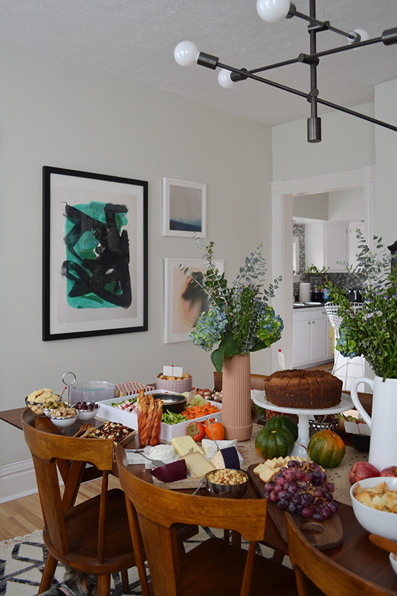
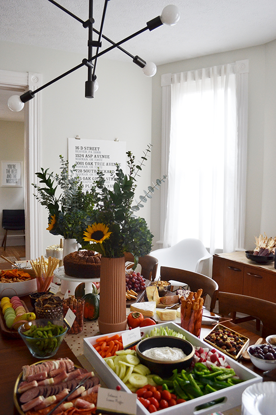
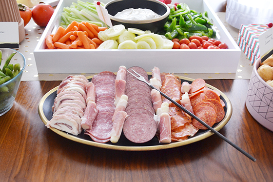
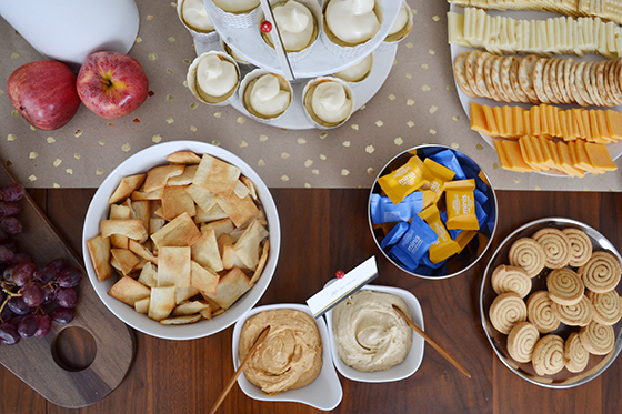
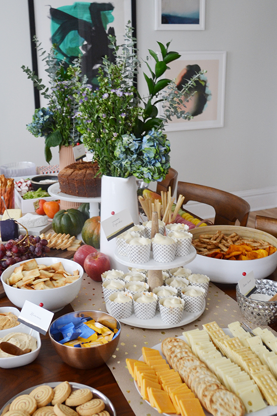
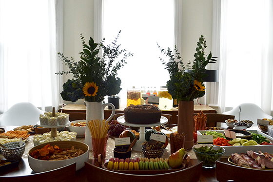
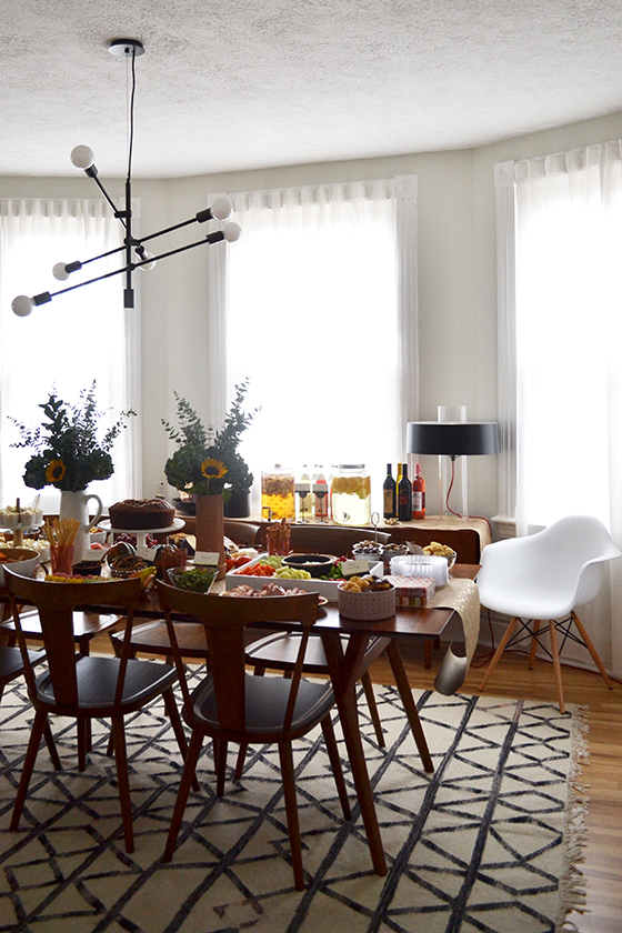
I knew I wanted to do as little cooking as possible, which meant it was going to be heavy snacks and appetizers. Everyone knows those are the best parts anyway. But the thing I was most excited about it, aside from seeing everyone, was getting to use all of the serving pieces I’ve collected with World Market generously filling in the gaps (source links following the post). In fact, I pulled out all of the Type A stops by laying everything out a few days before and labeling them with Post-Its so I knew where all of the food was going to go.


a-belated-housewarming-party-2-design-crush


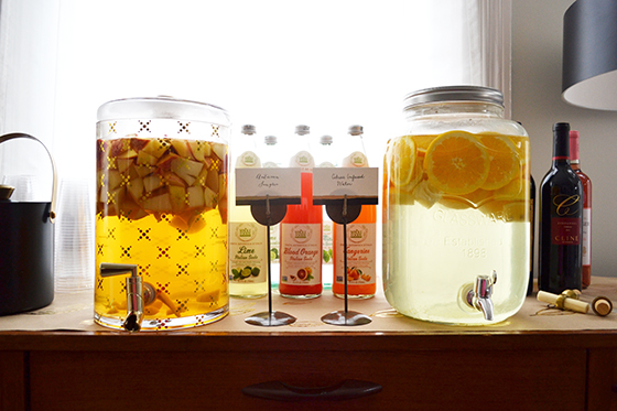
I made up a delicious apple cider sangria and infused water with citrus fruits, both were set out in decanters in serve yourself fashion. There was also a selection of Italian sodas for underage guests, a variety of beer, and so many bottles of wine! Let’s just say I’m set for the entirety of the holiday season thanks to my guests and their generosity.


a-belated-housewarming-party-3-design-crush


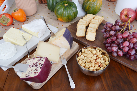
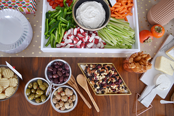
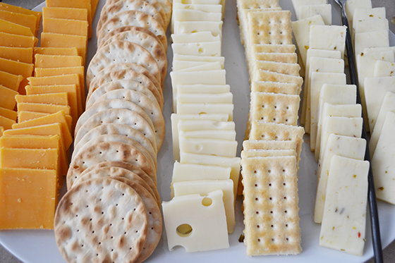
A non-negotiable for hosting any party is the presence of cheese. Well, at least it is in my book. I picked up six fancy varieties as well as plenty of sharp cheddar, gouda, swiss, and pepper jack to go on crackers and mini toasts. Oh, and there was a parmesan spread as well because cheese is delicious.


a-belated-housewarming-party-4-design-crush


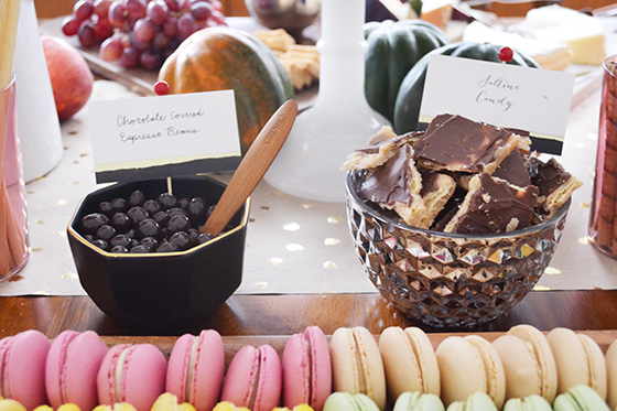
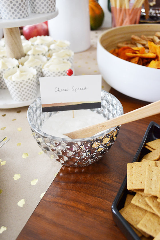
Minted, one of my favorite ongoing partners, is currently running a promotion where all of their digital invitations are free though December 31st, so I was fast to hop on the train and email out this type heavy invitation. My timeline was a little too tight to order their fabric table linens, so I went with the prettiest gold foil-pressed table runners for both the dining room table and buffet instead. Not only did they protect the wood, I was also able to roll them up for later use since there were no spills! I also customized some of Minted’s Inkblot foil-pressed place cards with foods that might need some explainging, like my Mom’s addictive cracker candy. All it took to use them in a new way was some toothpicks and tape!


a-belated-housewarming-party-5-design-crush


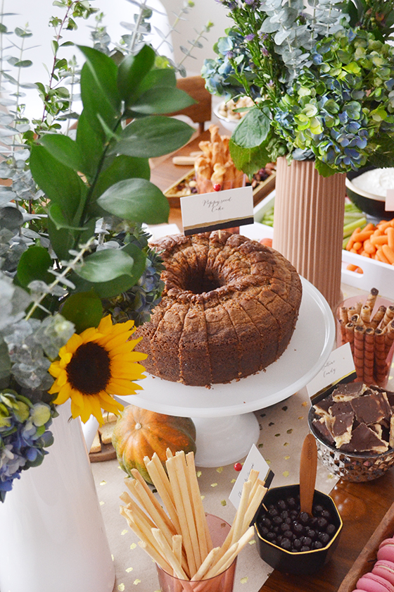
My stepdad made his famous poppyseed cake that’s actually a recipe from my Mom’s grandmother. At the end of the night there were only three pieces left, which made him plenty happy. I’ll be sharing the recipe here in the coming weeks, so stay tuned.


a-belated-housewarming-party-6-design-crush


I picked up the florals here and there throughout the prior week and kept them well watered until I was ready to put together the arrangements Friday night. If your table is longer than 96-inches I recommend going with two slightly smaller, yet equally tall bouquets for more of an impact. Some empty places on the table were filled in with produce – apples, acorn squash, oranges, and persimmons. It’s a great trick, just use whatever is seasonal.


a-belated-housewarming-party-7-design-crush


a-belated-housewarming-party-8-design-crush


a-belated-housewarming-party-9-design-crush


a-belated-housewarming-party-10-design-crush


a-belated-housewarming-party-11-design-crush


Recently I had picked up some lavender extract paste that I was anxious to try, so I baked up a batch of lavender cakes with lavender-honey cream cheese icing in some cute paper cups. I’m not sharing the recipe because I think they forgot an ingredient or two, but they looked so pretty!


a-belated-housewarming-party-13-design-crush


a-belated-housewarming-party-14-design-crush


a-belated-housewarming-party-15-design-crush

The party got started around 4:30 and I think the last guests rolled out around midnight. I had such a great time playing hostess that I basically forgot to eat and the only thing I drank was coffee, but I’d call it a success! My house was filled with so much love and laughter, and just maybe the first snow of the year that happened during the party was a sign of good to things to come.

Charcuterie Cutting Board // Marble Paddle Cutting Board with Copper Handle // Oval Wood Tray with Copper Handle // Woven Bamboo Salad Bowls Set of 2 // Mid-Century Creamer // Bamboo Salad Tongs // Small Olivewood Spoon // White Frosted Glass Pedestal Stand // White Rectangular Lacquer Serving Tray // White Coupe Oval Platter // Black and Gold Double Walled Ice Bucket  // Mid Century Bottle Stoppers Set of 2

A special thank you to Minted and World Market for providing product to help turn my party into a reality! And thanks to you for supporting the brands that help keep Design Crush creating fresh content.

3

Charming the Doors Off

nostalgia-1-design-crush


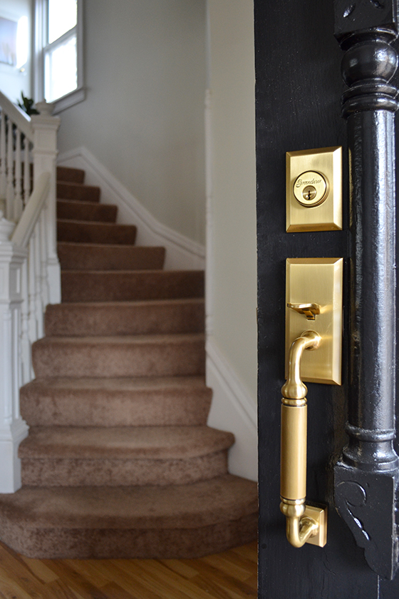
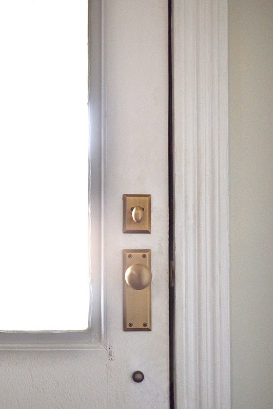
This is big, you guys. My front door no longer opens with a knob meant for the interior but an actual entry set! If I lived anywhere other than this sleepy little suburban town it would have been the first thing I replaced after closing. Now not only is my front door deadbolt safe but the rest of the doorknobs in my home are something other than boring builder’s grade, all thanks to Nostalgic Warehouse. (Oh, and ignore that staircase full of carpet, that’s on the project list as well!)


nostalgia-2-design-crush


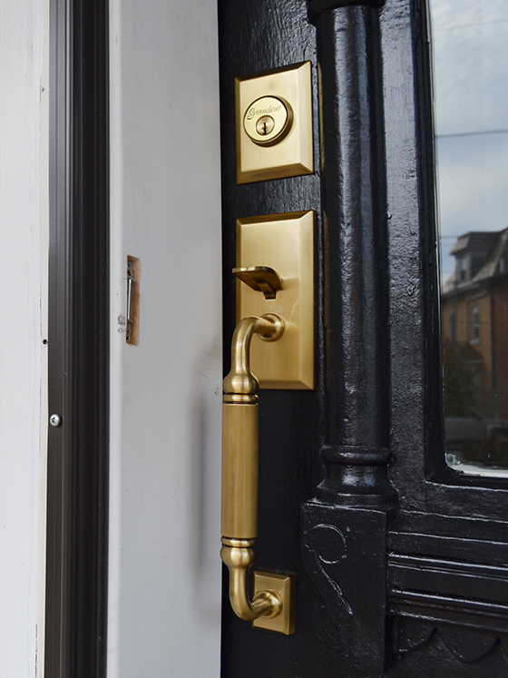
I painted the street side of the front door black to play down all of the gingerbread detailing in preparation of installing this gorgeous Fifth Avenue C Grip Entry Set in vintage brass. The house side is in dire need of a new coat as well, and that’s going on this week in preparation for a very belated housewarming party I’m throwing this weekend. (More on that to come.) But just look at that brass!


nostalgia-3-design-crush


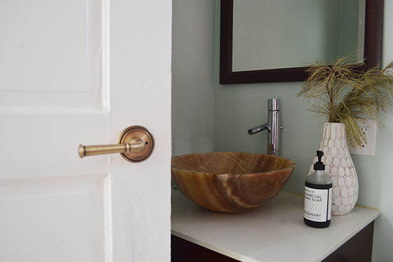
For the past two years it’s been a bit of a thorn in my side that the door hardware didn’t match the character of the rest of the house. (Get a peek of the befores here and here.) For the downstairs bath that’s directly off the dining room I wanted something with a little added pop, so I chose the Soleil Rosette with Georgetown Lever in vintage brass. I went back and forth with the finish because it doesn’t match the shiny nickel in the rest of the room, but in the end I decided it didn’t matter. The brass picks up on the other warm tones and it all pulls together nicely in the end.


nostalgia-4-design-crush


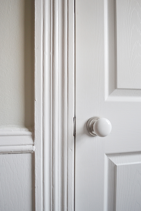
On the flip side, I chose the Rope Rosette with White Porcelain Knob in satin nickel for the pantry door in the kitchen because it does match the fixtures and hardware. The white porcelain knob manages to look both classic and modern at the same time which I notice every time I open the door.


nostalgia-5-design-crush


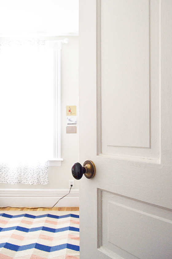
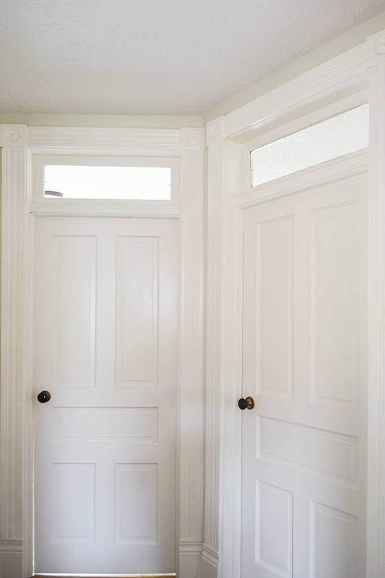
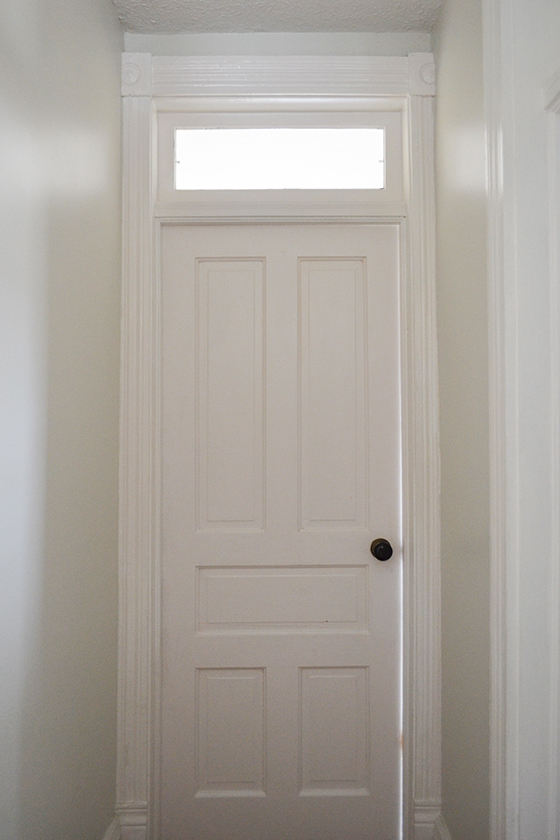
Upstairs there are six doors in a relatively small hallway so it made sense to make all of the knobs the same, and I have to admit that these Rope Rosette with Black Porcelain Knobs in antique brass are my favorite in the house. I can’t. Stop. Staring at them. There’s just something so sleek about these beauties and their super smooth touch. I also chose this design knowing that eventually I may paint all of the doors black and they’ll still look just as amazing.


nostalgia-6-design-crush

nostalgia-7-design-crush

nostalgia-8-design-crush


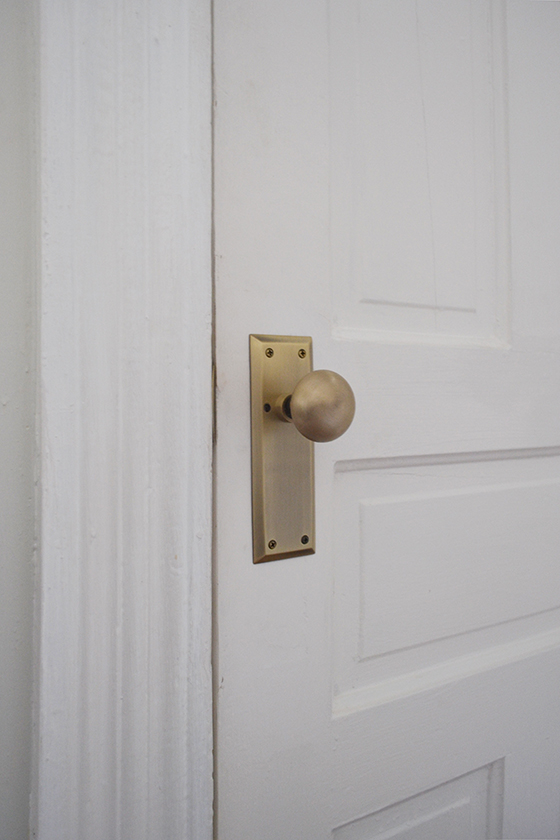
I fibbed a little though because there is one exception. The third floor attic is finished though lacking ductwork, and one day I hope to remedy that and move the master bedroom up there. For some reason I felt like that door needed a little something special, a denotation of sorts, and the New York Plate with New York Knob in antique brass was calling to me. By sticking with the same brass finish as the other five knobs the doors still feel cohesive as a group.


nostalgia-9-design-crush


This particular upgrade has been oh so satisfying! Door hardware pulls together a space like few other things can and I’m so thankful to Nostalgic Warehouse for partnering with Design Crush on this project.

This post sponsored by Nostalgic Warehouse, you can shop their entire collection through ATG Stores! All words and opinions are my own, as always. Thank you for supporting the brands that help keep Design Crush creating fresh content.
6

An Autumn Refresh with Burke Decor

burke-decor-1-design-crush


Tell me, do you change up anything in your home with the seasons? I do, but like to keep it minimal. Swapping out the bedding is usually first, followed by the rug and textiles in the living room. And boom, done. You don’t have to do big things to get an impact.

This autumn I chose a few pieces from Burke Decor to get my living room into cozy mode. The lifestyle and home furnishings company has a beautiful inventory, full of things inspired by design, function, and form curated from designers and artisans the world over. Spelled out: you can easily achieve a look that matches your aesthetic.

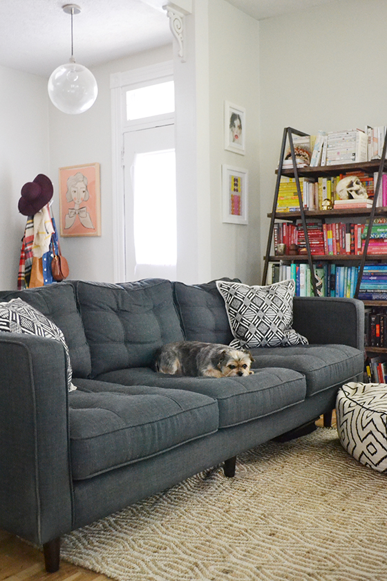
As you can see, I have a fair amount of color in my living room – mainly books and art – balanced out by neutral tones on the walls and furniture. I wanted something durable for the floor that could stand up to my dogs’ wet winter paws and roughhousing ways. When I saw this Natural Cape Cod Rug from Safavieh I knew it was a match. It’s soft and textural but woven of sustainably harvested sisal and sea grass that can take a beating. I really like how its pattern doesn’t compete with the others in the room and blends in with the flooring, keeping the space feeling bright and open.


burke-decor-2-design-crush


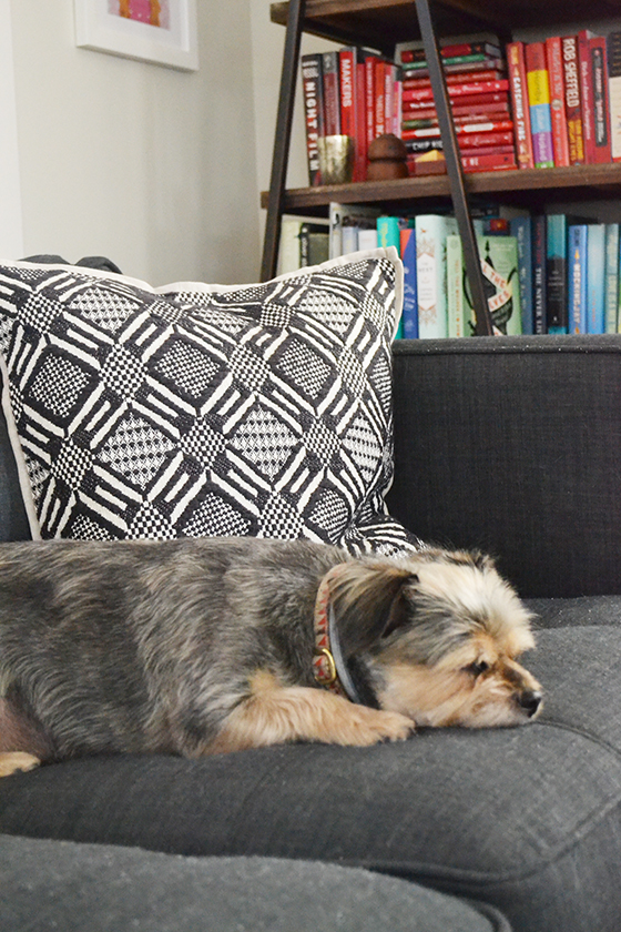
I’ve been getting bolder when it comes to using pattern, but I usually stick with black and white because they mesh easily. These Avila Onyx Pillow by Villa Home feature handcrafted embroidery and the softest linen backing. (Bebe is clearly a fan!) They add a layer of textural interest to my basic navy/grey couch that it needs.


burke-decor-3-design-crush


Here you can get a big picture peek at three of the four patterns in the living room, the other being this throw that’s been in high rotation. I think each piece comfortably holds its own while making you notice the others at the same time. Success!


burke-decor-5-design-crush


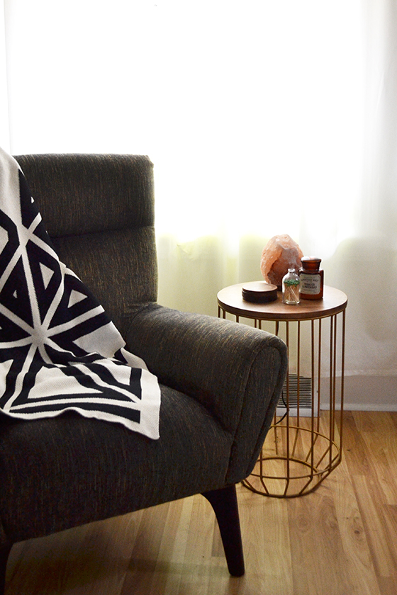
As I mentioned, this throw is constantly out. I’ve also been using my salt lamp more and more as the days get shorter and shorter. And my favorite candle is back in the rotation for cooler weather, tobacco and patchouli.


burke-decor-4-design-crush

burke-decor-6-design-crush


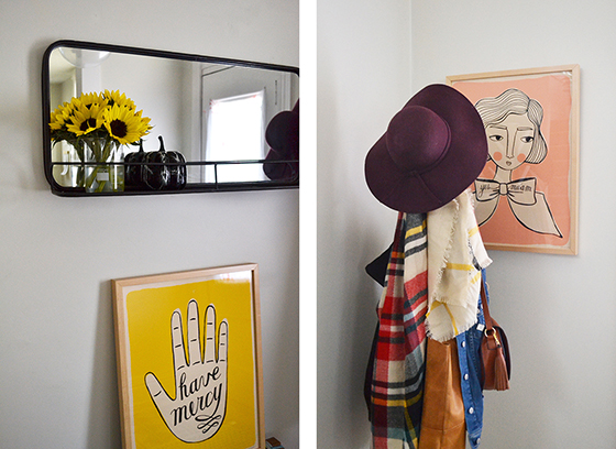
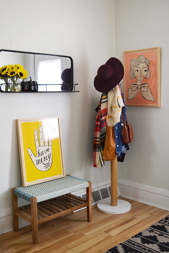
I’m certain this will be the cleanest the entry will be until April! I recently hung a new mirror and have been taking full advantage of the small shelf it features, setting small vases (this one’s actually a beaker) full of flowers and small seasonal decor on it. That coat rack is bound to be overflowing soon.


burke-decor-7-design-crush


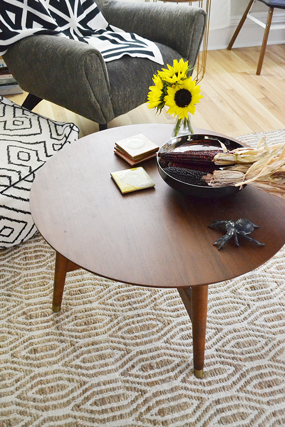
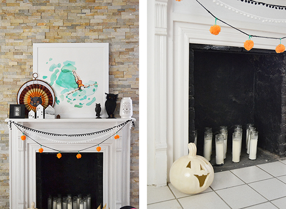
Did you spy my Halloween decorations in some of the other photos? I tend to stick with a few favorite pieces indoors rather than go overboard. A few owls on the mantel, a garland, a few pumpkins and skulls. Oh, and a spider on the coffee table, because every house needs one of those.

I hope you’re hunkering down as the weather cools and are just as cozy as we are!


Product for this post provided by Burke Decor. As always, all words and opinions are my own. Thank you for supporting the brands that help Design Crush create fresh content!
0

Let’s Talk Statement Art in the Bedroom

statement-art-1-design-crush

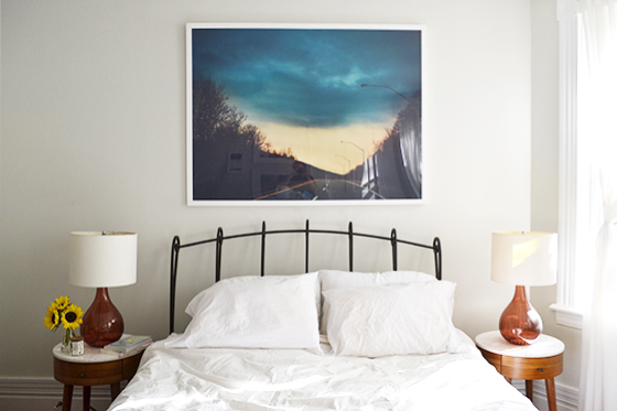
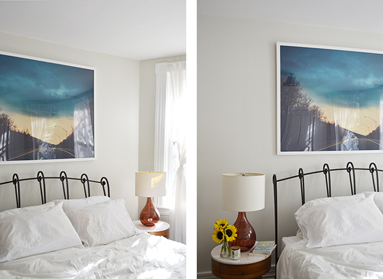
Stormy Drive by Smile Peace Love

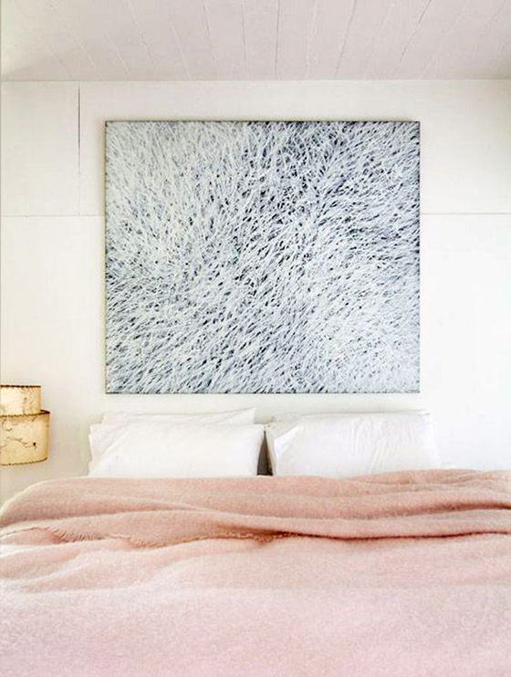
Have you noticed the trend of one large, statement making piece of art in the bedroom? Usually placed above the bed and sometimes even in place of the headboard itself. That’s my bedroom above, and I’m definitely considering removing the iron frame and lowering this piece on the wall a bit.

Don’t worry, gallery walls are still thriving. But one large piece of statement art commands all of your attention, which is an especially lovely look if you’re into minimalism. The bedroom should be a place that’s both relaxing and cozy – a retreat. For that reason I chose a piece of art with lots of moody blues, Stormy Drive by Smile Peace Love from Minted, that measures in at a whopping 54 x 40″. Can’t you imagine you’re in the car driving down the highway into this storm? For me it’s palpable.

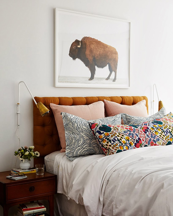
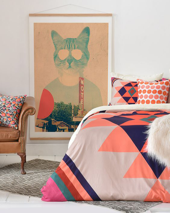
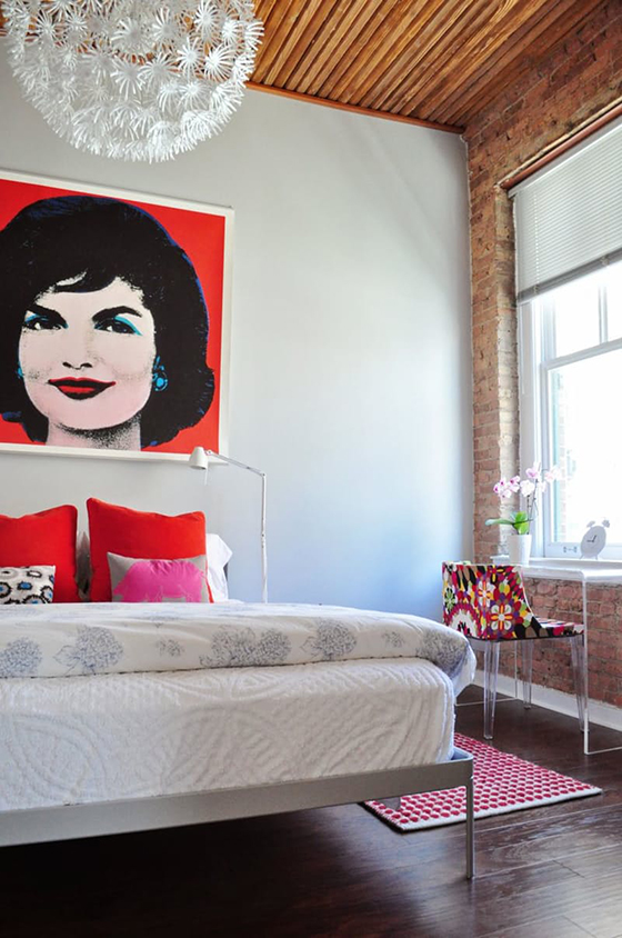
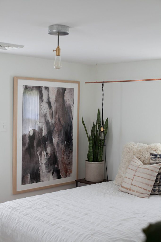
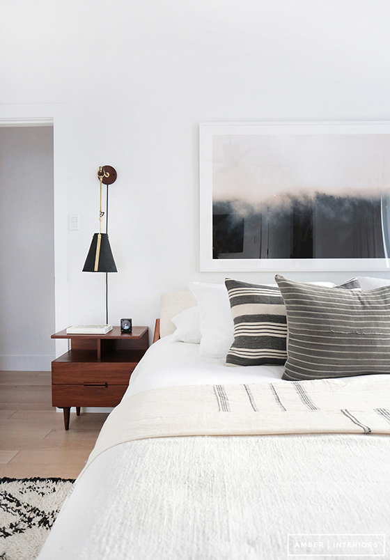
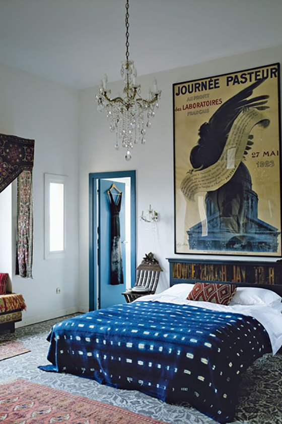
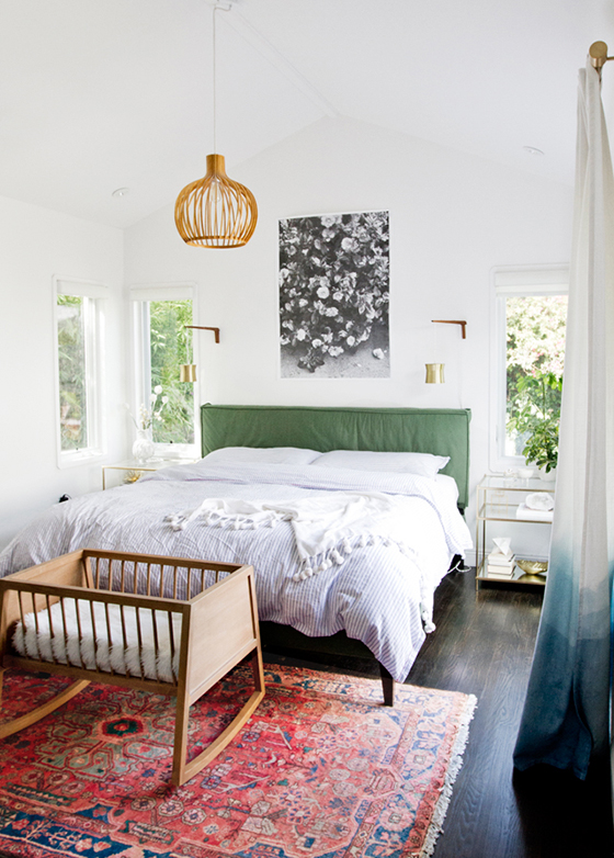
Here are ten other bedrooms doing statement art right, as well some large scale art recommendations for your own boudoir.


statement-art-2-design-crush


sfgirlbybay

sfgirlbybay


amber-interiors

Amber Interiors


house-and-garden

House and Garden


stories

Stories


a-cup-of-jo

A Cup of Jo


deny-designs

Deny Designs


apartment-therapy

Apartment Therapy


a-daily-something

A Daily Something


anne-sage

Anne Sage


lemon-stripes

Lemon Stripes


statement-art-3-design-crush

1/ Aquarium by Roberta Pinna  2/ Morning River by Lauren Adams
3/ From Down Below by Kim Bliss  4/ Key Rehab by Poppy A
5/ Golden Fields by Kaylee Coles  6/ Fossilized Rock by Frooted Design
7/ Silver Ice by Leslie Le Coq  8/ Going for a Swim by Whitney Deal
9/ Linger by Sarah McInroe  10/ Men in Red by Kate Baird

Thanks to Minted for providing art for this post. And thank you for supporting the brands that help keep Design Crush creating fresh content!

0

DIY Halloween House Monster

354-halloween-1-design-crush


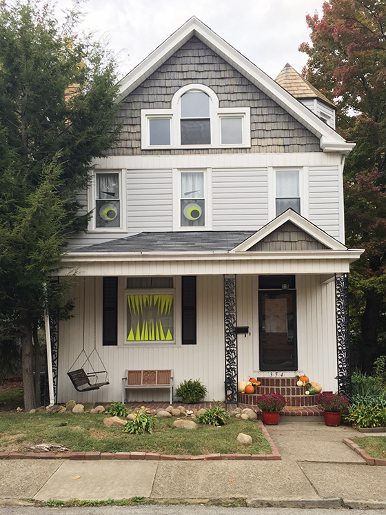
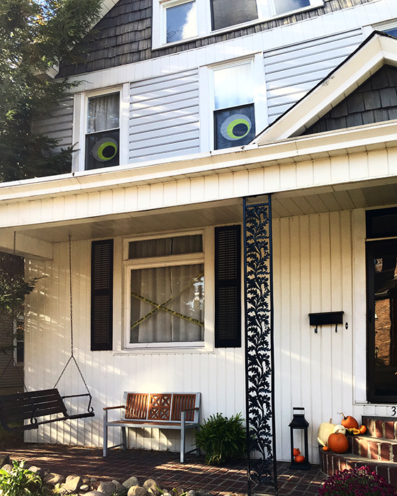
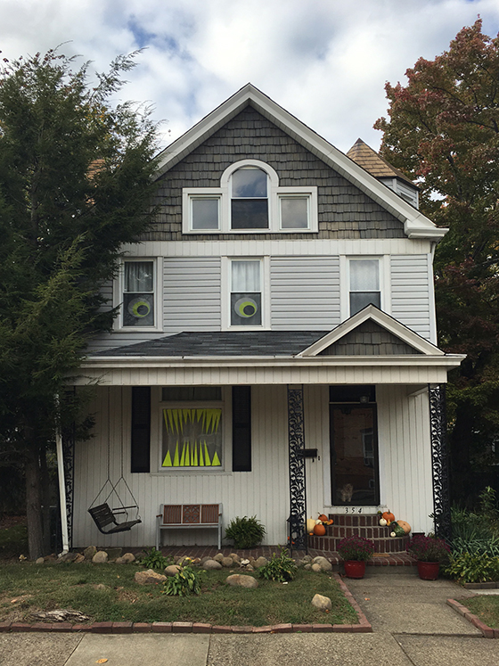
I always decorate for Halloween, but there’s no formula. Some years it’s only a porch full of pumpkins and others it’s something a little more. This year I decided that the windows in my guest room were begging for eyeballs.


354-halloween-2-design-crush


And that’s how it started, with six dollars worth of poster board and a pair of scissors. My first thought was that I’d like for them to be a bit larger, maybe even bigger than the windows themselves, but I was happy. I shared this photo on Instagram and Facebook as an afterthought.


354-halloween-3-design-crush


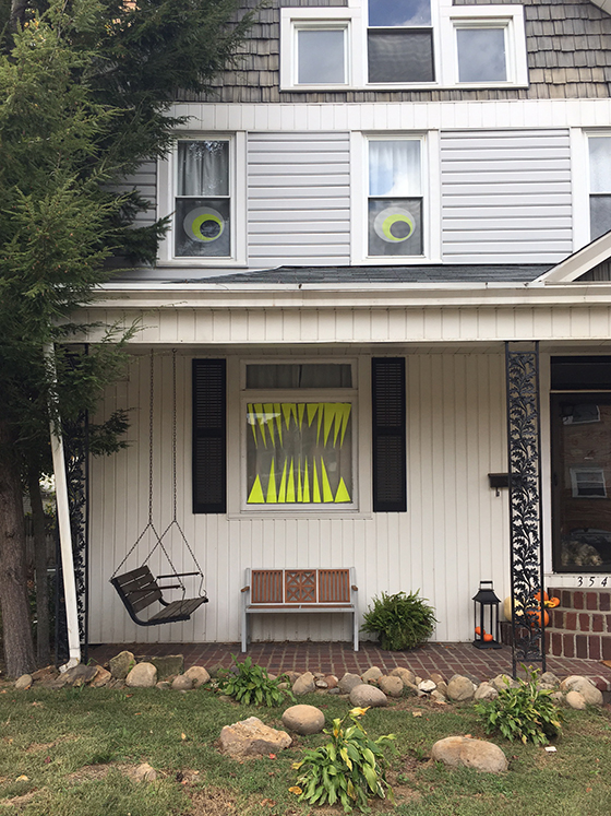
And that’s when the design by committee began! Several friends and followers suggested that the large living room window directly below needed teeth. And they were 100% correct, so back out came the scissors and leftover paper scraps.


354-halloween-4-design-crush


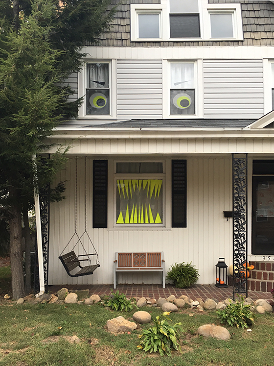
A window full of neon yellow snaggleteeth later and more suggestions came pouring in. Friends who live in town started driving by with their children in tow and I even caught a few snapping photos.


354-halloween-5-design-crush


The last suggestion that I entertained was the addition of some mean eyebrows with the last two scraps, which definitely made this DIY Halloween house monster complete. All-in-all it was a blast to create and I can’t wait to see the looks on trick-or-treaters’ faces in a few weeks!

1

5 Tips for Decluttering + Simplifying

poppin-1-design-crush


Do you ever get an overwhelming feeling to toss everything and start over? My last big clean out was two years ago during my last move, and over the past few months I’ve had a visceral feeling that it was time to go through everything again.

I’m currently over halfway through the Marie Kondo-ing of my things – the kitchen, living room, guest room, bathrooms, and master bedroom have been sorted. About half of the castoffs have been given away and the rest are sitting in my finished attic waiting to be sold or donated.

But the room I was dreading was my office.

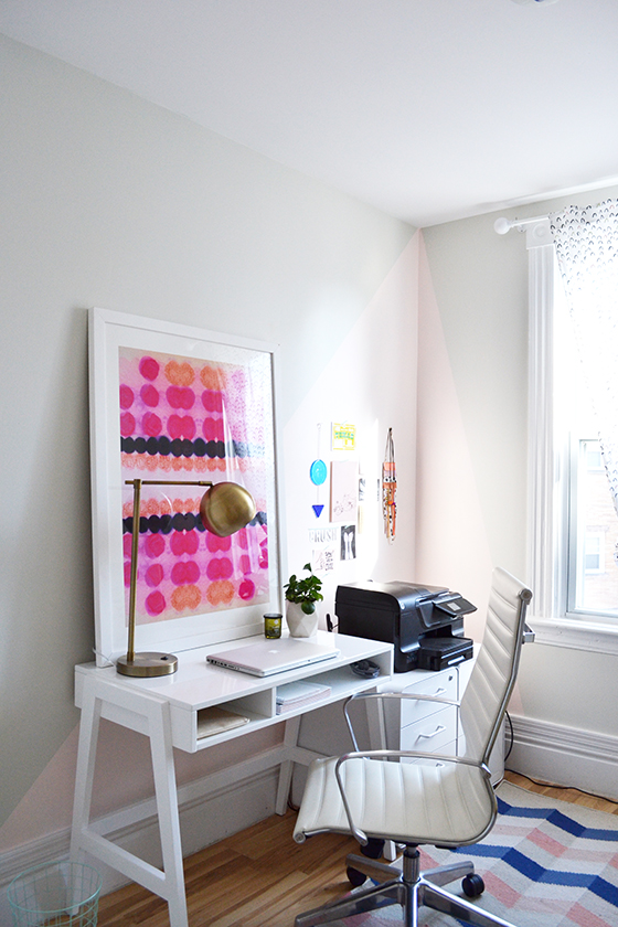
As a blogger I work out of a home office, and it often ends up as the room where submissions, samples, and products for projects get tossed. In other words: the Dump Room. Just walking into it made my anxiety jump a few levels, which definitely isn’t conducive to productivity.


poppin-2-design-crush


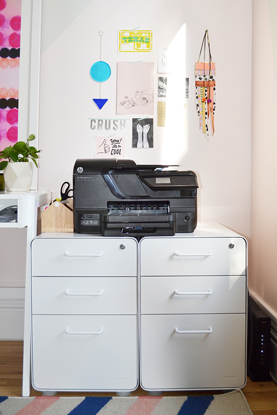
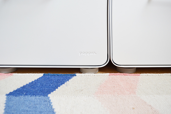
We’ve written about Poppin before, and you might’ve seen them yourself in some big box stores. The New York-based brand is a leading manufacturer of workplace furniture, as well as those brightly colored supplies you’ve likely seen, supported by the belief that everyone deserves to work happy. (That’s something we can all get behind, isn’t it?) Their well-designed, clean-lined pieces were a perfect match for my office, and I chose two white Stow 3-Drawer File Cabinets to tackle my biggest issues: organizing and decluttering.


poppin-3-design-crush


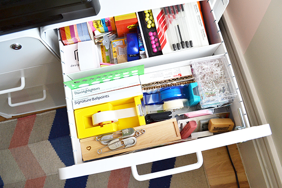
These powder-coated steel beauties showed up completely assembled and ready to rock – all of Poppin‘s furniture is always in stock and ready to ship asap – and I got right to work storing office supplies in one and craft and tech in the other. A bonus: one lock protects all three drawers! I chose white to match my desk, but the Stow Cabinets also come in a bevy of other colors.


poppin-4-design-crush


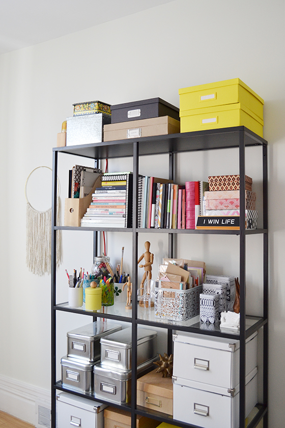
Everything else went into boxes on these shelves – notecards, notebooks, washi tape, etc are all hidden away nice and neat. The only things left out are the ones I need access to often, like pens, markers, and greeting cards.


poppin-5-design-crush


Tip 1: If you forgot you owned it – toss it.
I came across plenty of things that I either never remembered purchasing or thought I’d thrown out long ago. You’ll never have an easier decision.

Tip 2: If you don’t use it on a weekly basis – store it.
There are lots of items you own that are only get used occasionally. Tuck those things away in drawers, closets, or pretty boxes that are preferably labeled.

Tip 3: Don’t keep duplicates.
Extra supplies (Sharpies, tape, etc) excluded, you usually don’t need more than one. Get a new printer/camera/coffee maker? Get rid of the old one right away.

Tip 4: Donate it.
Guilt played a huge role in my entire decluttering process. My mom gave me this. I remember what I was doing that one time I wore this. I could maybe use this again if… Pass on your wealth by donating these loved but unneeded items.

Tip 5: If it’s broken, throw it away.
You’re not going to fix it. In fact, if it’s that important of an item you’ve probably already replaced it. To the trash can you go, end of story.


poppin-6-design-crush

This post sponsored by Poppin. As always, all words and opinions are my own. Thank you for supporting the brands that help keep Design Crush creating fresh content!
0

Still House

still-house-1-design-crush

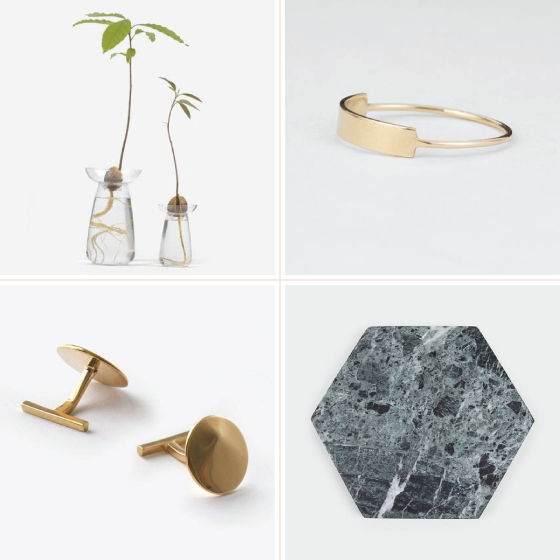
Aqua Culture Vase // Long Blade Ring // Okolo Cufflinks // Green Hexagon Stone Trivet

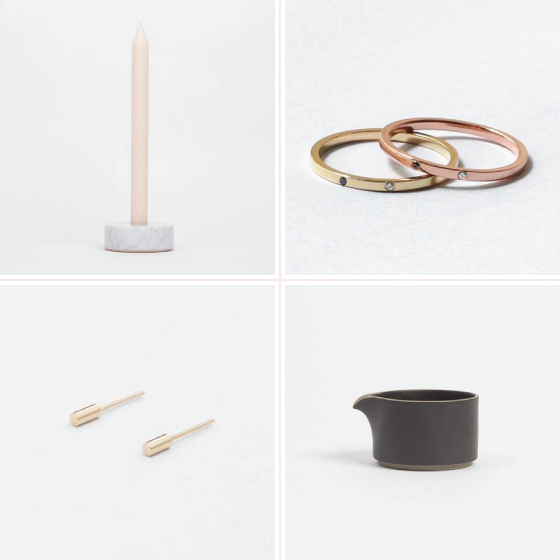
What started in 2011 as a brick and mortar shop in New York’s East Village is now available to the masses thanks to the internet. Still House has one of the best curated selections of interior accessories and jewelry I’ve come across in some time. Every single piece chosen by owner Urte Tylaite is clearly full of thought and intentional design choices, as timeless as they are beautiful. With goods from talented designers like Fort Standard, Kristen Elspeth, and a slew of others I’m looking forward to picking up a few special gifts for the holidays here in the coming months!
 

still-house-2-design-crush

Geometric White Stone Candle Holder // Sarala Ring // Lasa Earrings // Black Creamer


still-house-3-design-crush

Maple Letter Opener // Laya Necklace // Conductor Flasks // Long Steel Dessert Fork

I received product from Still House in exchange for this post. All words and opinions are my own, as always. Thank you for supporting the brands that help keep Design Crush creating fresh content!

0

Bringing Poised Taupe Home

sherwin-williams-poised-taupe-design-crush


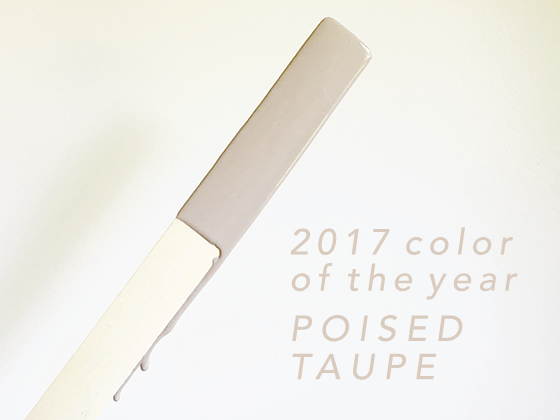
Let’s start this off honestly: Browns are not my bag. So when my long-standing partner Sherwin-Williams approached me about sharing their 2017 Color of the YearPoised Taupe – I was unsure. In my mind taupe is a drab nail color my mother used to wear in the 90s, one that I didn’t like then and didn’t feel much differently about now.

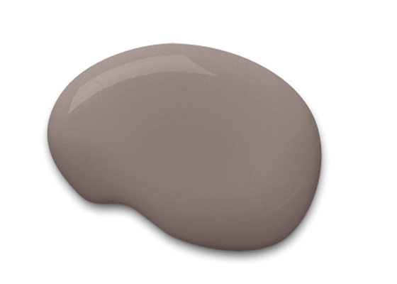
But then I actually saw the color in question, and I was proven wrong once again in life. Because this taupe? This taupe, Poised Taupe, was unlike anything I’d seen before. Plenty of grey undertones, even a little violet in some light, a modern take on a classic color.


sherwin-williams-poised-taupe-1-design-crush


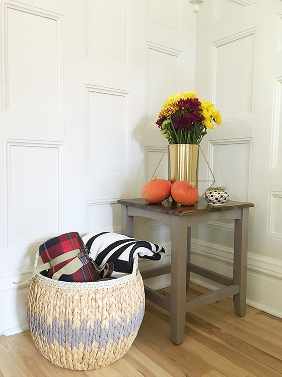
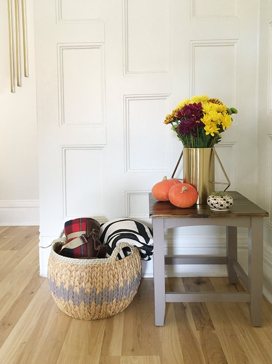
After considering where Poised Taupe might fit into my home I had the answer. A small wood side table  that had banged up legs and had seen better days could use a bit of a makeover, a second chance at life. I was also curious how different textures might take the paint, so I decided to give a seagrass basket that I keep blankets in an upgrade as well.

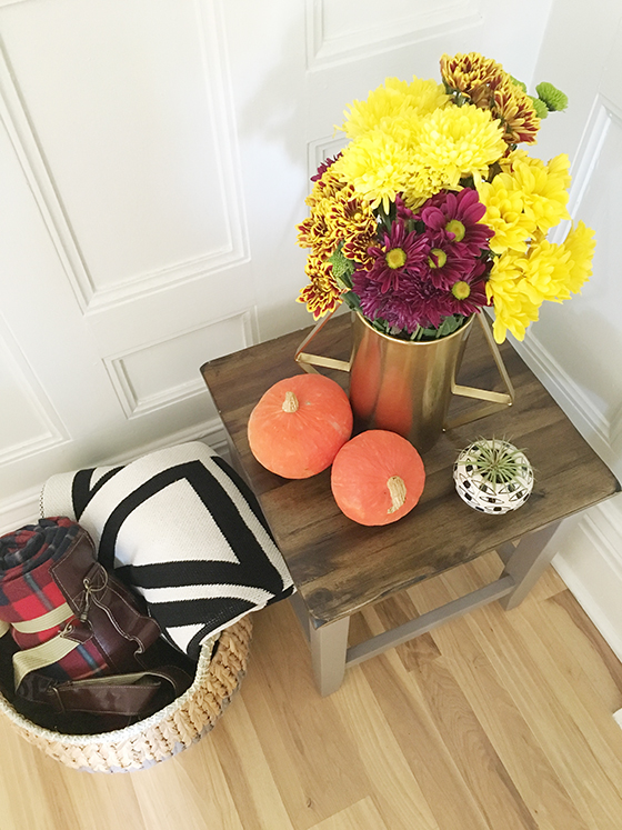
I left the surface of the side table unpainted for a bit of extra contrast. After giving the legs and underside a light sanding, I wiped them off with a cloth and swiped on two light coats of Poised Taupe in Sherwin-WilliamsProClassic formula with a satin finish.


sherwin-williams-poised-taupe-3-design-crush


My seagrass basket took a bit more time, but I found painting each little section therapeutic. After pouring through pattern options online I went with a simple zigzag – because sometimes simple is best, ya know? I love the update and how it feels a little bit like a fair isle sweater for the cooler months that are nearly here. For this mini-project I went with the Poised Taupe in Sherwin-WilliamsEmerald formula (my favorite!), also in a satin finish.


sherwin-williams-poised-taupe-2-design-crush


For a color I wasn’t so sure about, Poised Taupe sure seems to fit right in in my home with its earthy feel. Both the side table and basket are currently front and center when you walk in the door, nestled in the nook of my staircase. It’s the perfect place to put a vase of fall flowers and drop your keys.


sherwin-wiliams-poised-taupe-design-crush


This post sponsored by Sherwin-Williams. All words and opinion are my own. Thank you for supporting the brands that help keep Design Crush creating fresh content!

0

Artifact Uprising Float Frames

artifact-uprising-float-frames-1-design-crush


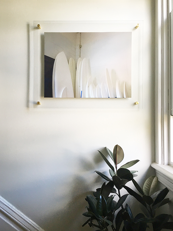
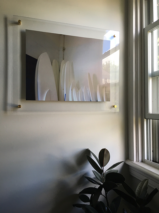
I’ve had the same piece of art hanging at the top of my stairs for nearly two years and have been wanting to change things up. I actually have a folder on my desktop of my favorite photos I’ve taken, with the hope that one day I’ll print and frame them as art. So when Artifact Uprising reached out about their brand new floating frames I was ready, willing, and completely prepared.


artifact-uprising-float-frames-2-design-crush


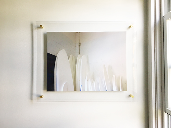
After some hemming and hawing I narrowed it down to this shot of a group of surfboard blanks that I snapped in San Diego a few years back. It’s a really muted photo and I love that it blends in with the wall color so well. I uploaded my iPhone image to Artifact Uprising and a week or so later a very safely packaged framed print was on my doorstep. (A huge deal, I’ve had several pieces show up broken from other companies.)


artifact-uprising-float-frames-3-design-crush


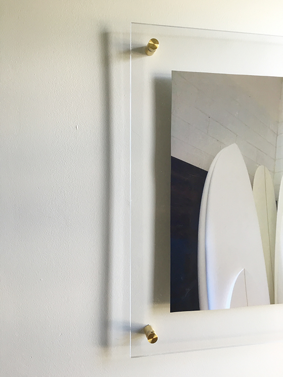
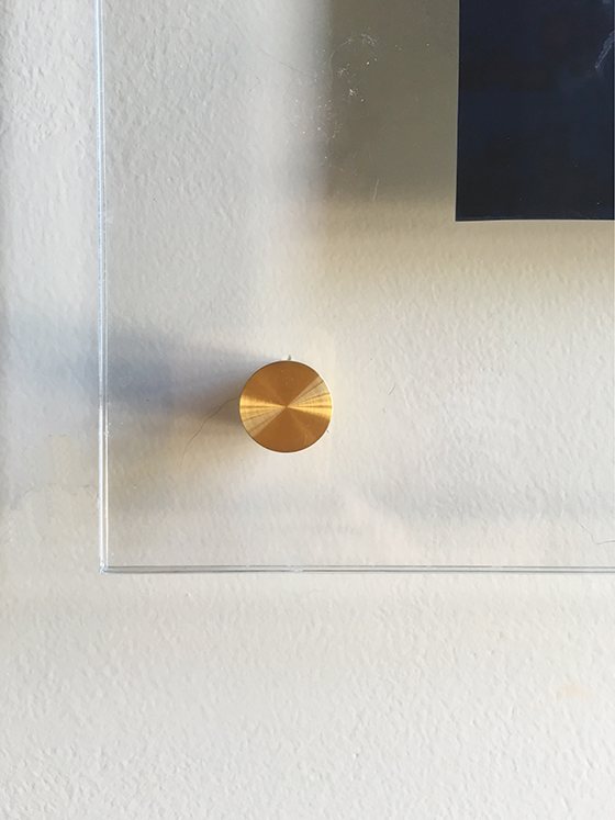
After watching a video and using the handy template they sent along to hang the float frame we were all set. So sleek, right?! The frame grade acrylic is thick without weighing a ton like glass, and the brass-coated bolts give the entire piece such a polished look. Such an impact!


artifact-uprising-float-frames-4-design-crush

artifact-uprising-float-frames-5-design-crush

This post sponsored by Artifact Uprising. All words and opinions are my own. Thank you for supporting the brands that help keep Design Crush creating fresh content!

2

The World of Whirlpool

Whirlpool-1-Design Crush


I’ve been starting to toss around the idea of a small kitchen renovation in the back of my mind. It’s not a huge space and the layout is actually very functional as is, so it will likely be cabinet replacements and updated appliances. There are so many updated options to choose from these days, but I’ve relied on Whirlpool in both of my homes and the brand loyalty I’ve built with them isn’t likely to deviate.


Whirlpool-2-Design Crush


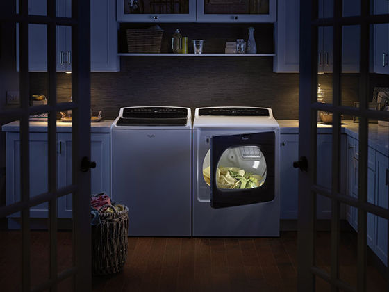
Whirlpool Corporation is actually a family of brands – Amana, Whirlpool, Maytag, KitchenAid, and Jenn-Air – featuring a portfolio of appliances that can match the personal style, use, and expectations of any consumer, any budget, and any project. Every household is unique and Whirpool’s line of appliance brands utilize cutting-edge design and purposeful innovation to fit every lifestyle.


Whirlpool-3-Design Crush


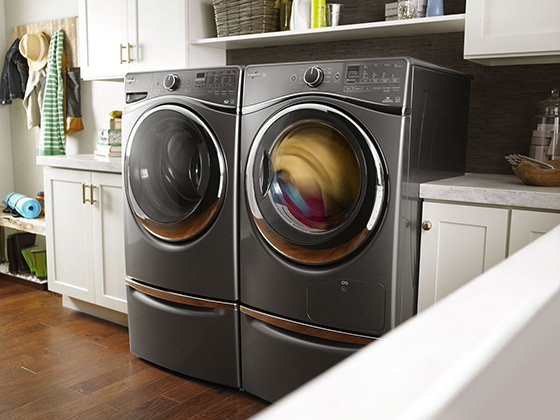
Whirlpool‘s Global Design Centers use consumer insights to guide design and create appliances that integrate with the entire home, not just the kitchen. Design preferences – like open kitchens – create plenty of opportunity to experiment with color finishes, textures, sounds, and the necessity for quiet and harmony within the space.


Whirlpool-4-Design Crush


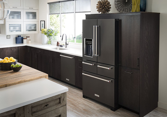
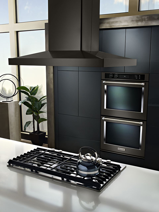
If you’re living in an open environment you know appliances can’t stand alone, which is why Whirlpool offers color finishes and textures that make appliances feel more like a part of the home, rather than the cold, utilitarian boxes of the past. For example, KitchenAid’s black stainless finish seamlessly blends with other home materials and resists smudging.


Whirlpool-5-Design Crush


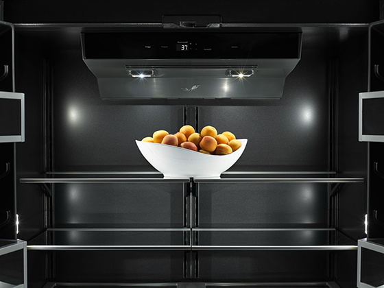
The eco-conscious among us can feel good knowing Whirlpool offers a “no-compromise” approach for homeowners by giving them high-performing products that have a small impact on the environment, an affordable purchase price, and a low cost to operate. Homeowners no longer need to choose between products that are sustainable and products that look good and are affordable.

This post sponsored by Whirlpool. All words and opinions are my own. Thank you for supporting the brands that help keep Design Crush creating fresh content! Follow Whirlpool Corporation on Twitter and LinkedIn.

0