Outdoor Living

Overstock-1-Design Crush


This summer has felt like a dream. After spending summers in triple degree heat, being back in Pennsylvania this season has been better than I remember. When living in Oklahoma City I always felt like I was jumping from one air conditioned space to the next, spending the shortest amount of time in the sweltering heat in between as possible. I was determined to get my two (yes, two) backyard decks whipped into shape for some outdoor living as soon as possible.


Overstock-2-Design Crush


I teamed up with the folks at Overstock to make it happen since I’d either sold or donated the majority of my outdoor furniture before moving last summer. My first goal was to create a space that was functional for entertaining 12 to 15 people at a time, my second was to make the area comfortable during summer as well as fall.

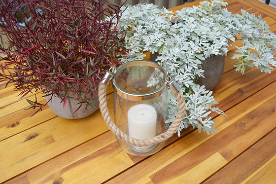
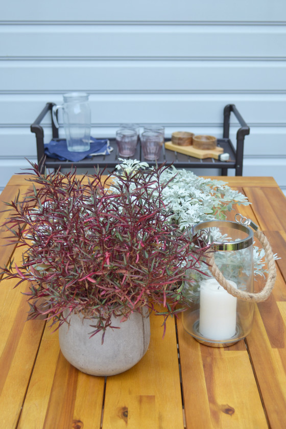
It all began with a few Eco Concrete Samai Planters. I love their industrial look and that they’re heavy enough not to topple over if and when the wind picks up. The plants I’ve used seem to love them just as much and have flourished like crazy.


Overstock-10-Design Crush

Overstock-3-Design-Crush


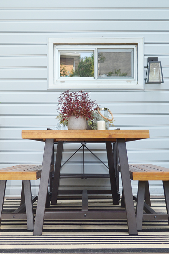
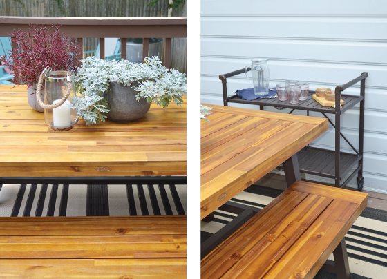
The most important addition to the upper deck was a patio set. I knew I wanted something constructed primarily out of wood and ended up going with the Carlisle Rustic Metal 3-piece Outdoor Dining Set from Christopher Knight Home. It easily seats six people and I plan on adding chairs to both ends to accommodate a few more.

Smartfold outdoor folding serving cart from COSCO is the outdoor equivalent of a bar cart. It’s on lockable wheels so I can push it around serving and park it when done. It’s also come in handy when potting plants and making s’mores on the lower deck.


Overstock-4-Design Crush


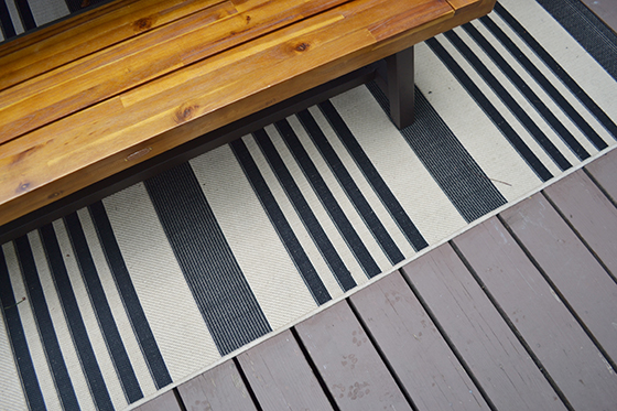
I’ve always been on the fence when it comes to outdoor rugs, but I couldn’t really tell you why. The upper deck is in major need of a fresh coat of paint (next summer’s project!) so I thought a rug might offer a solution. The stripes of this black and bone indoor/outdoor rug by Safavieh do a great job of carrying the aesthetic of the interior of my home to the outdoors. And I have to say, the dogs absolutely love lounging on it.


Overstock-5-Design Crush


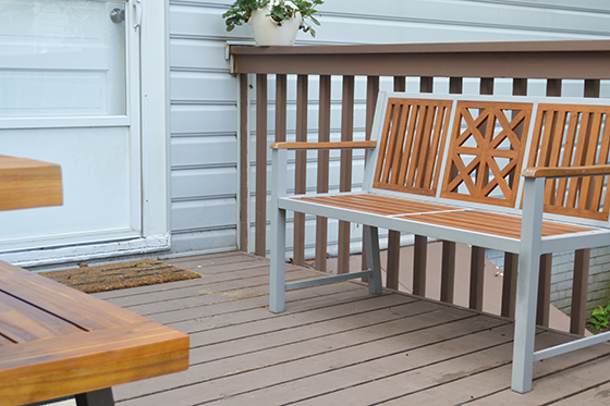
The last touch on the upper deck, or the deck that connects directly to the house, is the Laguna Park Bench. The geometric backrest is another extension of my style and the wood and metal of the piece tie in perfectly with the patio set and folding cart. I love sitting here watching the dogs while they’re on squirrel patrol in the yard, especially in the mornings with a cup of coffee in hand.


Overstock-6-Design Crush


But I have to admit, the lower deck is probably my favorite. When I bought this house almost a year ago I had no plans for its use. Was it built before the upper deck was put on? After? It was and remains a bit of a mystery, but its location right under a gigantic shady tree is just perfect.


Overstock-7-Design-Crush

Overstock-9-Design Crush


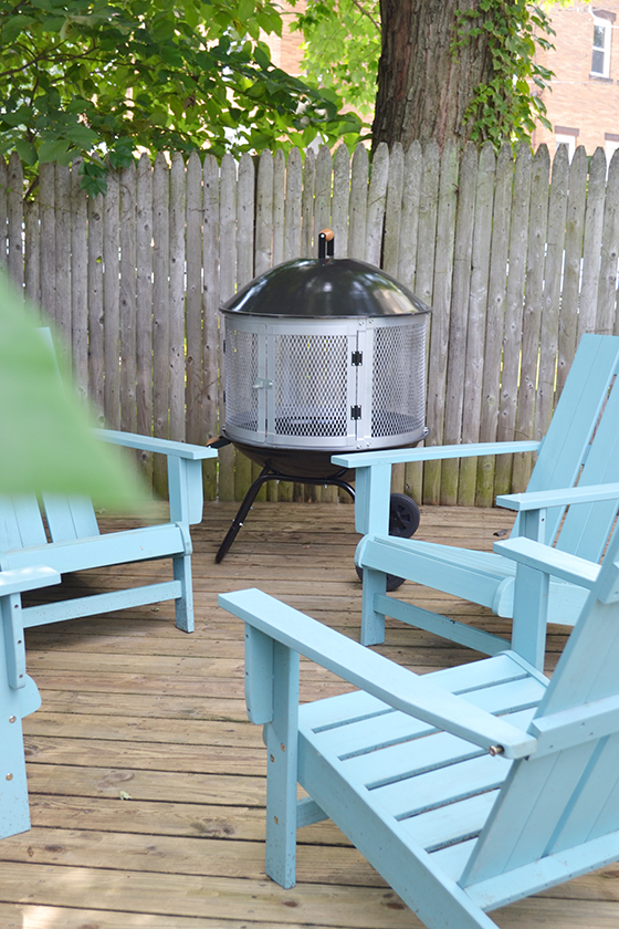
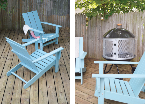
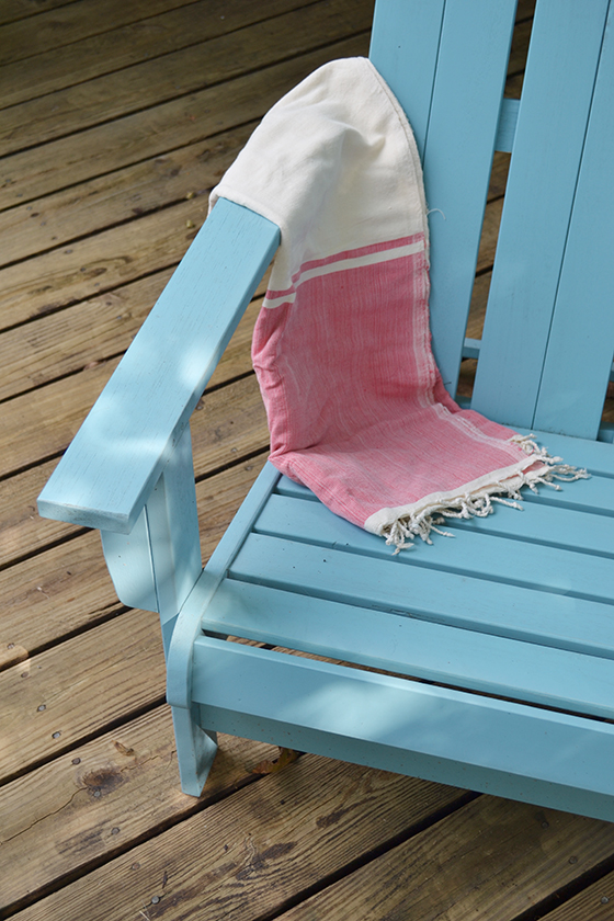
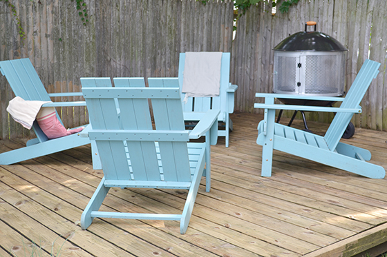
I’ve wanted adirondack chairs for years now, in fact I can remember telling my mom that they were one of the first things I’d buy once I had my own home. It didn’t happen quite like that, but these Acacia Square Back Adirondack Chairs now live in perfect formation on the lower deck. They’re super comfortable and I love the pop of light blue against all of that brown. Add a few blankets and we’re all ready for the cozy evenings soon to be spent out here.


Overstock-8-Design Crush


The yard itself is mainly the dogs’ domain and I didn’t want to take up their space with a fire pit, but I knew I wanted something similar to gather around come fall. I instantly fell for the Corvus Aviano Black Enamel Finished Wheeled Fire Pit. Again, I love the mobility of this piece. I can wheel it into the yard should the party get too big for the deck.

So, when are you coming over?!

This post sponsored by Overstock. Thank you for supporting the brands that help Design Crush creating fresh new content!
0

Sprout 3D Scanner + a Print Download

HP 3D Scanner-Hand Print-8-Design Crush


Last month I shared the bright summer desktop wallpaper I created with HP’s Sprout all-in-one desktop and its revolutionary scanning capabilities (check out #GoMakeThings to see how others are getting super creative!). Now they’ve released a 3D capture stage, a brand new accessory that allows you to scan objects in full 3D to print or use however you wish.


HP 3D Scanner-Hand Print-2-Design Crush


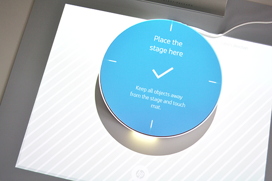
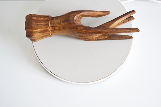
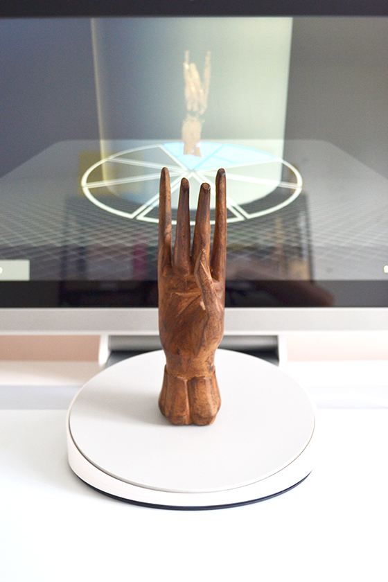
The stage easily plugs into a USB port on the Sprout and shows you exactly where to position the device. I had a lot of fun scanning random things – an air plant, a binder clip, etc – as I tried to test the devices limits and strengths. Organic shaped objects scan best, and things that are shiny or transparent aren’t going to do well.


HP 3D Scanner-Hand Print-3-Design Crush

HP 3D Scanner-Hand Print-4-Design Crush


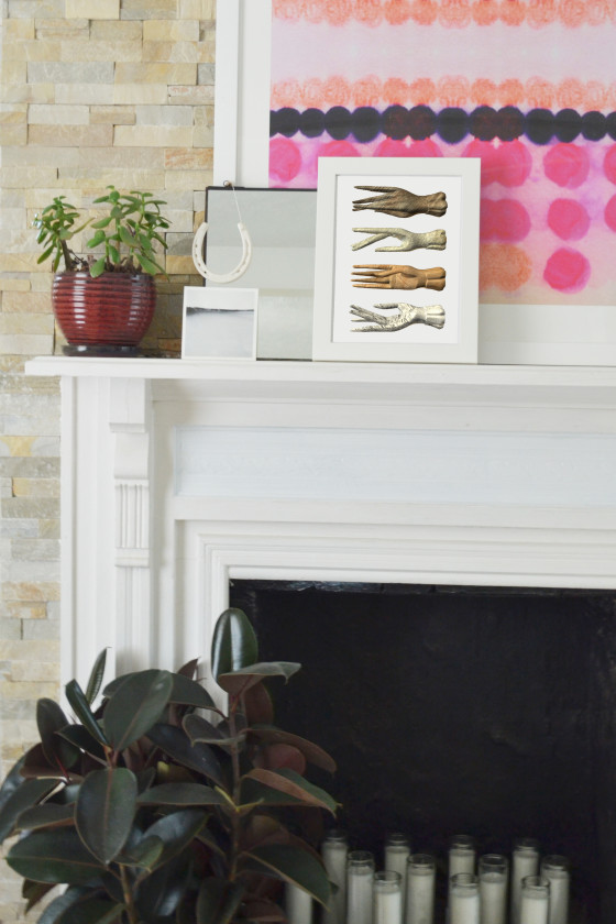
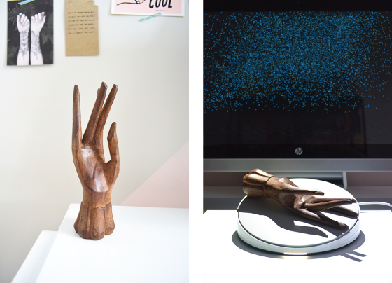
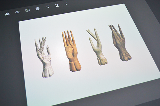
This teakwood hand has been in my possession for a few years and I absolutely love its shape and detail. Creating a print with it captured from different perspectives seemed really interesting to me and just the sort of job that the 3D capture stage would be perfect for.


HP 3D Scanner-Hand Print-1-Design Crush


The capture stage scanned my hand in several different positions, instructing me as it went. I loved that I could do as many scans as necessary (at least three are recommended) to stitch together the object, and it was so rad to watch it become more complete with each pass.


HP 3D Scanner-Hand Print-6-Design Crush


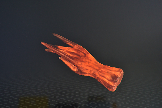
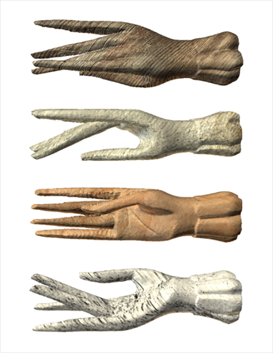
I used the touchscreen to flip the newly scanned hand every which way to inspect for any holes and found none. At this point I was finished scanning and it was time to edit the end result. After messing around with color and texture I settled on four organic looks, then saved 2D images of the hand from each side as well as from the front and back. These are what I would use to create my print.


HP 3D Scanner-Hand Print-7-Design Crush


I created a new project and with the flick of a finger moved the files from the image library to the touchpad. I scaled down all of the hand views and arranged them just like I wanted the end print to look. I sent it straight to the printer, popped it in a frame, and voila! – new mantel art.

Download your own copy by clicking on the image below.
For personal use only.


HP 3D Scanner-Hand Print-9-Design Crush

This post sponsored by HP. All words and opinions are my own. Thank you for supporting the brands that help keep Design Crush create fresh content!
0

The Office

354-Office-1-Design Crush


After sharing the first floor of my house here last fall, I’d planned on doing the same with the second floor this spring. As you can see… it’s taken a wee bit longer. You got a glimpse of the office earlier this year when it got a new paint job, but today it’s the whole deal. (The master bedroom and guest room will follow in the next few months.) Ready?


354-Office-2-Design Crush


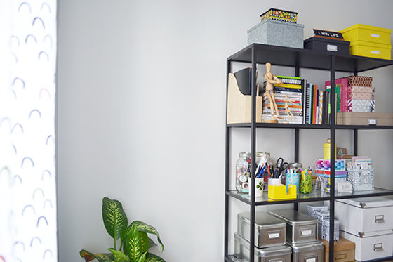
If I’m being honest with myself, I’m 110% surprised at how much color is in my office. It’s tempered in every direction you look by white and black, but it’s still more than I ever would have guessed.


354-Office-3-Design-Crush


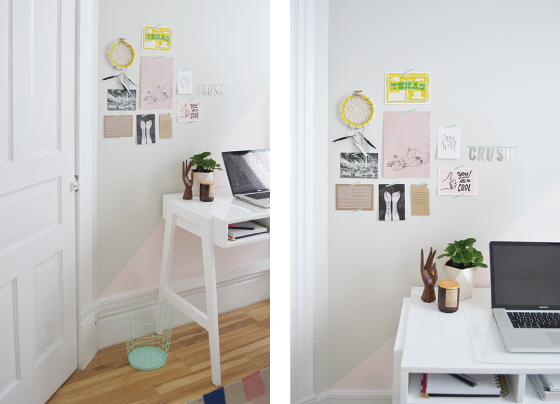
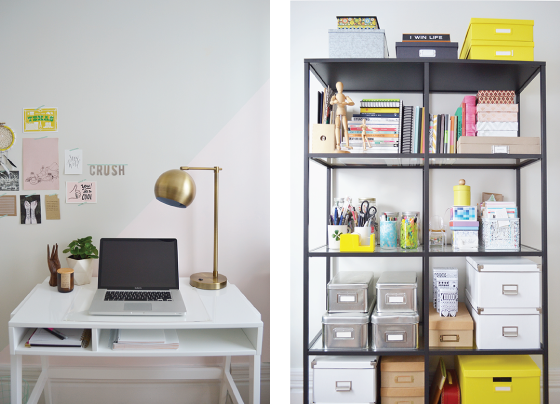
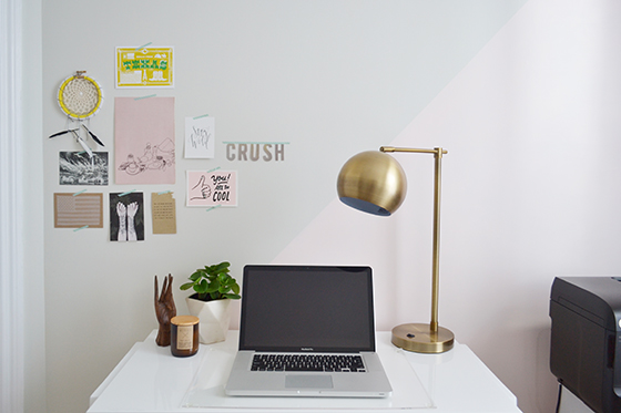
I upgraded my desk to one that would afford me a little bit of storage. The closet in this room is teeny tiny and triangular in shape, it’s located directly over the angled staircase below and has to accommodate its high ceiling. I went with the Prairie School Desk. (Do you just associate Land of Nod with kids? You’re wrong, they’re so much more.) I love its sleek and modern profile and the way it coordinated with a few other things I already had selected for the space.


354-Office-4-Design-Crush


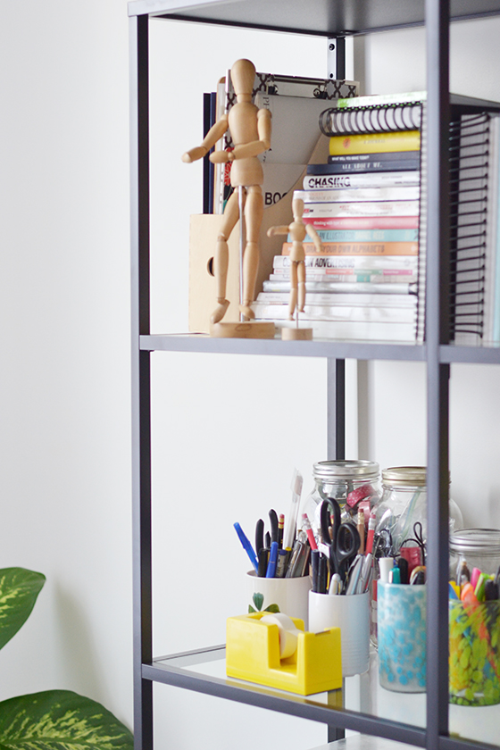
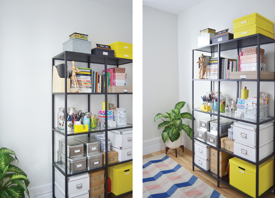
The VITTSJÖ shelving unit bears the burden of a lot of what a closet would normally be responsible for. The tempered glass and metal are super sturdy, so I’m able to hide a lot of clutter in boxes as well as design books and the blank journals that I can’t seem to stop collecting. Do you like the pops of brightness my yellow accessories bring to the table?

Plants give any space life, and I was determined to make my office feel as light and airy as possible. Modernica’s Case Study planters have been a longtime favorite and this seemed like just the place to use one. (Please note that I have the stand turned upside-down here to add some extra height.) The sturdy ceramic pot and wooden base add a nice earthy touch to an otherwise empty corner.

I debated whether or not to put down a rug in this space and ultimately decided it needed it. I embraced the opportunity to pull in some more color and pattern with this Surya Frontier design from Rugs Direct in salmon, light grey, and navy. It pulls in the light pink accents around the room all while remaining surprisingly neutral.


354-Office-5-Design Crush


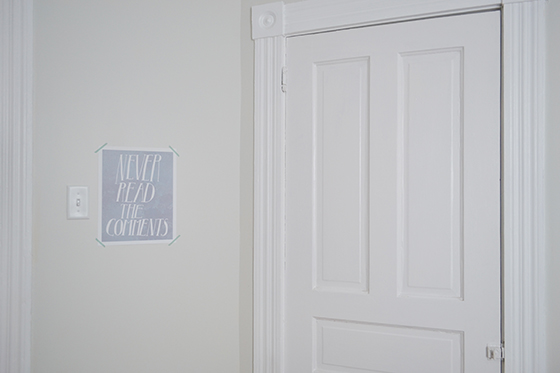
While I’m all about hanging art everywhere, I deliberately wanted lots of open wall space here. Aside from a few mood board-type things over my desk, the only other thing on the wall is this Never Read the Comments print by Serif & Script. Always a good reminder for anyone with a presence online, no?


354-Office-6-Design Crush


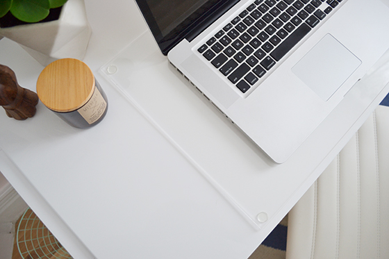
I plan on sandwiching a few things under this I Can See Clearly Now Desk Mat. I’m thinking favorite photo booth shots, important notes, etc. Bonus: It does double-duty as a surface protector for my desk and laptop!


354-Office-7-Design-Crush

354-Office-9-Design Crush


I finished things off with a curtain rod sporting ball finials and Little Arches curtains (More color! More pattern!) I was nervous that it might be a bit much and clash with the rug, but the pattern ended up complimenting the rest of the room better than could have been expected.

I’m thrilled with the way this space has come together and can’t wait to see how it evolves. Time to get back to work!


354-Office-8-Design Crush


Prairie School Desk c/o Land of Nod // VITTSJÖ shelving unit // Case Study planter c/o Modernica // Surya Frontier rug c/o Rugs Direct // Never Read the Comments print by Serif & Script // I Can See Clearly Now Desk Mat c/o Land of Nod // curtain rodball finialsLittle Arches curtain c/o Land of Nod

1

DIY Modern Shower Memo Board

method-DIY Modern Shower Memo Board-1-Design Crush


You know the drill… you’re in the middle of sudsing up in the shower when inspiration strikes. You’ve figured out the elusive answer to a work brief, nailed what kind of landscaping design you’d like in the backyard, or even solved climate change (here’s hoping). But by the time you step out of the tub *poof* it’s gone. The most fantastic ideas happen when you’re inspired, so why not have a place to write them all down?
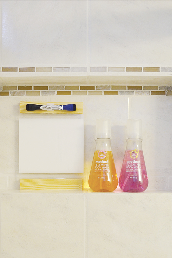
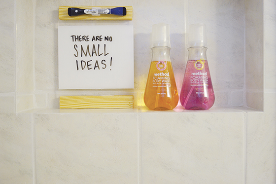
Trying method‘s latest and greatest product – foaming body wash – inspired me to come up with a solution. The scents and bubbles wake up my senses and get my creative juices flowing (the ruby orange is my favorite scent of the four available – it’s so summery and refreshing!). So a modern do-it-yourself shower memo board that would both give me a spot to brainstorm and match up with my minimal aesthetic seemed like just the ticket.
 

method-DIY Modern Shower Memo Board-2-Design Crush


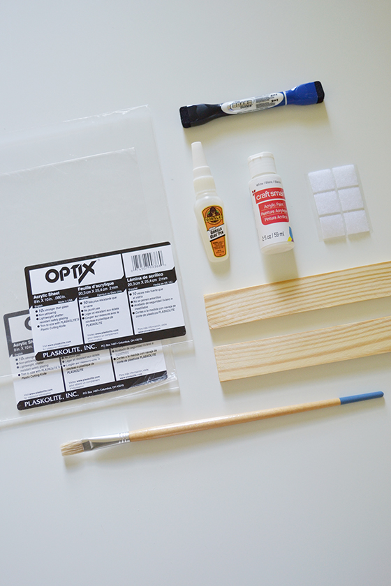
Materials:
• 2 – 8 x 10″ pieces of plexiglass
• 4 – 8″ lengths of quarter inch thick wood (varnished or not)
• strong adhesive (I used Gorilla Glue)
• painter’s tape
• white craft paint
• small paint brush
• self-adhesive velcro
• dry-erase marker


method-DIY Modern Shower Memo Board-3-Design Crush


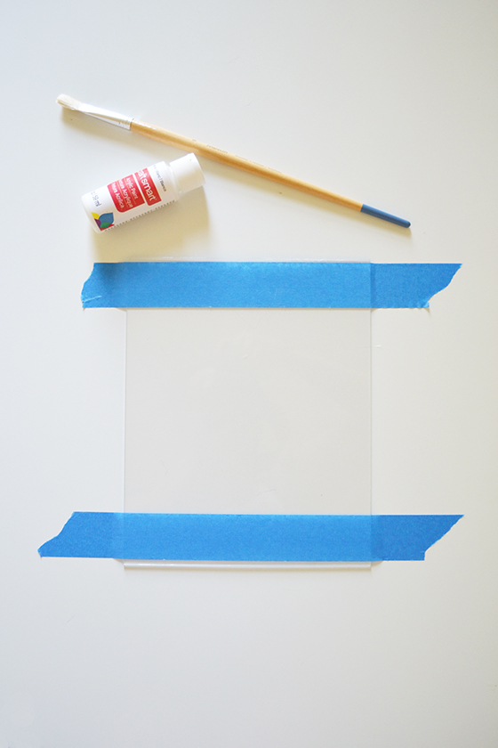
Begin by taping off one of the pieces of plexiglass with the painter’s tape, about and inch on both top and bottom. You could also get  more creative and mark out individual boxes, lines, etc – make the space work best for how you tend to process and think. I taped past the edges which helped to anchor the plexiglass in place while I was painting.


method-DIY Modern Shower Memo Board-4-Design Crush


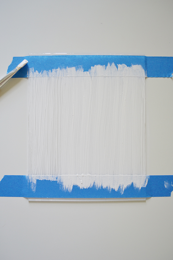
It’s best to apply several thin coats of craft paint instead of one thicker one. To achieve the opacity I wanted took three coats with about thirty minutes of drying time in between each. Make sure and pull off the painter’s tape before the last layer is dry, it will help keep the edges crisp and clean. If you get any smudges just use a cotton swab or your fingernail to to fix things up.


method-DIY Modern Shower Memo Board-5-Design Crush


Plexiglass is notoriously difficult to drill through, so I opted for a heavy duty adhesive instead. I placed a thin line of adhesive about 1/4-inch from the edge of both the top and bottom, then placed the second piece of plexiglass over the first to cover my newly painted surface. In order to get a really tight seal I placed a few heavy coffee table books on top to act as a clamp, then waited for an hour or so for things to dry thoroughly.


method-DIY Modern Shower Memo Board-6-Design Crush


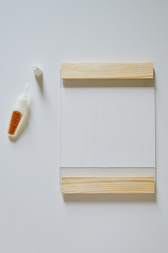
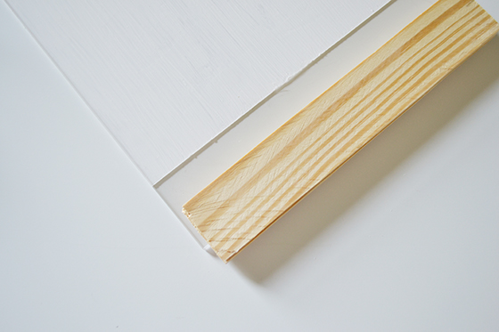
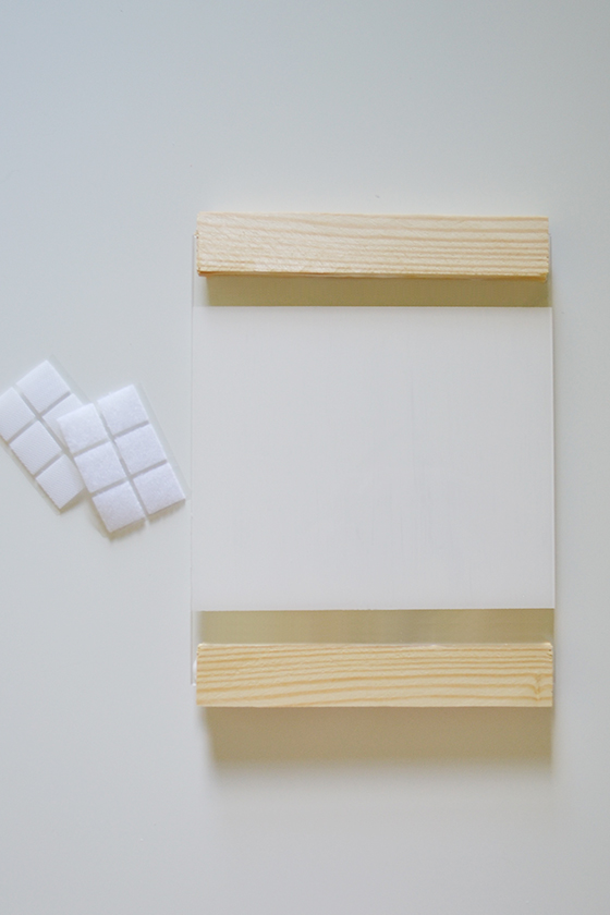
Attaching the wooden edges to top and bottom was just as easy. Once again I spread a thin line of adhesive along the edge of each piece, then placed them so that about two thirds of their width was on the plexiglass and the rest hung off. Then again I set a few large books on top and allowed everything to dry. You could stop here, but I opted to add a second set of wood edges to the backside by repeating the process.


method-DIY Modern Shower Memo Board-7-Design Crush

method-DIY Modern Shower Memo Board-8-Design Crush


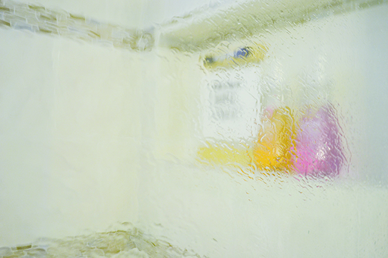
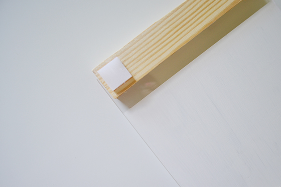
There were lots of possible ways to attached my brand spankin’ new memo board to the shower wall once I was finished. I could add an eye hook and use a suction cup or command strip, but I went with… velcro! Self-adhesive pre-cut squares couldn’t be easier to apply and they allow the board to really stay in place while writing on its surface. (And rest assured, I checked to make sure they survived the humidity and also came off the wall relatively easily!) One went on the four corners of the backside – both sides of the velcro stuck together at this point – then I positioned it on the wall and pressed for about 30 seconds.


method-DIY Modern Shower Memo Board-9-Design Crush


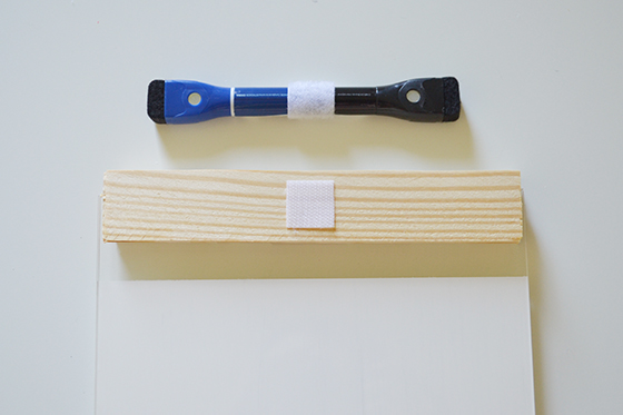
I attached a dry-erase marker the same way, with velcro so it’s always handy when I need it.


method-DIY Modern Shower Memo Board-10-Design Crush


I’ve used method‘s products in my home for years, their hand soaps and body washes favorites. I love that all of their products are naturally-derived and never tested on animals, a big plus in my animal loving household. These new foaming body washes are super moisturizing and smell amazing. They also manage to add a fun dose of color to my otherwise neutral bathroom. Head over to Target to try them for yourself now through October!


method-DIY Modern Shower Memo Board-11-Design Crush


method Foaming Body Wash is sold exclusively at Target now through October 2015. This post is sponsored by method. As always all words and opinions are my own. Thank you for supporting the brands that help keep Design Crush going!

1

That Time I Planned a Dance Party

In Bed by Ten-1-Design Crush


It all started with a challenge from Ford and their Switch It Up series to step out of my comfort zone and try something new, something inspiring or challenging or just plain crazy. It ended with what is now a monthly dance party fundraiser that continues to collect donations for worthy causes in my city of Pittsburgh.

But let me back up for a minute.


In Bed by Ten-2-Design Crush


My friend Matt Buchholz is a fantastic DJ who never fails to fill the dance floor to the point of spilling over. After an event a few months ago he and I started talking about how rad it would be to make these dance parties a more regular sort of thing. We, along with most of our friends, are in the 30- and 40-something range, everyone still likes to go out and have a great time but no one really wants to wait until 11pm for the party to get started. Ideally we’d all be in our pajamas by then watching Netflix.


In Bed by Ten-3-Design Crush

Photo Matt Dayak

Event planning is something I’ve been interested in the past few years, and this seemed like the perfect opportunity to get my toes wet. One sit-down meeting later and Matt and I were partnered with Spirit, a newly opened space in the Lawrenceville neighborhood of town. We quickly got the event on the calendar for the last Friday in May – no cover charge, just three hours of straight-up dancing and letting loose after the workweek was done with.


In Bed by Ten-4-Design Crush

Photo Matt Dayak

We created an event on Facebook and invited all of our friends. And they invited their friends and they invited their friends. Soon nearly 300 people had RSVPed. Matt and I were thrilled, but had no idea what to expect come the day of the event.


In Bed by Ten-5-Design Crush

Photo Matt Dayak

When we arrived for setup that Friday the air conditioning was broken and it was absolutely storming outside, buckets of rain being dumped from the sky kind of rain. At that point if fifty people showed up we were ready to call it a success.

So what happened next can only described as sweaty magic.


In Bed by Ten-6-Design Crush

Photo Matt Dayak

The people showed up in force – 150+ of them – and danced their hearts out in the sauna that was the dance floor. Everyone was dripping sweat, clothing was soaked through, but no one cared. It was like dancing when you were a kid, everyone was in their own zone just smiling and laughing and feeling it. Living in the moment. It got to the point that Spirit brought out cases of water to pass around because they didn’t want anyone dehydrating or passing out!


In Bed by Ten-7-Design Crush

Photo Matt Dayak

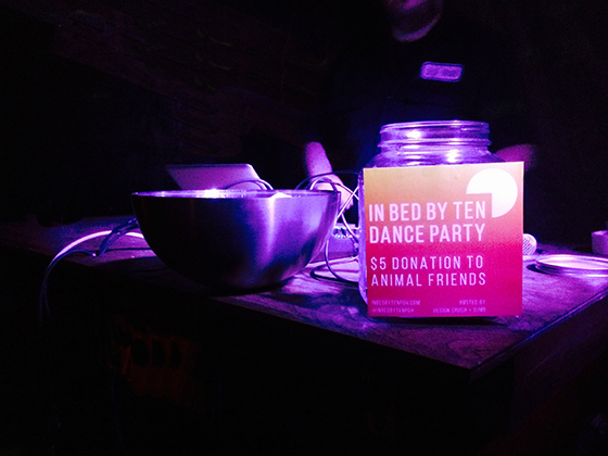
Before the night was even over everyone was asking when the next dance party was scheduled. We knew we could do something with this, something GOOD. Matt and I had started with the intention of raising money for causes we believe in, but wanted to get people in the door to see what the dance party – what we christened In Bed by Ten – was all about. The  next time we knew we wanted to gather a suggested cover charge as a donation towards something bigger.


In Bed by Ten-8-Design Crush

Photo Matt Dayak

We’ve since had another IBBT dance party in June that result in over $450 in donations to a local animal rescue, and more events are scheduled throughout the rest of the year! Each month we’ll be donating cold hard cash to different local charities in the name of having a good time and letting our hair down.

Since stepping out of my comfort zone to create this monthly for good event we’ve even had interest from other cities, which blows my mind. Just a reminder that taking a chance can pay off in more ways that you ever imagined.

On that note, I’m excited to share a new YouTube series presented by Ford: Switch It Up! The latest episode features Blogilates‘ fitness expert Cassey Ho stepping out of her comfort zone to create a gallery of her own photography. Take a peek below:


A big thank you to Ford for pushing me to do something out of my comfort zone and sponsoring this post. Thank you for supporting the brands that help keep Design Crush going!


3

SUMMER + HP Sprout (+ a Download)

Summer-Desktop-Sprout-1-Design-Crush


I have two things on the brain lately: summer and the color pink. In my mind the two just go together in a no brainer sort of way. I had the chance to team up the two when HP kindly asked me to try out their latest innovative product, Sprout.

Sprout is a touch-screen Windows PC that has a touch-sensitive mat and projection surface where you’d expect to see a keyboard. The interface is surprisingly simple. The mat and the monitor act like two screens, and you can seamlessly drag objects between the two to create. The hood that extends over the screen is called the Illuminator and includes a scanner, depth sensor, camera, and projector. It’s responsible for projecting that second screen onto the mat, but users can also photograph objects and make 3D scans with its help. Total magic. Don’t feel like using the touchscreen? That’s cool, just unsnap the pad and use the keyboard that comes with Sprout.


Summer-Desktop-Sprout-2-Design-Crush

Summer-Desktop-Sprout-3-Design-Crush


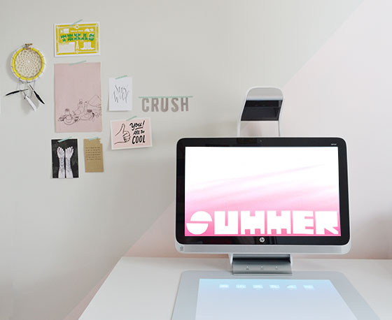
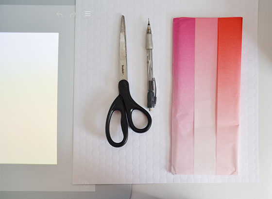
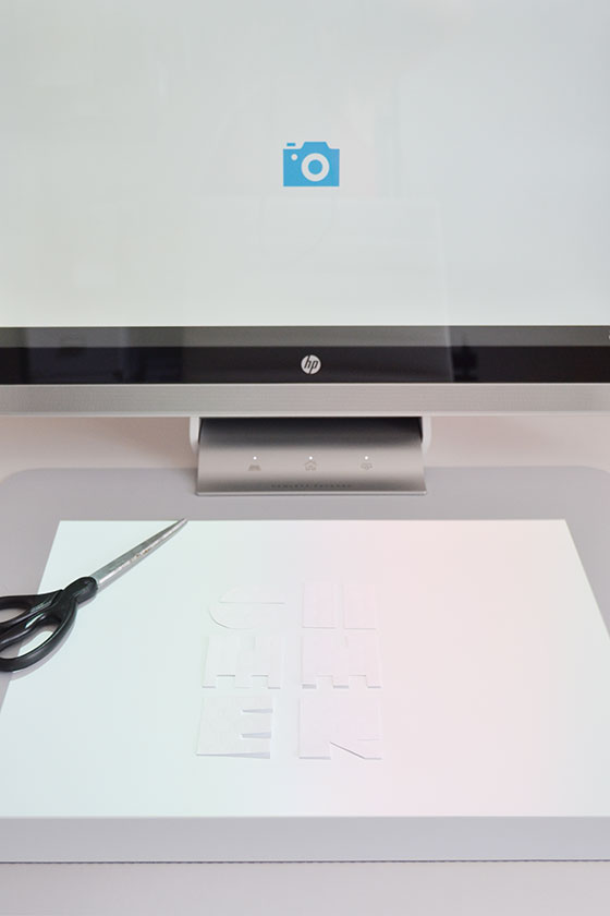
I’d recently squirreled away a pack of ombre tissue paper and knew it would be perfect for the creation I had in mind. The first thing I did was lay out a piece on the pad and scan it with a single touch of my finger on the screen. Then I cut out letters to spell out SUMMER and arranged them on the pad beneath the Illuminator. Another touch of that blue camera icon on the screen and we were in business.


Summer-Desktop-Sprout-4-Design-Crush


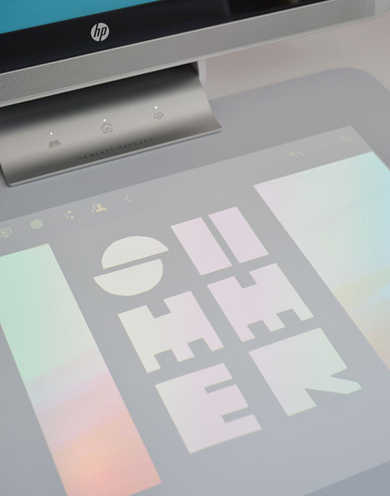
After pulling both images that I’d just scanned from the monitor to the projected screen on the pad, and just a little manipulation, I’d created a fun and bright desktop wallpaper design. It took a total of about 15 minutes and I loved getting to use my hands in conjunction with Sprout. Nearly all of my design work take place on a machine these days, and I can’t tell you how good it felt to create something more analog once again.


Summer-Desktop-Sprout-5-Design-Crush

Download the SUMMER desktop wallpaper here

This post is sponsored by Sprout by HP. As always all words and opinions are my own. Thank you for supporting the brands that support Design Crush

1

A Welcoming Front Porch

Front Porch-1-Design Crush


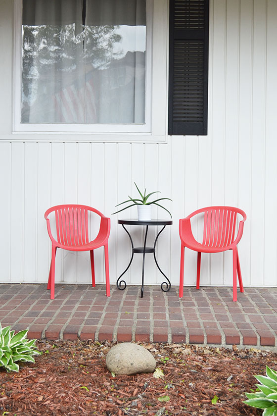
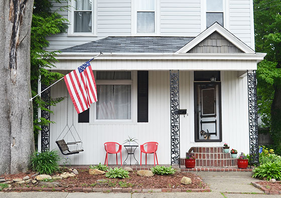
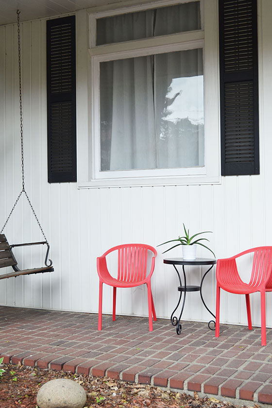
While the inside of my 115 year old home has been fairly easy to make my own, it’s been a bit more of a struggle with the outside. I’m in love with the facade but not the siding, the porch swing but not the steps. It’s been a process of learning to love all of the quirks and character that come with living my chapters in this place, all while putting my aesthetic mark on it. This set of DelRay Bay Chairs add a great pop of color and good lines to the house’s first impression from the street.


Front Porch-4-Design Crush


I plan on replacing the porch light with something low profile, but more modern. And I’ve toyed with the idea of boxing in the porch posts with cedar. I can’t wait to put black shutters on the second floor windows for a more cohesive look, but that will have to wait a bit longer.


Front Porch-3-Design Crush

Front Porch-6-Design Crush


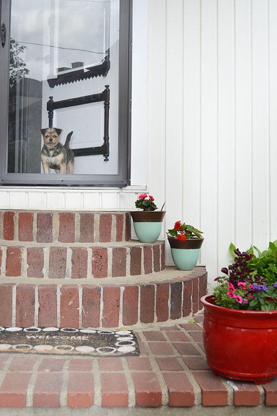
Other plans for the coming weeks include painting the front door a semi-gloss black, as well as giving the swing a fresh coat and replacing the rusting chains. I have yet to figure out what to do in the small yard area that butts up directly against the sidewalk. Enclose it in black wrought iron fencing and plant wildflowers? Add more hosta from the backyard and keep it as is? I’m undecided and impatient but very optimistic.

Product provided by Lamps Plus in exchange for this post. All words and opinions are my own. Thank you for supporting the brands that support Design Crush.

1

Neoflam

Neoflam-1-Design Crush


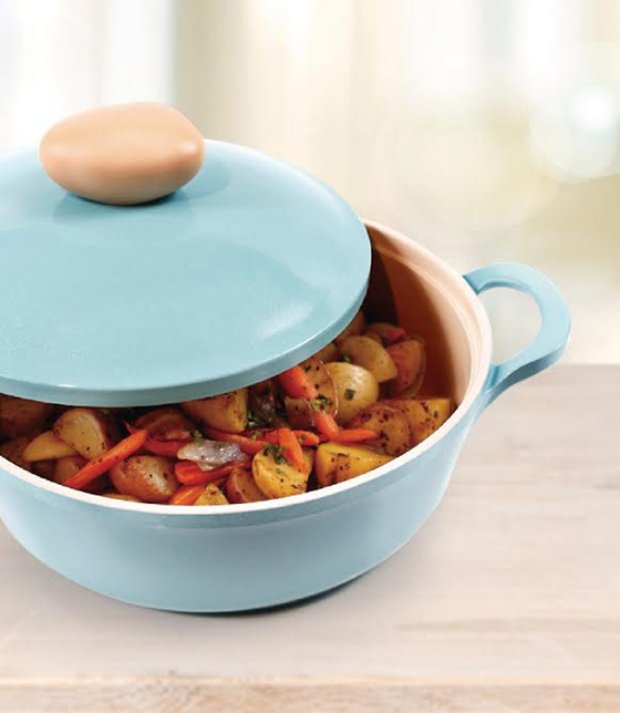
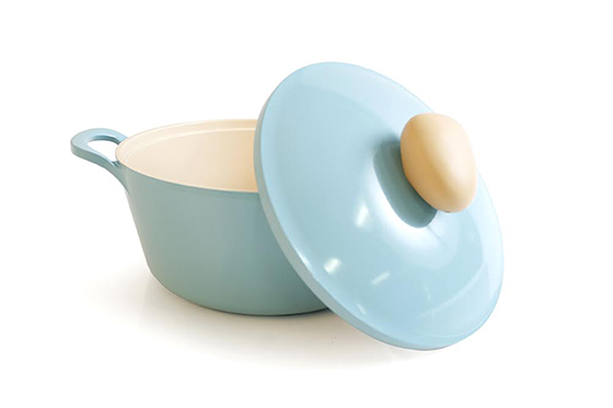
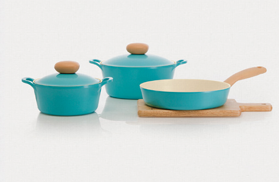
I’ve been trying to cut back on costs before summer and its full schedule of activities and events hit full stride, mainly by cooking at home more and eating out less. A big part of being in the kitchen for me is enjoying the process, and having sturdy hardworking pieces to work with can make or break the experience. So when Neoflam asked if I’d like to try out some of their retro cookware I didn’t hesitate. I was surprised by just how light their cast aluminum pieces are, a huge difference-maker when lifting a potful of my famous (among dozens) peanut soup. The sleek lines and colors look so good in my kitchen that I’ve opted to keep my stockpot stovetop even when not in use. (Check out the Promotions section of their site to score a deal of your own!)


Neoflam-2-Design Crush

Neoflam-3-Design Crush

I received product in exchange for this post. All words and opinions are my own. Thank you for supporting the brands that support Design Crush!

0

National Painting Week: The Office Reveal (+ a Giveaway)

National-Painting-Week-1-Design-Crush


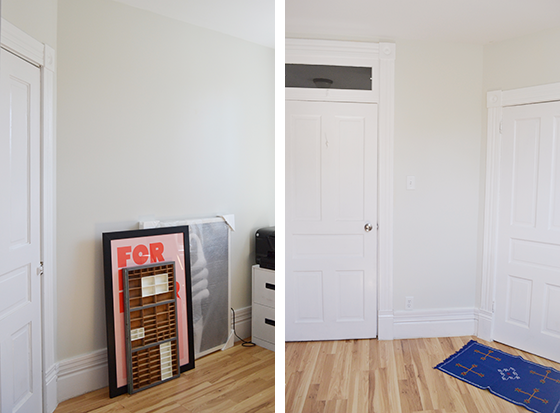
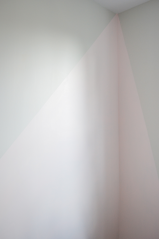
I did it. I created an accent wall that I love that doesn’t feel tacky or cliche, but that still packs a punch. In this case the key was choosing two muted hues as well as embracing my love of geometry. But let’s back up for a minute and check out the before photos of my home office.


National-Painting-Week-2-Design-Crush

National-Painting-Week-3-Design-Crush


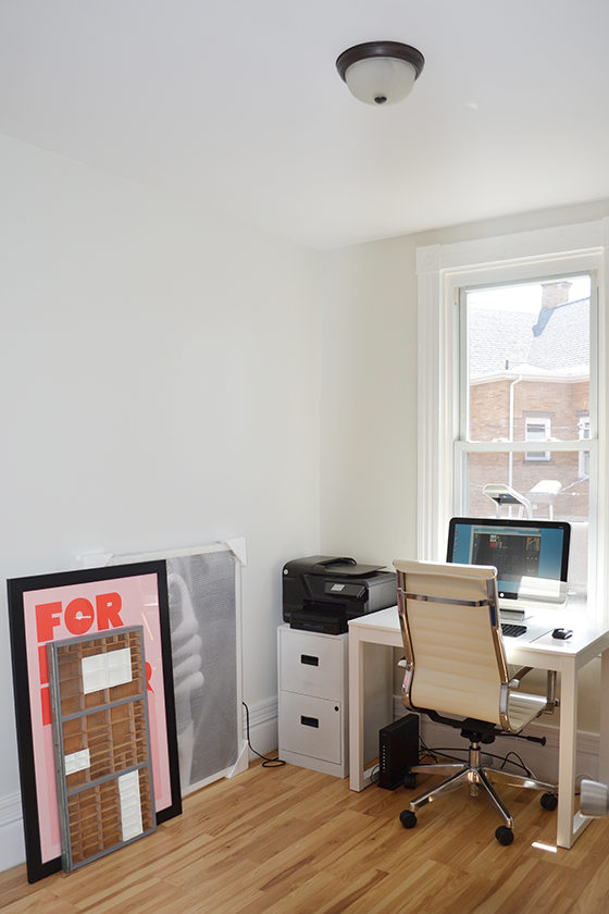
The bare basics and oh so boring. A small Parsons style desk, office chair, filing cabinets to hide supplies, and artwork that has yet to find a home. Of course no room would be complete without a wayward throw rug, yes? As I mentioned in my last post, the walls had been painted a greyish white and that’s about all I’d done in this space since moving into my house last September.


National-Painting-Week-4-Design-Crush


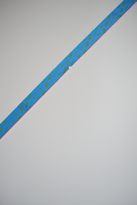
Before charting out the diagonal accent wall I’d settled upon, I gathered a length of rope and a few thumbtacks. The first step was maneuvering myself up to the tippy-top of my ladder to reach the high ceiling, where I tacked the rope in the upper corner. (No small feat for this 5’2″ girl.) I drew it taut as I pulled down to the opposing corner and tacked a few places along the way for reinforcement, then followed the line it created with painter’s tape. My (mad) method ensured a straight line, which is oh so important if you’re the OCD type like me who might obsess over any imperfections later on.


National-Painting-Week-5-Design-Crush


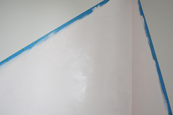
It took two coats of SW 7110 Cosmetic Blush in my favorite Sherwin-Williams combo, the Emerald line in a satin finish. I’ve used this tag team on my last four painting projects and love it. Once the second coat was on I removed the tape by pulling away at an angle for a super crisp line. (A pro tip is to always remove painter’s tape while the paint is still slightly wet.) The low VOCs made the smell of paint non-existent, so with a small crack of the window I was able to start working in my office almost immediately.


National-Painting-Week-6-Design-Crush


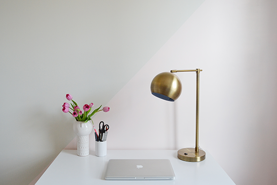
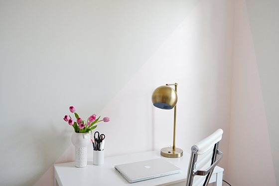
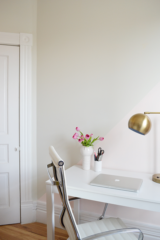
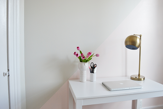
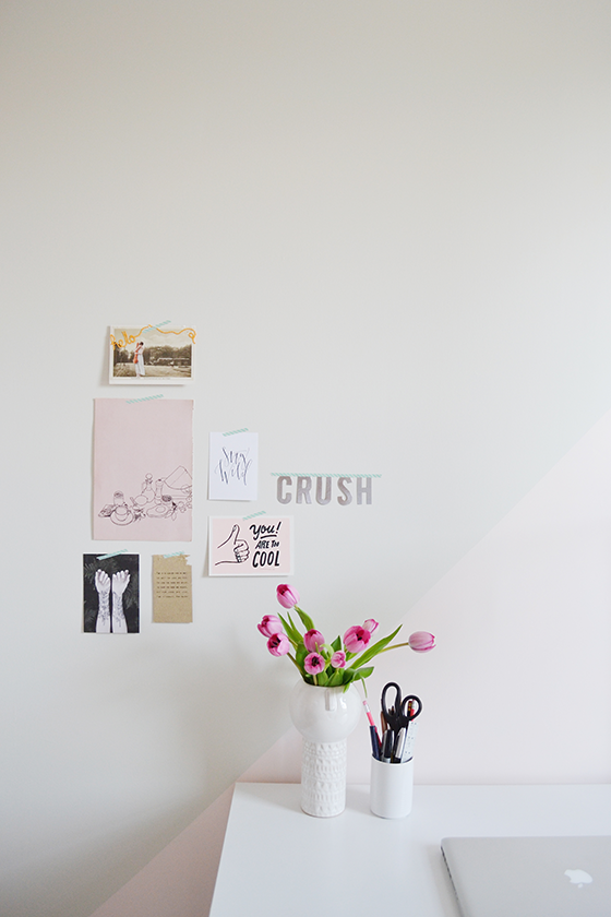
If you noticed, I turned my plan for a diagonal accent wall into more of an accent corner! I didn’t plan on it beforehand, but once I started taping things off it just felt right. So I went with it. The end result feels a bit like a pink beam of light shining on my workspace, which has been an especially welcome presence on overcast days.


National-Painting-Week-7-Design-Crush

National-Painting-Week-8-Design-Crush


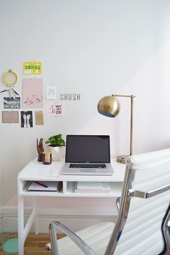
I relocated my desk to the newly painted wall and kept things simple with a brass lamp and fresh flowers. (Trust me, that desk will be cluttered in no time.) The project as a whole took just around two hours spread over two days. I have a few more pieces of furniture to add before the office is 100% complete, but this refresh is perfect for the immediate future!


National-Painting-Week-9-Design-Crush

National-Painting-Week-10-Design-Crush


For the past three years I’ve teamed up with Sherwin-Williams to mark National Painting Week. Together we’ve tackled the front door and hall bath at my old home, and now my office. Each project wasn’t huge as a whole, but made such a positive change in my space.

Visit the National Painting Week site and see what other bloggers are doing to update and celebrate! Leave a comment below sharing if you have plans to switch up an area in your home for National Painting Week for a chance to win $100 from Sherwin-Williams. Giveaway ends May 17th at midnight EST.

I received product and compensation from Sherwin-Williams in return for this post. Thank you for supporting the brands that support Design Crush!

48

Life & Type

Life & Type-1-Design Crush


Life & Type is a collaboration where you provide the idea and they provide the letterpress machine, the design templates, and the craftsmanship. Together you work to create a personalized, large format art print that shares your life in type. I had the chance to team up with creator Daniel Richardson to work through the seamless process he’s streamlined and make my own.


Life & Type-2-Design Crush


After settling on one of their three available templates (with more to come soon), and a theme of previous addresses of places I’ve lived, we got to work. I filled out the simple template form, submitted it, and received a proof within 24 hours. I made a few tiny changes to my original wording and gave the go ahead to Daniel.


Life & Type-3-Design Crush


That’s when he took the reins setting type and printing. A few days later my custom poster was in the mail and on its way to my doorstep. In the meantime Daniel emailed some photos of the process, a step that’s included in all orders that really sends the experience over the top.


Life & Type-4-Design Crush


When my Life & Type poster arrived I was even more impressed than expected. The paper is super luxe, the type is beautiful, and the entire experience was just so personalized. A poster like this would make such a fantastic gift for so many occasions – graduation, a new home, a wedding, etc. I know this beauty will be hanging in my home for years and years to come.


Life & Type-5-Design Crush

I received product in exchange for this post. Thank you for supporting the brands that support Design Crush!

2