In Print: 3.23.11
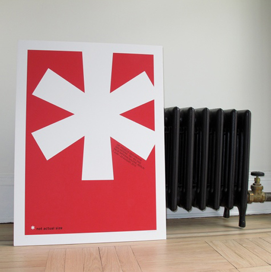
Asterisk by Oddhero
{via Design*Sponge}
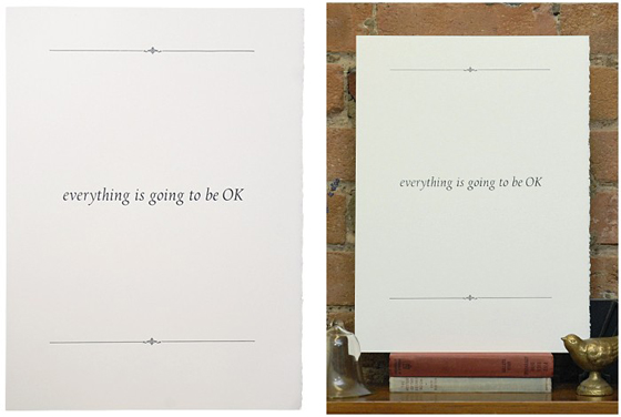
Going to Be OK by Rachel Foster
{via swissmiss}
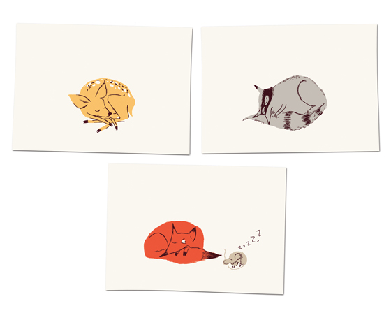
Woodlands Trio by Heather Ross
{via Hooray}

Asterisk by Oddhero
{via Design*Sponge}

Going to Be OK by Rachel Foster
{via swissmiss}

Woodlands Trio by Heather Ross
{via Hooray}
PHOTO: Catherine Tighe
In this day and age we’re accustomed to having a selection of magazines being devoted to modernism at our disposal, but twenty years ago when Metropolitan Home first began that wasn’t the case. Each year the periodical published a favorite issue called the Design 100, celebrating the best in residential design, architecture, and the allied arts and crafts. Sadly Metropolitan Home wrote its last page in December 2009, but recently they published this book – Design 100: The Last Word on Modern Interiors by Michael Lassell – focusing on the best of the best to have ever appeared on their pages. Each of the 100 spaces included is the best of something, think “Best Little Kitchen in the Midwest” or “Most Glamorous Dining Area in NYC”. There’s a little something for every modernist out there captured through show-stopping photography, I loved flipping through its pages.
Posted In house and home, read up
PHOTOS: mrs. french
01. how to make your own seed bombs
02. but of course French Paper Co. has lovely business cards!
03. hope you had a lovely Pi Day
04. I’d love to stay at the Whitepod Resort
05. now you can make your own Pop Rocks!
06. create a secret doorstop stash for your valuables
07. if March Madness isn’t for you, maybe Beard Madness is
08. print your own fabric
09. I forgot to do a pie roundup for Pi Day, Amy’s got my back
10. genius idea: visual note taking at SXSWi
PHOTOS: gildem
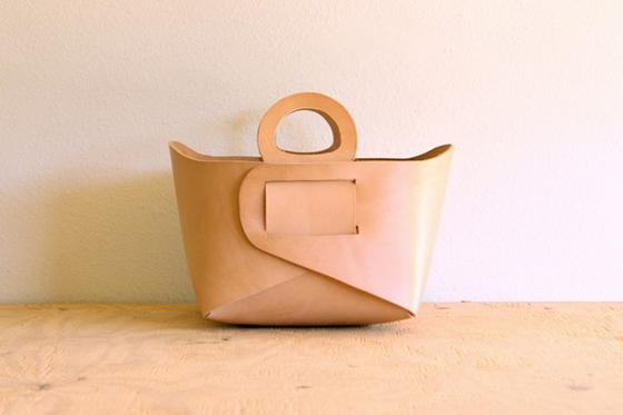
I can’t convey how much I’m in love with these leather totes from gildem. I want to own at least eight, but think I’ll have to settle for this pretty keychain instead. {via Two Brunettes}
Posted In accessories, create, house and homeEver since last Sunday’s Help Japan post I’ve received more emails than I can count, all from artists and readers pointing out other ways to help the ravaged country. Here’s a collection of more pieces, purchase one and all proceeds will go towards rescue and rebuilding efforts.

Shinjuku, 6:43 by Joseph O. Holmes
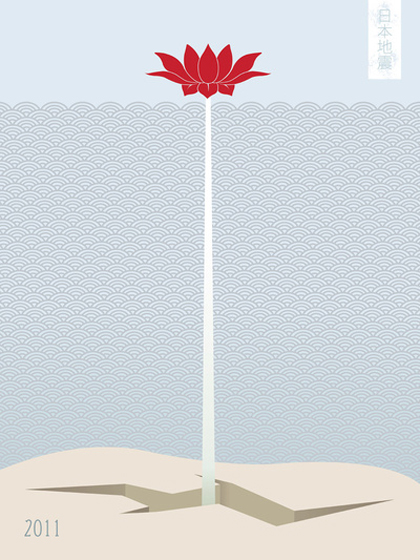
Japan Earthquake 2011 no. 1 by Linda Yuki Nakanishi
{via Design Milk}
Donate to SOGO Japan and get a free copy of Angel Script from Veer
Posted In create, do good, graphics, photographyThere’s something about foods packaged in glass jars that makes it seem that much more delectable. Maybe it’s that we can actually see what we’re getting, or that it makes us think of someone lovingly preparing the goods in their kitchen. Or maybe even that there’s something we can take away from the experience itself, the jar. Whatever the reason, I’m on board with it.
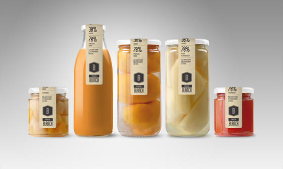
Pack Fruta Blanch packaging, designed by ATIPUS
(Psst… check out their killer identity design, too!)
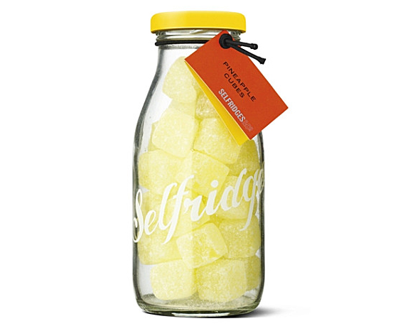
Selfridges sweets
{via hooray}
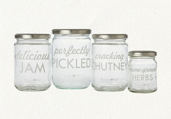
printed jar set from Terrain
for your own jarred goods!
Lawrence McRae’s hand-thrown handmade pieces are beautiful. and they mimic the delicacy of lace perfectly.
Posted In create, house and home, sculpture

via ffffound, no source

via ffffound, no source
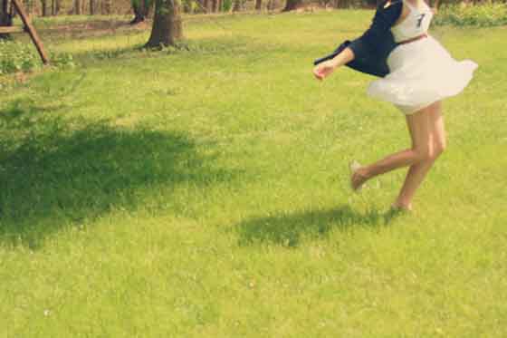
via Lookbook.nu

Adam Cohn
{via Design Blahg}
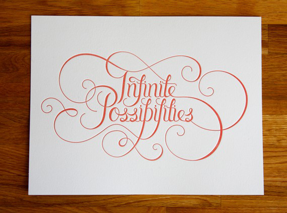
Infinite Possibilities by Eight Hour Day
{via Oh So Beautiful Paper}
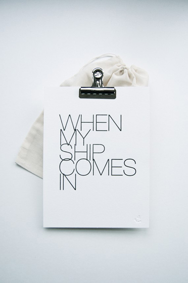
When My Ship Comes In by In Haus Press
{via design is mine}


