Master Bedroom Makeover Bits + Pieces
How happy am I with the makeover Quick•Step flooring and I worked on? So happy that I basically never want to leave my bedroom. I’ve never been a morning person and I now find myself waking up with a smile on my face. It’s utterly ridiculous and I’m completely head over heels for what I feel like is the first bedroom design that truly matches my aesthetic.
Here I’m spilling about how I pulled it off and the items I picked up to give the room a great refresh, and over on Quick•Step Style I’m sharing more about which flooring I chose for the RoomUP Challenge, as well as five tips for making your space feel bigger (trust me, they’re really good ones). Head over there then meet me back here… I’ll wait…
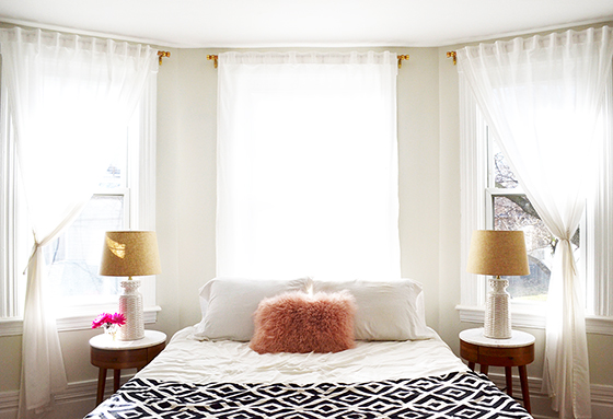
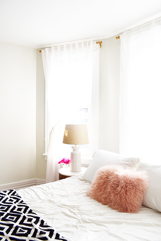
Okay, let’s start with those lamps. (Oh, if you need a refresh of what the master bedroom looked like before, here you go.) I loved the old lamps hard, but it was time for a change that blended more seamlessly with the rest of the room. This pair of Helene white ceramic table lamps* match the boho chic vibe I was going for. Their basketweave-patterned bases and linen shades add a nice touch of texture and the size isn’t too overwhelming for the Penelope nightstands.
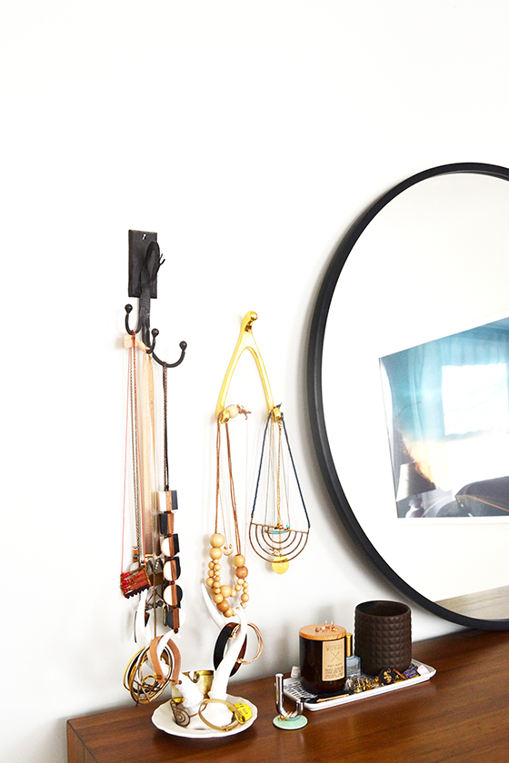
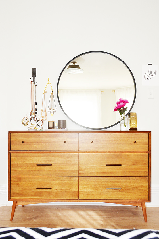
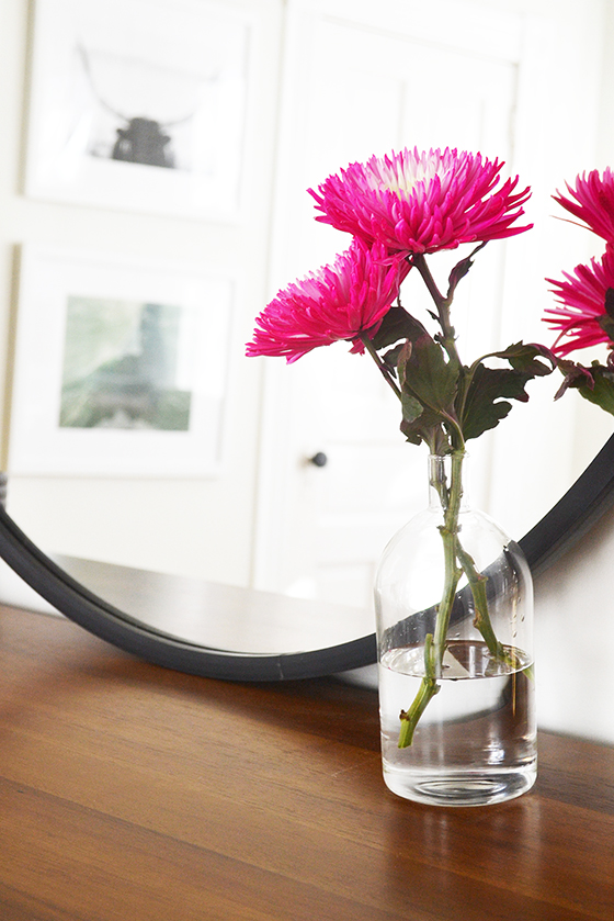
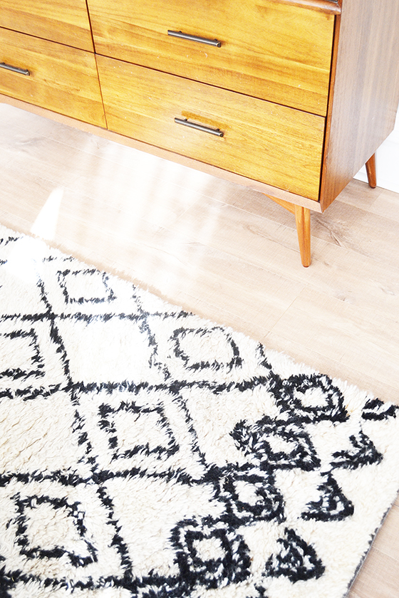
When it comes to dresser mirrors I’m more of a leaner than a hanger. I finally upgraded the round vintage mirror that sadly cracked in half and that I sadly kept using for more than two years with a larger 36-inch one, the HUB Mirror. It’s rubber rim fits snuggly against my mid-century 6-drawer dresser‘s surface, leaving me unafraid of a crash in the middle of the night. You can’t beat the price of this piece either – it’s huge and quite a deal when compared to other large mirrors.
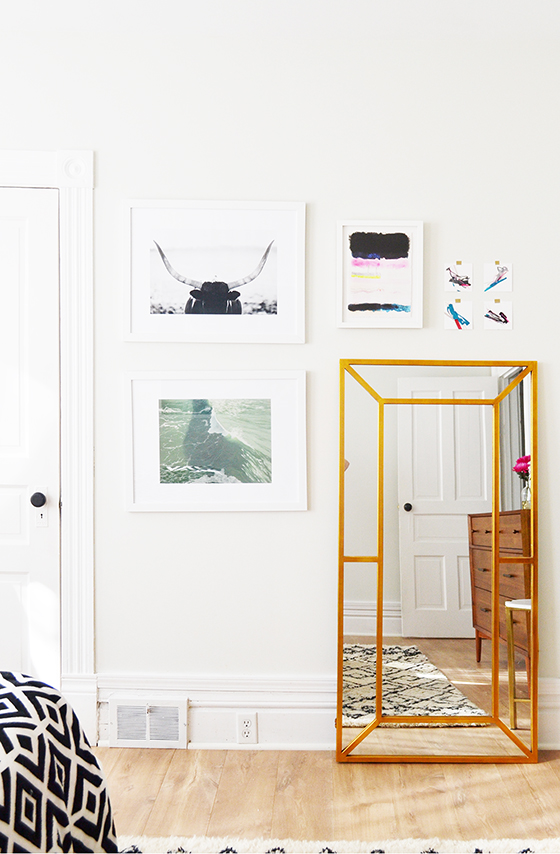
I’ve been on the lookout for a great floor mirror for years, and that’s not an exaggeration. The Payne antique gold full length floor mirror* got my number and called the next day. Its windowpane style has an art deco feel to it, and the gold calls out some of the other metallic accents in the room. I made space in my mini gallery wall for it, because it really does feel like a piece of art.
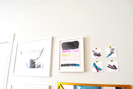
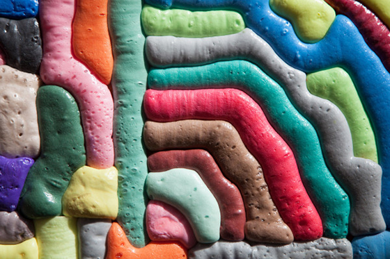
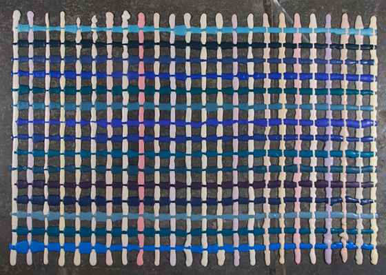
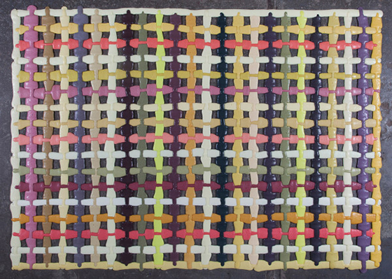
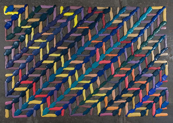
Speaking of art, my very good friend who is also a very talented artist – Jaime Derringer – made me four pieces of 4 x 4″ art for the revamped space. I have a few more things I’d like to do in this bedroom (new light fixture, different floor rug, adding a bench, etc) and framing these is at the top of the list. I love her abstract style and am thrilled to add these minis to my ever-growing collection of her work.
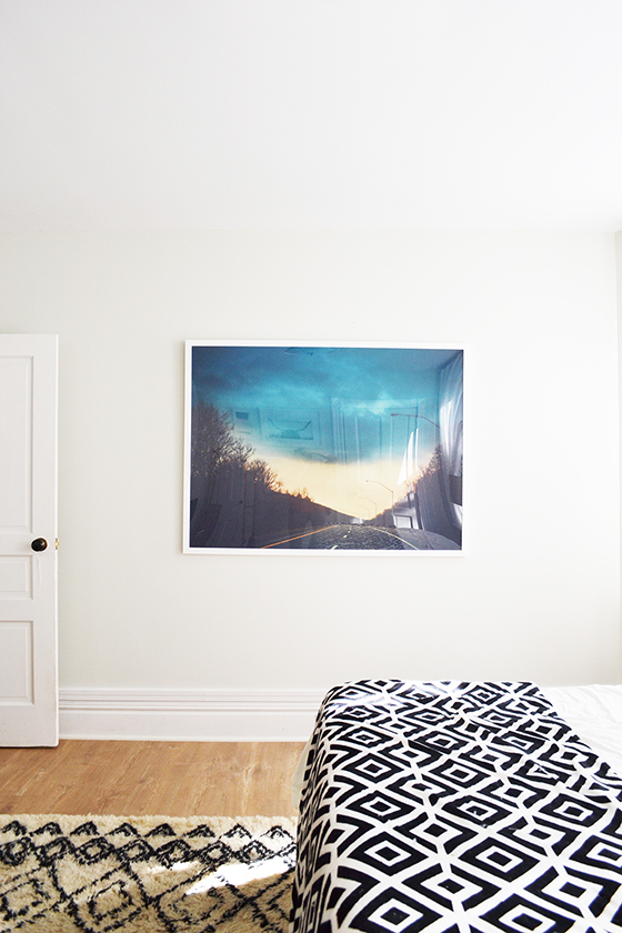
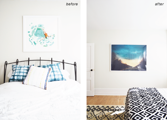
This piece, Stormy Drive, used to be a huge statement over my headboard. After relocating the bed to under the windows, I chose to lower the gigantic frame to be level with the door and let it own the entire wall. It’s so striking from this angle!
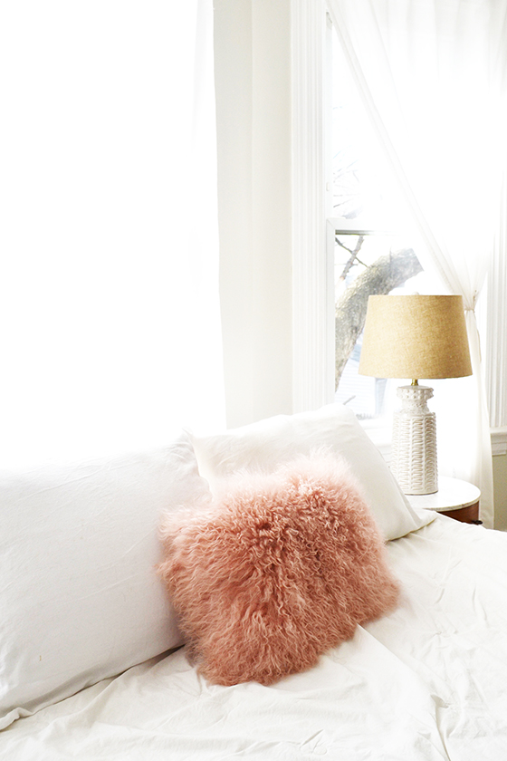
I’ve been toying with notion of painting this room the same pale pink as the accent wall in my office, and to ease into the idea I added this Mongolian pink fur pillow* to the mix on my bed. The texture is fantastic and I’m so much closer to pulling the trigger on that paint job.
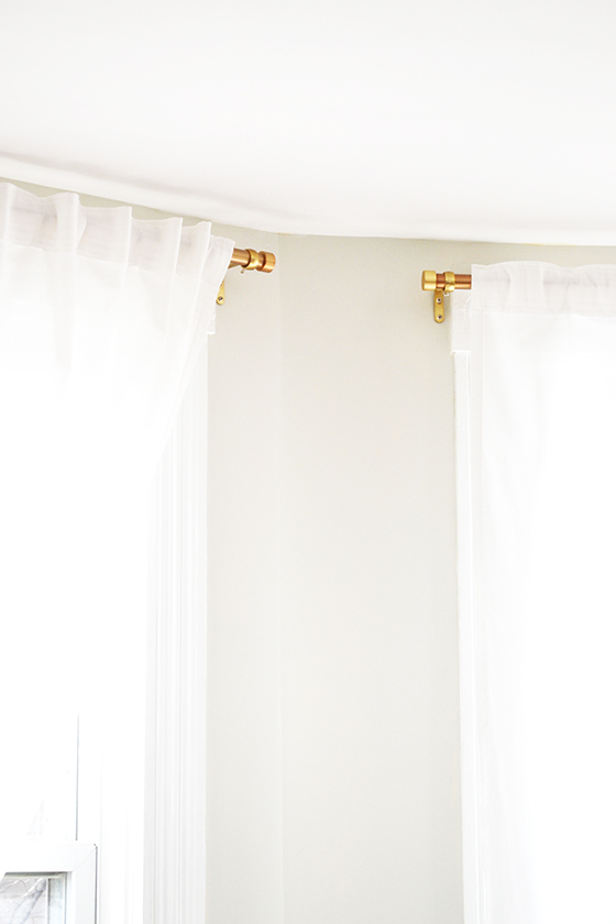
There’s only about twenty feet between my house and the neighbors’. So when I first moved in I picked up some tension rods to get curtain up ASAP and, well, never replaced them. This trio of brass Cappa adjustable single curtain rods look at least one hundred times better. At least.
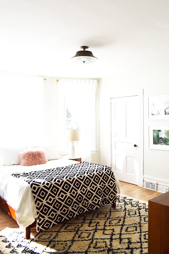
The vintage light fixture fit in much better once I removed the ornate decorative rims – dare I say it looks modern even? It ties the curtain rods, the fixtures on the dresser and nightstands, and the edging on the floor mirror together oh so nicely.
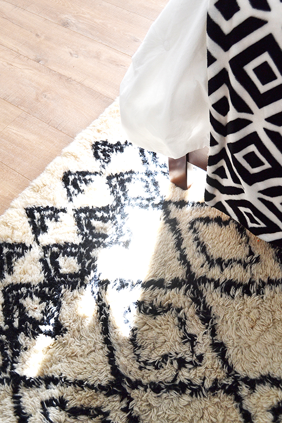
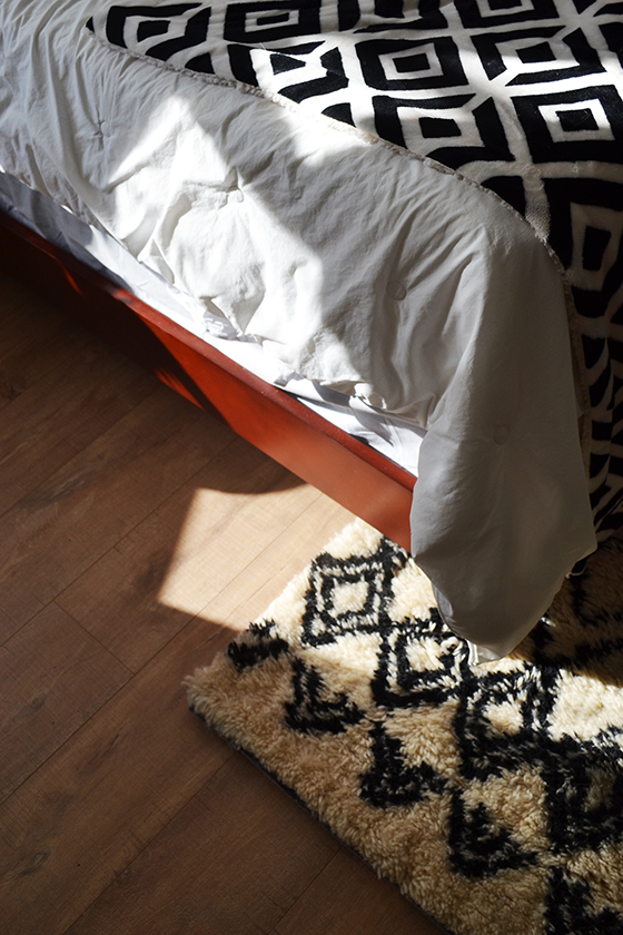
The last addition is the Murray modern mahogany platform bed*. I was honestly pretty nervous about mixing mahogany with the other two wood finishes in the room, but it fits in seamlessly and actually manages to set off the Quick•Step flooring. I love having such a low-profile bed more than I expected I would, it just helps the room feel that much more open and airy which was my number one goal in this project.
If you ignored me above, click over to Quick•Step Style to read more about the transformation and process, the amazing flooring, and five tips for making your space feel bigger. And then enter the RoomUP Sweepstakes for a chance to win up to 500 sq ft of Quick•Step flooring for your own project, as well as see other transformations from other RoomUP bloggers!
This post sponsored by Quick•Step. All words and opinions are my own, as always. Thank you for supporting the brands that help keep Design Crush creating fresh content! Get more inspiration from Quick•Step on Facebook and Pinterest. You can also download their Style My Floor app to visualize their floors in your own home. *product provided by Lamps Plus
Posted In behind the scenes, floors, house and home, living, my house, sponsored post


