Creating My Holiday Cards with Zazzle

Sponsored by Zazzle.

Zazzle-1-Design Crush


I’ve always erred on the early side of, well, everything. And holiday cards? Well, they’re no exception. November and December are always straight-up crazy busy in my life, so the sooner I can get my cards done the better. (One year I had them addressed and waiting before Halloween! Only mildly embarrassing in retrospect.)

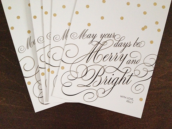
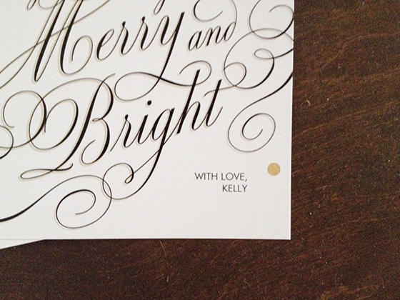
This year I’ve teamed up with Zazzle to create the perfect holiday card, one that covers all the bases just like I like to do. They have so many customizable options and designs available, it was easy to find something that fit my style. I could have gone with a photo card of my four pets (but they’d never sit still long enough to make that happen) or I could have gone with a shot of my tree from last year (which was exception if I do say so myself), but in the end I opted for this scripted graphic flat that features my favorite holiday phrase from my favorite Christmas song and I couldn’t be happier. I loved going through all of Zazzle‘s color and paper options and choosing just the right thing that my friends and family are sure to flip for come December!


Zazzle-2-Design Crush

Holidays are made for you at Zazzle. Find cards you’ll covet at http://www.zazzle.com/holiday+cards.

2

Elisa Strozyk

Elisa Strozyk-1-Design Crush


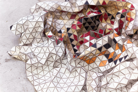
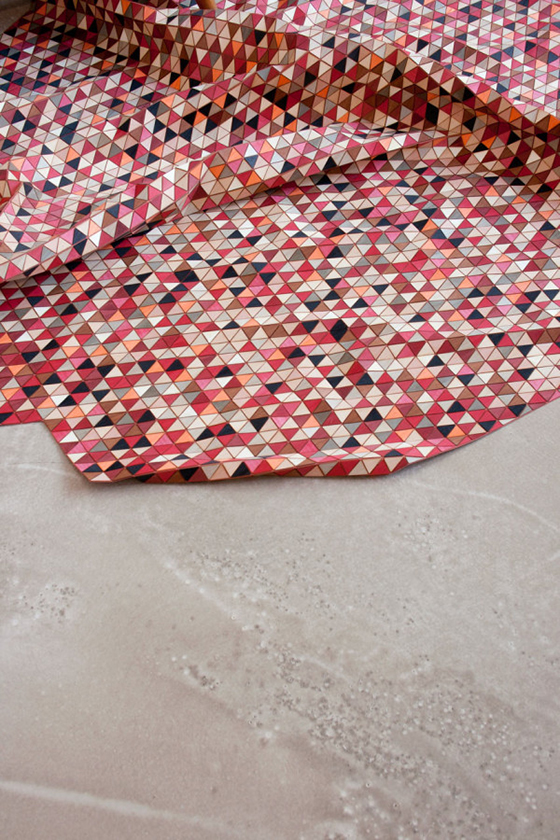
Wooden. Rugs. Rolls those two words around in your mind hole for a minute or two. German artist Elisa Strozyk has created three variations of these delightful coverings. Strozyk dyes and connects row upon row of triangular pieces as she pulls together the end result of a colored wooden rug, which is so flexible that you can literally crumple it up and toss it into a corner. (via Design Milk)


Elisa Strozyk-2-Design Crush

Elisa Strozyk-3-Design Crush

1

Happy Weekend

1-Design Crush

2-Design Crush

3-Design Crush

4-Design Crush

5-Design Crush

6-Design Crush

7-Design Crush

8-Design Crush

9-Design Crush

10-Design Crush

01/ Mica Angela Hendricks illustrates heads and let’s her 4 year old draw the bodies!
02/ Fantastic 3D drawings by Ben Heine.
03/ A floating rainbow made from 840 sheets of colored paper.
04/ This little bike really is the ultimate IKEA hack!
05/ Illustrations of every outfit Walter White ever wore in seasons 1-5 of Breaking Bad.
06/ This clever outdoor color installation mimics lamplight.
07/ A man spent 20 years building kinetic carnival rides to advertise a family restaurant.
08/ Beautifully graphic crystal stemware from Scholten & Baijings.
09/ Banksy set up an anonymous booth in Central Park + sold his original art for $60 a pop!
10/ Just some regular guys as underwear models.

This week on Design Crush:
Mix #29: You Hold My Hand and Tell Me It’s Fine
Shannon Finley
All Spooked Up
Mark Lovejoy
Party Prints
Variopointe
Marbelous Wood
Tips&Tricks: Being Green
Anek

0

Tips&Tricks: Being Green

Tips&Tricks-Being-Green-Design-Crush

I don’t know about you, but I try to consistently add green ways of living to my day to day on a regular basis. Some things are easier than others, but it’s always worth it. Here are some tips&tricks (and a few products) that can go a long way.


10 easy secrets to greening your house.

30 items to avoid composting + recycling.

Make your own compost bin.

30 green beauty finds.

Using natural fabric dyes.

DIY cleaning products.

Natural homemade wood polish.

DIY living wall projects for your home.


0

Marbelous Wood

Marbelous Wood-1-Design Crush


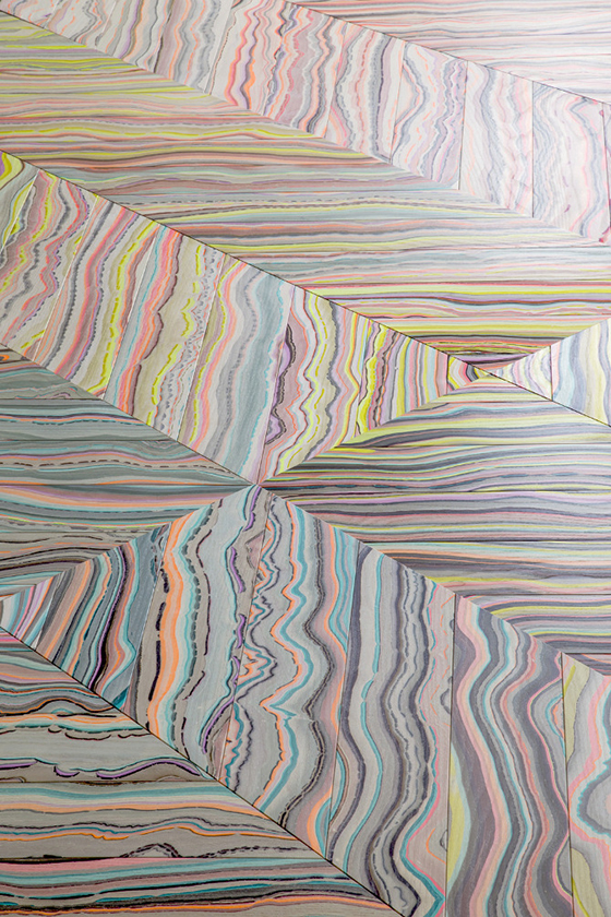
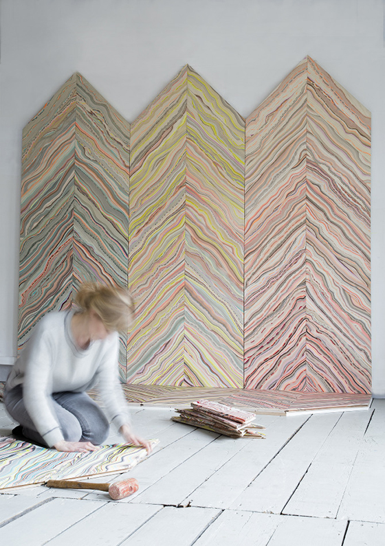
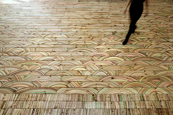
Oh, hey there – I’m sorry, but I just can’t stop staring at these images of Marbelous Wood. It’s crazy good, right?? Pernille Snedker uses a repurposed marbling technique from old book covers to give wood this incredible look. Produced one drop of color at a time, ring by ring, the pattern is constructed on the water surface. The final result being a reflection of the annual rings of wood and a product that can be used on both walls and floors. (via Mint)


Marbelous Wood-2-Design Crush

Marbelous Wood-3-Design Crush

3

Variopinte

Variopinte-1-Design Crush


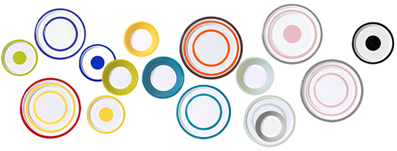
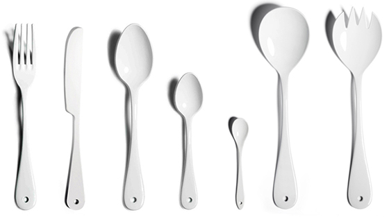
In my opinion enamelware doesn’t get enough love. Yes it can chip, and no you can’t put it in the microwave but come on. The colors are always showstoppers and the weighty feel of a piece in your hand can’t be topped. I’m crushing on this dinnerware from Variopinte and the stark white cutlery to match. (via Oh Joy!)


Variopinte-2-Design Crush

0

All Spooked Up

All-Spooked-Up-Design-Crush

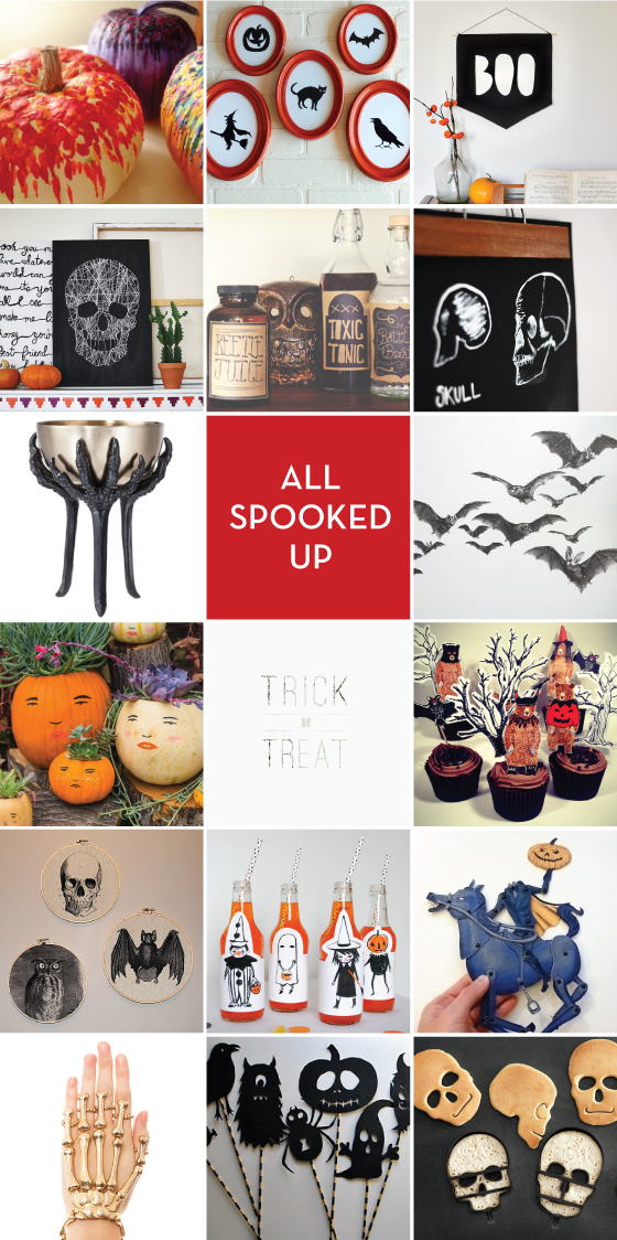
ROW 1: DIY Crayon Pumpkins // Five Simple Halloween Silhouettes // Boo Banner   ROW 2: Skull String Art // DIY Halloween Bottle Labels // DIY Skeleton Wall Hangings   ROW 3: Halloween Tall Metal Nut Bowl // Bat Wing Decals   ROW 4: Make a Pumpkin Family // Halloween Print Printables // Halloween Cupcake Printables   ROW 5: Halloween Fabric Art // Printable Halloween Party Pack // Printable Retro Halloween Paper Puppets   ROW 6: Skeleton Passion Handlet // Halloween Shadow Puppets // Skull Pancake Molds 


4

Happy Weekend

1-Design Crush

2-Design Crush

3-Design Crush

4-Design Crush

5-Design Crush

6-Design Crush

7-Design Crush

8-Design Crush

9-Design Crush

10-Design Crush

01/ Not a haunted house, rather photos of the walls of the original CBGB.
02/ Yes. That’s an artist who paints by squirting paint out of his eye.
03/ The Planter Chess Set almost makes me want to commit to learning how to play the game.
04/ Sand Prints shows off ancient printing rituals that are created using carved cylinders.
05/ Would you live in this translucent house built around the tree in a forest?
06/ A fully functional handcrafted wooden Vespa!
07/ How about this Cube House?
08/ Photographer Matt Weber has been capturing New York kisses for 30 years.
09/ Forever Bikes uses 3,144 bicycles to create a 3D labyrinth installation.
10/ A photo series that captures every day life with a man and two plastic skeletons.

This week on Design Crush:
Wooly Baby
Penny Sage
Myriam Dion
Fern + Crystal Temporary Tattoos
Jaylon Israel Hicks
Elisa Strozyk
Leslie Fandrich

0

Plain with a Punch

DesignCrushMotoLogo
Brought to you by Motorola Moto X: Thousands of combinations. Design yours.

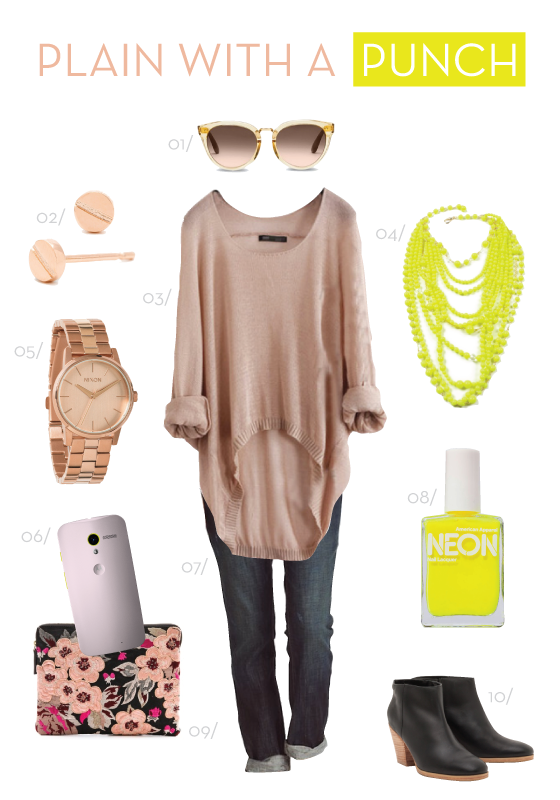
Color is one of the biggest elements of my style, of most peoples’ really. You can choose to be moody one day while cloaking yourself in black, or fun and playful the next while mixing bright hues. Innocent and ethereal in white, or downplayed in shades of brown. The point is that color infiltrates our lives in every way and definitely effects our mood. It’s reflected in my home, my closet, and now technology as well!

Motorola’s Moto X has been blowing up all over the place, and with over 2,000 color combinations it’s easy to see why. I’m glued to my phone and I’m sure you probably are too, so it’s especially it’s nice that Motorola has realized what a huge chunk of the market thinks of their phone not only as a lifeline but also as an accessory! After really examining my aesthetic and style preferences I decided on a blush Moto X with lemon lime accents. It perfectly mimics my taste, Plain with a Punch! Neutral tones, casual style, with an unexpected touch to make it really special.


Plain-With-a-Punch-Motorola-MotoX-Design-Crush

01/ 02/ 03/ 04/ 05/ 06/ 07/ 08/ 09/ 10/

1