The Office

354-Office-1-Design Crush


After sharing the first floor of my house here last fall, I’d planned on doing the same with the second floor this spring. As you can see… it’s taken a wee bit longer. You got a glimpse of the office earlier this year when it got a new paint job, but today it’s the whole deal. (The master bedroom and guest room will follow in the next few months.) Ready?


354-Office-2-Design Crush


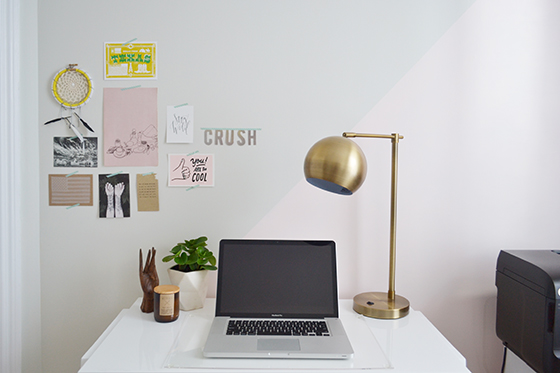
If I’m being honest with myself, I’m 110% surprised at how much color is in my office. It’s tempered in every direction you look by white and black, but it’s still more than I ever would have guessed.


354-Office-3-Design-Crush


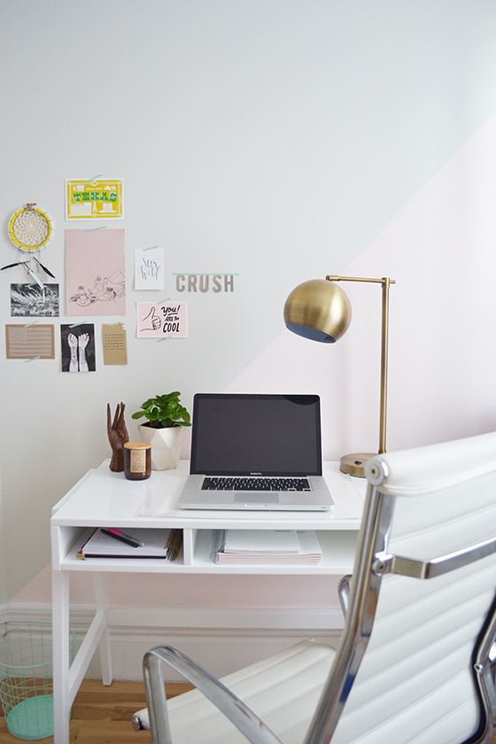
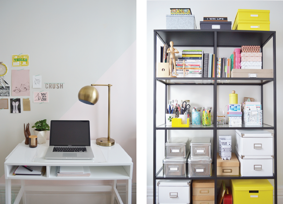
I upgraded my desk to one that would afford me a little bit of storage. The closet in this room is teeny tiny and triangular in shape, it’s located directly over the angled staircase below and has to accommodate its high ceiling. I went with the Prairie School Desk. (Do you just associate Land of Nod with kids? You’re wrong, they’re so much more.) I love its sleek and modern profile and the way it coordinated with a few other things I already had selected for the space.


354-Office-4-Design-Crush


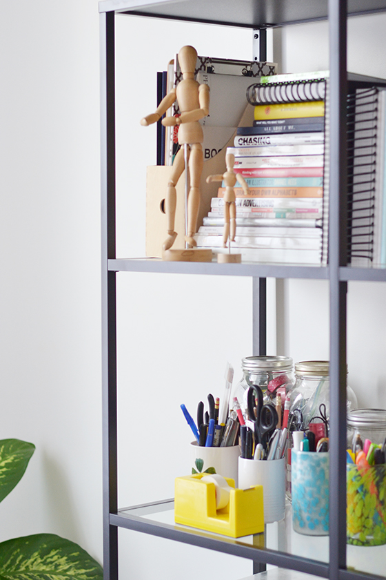
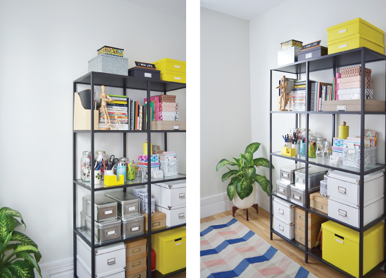
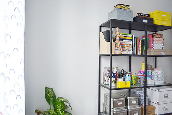
The VITTSJÖ shelving unit bears the burden of a lot of what a closet would normally be responsible for. The tempered glass and metal are super sturdy, so I’m able to hide a lot of clutter in boxes as well as design books and the blank journals that I can’t seem to stop collecting. Do you like the pops of brightness my yellow accessories bring to the table?

Plants give any space life, and I was determined to make my office feel as light and airy as possible. Modernica’s Case Study planters have been a longtime favorite and this seemed like just the place to use one. (Please note that I have the stand turned upside-down here to add some extra height.) The sturdy ceramic pot and wooden base add a nice earthy touch to an otherwise empty corner.

I debated whether or not to put down a rug in this space and ultimately decided it needed it. I embraced the opportunity to pull in some more color and pattern with this Surya Frontier design from Rugs Direct in salmon, light grey, and navy. It pulls in the light pink accents around the room all while remaining surprisingly neutral.


354-Office-5-Design Crush


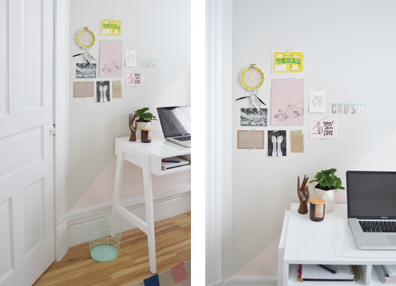
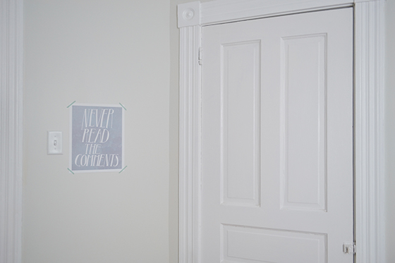
While I’m all about hanging art everywhere, I deliberately wanted lots of open wall space here. Aside from a few mood board-type things over my desk, the only other thing on the wall is this Never Read the Comments print by Serif & Script. Always a good reminder for anyone with a presence online, no?


354-Office-6-Design Crush


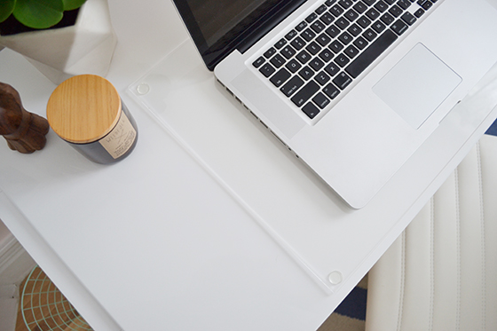
I plan on sandwiching a few things under this I Can See Clearly Now Desk Mat. I’m thinking favorite photo booth shots, important notes, etc. Bonus: It does double-duty as a surface protector for my desk and laptop!


354-Office-7-Design-Crush

354-Office-9-Design Crush


I finished things off with a curtain rod sporting ball finials and Little Arches curtains (More color! More pattern!) I was nervous that it might be a bit much and clash with the rug, but the pattern ended up complimenting the rest of the room better than could have been expected.

I’m thrilled with the way this space has come together and can’t wait to see how it evolves. Time to get back to work!


354-Office-8-Design Crush


Prairie School Desk c/o Land of Nod // VITTSJÖ shelving unit // Case Study planter c/o Modernica // Surya Frontier rug c/o Rugs Direct // Never Read the Comments print by Serif & Script // I Can See Clearly Now Desk Mat c/o Land of Nod // curtain rodball finialsLittle Arches curtain c/o Land of Nod

1

Cosmic Diner Collection

Cosmic Diner Collection-1-Design Crush


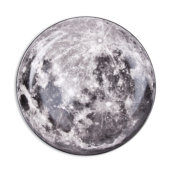
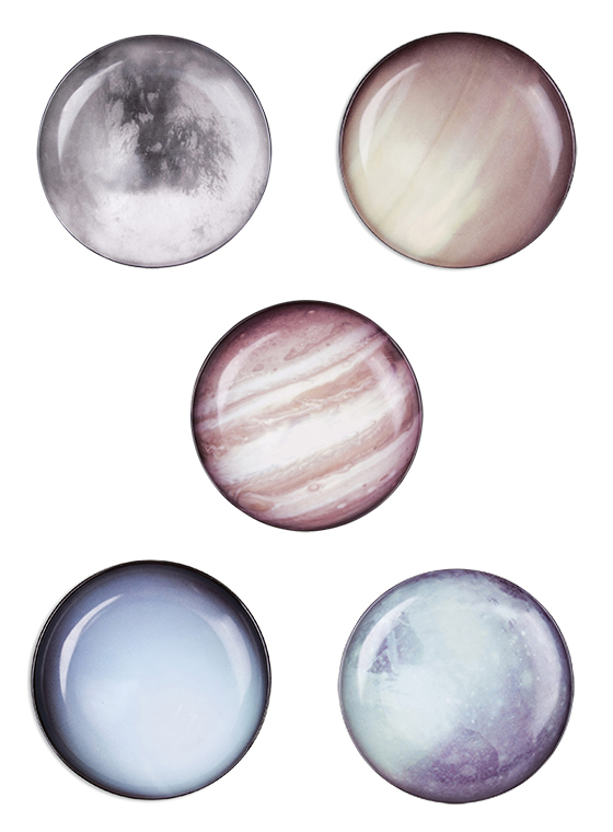
I’ve always been fascinated by space, so why not make room for it in my kitchen? Italian designers Diesel Living and Seletti’s eleven piece Cosmic Diner Collection is made of porcelain and decorated with realistic images of the planets, the sun, and several moons. I love that several of the pieces could pass for abstract if you didn’t know what you were looking at.


Cosmic Diner Collection-2-Design Crush

Cosmic Diner Collection-3-Design Crush

(via bltd)

0

ENTLER

ENTLER-1-Design Crush


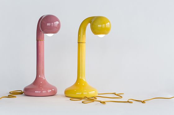
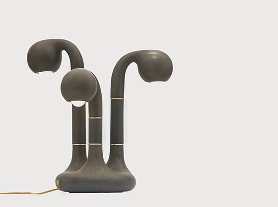
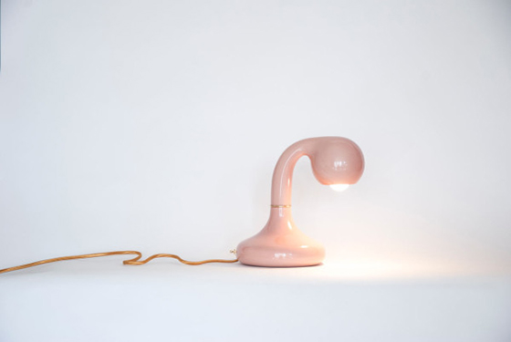
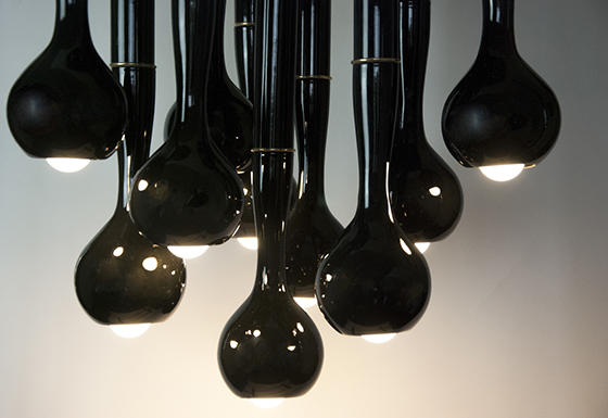
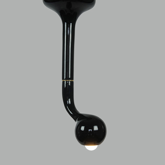
If you were to create a modern lamp with old-fashioned telephones as inspiration, you might end up with something like this ceramic lighting collection from ENTLER. Sturdy bodies support elegantly curved necks and all is covered with a glossy finish, making me feel like I could lift one up for a conversation.


ENTLER-2-Design Crush

ENTLER-3-Design Crush

ENTLER-5-Design Crush

ENTLER-4-Design Crush

(via Design Milk)

0

Happy Weekend

1-Design Crush

2-Design Crush

3-Design Crush

4-Design Crush

5-Design Crush

6-Design Crush

7-Design Crush

8-Design Crush

9-Design Crush

10-Design Crush

This week on Design Crush:
Check out these ten fresh art prints for your dose of Print Edition: August.
I took a trip to Kennywood for the first time since 1999!
Tessa Horrocks‘ pebble-centric art has me looking for the nearest stream.
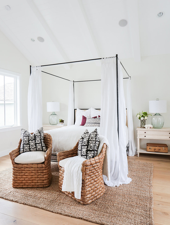
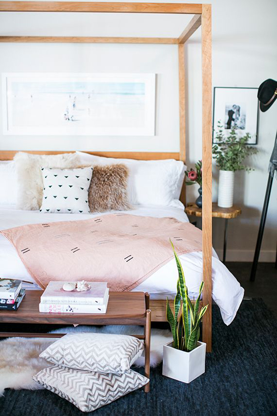
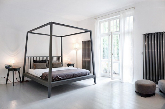
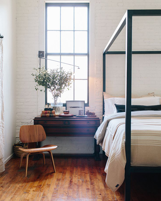
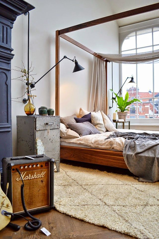
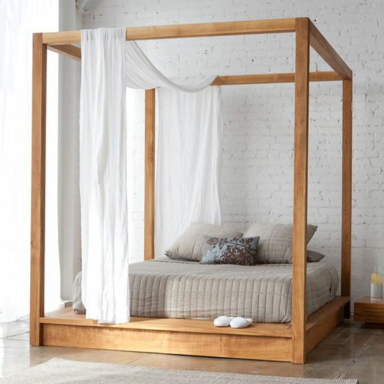
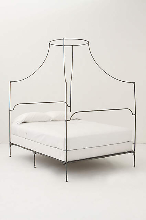
Canopy beds done right.
I’m ready for fall, thanks to Lieke van der Vorst.
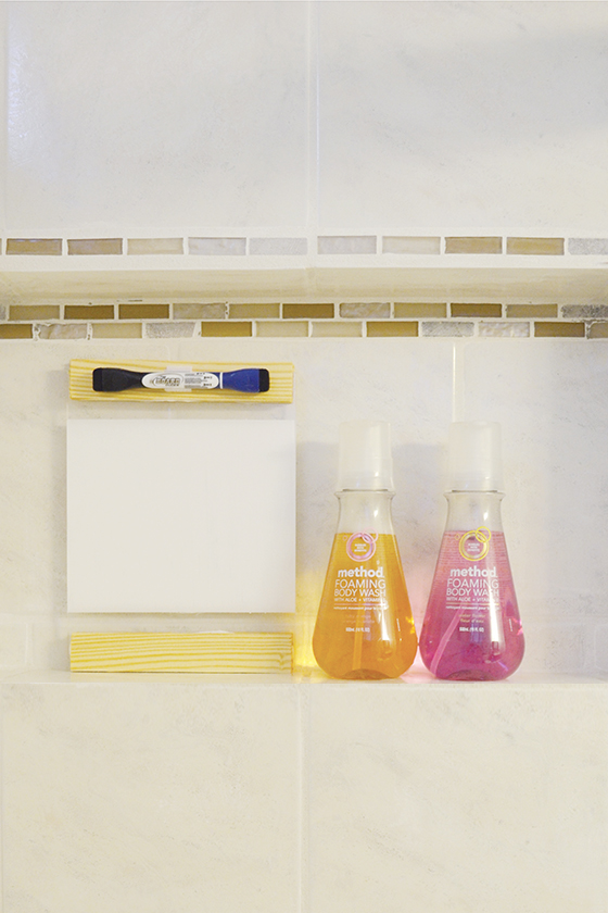
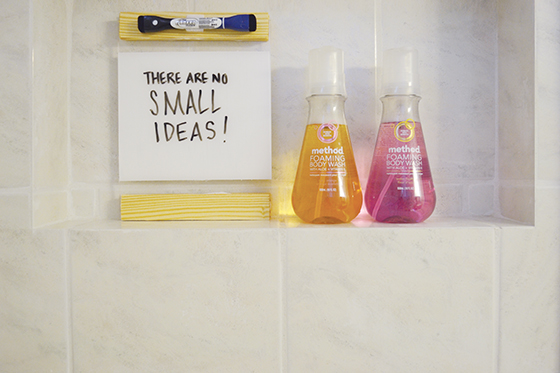
I’m getting so much use out of my DIY modern shower memo board!
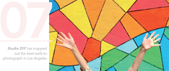
If Drew Tyndell styled up the outside of my home like his art I wouldn’t mind.
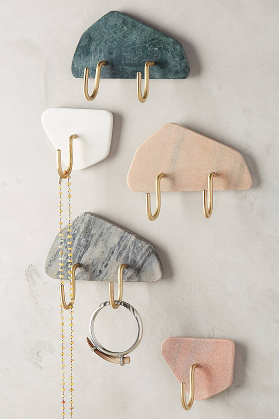
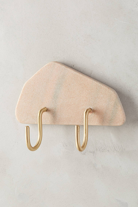
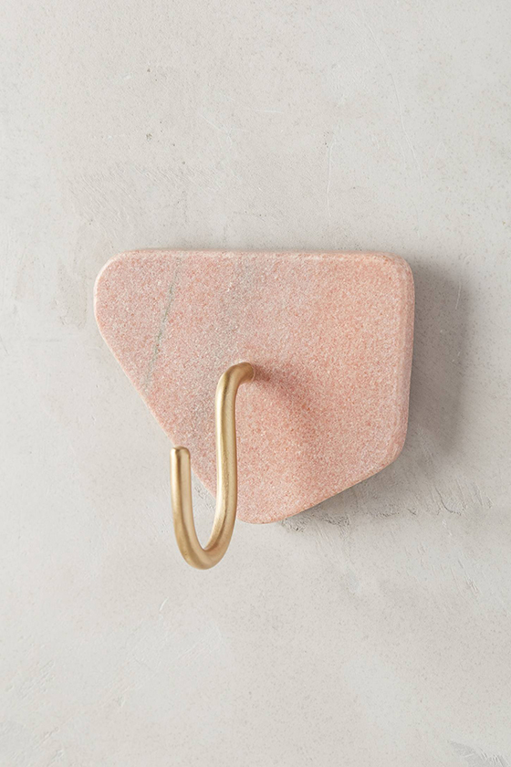
These slivered marble hooks are so pretty and handy.
Loving the summery paintings of Seth Smith.

0

DIY Modern Shower Memo Board

method-DIY Modern Shower Memo Board-1-Design Crush


You know the drill… you’re in the middle of sudsing up in the shower when inspiration strikes. You’ve figured out the elusive answer to a work brief, nailed what kind of landscaping design you’d like in the backyard, or even solved climate change (here’s hoping). But by the time you step out of the tub *poof* it’s gone. The most fantastic ideas happen when you’re inspired, so why not have a place to write them all down?

Trying method‘s latest and greatest product – foaming body wash – inspired me to come up with a solution. The scents and bubbles wake up my senses and get my creative juices flowing (the ruby orange is my favorite scent of the four available – it’s so summery and refreshing!). So a modern do-it-yourself shower memo board that would both give me a spot to brainstorm and match up with my minimal aesthetic seemed like just the ticket.


method-DIY Modern Shower Memo Board-2-Design Crush


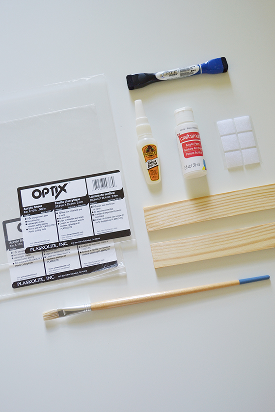
Materials:
• 2 – 8 x 10″ pieces of plexiglass
• 4 – 8″ lengths of quarter inch thick wood (varnished or not)
• strong adhesive (I used Gorilla Glue)
• painter’s tape
• white craft paint
• small paint brush
• self-adhesive velcro
• dry-erase marker


method-DIY Modern Shower Memo Board-3-Design Crush


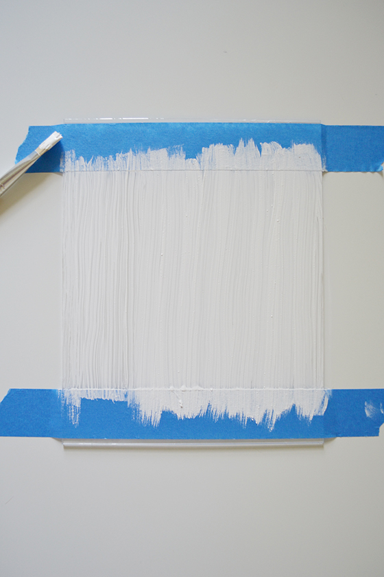
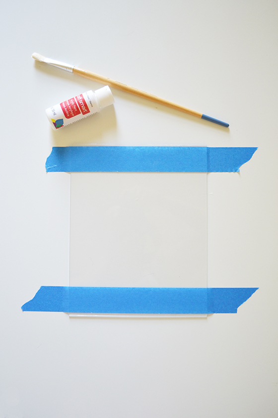
Begin by taping off one of the pieces of plexiglass with the painter’s tape, about and inch on both top and bottom. You could also get  more creative and mark out individual boxes, lines, etc – make the space work best for how you tend to process and think. I taped past the edges which helped to anchor the plexiglass in place while I was painting.


method-DIY Modern Shower Memo Board-4-Design Crush


It’s best to apply several thin coats of craft paint instead of one thicker one. To achieve the opacity I wanted took three coats with about thirty minutes of drying time in between each. Make sure and pull off the painter’s tape before the last layer is dry, it will help keep the edges crisp and clean. If you get any smudges just use a cotton swab or your fingernail to to fix things up.


method-DIY Modern Shower Memo Board-5-Design Crush


Plexiglass is notoriously difficult to drill through, so I opted for a heavy duty adhesive instead. I placed a thin line of adhesive about 1/4-inch from the edge of both the top and bottom, then placed the second piece of plexiglass over the first to cover my newly painted surface. In order to get a really tight seal I placed a few heavy coffee table books on top to act as a clamp, then waited for an hour or so for things to dry thoroughly.


method-DIY Modern Shower Memo Board-6-Design Crush


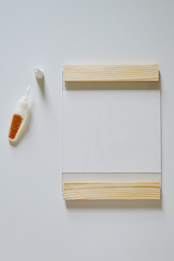
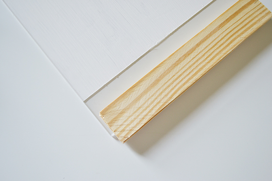
Attaching the wooden edges to top and bottom was just as easy. Once again I spread a thin line of adhesive along the edge of each piece, then placed them so that about two thirds of their width was on the plexiglass and the rest hung off. Then again I set a few large books on top and allowed everything to dry. You could stop here, but I opted to add a second set of wood edges to the backside by repeating the process.


method-DIY Modern Shower Memo Board-7-Design Crush

method-DIY Modern Shower Memo Board-8-Design Crush


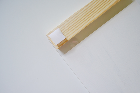
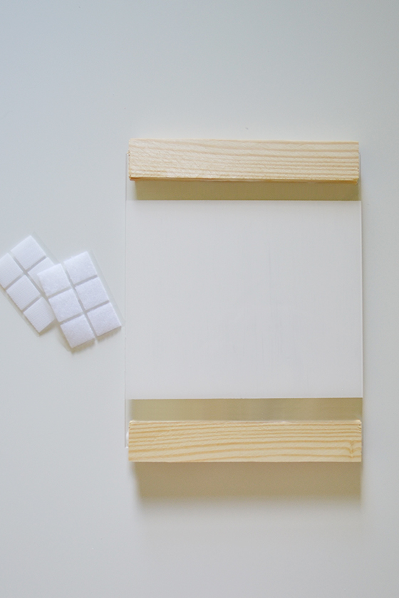
There were lots of possible ways to attached my brand spankin’ new memo board to the shower wall once I was finished. I could add an eye hook and use a suction cup or command strip, but I went with… velcro! Self-adhesive pre-cut squares couldn’t be easier to apply and they allow the board to really stay in place while writing on its surface. (And rest assured, I checked to make sure they survived the humidity and also came off the wall relatively easily!) One went on the four corners of the backside – both sides of the velcro stuck together at this point – then I positioned it on the wall and pressed for about 30 seconds.


method-DIY Modern Shower Memo Board-9-Design Crush


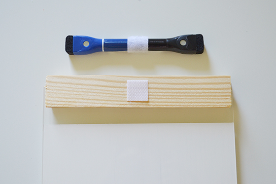
I attached a dry-erase marker the same way, with velcro so it’s always handy when I need it.


method-DIY Modern Shower Memo Board-10-Design Crush


I’ve used method‘s products in my home for years, their hand soaps and body washes favorites. I love that all of their products are naturally-derived and never tested on animals, a big plus in my animal loving household. These new foaming body washes are super moisturizing and smell amazing. They also manage to add a fun dose of color to my otherwise neutral bathroom. Head over to Target to try them for yourself now through October!


method-DIY Modern Shower Memo Board-11-Design Crush


method Foaming Body Wash is sold exclusively at Target now through October 2015. This post is sponsored by method. As always all words and opinions are my own. Thank you for supporting the brands that help keep Design Crush going!
1

Canopy Beds Done Right

blackband-Design Crush

blackband

I grew up sleeping in my aunt’s hand-me-down single canopy bed – or my can of peas bed, as I referred to it until I knew better. While I loved it at first I eventually began to despise it, and at the age of 10 was gifted my very own brand new cherrywood daybed. When I got older my mom and stepdad got a more modern metal version of a canopy which made me change my opinion on my old nemesis. And lately I’ve been noticing more and more canopy beds that I’d be more than happy to welcome into my own bedroom for a second chance at happiness.
 

100 Layer Cake-Design Crush

100 Layer Cake


Remodelista-Design Crush

Remodelista


Lonny-Design Crush

Lonny


from moon to moon-Design Crush

Moon to Moon


Mash Studios-Design Crush

Mash Studios


Anthro-Design Crush

Anthropologie

1

Happy Weekend

1-Design Crush

2-Design Crush

3-Design Crush

4-Design Crush

5-Design Crush

6-Design Crush

7-Design Crush

8-Design Crush

9-Design Crush

10-Design Crush

This week on Design Crush:
Fill my kitchen with the ceramics of Elnaz Nourizadeh and call me when you’re done.
In love with the structural bags in Candamill‘s fall 2015 collection.
Lucy Williams‘ architectural collages are so intricate it hurts.
Ondu pinhole cameras are wooden, handcrafted, and on my wish list.
This month’s PGH Maker Profile is a good one on tin artist Worker Bird.
Sleek and modern jewelry from Metalepsis is beyond perfect.
I can’t wait to get my hands on a copy of Carson Ellis’ Home.
Lindsay Stead’s Collection Quilts are sure to be heirlooms.

0

Lindsay Stead / Collection Quilts

Lindsay Stead-Collection Quilts-1-Design Crush


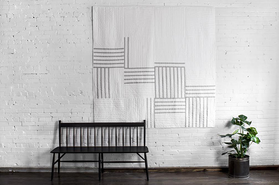
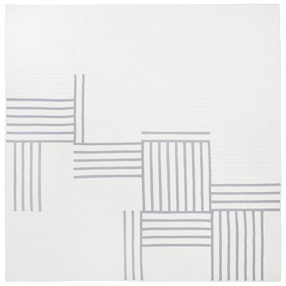
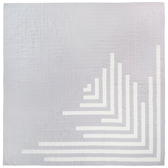
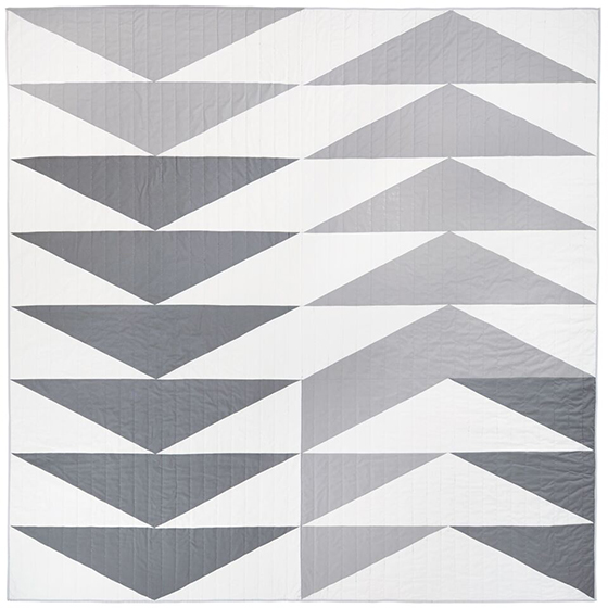
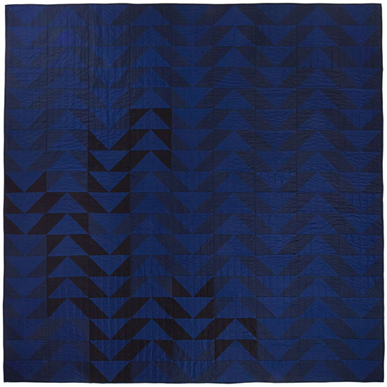
Lindsay Stead’s Collection Quilts are made in small batches, maintaining the quality and integrity that her work is known for. Lindsay works closely with a group of quilters in rural Ontario to produce these heirlooms. Each quilt is designed personally by her then made by a group of women who have handed down, through generations, their knowledge of quilting. The result is a collection of modern quilts with traditional roots that you’re sure to love and cherish. You can grab your own in her shop, at Steven Alan’s home store, or in Toronto’s Mjölk.


Lindsay Stead-Collection Quilts-2-Design Crush

Lindsay Stead-Collection Quilts-3-Design Crush

Lindsay Stead-Collection Quilts-4-Design Crush

Lindsay Stead-Collection Quilts-5-Design Crush

0

5 Favorite Food Blogs of the Moment

5-Favorite-Baked-the-Blog-Design-Crush


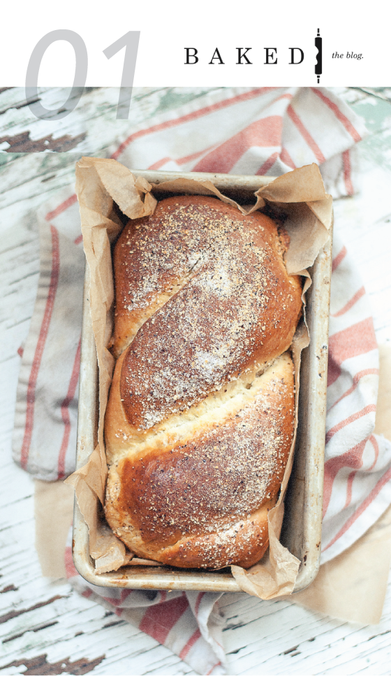
Baked the blog is a collaborative site run by seven Canadian food bloggers that celebrates all things sweet. Posting about one recipe a week, each blogger takes a turn sharing one of their delicious creations accompanied by photography that’s sure to make you drool even more.

Recent Favorites: Frozen Lemon Custard with Summer Berry Crumble (Dairy-Free), Baked Grapefruit with Coconut Whipped Cream, Mascarpone Strawberry Lime Hand Pies


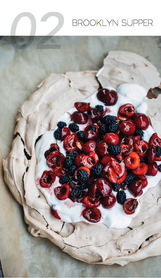
5-Favorite-Brooklyn-Supper-Design-Crush


Brooklyn Supper is the lauded blog of Elizabeth Stark and Brian Campbell, a couple who focus on eating seasonally. The two share simple, straightforward recipes (with a fancy one thrown in here and there) for home cooks at all levels. Some of the best salads you will ever see are right here.

Recent Favorites: Chocolate Pavlova with Cherries and Mulberries, Honey Cornmeal Waffles with Blackberry Syrup, Charred Corn Salad with Quick-Pickled Onions and Lime Dressing


5-Favorite-Cookie+Kate-Design-Crush


Cookie + Kate is a longtime favorite of mine with a focus on whole foods and vegetarian recipes. Kate’s hallmark is that she believes in recipes being flexible, and practices what she preaches. Several of her recipes are in constant rotation in my kitchen year-round.

Recent Favorites: Summertime Spaghetti with Fresh Tomato Sauce, Maureen’s Avocado Tabbouleh, Herbed Red Potato Salad


5-Favorite-How-Sweet-It-Is-Design-Crush


Another longtime favorite, How Sweet It Is (aka How Sweet Eats), is the food blog baby of witty Jessica. Healthy recipes, comfort food, and indulgent desserts all have their place here, where Jessica’s banter and realness make you want to hang around and have a cocktail.

Recent Favorites:  Grilled Cherry Salsa, Heirloom Tomato, Avocado, and Burrata Salad on Grilled Garlic Toast, Pistachio Pesto Pizza with Fresh Mozzarella and Honey


5-Favorite-Wit-&-Vinegar-Design-Crush


Billy Green is one hilarious mofo, and his site Wit & Vinegar is as funny as it is delicious. His graphic design background shines through with beautifully styled photos that will have you Risky Business-sliding into your kitchen ASAP.

Recent Favorites: Mini Graham Cracker Pavlovas, Burnt Marshmallow Pudding Pops, Caramelized Honey & Sea Salt Gelato Pops

1