Taste Tour: Tucker’s Onion Burgers

Taste-Tour-Tuckers-1-Design-Crush

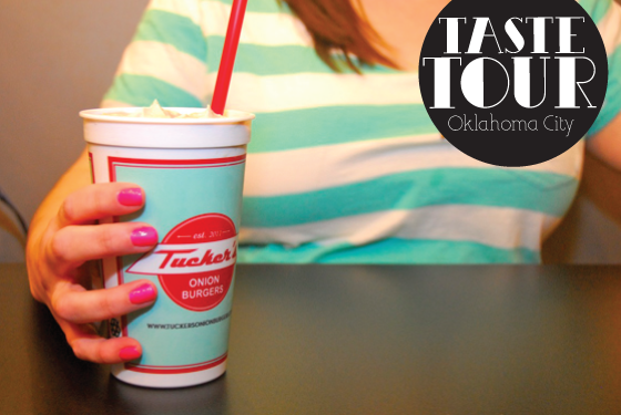
Onion burgers are an Oklahoma institution, a delicious patty of beef with paper thin slices of onion seared into it right on the griddle. Never tried one? You’re definitely missing out. One of my favorite joints is Tucker’s Onion Burgers, and a few weeks ago my friend/photographer Caroline and I popped into their new location on Classen Curve to check it out!


Taste-Tour-Tuckers-2-Design-Crush

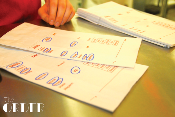
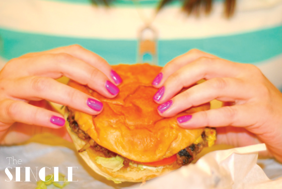
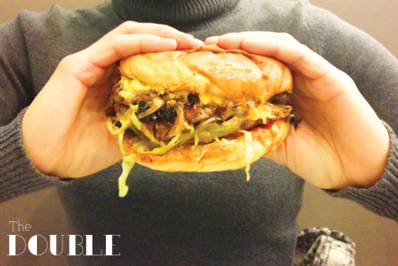
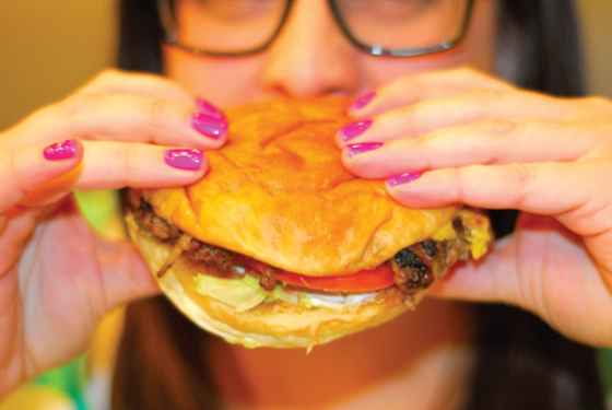
Like any good burger, you can order an onion burger about a million different ways. I opted for a single with cheddar, lettuce, tomato, ketchup, and mayo while Caroline went with the double (she’d has a really bad week) with the kitchen sink minus the pickles. I love how Tucker’s uses the bags your meal is delivered in as the order form – so smart!


Taste-Tour-Tuckers-3-Design-Crush

Taste-Tour-Tuckers-4-Design-Crush

Uhhh, the difference is obvious! (PS: She ate it ALL.) Not pictured is the fresh limeade I sucked down and the chocolate shake Caroline couldn’t even finish. Oh, and there might have been some fries, too…


Taste-Tour-Tuckers-5-Design-Crush

Taste-Tour-Tuckers-6-Design-Crush

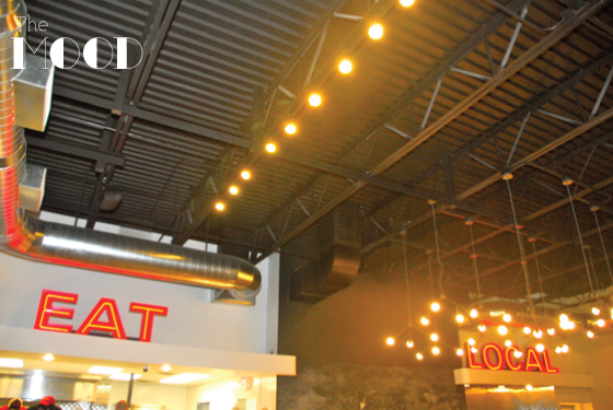
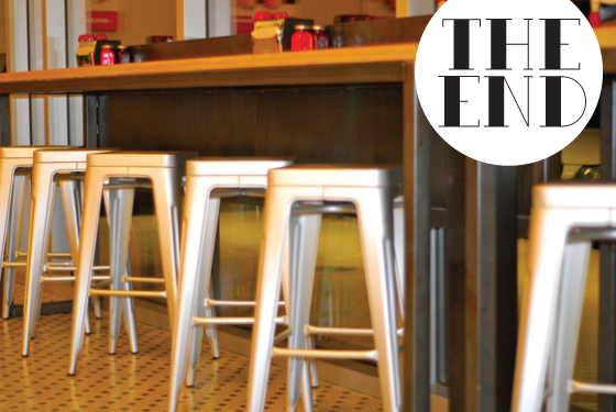
We have a fantastic local food movement here in OKC, and it’s also at Tucker’s where everything is locally sourced. Their Classen Curve location has an amazing exposed ceiling that somehow goes right along with this idea. The vibe is very vintage modern, embracing your classic burger joint while keeping things fresh!


Taste-Tour-Tuckers-7-Design-Crush

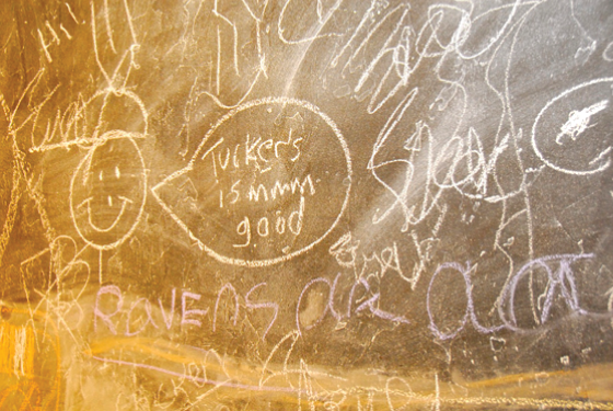
My sentiments exactly!


Taste-Tour-Tuckers-8-Design-Crush

All photos ©Caroline Cohenour

Disclaimer: Tucker’s provided both mine and Caroline’s meal as a member of EngageOKC. However, all words and opinions are my own. Thank you for supporting the brands that keep Design Crush going!

3

January Snaps

January-1-Design-Crush

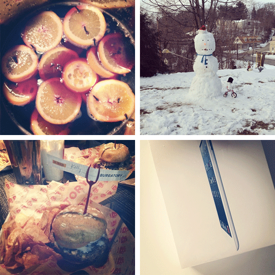
Made my first ever mulled wine.
Made a massive 6-foot-plus snowman with my cousins!
Got my first (gen 2) iPad.
Ate the best veggie burger of my life at Burgatory.


January-2-Design-Crush

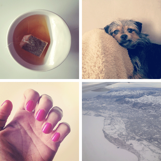
I’ve been under the weather for more of the month (three separate times from what I can tell).
Bebe has been my constant nurse, snarling in the face of illness!
Flew to Salt Lake City for my 4th annual Alt Summit.
Got my first gel manicure – the color was called something ridiculous like Frozen Strawberry.

You can follow me on Instagram at designcrush!

0

100 Years of Grand Central Station

Constelations-Design Crush

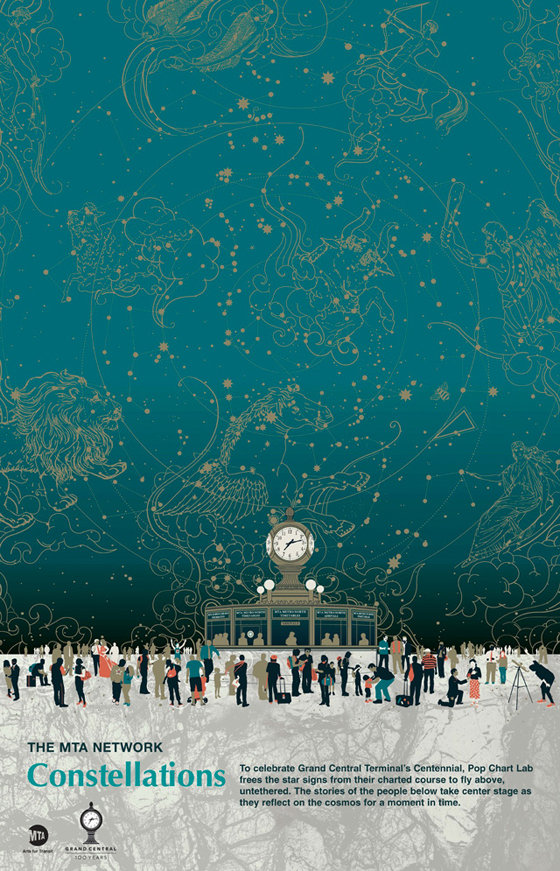
There’s no denying that New York’s Grand Central Station is magical. This February the icon turns one hundred, and to celebrate Pop Chart Lab has released Constellations. The print was commissioned by the MTA’s Arts for Transit and Urban Design program and features the famed four-sides clock and constellation-filled ceiling. It will be seen around the subway system, but you can purchase your own right here.

2

Even More Valentines For Your Valentine

Valentines-2-Design-Crush

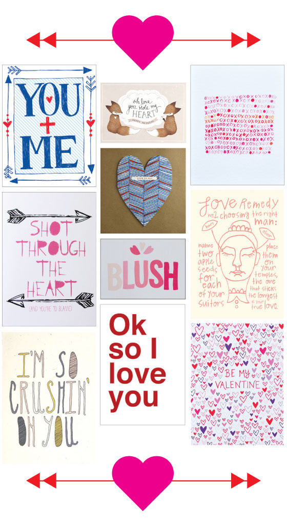
Column 1: YOU + ME by Natalie Eden, Shot Through the Heart by Letterhappy, I’m So Crushin’ On You by Hello Small World  Column 2: Oh Love You Stole My Heart by Whimsy Whimsical, love to you heart by egg press, BLUSH by Fair Morning Blue, ok so i love you by Sad Shop  Column 3: xoxo notecard by Amy Marcella, Love Remedy No. 2 by Moxie House Paper Goods, Be My Valentine by Happy Cactus Designs

3

Elizabeth Olwen

Elizabeth Olwen-1-Design Crush


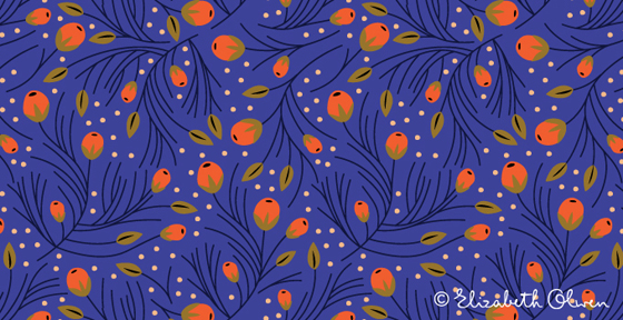
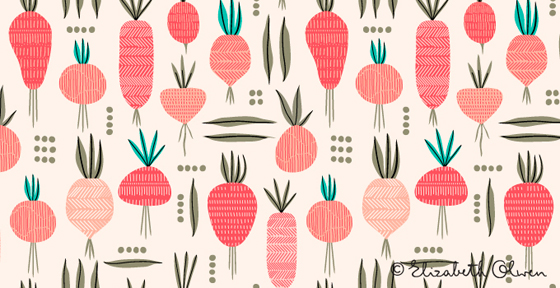
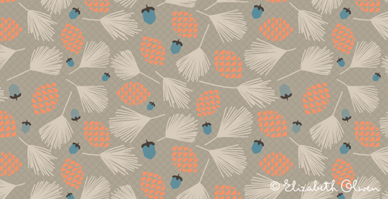
Elizabeth Olwen is one talented surface designer, but you can see that for yourself. Her bold, unapologetic patterns are inspired by beauty, nature, folklore, and romance – not a bad mix of influences! Her use of layered color makes each and every pattern seem to jump off the page, making her a fast favorite of mine.


Elizabeth Olwen-2-Design Crush


Elizabeth Olwen-3-Design Crush

2

Jeremy Rabus

Jeremy Rabus-1-Design Crush


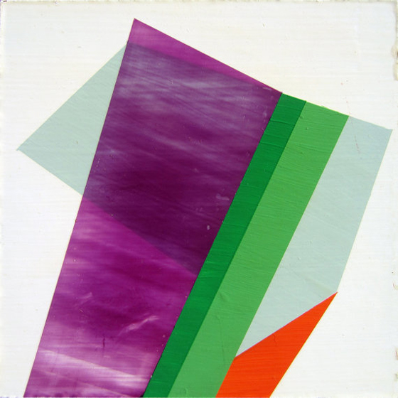
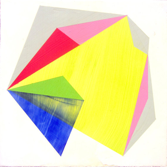
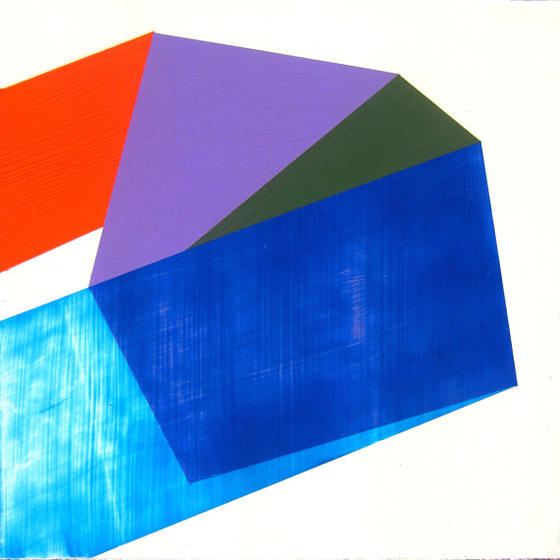
Jeremy Rabus‘s Prismatic series reminds me of deconstructed gemstones. These small, geometric, colorful acrylic paintings are inspired by the small stones and their sharp angles. I love how the color palette of each piece strays from the expected monochromatic hues and opts for something more dramatic instead.


Jeremy Rabus-2-Design Crush


Jeremy Rabus-3-Design Crush

1

Reader Survey

2013-Reader-Survey-Design-Crush

ORIGINAL PHOTO: Aaron Ruell

Well, we’re five and a half years into the journey that is Design Crush and I’d love to get your opinion on a few things! Please click here and take the 2013 Reader Survey so that we can make sure everyone is on the same page. Thank you so much for helping to make this site the success that it has become!

0

Happy Weekend

1-Design Crush

2-Design Crush

3-Design Crush

4-Design Crush

5-Design Crush

6-Design Crush

7-Design Crush

8-Design Crush

9-Design Crush

10-Design Crush

01/ LEDscape, an installation of 1,200 IKEA floor lamps.
02/ Defrosting an entire cold storage building.
03/ The Home Office Beach!
04/ A study of butterfly wings.
05/ Meet Momo, like Where’s Waldo with an adorable dog.
06/ NeighBirds. Heh.
07/ A Visual Compendium of Guitars.
08/ Smorgasboard, an illustrated board game for foodies.
09/ Jeni’s cure-all, Influenza Sorbet!
10/ No big deal, just an espresso vending tricycle.

5

Fort Trays

Fort Trays-1-Design Crush


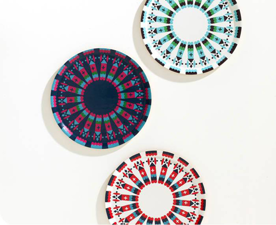
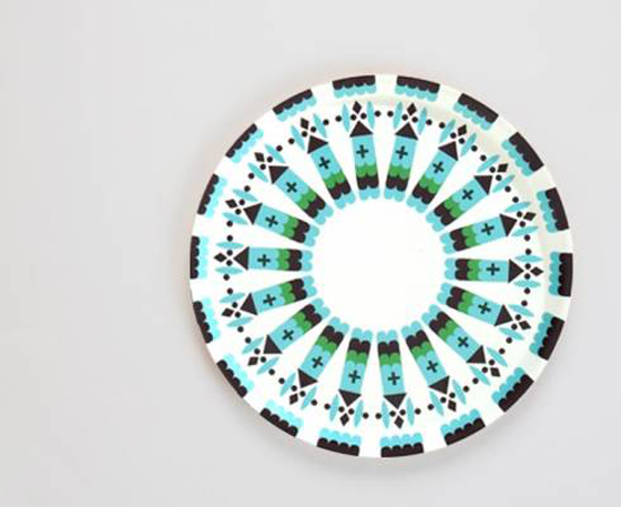
Donna Wilson can do now wrong, and her Fort Trays are the latest proof of that statement. The design is based on storybook medieval castles, the trays themselves are then made from laminated birch wood in Sweden. Three color choices offer a *POP* of color for these dreary winter months, great for displays and parties alike.


Fort Trays-2-Design Crush

1