Hover-spoon.

I heart Susanna Shaw’s Hover-spoon. The utensils balance on the rim of cups and bowls, appearing to float. Fortunately, the Hover-spoon also provides a clean way of resting your cutlery during dinner. Ironically, there are forks and spoons available in the aesthitcally beautiful collection. I’d feel a little gipped if I were the spoon’s four-pronged, un-named sidekick. You know if, um, forks had feelings and all.

0

Bird & Banner.

Bird & Banner has been in my peripherals for a while now. When I checked out their site recently I was really impressed by the way they handled their samples. I love the way each piece is accompanied by a story about how it came to be – I feel like I’m getting the whole story and not just the end result. And I’m absolutely in love with the B&B logo.


0

rice.

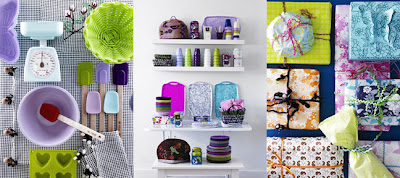
rice is full of colorful and nostalgic fun this season. Their Bake in Style section is amazing. I’m really into all the pastels lately, which I’ve never been a fan of before.

0

A Brief Message.

I’ve been reading A Brief Message religiously for the past few weeks. ABM features design opinions in 200 words or less, the topic changes every few days, as does the author and illustrator. The most recent – Arrogrance and Humility – was written by Clay Shirky and illustrated by Louise Ma. I always like seeing what other have to say about the industry and digging into the mentalities of those within.

0

Miette Patisserie & Confiserie.


It’s almost a though San Francisco’s Miette Patisserie & Confiserie stepped out of a fairy tale. The products have incredibly fun names like the Tomboy, Debutante and Princess Cakes and change with every season. The shop itself is a modern candy store blending the look of old-time penny candy with European delights. And of course don’t forget the clouds of handmade cotton candy, bouquets of candy flowers and trees made of lollipops. A Sweet Tooth’s dream come true.

0

Vertical Rolodex.

I have a thing for address files of all shapes and sizes and have been coveting this vertical rolodex at Pottery Barn for a while now. There’s just something about the vertical orientation and carousel-like organization along with the shiny chrome that does it for me.

0

Lemon Squeezer.

Another example of great design at work. It seems like this lemon squeezer at j-me would be perfect for putting a few drops of lemon in your tea or on your salad. Not to mention I think it would make measuring a breeze.

12

Wild Bunch & Co.

Wild Bunch & Co produces 100% organic cold-press juice made exclusively to order for bars, restaurants, healthcare centers, spas and resorts. If you happen to live in Singapore – where it’s made – home delivery and catering are available.

I’m not so much interested in that side of Wild Bunch & Co. (although I will take organic when and where I can get it). What I am into is the package design. I love the simple black and white sans serif type on that amazingly functional bottle, not to mention the vibrant colors of the juices themselves.

0