Food Design.

Marti Guixe is crazy in the very best possible way. He’s an artist who’s been creating food design for the past ten years. And by food design I don’t mean packaging or designing with food. He’s actually been designing food with a practical purpose. Take for example, the following Guixe creations.
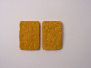

The Seven Step Cookie
A cookie with decoration that indicates how to bite it.


Flavored Stamps
Stamps with food images on one side and with the flavor of the imaged food on the other.


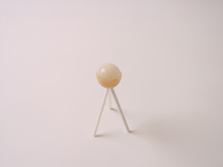
Hands Free Lollipop


Oranienbaum Lollipop
An orange candy lollipop with a seed inside. It is a way to activate sporadic and spontaneous reforestation just by splitting the seed once the candy is finished.

Thanks for the heads up J. May!

0

Matthew Mead Style.

I discovered a great new site this morning – Matthew Mead Style – which pins themselves as “fresh ideas for modern living.” It’s very Martha in a less passive-aggressive, anal kind of way. Mr. Mead covers Entertaining, Style, Collecting, as well as a rotating category that can be anything from pasta recipes to holiday ideas. There’s also a section on downloads. The site is seasonally based, meaning it only changes once a season and is updated only that often. So far I love what’s been done and will definitely be checking back.

0

Popoutz Birdfeeder.


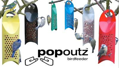
And this isn’t even related to my recent bird obsession. I love the modern-simplistic look and feel of these Popoutz birdfeeders. And get this: you can buy them here for only $1.80 each. Ridiculous. They’re made out of 100% recyclable polypropylene plastic and come in six vibrant, bird-attracting colors.

0

M is For Modern.


I rarely post about childrens’ products, but every once in a while something comes along that makes me stop and say (sometimes outloud) “why didn’t I think of that” or “wish I had that when I was a kid.” Besides that, I’ve got a couple of new(ish) munchkins in my life via my best friends.

The M is for Modern Alphabet flashcards by Jargon Boy are a pocketful of genius. Coolness in a box. A Mid-Century Modern education in 26 easy lessons. Or a way to keep your kids busy. Forget A is for Apple. B is for Bauhaus is where it’s at. Check them out at Uncommon Goods.

0

P.O.S.H. Chicago

In 1997 P.O.S.H. opened its doors in Chicago, determined to offer something unique to the consumer that was tired of the “sameness” that had crept into the marketplace of home & table decor. P.O.S.H. searches high and low for the items that stock its shelves – an eclectic assortment of vintage hotel silver, restaurant china and fleamarket finds. Found in such places as old American china warehouses to the antique markets and auction houses of Europe, the items are often one-of-a-kind or limited in quantity.


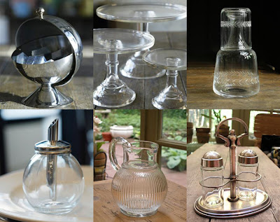
Here are my picks. Clockwise left to right: French roll top sugar bowl ($40), 12″ glass cake plate ($75), bedside carafe ($44), glass sugar pourer ($8), 6″ flited pitcher ($18) and the brasserie salt and pepper set ($50).

0

Martha's Evil Empire Expands.

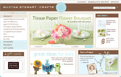
I’m torn. I’m torn between my love of all things design and craft and my immense dislike for Martha Stewart. She’s got a new branch of her empire – Martha Stewart Crafts. The products are available online or at the Michael’s store closest to you.

0

Martha’s Evil Empire Expands.

I’m torn. I’m torn between my love of all things design and craft and my immense dislike for Martha Stewart. She’s got a new branch of her empire – Martha Stewart Crafts. The products are available online or at the Michael’s store closest to you.

0

The Little Know-It-All.


It’s a book, not a person. Not me (unforturnately, or fortunately depending on how you look at it and who you are). more specifically, it’s a book for designers. It might as well be the new Design Bible actually.

The Little Know-It-All: Common Sense for Designers by Silja Bilz is divided into sections explaining unique vocabulary used in design, printing, typography and photography and includes helpful tips and concise analysis in areas such as advertising, mulimedia, business, copyright and project management. It is structured thematically and equipped with a resourceful index that references numerous sources and links. It’s complete with graphics that illustrate and supplement the texts, making it a reference book for students and newcomers while serving as a trusty companion for professional designers and media professionals alike in their everyday work.

0

A Kick in the Pants.

These are hilarious and I totally needed it this morning! You know how some people just suck? Really bad? Here are three things that can help you feel better about it. Even if it’s just a little bit.


The first is from youparklikeanasshole.com (clever address, no?). Sick of a car taking up two spaces on the street? How about a car too close to yours? What about the car at the mall parked diagonally? Now you can do something about it. Simply download a notice and place it on the car’s windshield. The owner of the vehicle will be informed of their asshole status as well as the proper tips to improve their poor parking techniques. It’s time to put an end to asshole parking, or at least to make fun of it. The site is pretty clever, too, you can download the notices as well post and view notices in action.


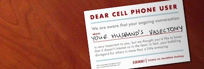
The second is from Coudal’s Cell Phone Etiquette campaign. We’ve all had that awkward moment when we overhear someone’s personal cell phone conversation. Now we have the power to stop it. You can download them here.


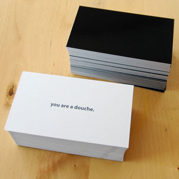
The third is the all-encompassing Douche Card from Orange32. Stock up. 25 cards for $5.

0

Joey Ruiter.

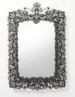
I’m way into this metal-cut mirror by Michigan designer Joey Ruiter. I just can’t decide if it would be something I would get tired of after a few years (not that it’s remotely near my price range).

0