Kuler.

If you’re a design addict and color-holic like me, Kuler will rock your socks off. A co-worker showed me the site yesterday and I’ve barely been able to get any work done since then. I’m addicted.

Kuler is a Adobe-run site that allows users to log on (with your free Adobe registration) to explore, create and share color themes. You can use it online or download color themes to use with Creative Suite 2 and 3. When I just checked there were over 16,000 color themes to drool over. It’s super easy to use and when you find something you like there’s an icon that gives you the color builds. Love it!

We’re each designing our own business cards today at work and I used this color scheme below on mine.

0

Mission Stencil Story.

The mission stencil story is an interactive, choose-your-own-adventure story that takes place on the sidewalks of the Mission district in San Francisco.

Its a love story with 2 characters who start in different locations. His story starts at 16th and Valencia, in front of the Crown Hotel / Limon Restaurant with the text “He Leaves his Lonely Apartment.” Her story starts at 21st and Guerrero in front of a stunning mansion with the text, “She Leaves her Lonely Apartment.” Spray-painted stencils are connected to each other by arrows guide them on their adventure. Eventually their paths merge, at the point where they meet, and their paths travel together until drama pulls them apart. Their are two possible endings, happy and tragic, and two other points where the story can end unexpectedly if the viewer chooses the wrong ending. All in all, there are 4 possible endings.


0

Relish Style.

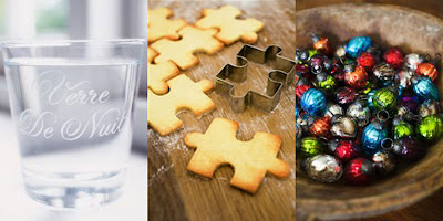
Relish says what they’re about better than I ever could. Relish is more than a brand. It is a lifestyle, a mentality, a philosophy. It is the idea that everyday objects should be beautiful, functional and affordable. It is the zone between individuality and mass production. It is a carefully curated collection of emerging designers from around the globe that inspire, elevate and touch our senses.

Definitely check them out sometime. Here’s what I’m relishing at the moment.
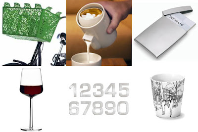

Clockwise from top left: bicycle basket, sugar and creamer set, business card holder, mug, house numbers and red wine glasses

0

Rosebud Design Studio.

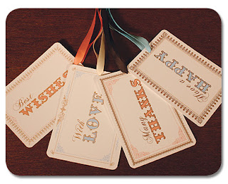
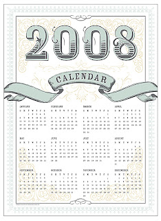
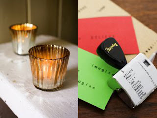
Rosebud Design Studio brings attention to detail, wit, whimsy, and class back into correspondence. They appreciate intricate and ornate decorative elements and beauty for its own sake — elegant but never stuffy. I’m digging this calendar and gift tags. I really like the old-fashioned quality the type technique exhibits.


0

iPhone Mania.

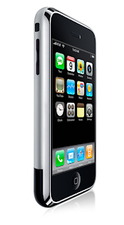
I’m almost positive that I’m the only person in a Mac-conscious world who doesn’t want the iPhone. I have an iPod, so that job’s taken. I also have a digital camera as well as a camera phone. Lead rold and understudy. Taken. I have a Powerbook and a G4 desktop. Once again, well prepared. So why in the world would I need an iPhone???

Because it’s cool as hell, that’s why. I could have withstood all the hype had I not seen one for the first time in person today in my boss’s office and had a chance to play around with it. I am amazed to say the least. To start, it’s much smaller and thinner than I imagined (especially after seeing ads by Mac that used a particularly large hand model). It’s lighter. It’s easier to use. They really weren’t kidding.

So now I totally want one, but sure don’t have the $500 to drop on it since I’m saving for a down payment on a house. Maybe I’ll just have to wait for version 2.0 to come out…and then stand in line for five hours to get it.

0

Vitamin Water.

I first started drinking Vitamin Water when I was living in New York a few years ago. Ever since then I’ve been a loyal consumer of the tasty beverage. And yeah, the clean packaging and quippy sayings on every bottle help out.


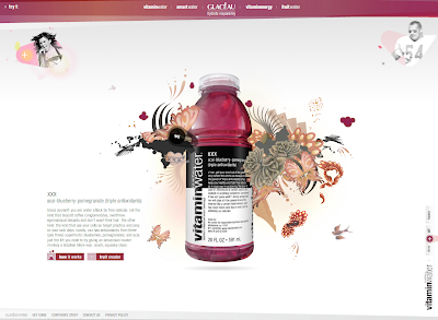
I just found a new flavor yesterday – XXX – and it’s my new favorite (sorry power-C!). The triple-X is for the triple dose of anti-oxidants you get in every bottle: acai, blueberry and pomagranite. (Not porn. Sorry.) It seriously smells and tastes like a melted Slush Puppy, but it’s actually good for you.

The web site is great, too. Not only the design, but the dialogue. More quippiness, like this for multi-V (lemonade with a-zinc): you are not an emotionless, single-minded robot (if you are an emotionless, single-minded robot, you can stop reading now). you are a human being. you wear many hats. you dance many dances. and you try many things. things like using a swiss army knife in a medievil sword fight. vitamin-packed, multi-v helps you keep your horizons broad.

0

Lekker.

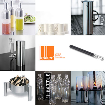
It’s important to furnish a home with items that are reflections of the people who live there, don’t you think? Lekker provides an environment that creates a relationship between design and inspiration by bridging the gap. They have lots of amazing things, but are a little on the pricier side of the road. That said, if anyone’s buying here’s my wish list.


Clockwise from top left: kitchen squeeze bottles, porcelain votive set, stainless carafe, bottle opener, outdoor stainless table torches, glass bottles, fire pit, 007 shaker

0

Corzo Tequila.

I love tequila. Okay, well, I haven’t exactly been able to drink any since mid-January after an unfortunate “incident” involving my face and a patch of ice. That aside, I love it. Margarita on the rocks, no salt. Shots. Whatever, I’ll take three.


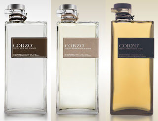
I’ve never had the pleasure of trying Corzo, but I want to buy some. Mainly because of the bottle which has an amazing design. I’m sure it would be one of those things I bought and never opened. Or maybe opened and filled with food colored water later on…

Fabien Baron had this to say about the bottle design, “Unlike the typical approach to tequila packaging we wanted to reflect the modern side of Mexican design. A more innovative and unexpected bottle was also a good complement to the traditional craftsmanship of the Corzo tequila.”

The web site is really clean and modern, like the bottle. It has sections devoted to the evolution and process of making Corzo, as well as cocktail recipes.

0

Farewell, Jane.

I read some sad new online today – one of my very favorite magazines, Jane, will no longer be published after August. It debuted in September 1997 and I’ve been a loyal reader ever since. It was edgy and as indie as you can be in a mainstream kind of way. It always featured amazing women (re: Drew Barrymore, Zooey Deschanel, etc), fantastic music reviews, and great ideas. Jane will be greatly missed by me and all of her readers!

0

Method of Madness.

By now most people are familiar with Method, the cooly-designed, eco-friendly cleaning and personal products line most famously sold at Target. While visiting my local Target (or “Home” as I like to call it) a few weeks ago I was walking down the body wash and lotion aisle when I saw these crazy, stand out bottles. Turns out Method has a new line called Bloq. And it’s not only body wash, but lotion, shave cream and bar soap as well. Very cool, although I did wonder for just a moment how one would get all the product out of the rigid plastic, acute angled bottle. And questioned if the soap might be painful. Then I remembered how cool it looks and pushed the thoughts out of my mind.


Method is a really cool brand in general. Their products are bio-degradable, but they also work. Besides that they’re also made out of recycled materials and there’s no animal testing. Method’s products are non-toxic, so you can use them around children and pets. And the design is amazing, which makes you wonder why you’ve been hiding your cleaning products under the sink for so long. So breathe deep, knowing that you’re using a quality product – and that it also smells good.

0